
A strong composition is achieved through intentional design, not a happy accident of random shapes. If we look closely, nature gives us all the information we need. We just have to organize the pieces to create visually pleasing paintings.
TIPS FOR BETTER COMPOSITIONS
• Don’t feel like you have to duplicate everything in front of you — that’s a camera’s job.
• Remove unnecessary objects in overcrowded compositions.
• Leave out any object that doesn’t support the overall design of your painting.
• Add points of detail, figures, or directional cues to compositions that appear too empty or boring. It doesn’t matter if they’re not present in real life; they just need to make sense and be placed with purpose.
• Bend reality and reorganize objects to send the clearest, strongest message of your painting.
• Do thumbnail sketches and learn to pre-visualize your finished painting.
• Sketch regularly to build up your visual library so that you can draw from experience and add elements to your painting, even when they’re not directly in front of you.
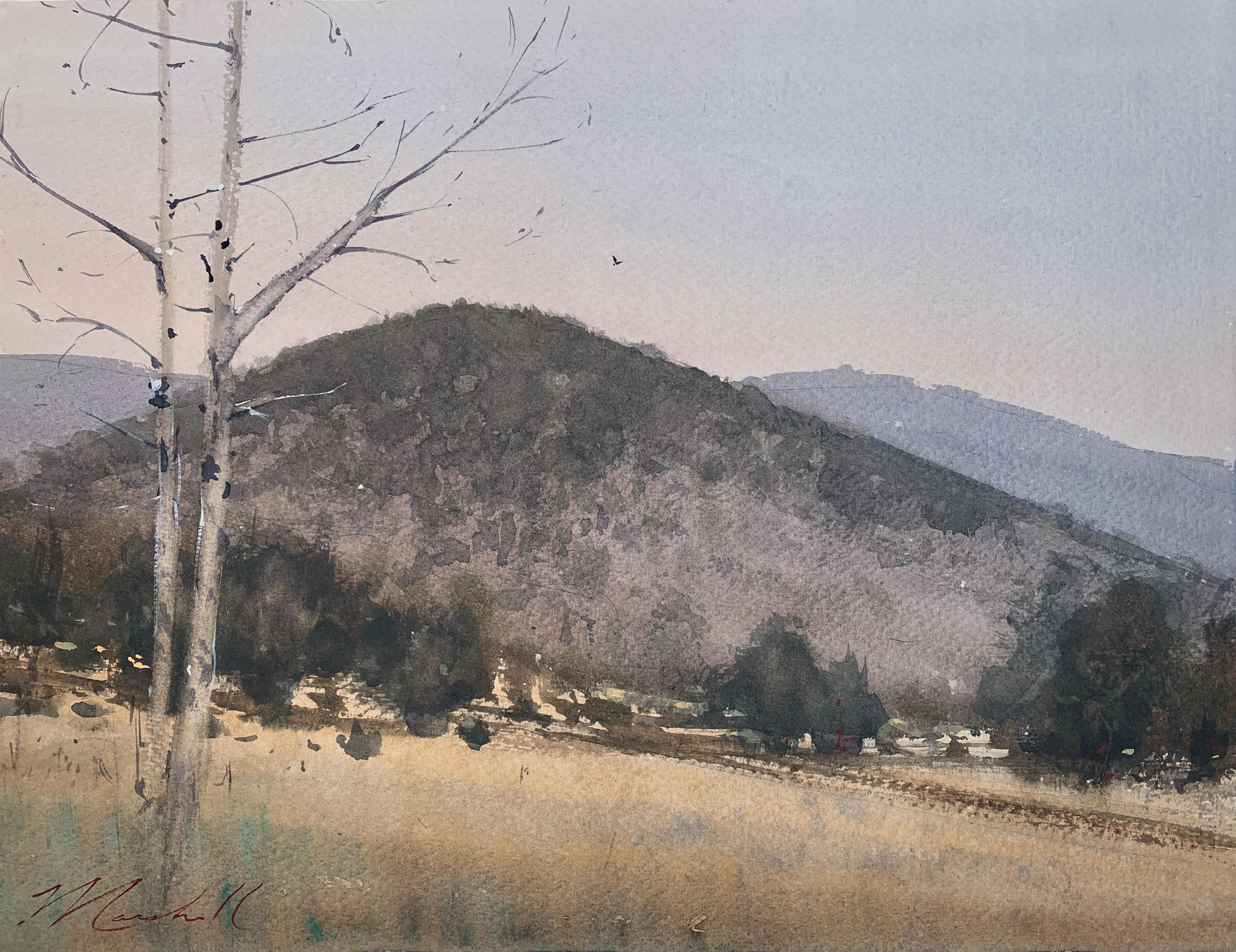
In reality, the diagonal path in Sawmill Trail, Dusk existed outside my field of view, but I needed a directional to lead the viewer’s eye into the painting. I moved the element into the composition as I worked in the field. Upon returning to the studio, I found that the piece lacked interest and needed a strong vertical to contrast with the rolling hill. I added the wintry trees, which also helped to enhance the feeling of dusk and push back the hills, creating greater depth.
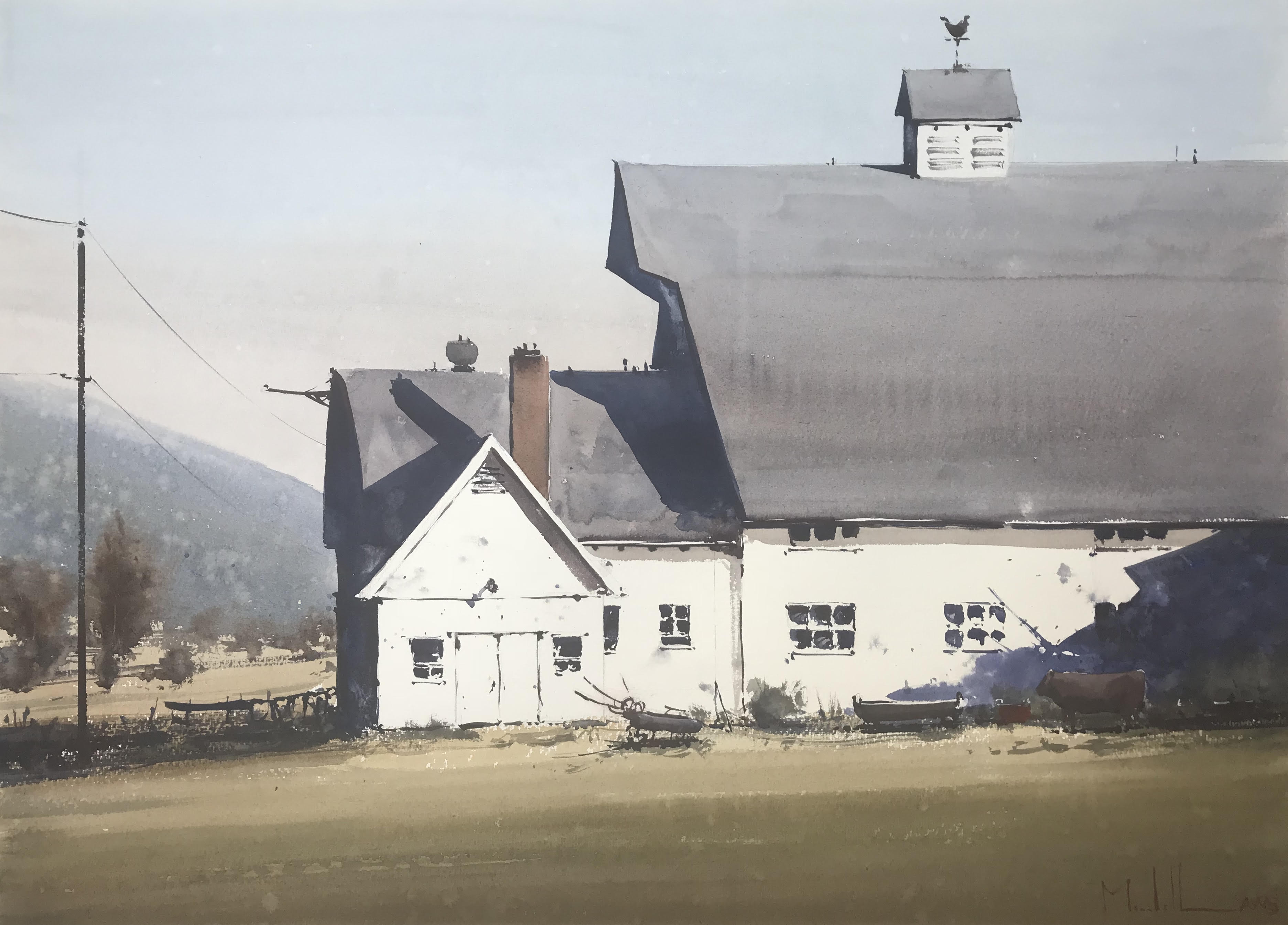
I knew this lovely old barn would make a great subject, but a maze of cattle pens cluttered up the foreground. Eliminating the pens simplified the space and created a more inviting path for the viewer’s eye to travel into the scene. I then used shadows and the angles of the barn to form a visually interesting zigzag pattern that would move the eye further around the painting.
Dan shares more tips in his DVD CITYSCAPES IN WATERCOLOR WITH DAN MARSHALL.
Ambassador of the Week: Margie Hildreth
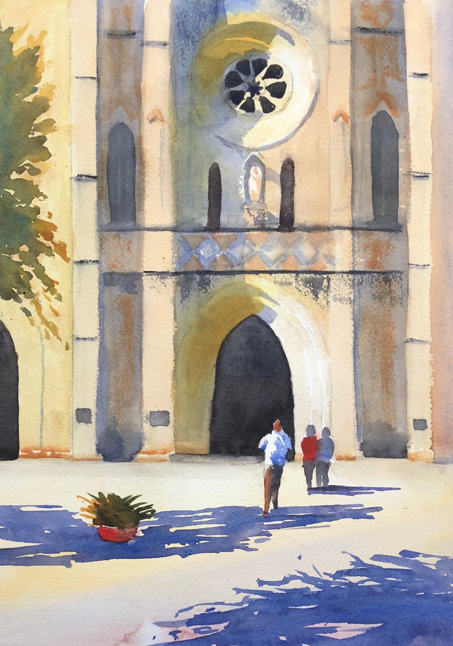
Combining her love of travel and painting, Margie Hildreth is continually looking for a way to express herself through her art. Her focus is to show the contrast between light and shadows in a vibrant format, as she did in “Meet Me at San Fernando.” She counts John Singer Sargent and Winslow Homer, as well as contemporary watercolor artists Joseph Zbukvic and Keiko Tanabe as influences.


It’s nice to get these “free” tips occasionally instead of having to buy yet another book or video. So thank you.
Thanks for sharing this good advice. I’m always looking for insights on composition.
Thank you for very interesting short articles. I enjoy your lists very much. Most of your reminders I know , but have forgotten to do or use or apply them. Keep them coming!
I especially enjoy articles on design and composition. Keep these coming.
Thank you for sharing these tips.i look forward to your emails!
[…] Artist Jessie Rasche Painting Composition Tips for Beginners | How To Create Bolder Paintings 7 Steps to Better Compositions Composition in Painting: How to Create Better Painting Compositions 6 Time-tested Ways to […]