
What works in Wisconsin won’t work in west Texas — and the watercolor artist who knows Maine’s granite coast knows something that no amount of studio mixing can teach a painter who has never stood in that particular light. Over the next five weeks, I’ll be bringing you a region-by-region guide to the palettes that actually work outdoors, drawn from a feature story I compiled for PleinAir Magazine. Each week, one accomplished watercolorist shares the colors, mixes, and hard-won knowledge they’ve built through years of painting their home landscape — the must-have pigments, the surprise additions, and the specific combinations they reach for when the scene demands something only experience can teach. Whether you paint in your own backyard or travel to unfamiliar terrain, their insights will help you see the landscape — and your palette — with fresher eyes. First up: the coastal Northeast.
THE ROCKY COAST OF MAINE
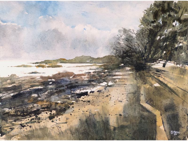
Maine is not a landscape that flatters the unprepared. Its coastline is granite and shadow, earth and fog — a world of subtle, shifting neutrals that punishes painters who arrive with too much color and not enough restraint. Thomas Bucci has spent years learning to read it, and the palette he’s built reflects that hard-earned understanding.
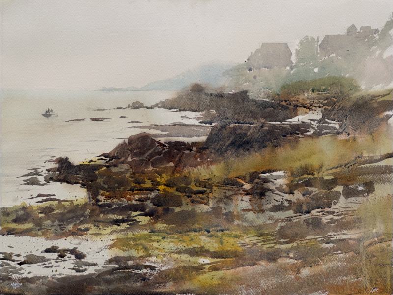
“This is a coastal area with the Appalachian Mountains meeting the sea,” Bucci explains. “It’s comprised of granite ledges, boulders, and smaller stones rather than wide sandy beaches — so that means a full range of earthen hues, browns, and grays.”
At the core of his palette are four colors he returns to again and again: Pyrrol Orange or Red, Quinacridone Gold, Ultramarine Blue, and Viridian. Together, they function less as individual colors than as a system — a set of building blocks that, in various combinations, can produce almost anything the Maine coast requires. “With a red, yellow, blue — and I like to add in a green — I can make a full range of color,” he says. His method is equally deliberate: he places dollops of his four go-to colors, fresh from the tube, into the corners of his main palette well and drags them toward the center to mix in various ways. “Color harmony results by default,” he notes, “since every color is some variation of a mix of the four.”
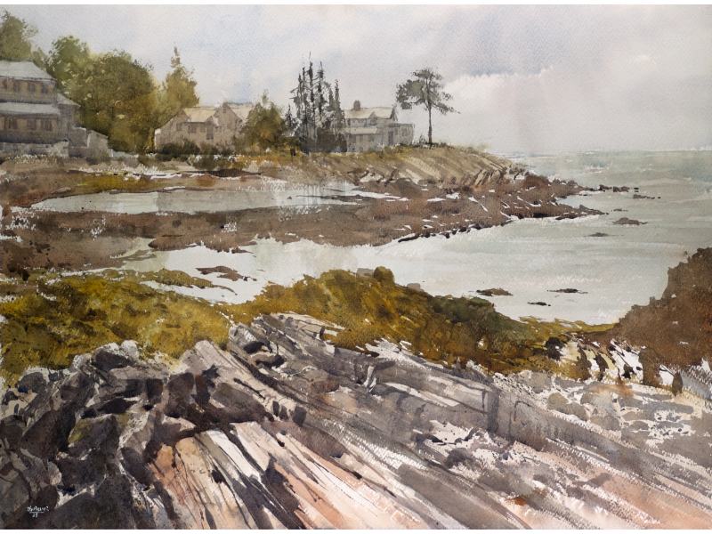
Each color earns its place. Pyrrol Orange or Red brings a granulating quality that’s ideally suited to the textures of rock and soil. Quinacridone Gold, intense and transparent, is never used straight from the tube, but mixed with blues, browns, and blacks to produce what Bucci describes as “a perfect range of subtle greens” — exactly the kind of muted, complex greens that Maine’s landscape demands. Ultramarine Blue he considers simply indispensable. “I think this one must be on every painter’s palette,” he says. “I don’t know of any mix that can replace it.” And Viridian, like the gold, earns its keep entirely through mixing — never alone, always in service of something richer.
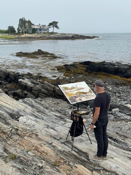
For his favorite color recipes, Bucci returns to a few reliable combinations. Ultramarine Blue and Burnt Umber produce what he calls “a classic mix” — a rich base for the full range of grays and blacks that define the rocky Maine coast. He warms it with Pyrrol Orange or cools it with Viridian depending on the light. Quinacridone Gold mixed with Lunar Black — which he prizes for its granulation and transparency — yields a deep greenish-gray that he finds irresistible.