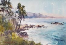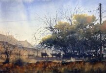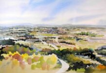

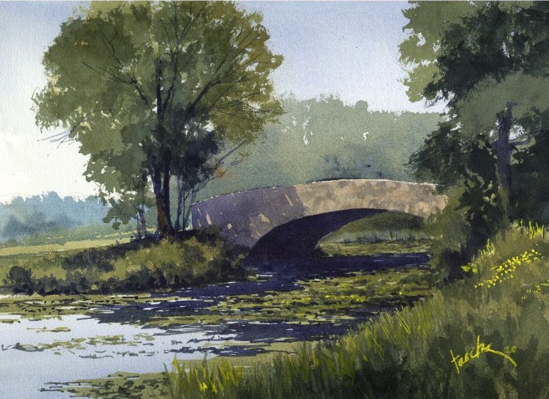
(watercolor, 11 x 15 in.) by James Faecke
Each week for five weeks, we’re sharing the regional palette wisdom of one accomplished watercolorist, drawn from a feature in PleinAir Magazine. If you’re just joining us, you can find earlier installments here. This week, we head to the Midwest.
THE LUSH GREENS OF WISCONSIN
James Faecke grew up in the “desolute Southwest,” where the dominant colors are browns, golds, and sky blue. Moving to Wisconsin was, by his own account, a revelation. “The Midwest landscape is lush, dominated by greens and blues,” he says. And greens, as any watercolorist knows, are tricky.
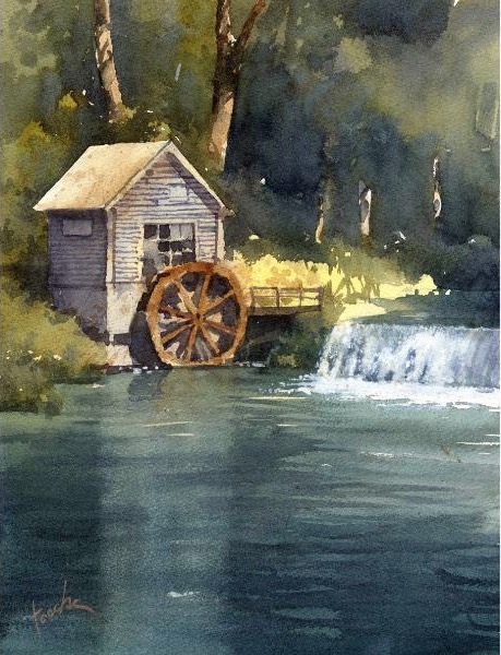
“They can go flat on you,” as his friend, watercolorist Richard Sneary, once warned him. It’s a problem Faecke has spent years solving. “I haven’t found any good out-of-the-tube greens,” he says, “so I always mix them myself.”
His most reliable green recipe came from fellow watercolorist Andy Evansen: Payne’s Gray mixed with Quinacridone Gold. The result is what Faeke calls a beautiful “natural” green — one that reads as organic and complex rather than synthetic. The key, he notes, is brand specificity: “It’s important to use Winsor & Newton paint for your Payne’s Gray in this mixture because it has more blue in it than other brands.” He sometimes substitutes Indigo, which pushes the mix slightly bluer still. From there, the ratio does the work — more gold warms the green, more gray cools and deepens it. And to keep those greens alive on the paper, Faecke drops blues and Quinacridone Burnt Orange into wet washes.
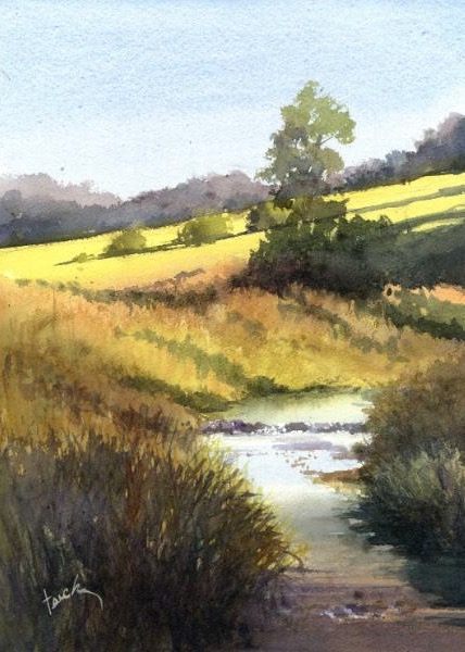
In addition, Faecke’s must-have colors include Cobalt Blue, Carmine, and New Gamboge — essentially a personalized set of primaries. “I believe we all develop an affinity for our own personal color palette,” he says, “and we use these preferences to interpret local color in a way that expresses our individual vision. With this combination of colors I can paint pretty much anything.”
Complementary colors play a central role in his work, particularly the interplay of oranges and blues — a pairing he returns to again and again. “I love to drop a complementary color into a wet wash,” he says. “Watching pigments disperse and bloom is one of the joys of watercolor. It’s simply magic.”
For water — a popular subject in the lake-rich Midwest — Faecke turns to Cobalt Turquoise — not on its own, but as a mixing color that, combined with other pigments, creates a range of blues and greens. For deep, clear water, he combines Indigo with Winsor Green, often adding this mixture at the bottom of a wash as it moves toward the foreground to deepen both color and value. To create wave patterns and color variation on the surface, the artists applies thin washes of Winsor Green or Cobalt Turquoise and Winsor Violet wet-into-wet. He seldom uses blacks, but when he does he mixes Indigo with Carmine — sometimes dropping the combination into an existing wet or damp wash for richness and depth.