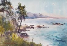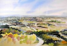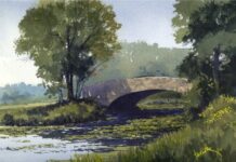

Each week for five weeks, we’re sharing the regional palette wisdom of one accomplished watercolorist, drawn from a feature in PleinAir Magazine. If you’re just joining us, you can find earlier installments here. This week, we head to the Southwest.
Big Skies and Earth Tones of West Texas
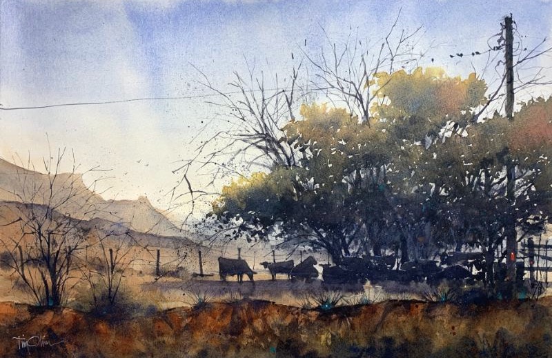
West Texas is not a landscape that gives much away. Trees are scarce. Plains stretch wide and flat to a long, featureless horizon. What dominates is sky — enormous, changeable, uncompromising — and the colors of pastures that shift season to season from greens to dull yellows and sun-baked browns.
Tim Oliver has been painting this landscape long enough to have built a palette that mirrors it precisely. “My color palette definitely reflects my home country,” he says simply.
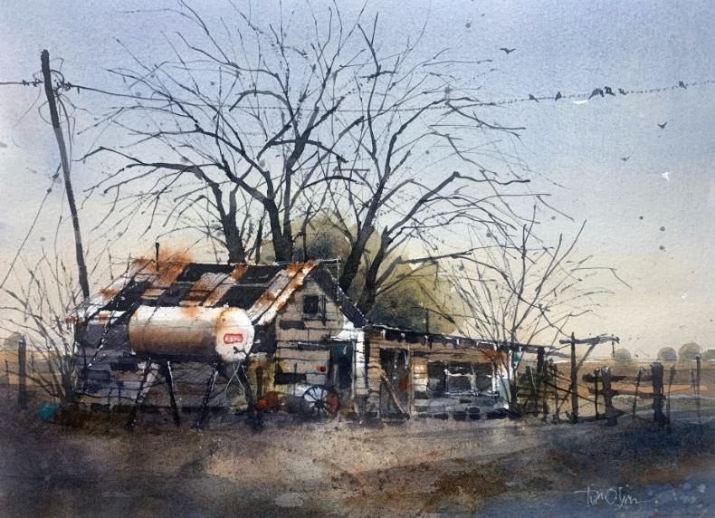
At the heart of that palette is a classic complementary pairing: French Ultramarine Blue and Burnt Sienna. “They give me my sky blues and orange browns,” he says. “With this combination I can also achieve my darkest darks and an infinite number of neutral colors, ranging from strong to weak and from warm to cool.” It’s a partnership almost as old as watercolor itself, but in the hands of a painter who knows west Texas light, it becomes something specifically right for the place.
For the region’s characteristic grasses — tawny, sun-cured, and rarely the lush green painters in other parts of the country take for granted — Oliver reaches for Quinacridone Gold and Raw Sienna. “Green grass is rare here,” he notes. “These colors are perfect for west Texas grass pastures in summer.” When green is called for, he turns to Undersea Green, always slightly modified with Alizarin Crimson to keep it from reading as too pure or too foreign to the landscape.
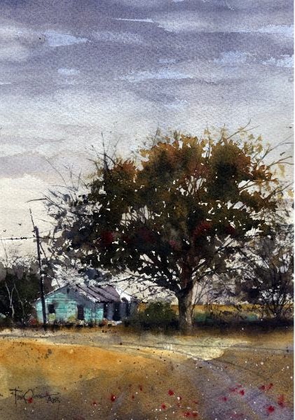
His surprise addition is Transparent Pyrole Orange from Qor. “It’s a strong, transparent orange that mixes well with my blues to create rich neutrals and darks,” he explains, “as well as powerful orange-drenched sunsets.” It’s an addition born of close observation: the sunsets of west Texas are a particular kind of spectacle, and he’s found no other orange captures them in quite the same way.
Oliver’s favorite color recipe speaks directly to another distinctive local subject: trees. In a region where trees are prized precisely because they’re rare, painting them well matters. He approaches them as variegated washes, working top to bottom and allowing the paints to mix on the paper as often as possible. “For sun-drenched subjects, I’ll start with a dilute Cadmium Yellow that morphs into Alizarin-modified Undersea Green,” he explains. “French Ultramarine is then dropped into the mix in increasing strengths. The goal is to get from light at the top to dark at the shaded bottom of the canopy.” It’s a method that captures both the brilliance of direct sunlight and the depth of shadow in a single, continuous motion.
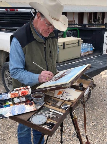
Comprised primarily of Daniel Smith paints, his full outdoor palette also includes Transparent Red Oxide (the same pigment as Winsor & Newton Burnt Sienna) and Cobalt Teal.