
By Dale Laitinen
Striving for perfection is a sure way to squeeze the life from a good painting. Making a painting is not a one-way path. It requires acceptance of what has already been put in place. The subject and the painting should speak for themselves. I imagine myself, the painting, and the subject as a committee that comes to a decision. In some instances, I need not be the final authority by pushing for perfection. I never make mistakes, only adjustments suggested by the painting itself. In the end, I strive to convey what I felt when I first encountered my subject. That may require me to turn a blind eye to much of what tempts me out there beyond my inner awareness. Less is more.
WATERCOLOR PAINTING TUTORIAL
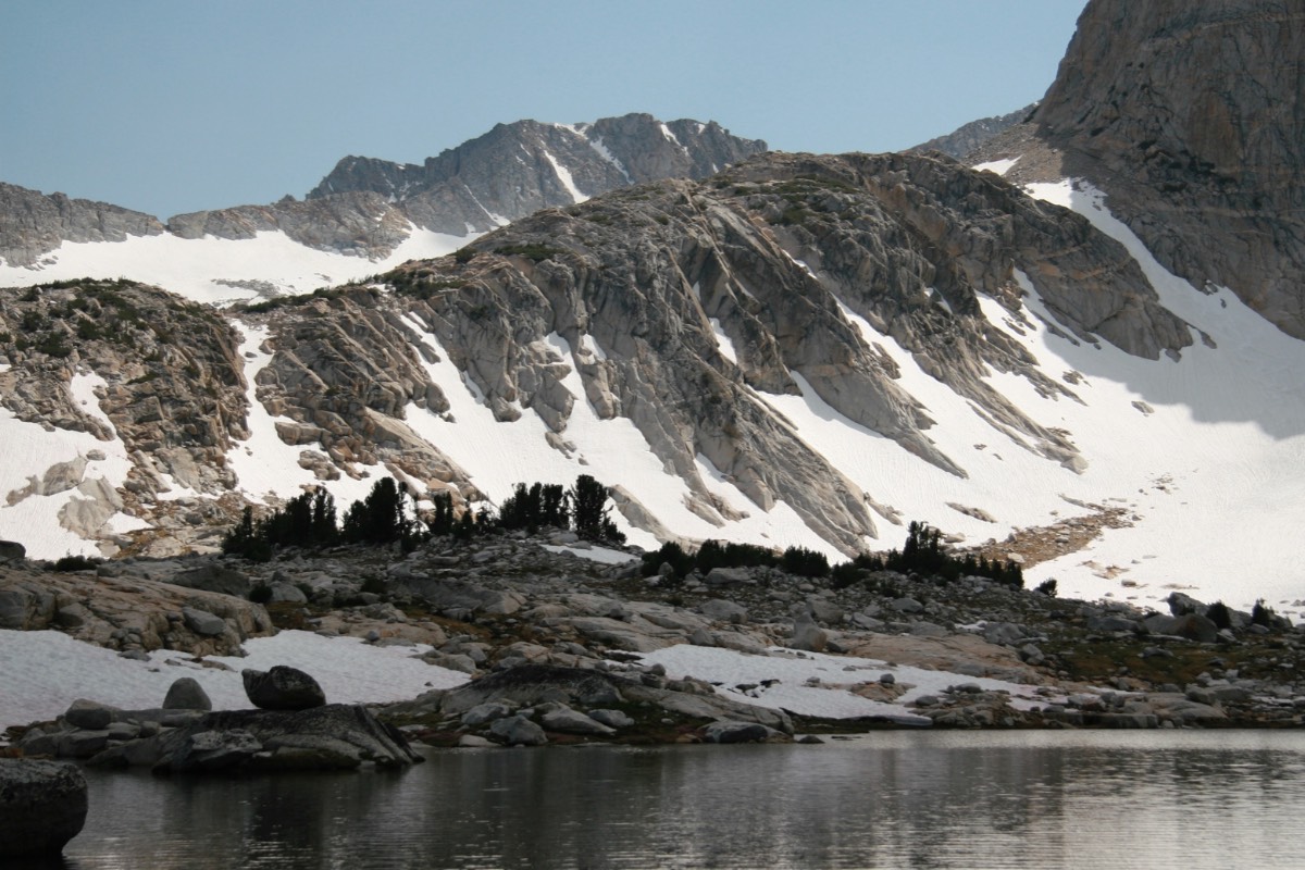
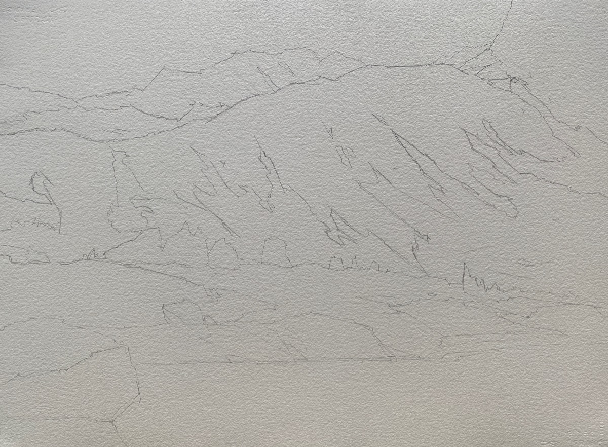
STEP 1
Line is the first of the five elements that artists use to describe their subject. In my view, it’s the most important as it sets the tone for all that is to come. After stapling watercolor paper to my painting board, I drew the compositional lines. I referred to my sketches as a way to simplify the design, but frequently turned to the subject for specifics. I used a hard-leaded 2H graphite pencil to develop the drawing, keeping in mind the large, more abstract shapes, and avoiding becoming too detailed.
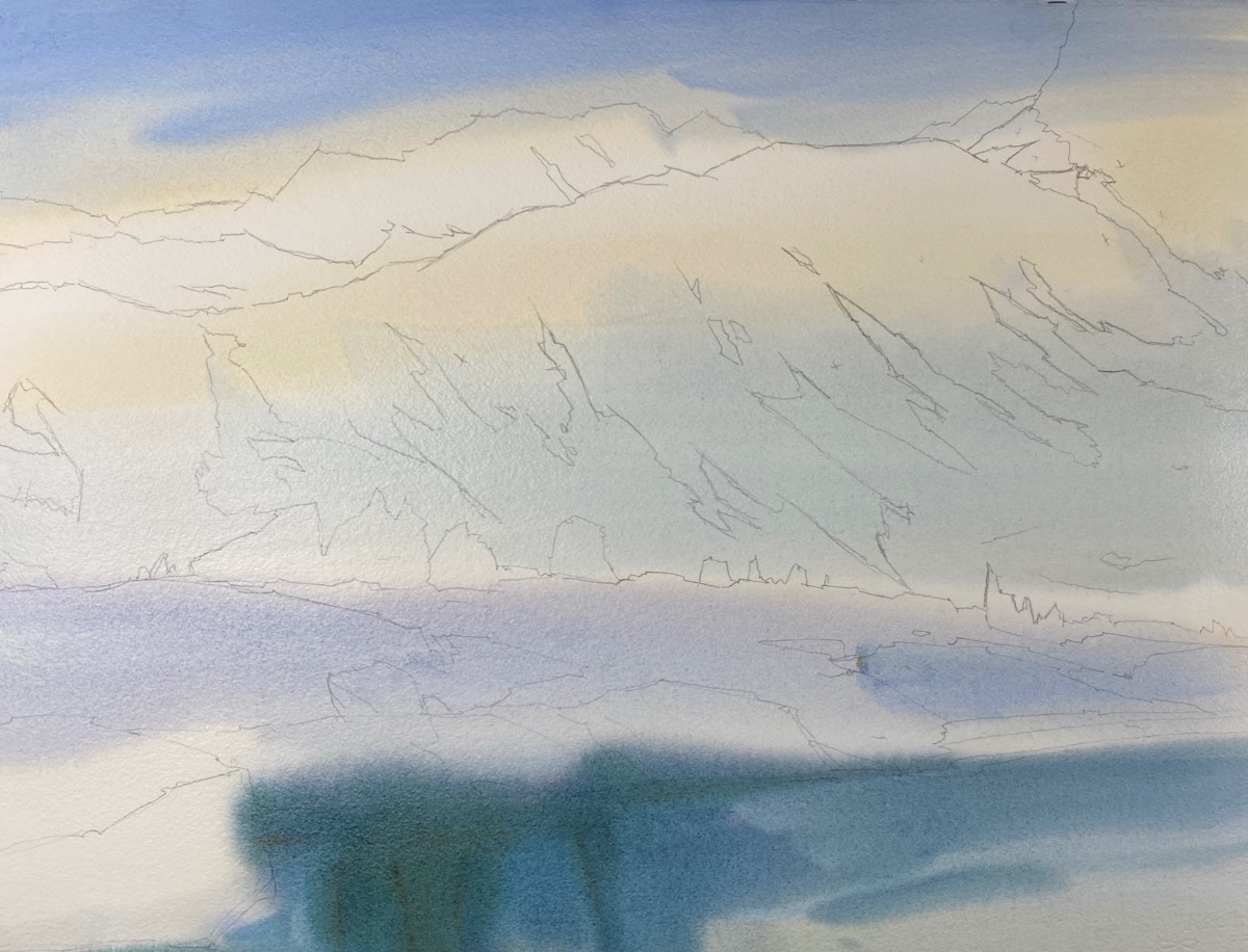
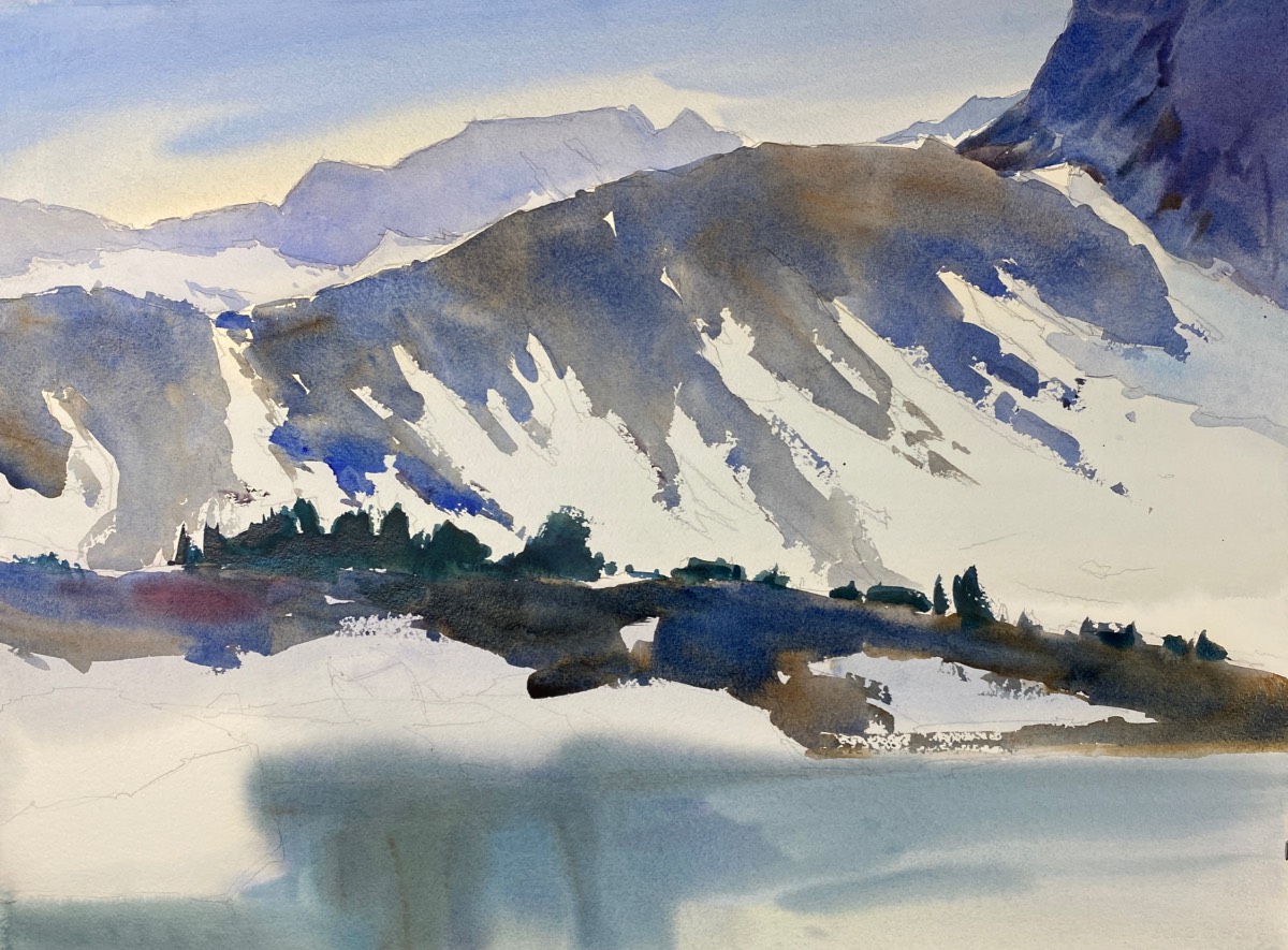
STEP 2
I wet the entire surface of the watercolor paper with my 3-inch watercolor flat brush. Once the paper was saturated and had a visibly consistent sheen with no obvious puddles, I introduced colors I might find in my lightest values, including the sky, snowfields, and areas of Cascade Lake. I started with a light wash of yellow ochre, followed by a heavier application of cobalt blue in the sky and a lighter wash in the snowfields. While the paper was still wet, I introduced ultramarine blue and a bit of quinacridone burnt sienna over the yellow ochre in the lake, then let the painting dry thoroughly.
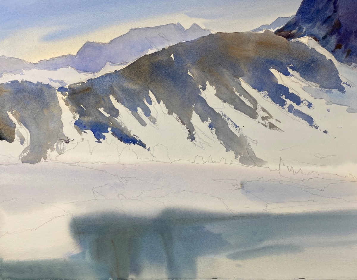
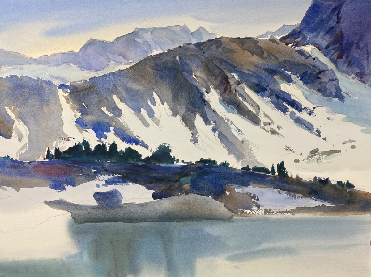
STEP 3
There are two ridge lines in the scene. In the upper part of the composition, I laid in a pale light cobalt blue wash for the distant profile of Conness Glacier. After that area dried, I began work on the forward ridge, which is the shoulder of North Peak that trails down from the upper right. The objective was to work around the light areas of snow that resided in the troughs between the exposed granite slopes. I brushed in medium-value warm and cool grays comprised of ultramarine blue, quinacridone burnt orange, and a tiny bit of quinacridone red. Using a 2-inch flat wash brush, I massed in the forward ridge first, using ultramarine blue as my base wash, and then, while the paint was still wet, I charged in quinacridone burnt orange and touches of quinacridone red. This was done quickly on the dry paper.
STEP 4
I added the dark values of the trees and rocks of the mid-ground shoreline, using heavy applications of ultramarine blue and quinacridone burnt orange along with small charges of quinacridone red. The silhouetted trees appear almost black, but were established with phthalo blue (green shade) plus quinacridone burnt orange and a bit of neutral tint to get to almost black. With the snow being high key (very light), and the trees being extremely dark, it set off the snowfield by pushing it into the distance behind the dark evergreens.
STEP 5
Once the washes on the exposed granite slopes were dry, I added the shadow planes to the flat shapes of exposed stone that contrasted against the light of the snow. To create the sense of light and shadow on the granite, I worked from right to left, laying in darker patterns. I paid attention to the edges of the granite by using the broad side of my brush in a drybrush technique. I also added a boulder balanced on a bit of granite forward of the dark mid-ground. For that, I used warm grays comprised of ultramarine blue and neutral tint.
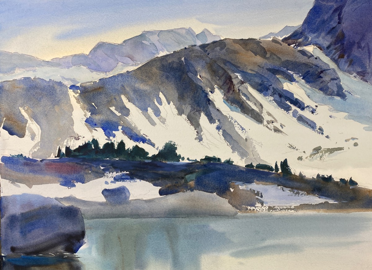
STEP 6
In the immediate foreground on the left, I added a dark boulder protruding into the frame using ultramarine blue and a bit of quinacridone red and burnt orange. For the entire area from the dark trees forward, I used medium to dark values to engender a feeling of being cast in shadow. Using a 3-inch flat, I moistened the entire area of the lake, then charged in grayish green tones using ultramarine blue, smaller amounts of phthalo blue (green shade), quinacridone burnt orange, and a tiny amount of neutral tint.
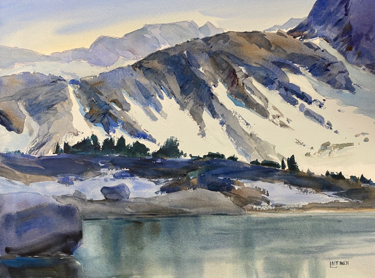
STEP 7
From time to time, I let the painting rest over night; time and distance are a tonic. I call this the tinkering phase. Placing the painting at a distance, I look for areas that need detail or texture. In this case, I decided to add more shadows on the mountain and extra details in the stone fractures, the edges of the granite shapes, and the snowfields. I used titanium white (a semi-opaque) in tiny areas to add finishing flourishes. I added opaque touches to the perimeter of the snow and sky holes in the dark tree mass to finish Sun-Washed Slopes.
FINAL THOUGHTS
In the final stages of a painting, it’s easy to be lured into overworking it. Slow down, let the shapes and colors settle; they will speak for themselves if you let them. Nothing will kill a painting more than plowing on through good, attempting the perfect.
Dale Laitinen lives and paints in a pine and cedar forest in the Sierra Nevada.


