
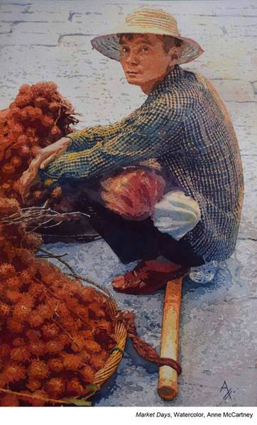
“Challenging yourself is important for growth and for keeping the experience of painting exciting,” says Anne McCartney. “One of the things I do to challenge myself is to change my palette with each new piece. Playing with color and experimenting with the properties of a tube of paint is always a learning experience.
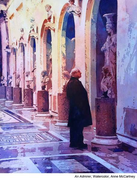
“Each tube of paint is unique. Before I start a piece, I will introduce myself to the properties of the colors I’ve chosen by doing paint swatches to make sure the colors I want to work with blend and mingle together and are pleasing to the eye.
“I might want to have an area where a sedimentary paint would work well. Once, I even added a paint with metallic properties to a piece just because I had never used it before, and I thought it might enhance that particular piece.”
Choosing Transparent, Semi-Transparent, or Opaque Paints
“When I started painting in the style I do, I tried to find paints that were either transparent or semi-transparent. When you layer as much as I do, the more transparent the pigment, the fresher and cleaner the work appears, since the transparent paints don’t contain the chalky fillers that are present in opaque colors. Also, one of the characteristics I love so much about watercolor is its transparency, so using transparent colors made me feel I was being truer to the medium.
“In the last couple of years, I have introduced some opaques. I now love to use them at the final stages of my work. Because they sit on the surface well, they are great for splattering which is something I enjoy adding to a piece, especially if it needs some element of movement.”
Planning For Color
“When considering my palette at the beginning of each piece I might go about it in two ways.
“Usually, I pull out my trusty old color wheel, which reminds me of different combinations like a triad or monochromatic schemes, etc. Then I look at some of the local colors in my focal area and decide if I want to stick closely with these, in which case I dial my color wheel to include these colors and see my options, or I decide to use the warm and cool colors to design the piece.
“If I choose local colors, it is usually because those colors are important as identifiers to an object that helps tell the story — for example, a flower that is more easily identified because of its color. If I am doing a piece where the values are more important than the actual colors, I will place my yellows and reds at the focal areas and save my blues and purples for the surroundings.”
Making Values Work
“I always work from a black-and-white copy of the image I’mm painting. This helps me see the values much more clearly than a colored image. My goal with each layer is to darken my values by at least 10 percent.
“Although most of the time I can just eyeball it, I do paint with a value scale close at hand. Sometimes when I am doing a piece that requires 10 or so layers, I will check with my value scale, to make sure it is accurate. Making sure the values are correct at each layer is top priority because once I get the value right, I cover it with masking, then proceed to the next layer.
“When the layer is covered, I cannot go back and redo it. Occasionally, I have needed to do touch-ups once all the masking has been removed, mostly because the masking itself has lifted more paint than I thought it would. This is done very carefully as I don’t want to risk losing the sharp edges that the masking has helped me create.”
Open your eyes to many more ways of working with watercolor at Watercolor Live, January 24-26, 2024, with an optional Essential Techniques Day on January 23!


Very helpful insights, Anne. For me I need these tips on how to prepare for the painting and this article articulated excellent tips on focusing on a color scheme, keeping it clean and transparent. I would like to hear more and see examples from you concerning the use of a value scale in planning and executing your watercolor. Maybe a follow up article?
Wonderful article. Many useful tips,will definitely follow and create better work.
Thanks,