
“If you’re painting all your shadows with a tube of Payne’s gray, look again,” says Catherine Hillis. “I don’t think you’re observing the real colors in shadows, and you’re certainly not observing the reflected colors bouncing into the shadow. Shadows often include reflected color from the sky above, from light sources such as the sun, from the ground below, and from structures and objects all around.
“Train your eye to observe color temperature differences in shadows. I squint when I look at a subject to blur my vision and simplify the scene before me into shapes, values, warms, and cools.
“Shadows explain the lay of the land. A shadow runs along the ground, up and over the curb, and vertically up a building. I get excited to see palm tree shadows run diagonally across a roof and then down the wall and around a shutter.
“Shadows can draw the eye to your focal point, where the greatest contrast is. The power of shadows — and light — can be exploited by evaluating and including color temperature and working towards painting the correct value.
“So, how do we paint shadows? Start by thinking about shape, value, and then color.
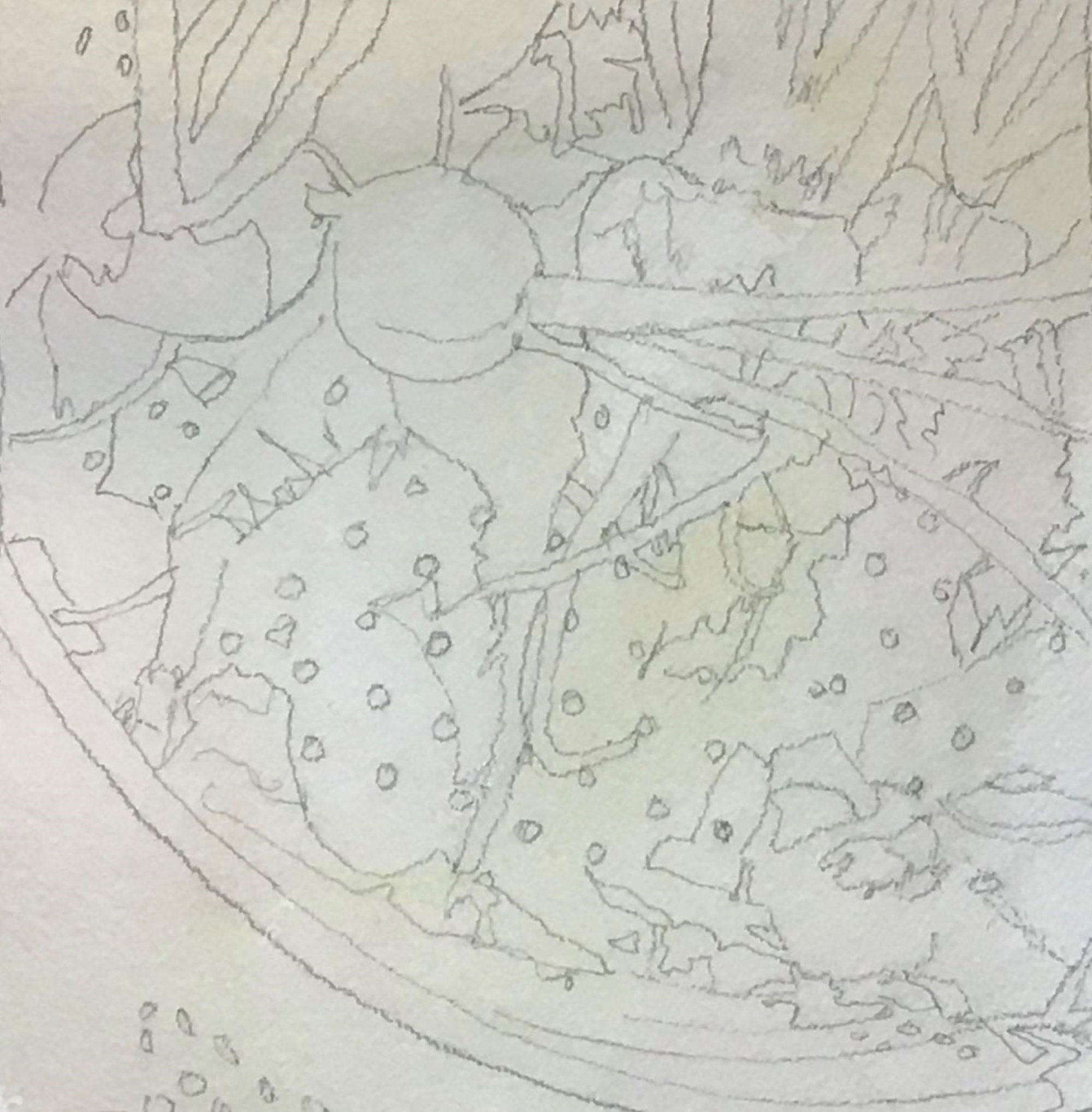
1. The Big Picture (Think before you start):
Value is the most important factor to consider. The temperature of color is the next important factor to consider. While value overrides color temperature, it’s the cool and warm factors that make color exciting.
I try to think of everything as shape. A tree is a shape. The entire background of a mountain range is a shape. Everything is a shape consisting of combinations of squares, rectangles, triangles, cylinders, circles, ovals … a still life is the same, a collection of shapes. Among those important shapes is the shadow shape.
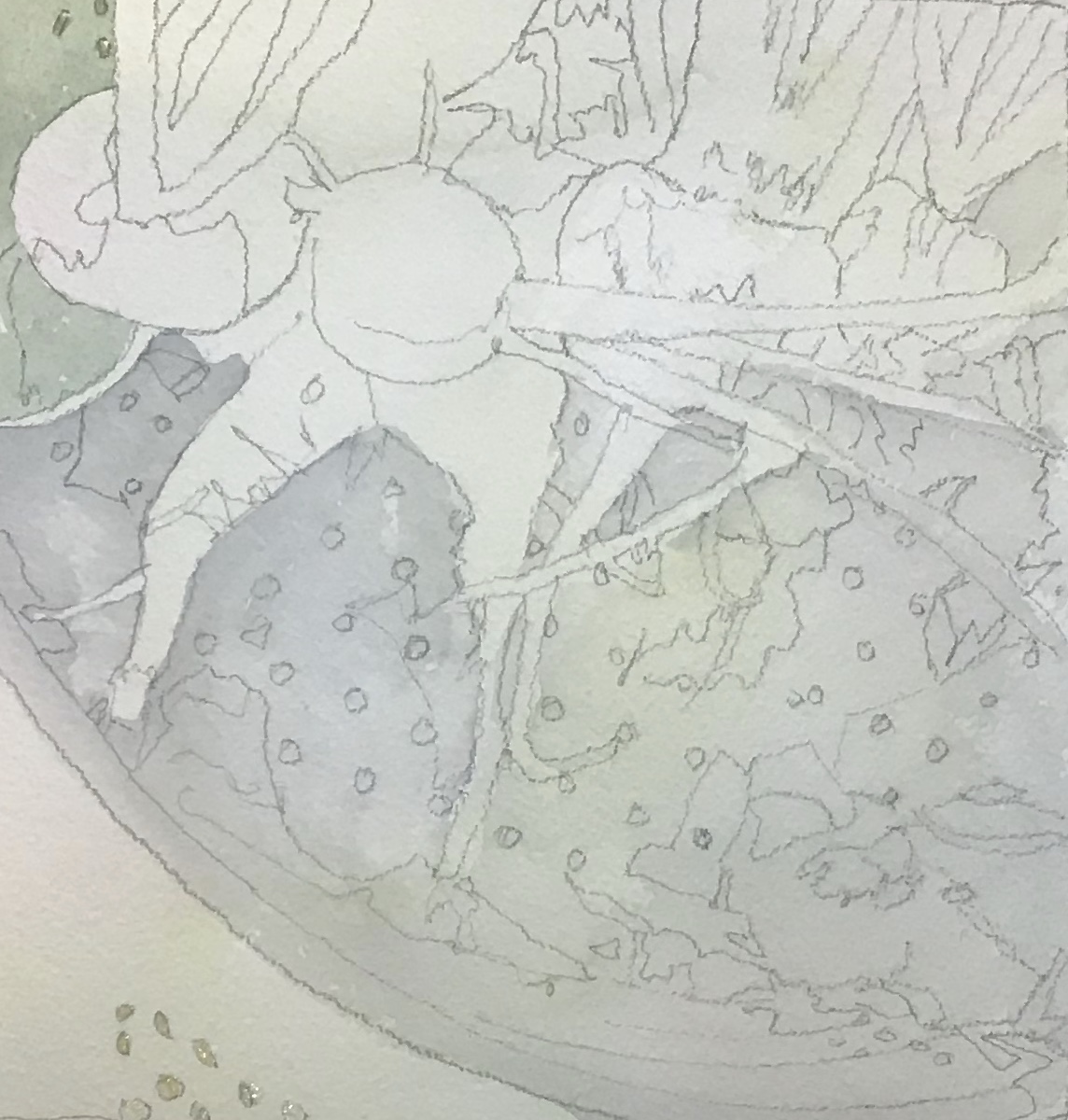
2. The Value Sketch:
I enjoy drawing preliminary value sketches. They help me understand the value of the shadow areas and discover where my middle value areas are. It’s best to understand value and shape patterns before I start painting. If I take time to sketch first and clarify my value and shape pattern, my painting is always better. I confess that I often want to just paint, but if I take this preliminary step, I never regret it.
3. The Painting:
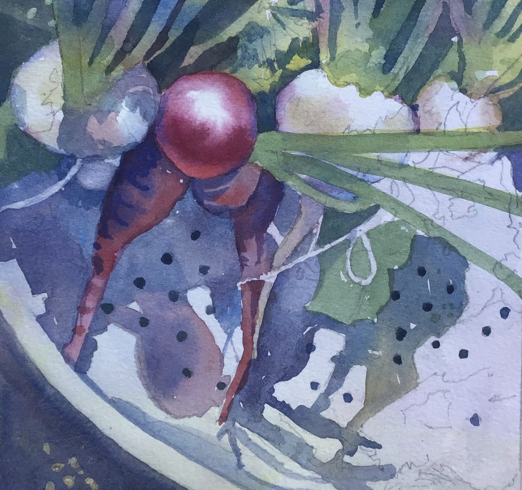
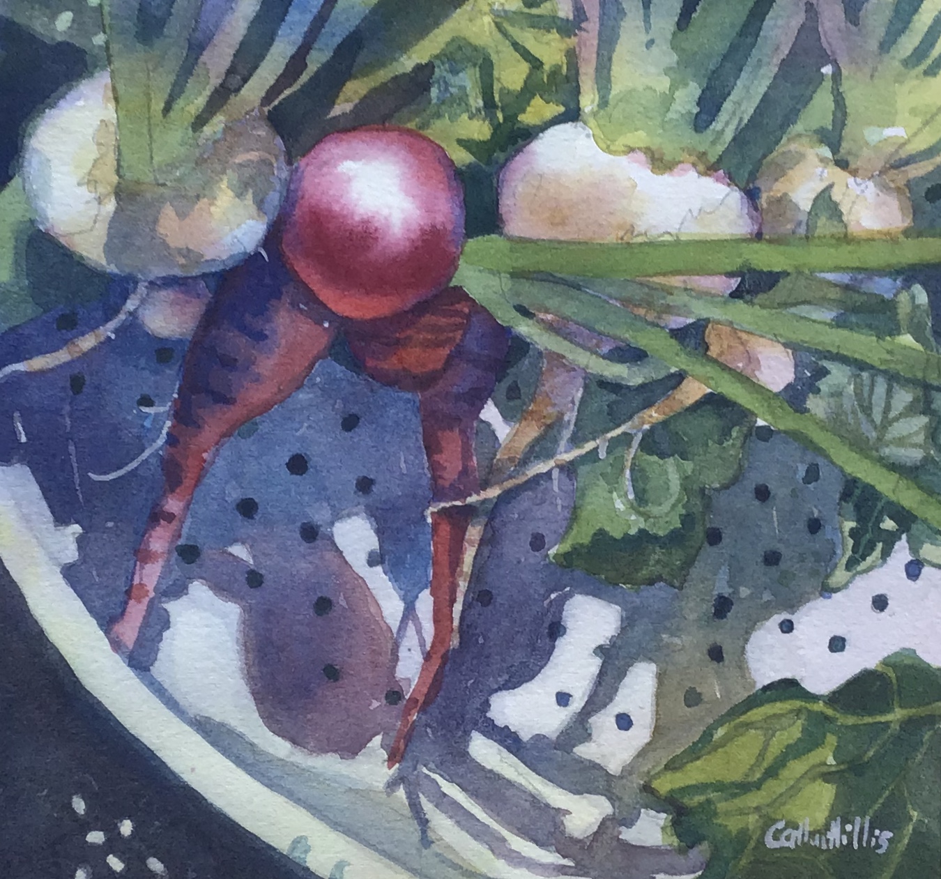
Once I know my value and shape patterns, I begin to think about colors and color temperature. Warm colors (yellows, oranges, reds) might be visible beneath eaves where the sun is bouncing, in the edges of cast shadows, and on the foundations of buildings. Cools (blues, violets) might be observed in the interior of cast shadows and in the middles of shadows on buildings. I concentrate on painting the appropriate value in the shadows, but I make sure my paint mixtures allow for the warm and cool tones that I see.
Shadow areas are often worked wet-into-wet while I lay down the warms first (I want them to glow from beneath) and then paint the cools on top of the warms. I like to let the colors mingle in unexpected ways. I’m always using complements, or near complements, to paint warm and cool colors, so I end up with subtle grays as the paints blend together. These blended grays are always more vibrant and interesting than tube grays.
One more thing: When I paint shadows, I try to load my brush with lots of paint so that I can achieve the correct value the first time I lay my brush to the paper. One application of paint is superior because it will be more transparent and fresh. One stroke is better than two and two strokes are better than three, and so on.”
Watercolor Tutorial: Shadow Shapes in Progress

Summary:
• Study your subject first. Squint and learn to see light and dark shapes and warm and cool colors.
• Draw a quick value sketch of your subject, using only 2-4 values.
• Think in terms of shapes and not things. Shadows are shapes, too.
• Value is the most important factor in your design; color temperature is the eye-candy.
• Shadows are an essential part of the design. They lead the eye to the focal point; they provide contrast; they often provide diagonal energy.
• Use color for shadows so you can paint both warm and cool areas that will blend together and create beautiful grays.


I absolutely love seeing articles from Catherine Hillis. She does a wonderful job of explaining how and why she paints things the way she does. She inspires me!
Study the shadows of Charles Reid. He puts warm and cool in his shadows, which is very effective.Not necessarily what he sees, but what the painting needs.
I loved this article and learned a lot from the progression on the photo.It was very educational for me. Thank you.
This is very helpful to me. Shadows can be tough, thanks for the the explanation and the demo.
What q very informative article about shadows. Thank you