
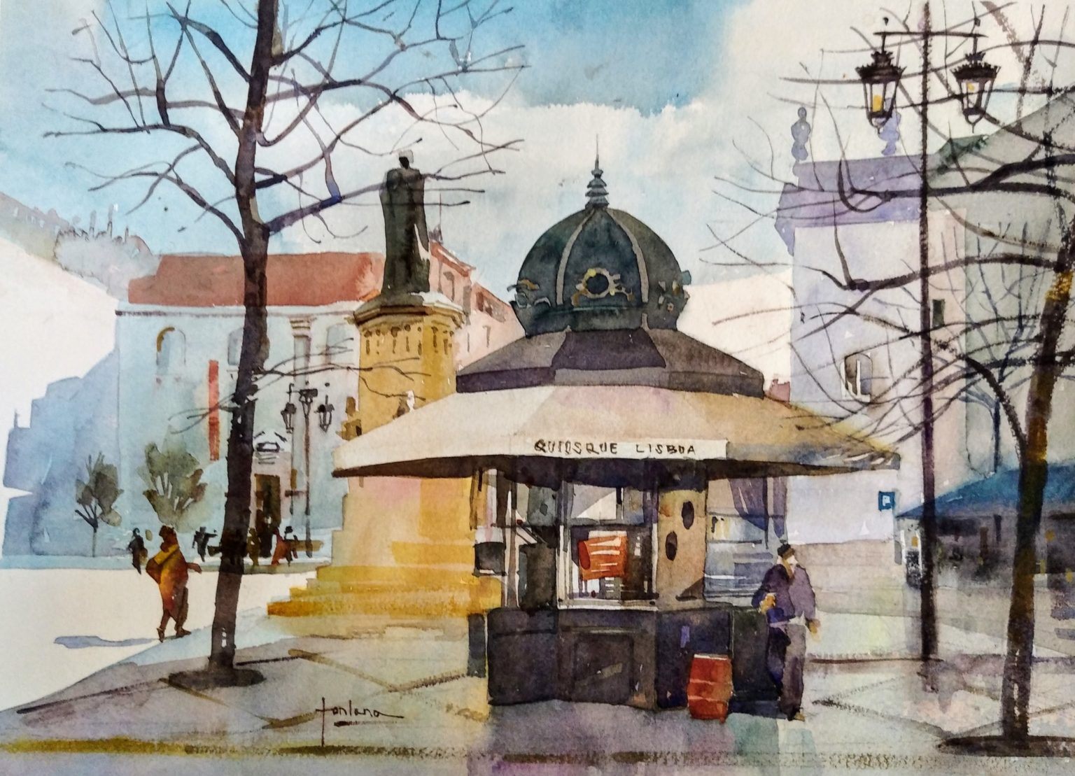
“The fight between realism and Impressionism, or of abstraction, is always there; there’s always that conflict,” says Francesco Fontana. “Basically, I start drawing. Sometimes I go out with a sketchbook, and just throw stuff around. The challenge, the first challenge, is always to simplify and to reduce the amount of information that I see in a city or landscape. I try to find a focus, an element, which could be a sign, a trashcan or whatever, to start my journey into the scene. And then I do two to three layers of watercolor with a limited palette. I try to stick with a formula of five values, three colors, and seven main shapes.”
And the three colors he uses aren’t necessarily the primaries.
“I teach my students, especially beginners, to focus on one color, the one they can’t do without. So if they say, I can’t do without orange in a picture, because there’s a lot of orange in the main building or whatever, then I say, Okay, now find the the complementary color, in this case, blue. So then they have two colors that are very useful to modify each other, to get darks, to create neutral shades, etc. And then I tell them to decide on the third color, perhaps something to make the temperature of the painting warmer or cooler. If they chose to add red, then they’ll be able to now make purple, and create a warmer painting. If they decide to add green instead, they’re going to create a cooler temperature. Of course, when I’m painting I may not always be so strict, but it’s a good exercise to do, not only for beginners, but for anyone who just wants to have a simple roadmap to follow when they start a work.

“As for the five values and seven shapes, again, that’s a convention, a way into a scene. You can see that I do like odd numbers — 3, 5, 7. And, I found that they result in a pretty readable painting. It’s not too much, not too many shapes. Of course, I’m talking main shapes. And it’s not too little, it’s not too simplistic. You may find that you reach seven shapes in no time, but if you try to stick to that to limit, you may find that you benefit from that, especially in landscapes, but of course it can work for portraits, florals or architecture, too. If you have shapes with a lot of details, I suggest splitting them into 2, 3, 4, or 5 subs-shapes.
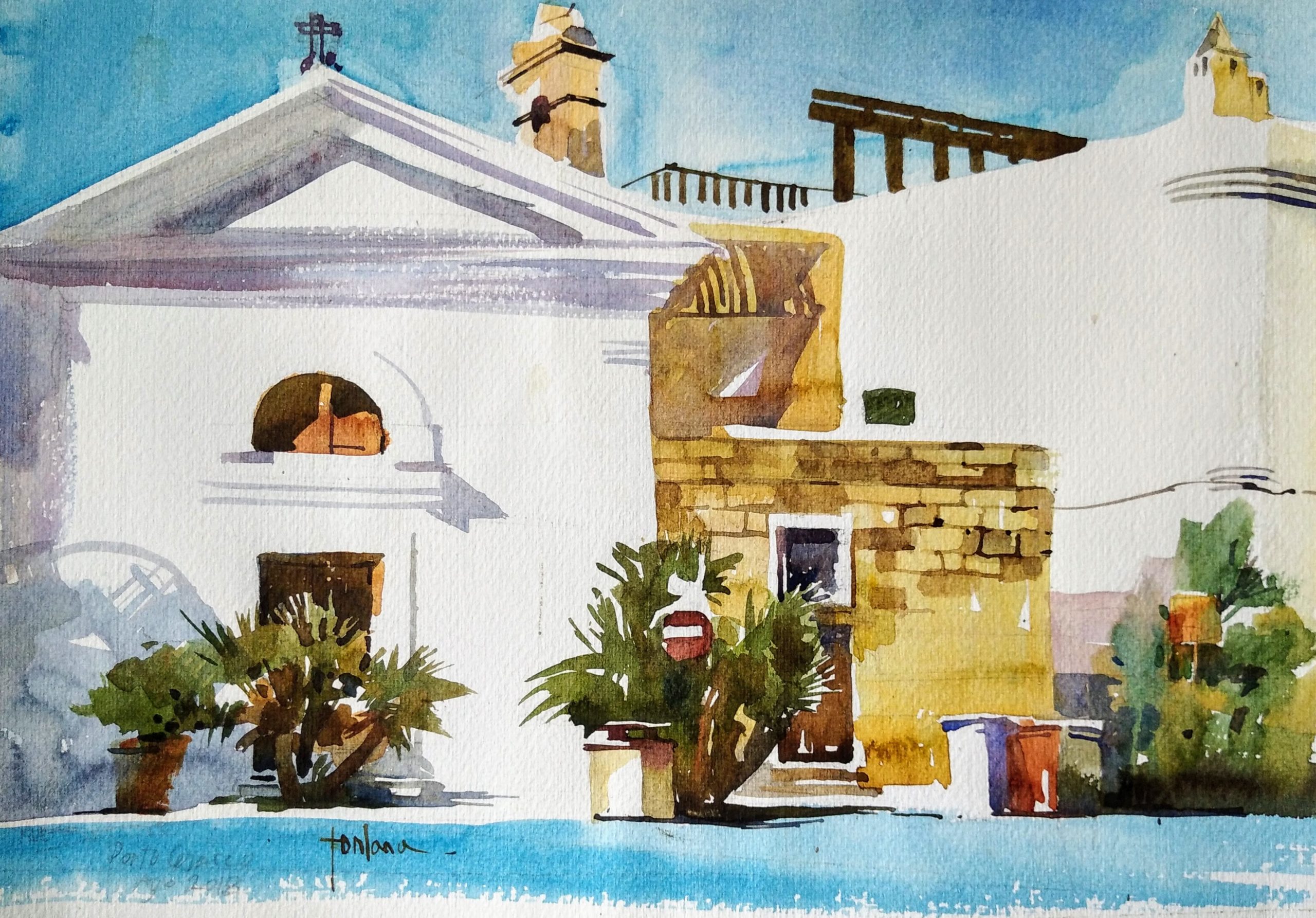
“This is just one method I’ve invented for myself and my students, and of course, there are many others. Even when you no longer need these methods, it’s fun to give yourself rules that you follow for a while and see if they work. And then make adjustments and try something else. I don’t know – nine shapes, maybe? Of course, you can increase that number, the more skilled you get. But not necessarily, because simplicity is really really, really hard to achieve actually.”


Francesco Fontana is excellent, got a lot out of this article, i like the 3 colors, 5 tones, etc. does he ever teach here in the US? would like to be a student❤️
Hi Sharon, thanks for your nice words (on my birth day:). Until I get back to the US, please get in touch at [email protected] We can figure same teaching online. Best – F
This was a wonderful lesson!
Thank you very much Lisa!