
By Mike Kowalski
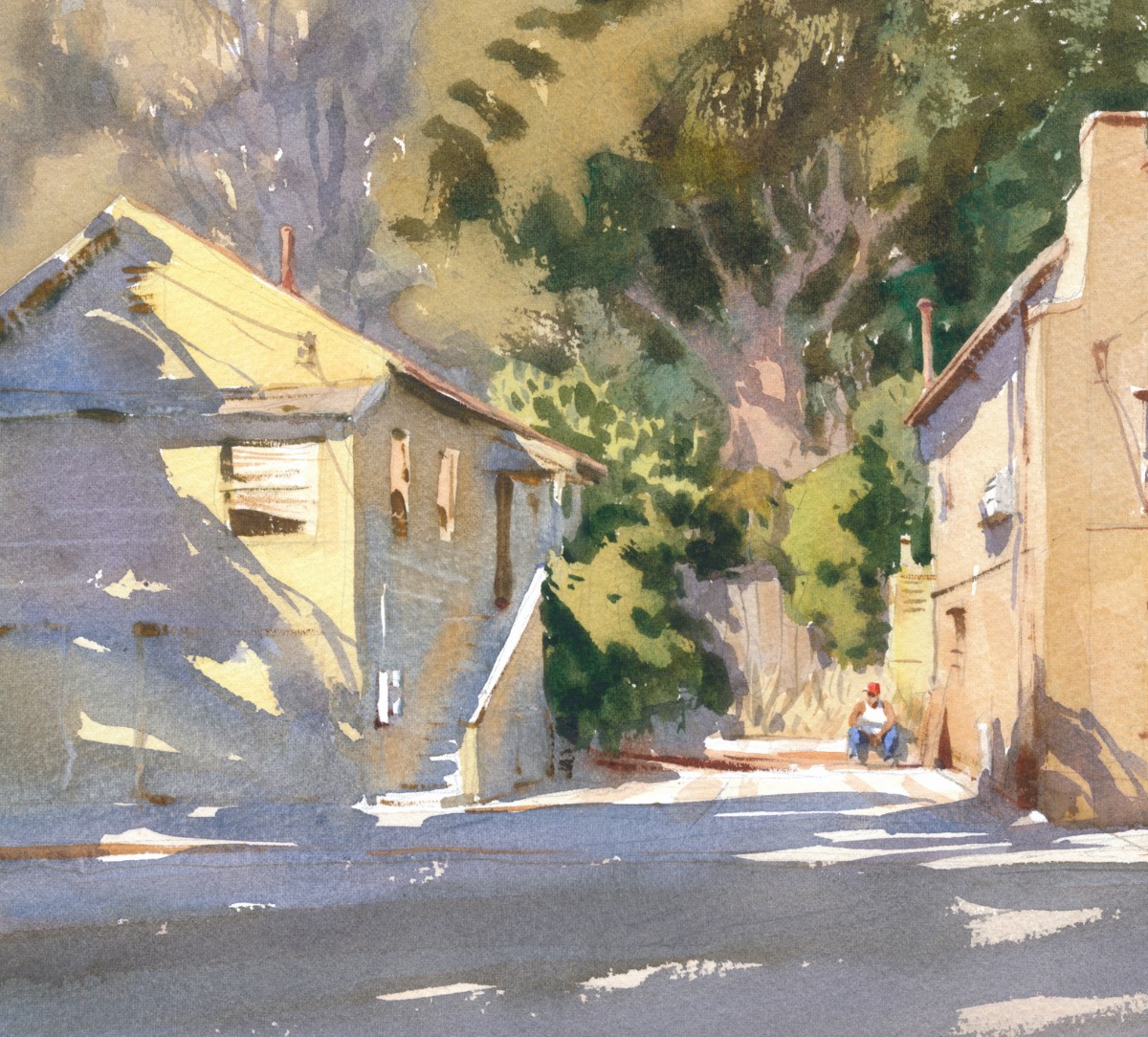
Strong shadows rake across the vertical facade of the house and flat road leading the eye to the figure. The entire shadow area was painted in one go. Note the subtle color and temperature changes dropped into the shadow wash.
I never use a premixed “shadow color” all by itself. Can you imagine using just one color of blue for all your skies? If you look closely, you’ll often see a vibrant play of color in a shadow. Many students use a darker hue of the “light” colored object for its shadow (for instance, a dark green shadow for a light green object). That’s a mistake. Shadows are affected by surrounding colors (the sky predominately), reflected light, as well as the actual color of the object from which it’s cast.
I use a triad for mixing most of my shadow colors, generally cobalt blue, quinacridone rose, and a yellow (nickel azo yellow, yellow ochre, or raw sienna are favorites). With cobalt blue, I can only go so dark. If I want a darker tone I switch to ultramarine blue. Depending on what I’m painting, I may throw in bits of viridian (the only green on my palette), raw umber, or cerulean blue. In any case, I make many puddles of separate colors to slosh into while I’m painting a shadow.
Although I generally work with a wet brush on dry paper, I sometimes wet the paper loosely to create areas of softness. But before my brush ever hits the paper — wet or dry, I’ve already thought about the shape of my shadow, its placement and value, as well as the color variations and edges.
WATERCOLOR TUTORIAL
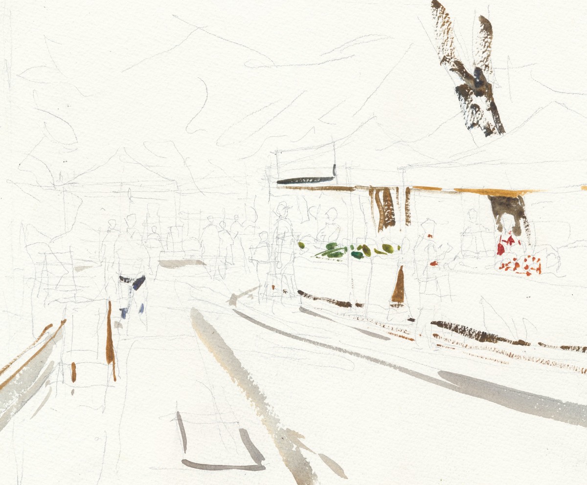
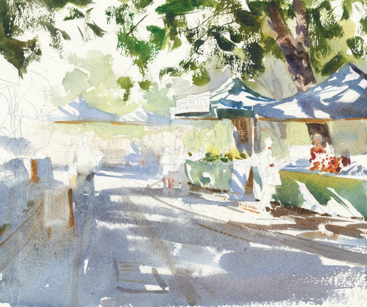
Step 1: For this piece, I’m working on Fabriano 300-lb. rough paper. After drawing with a loose soft pencil, I put in a few rich darks, which will serve as placeholders for some of the subjects. I don’t often refer to a photo while painting, and these strokes keep me from forgetting key areas. I mix my darks with thick paint that will soften with overlaid washes. The broken quality of my initial brushstrokes over “raw” paper is vital to my painting. I’ll use any of the colors on my palette for these first strokes except cadmium red.
Step 2: I loosely wet the paper, allowing for some dry spots, then drop in washes that contain cobalt blue, burnt sienna, viridian, raw sienna, and cerulean blue, spritzing the paper at times to keep it from drying. Here, you can see a spritz mark in the middle of the shadow area. I take care to use strong color and directional strokes near the main figure on the right. Rather than use a liquid mask, I cut around my shapes, allowing for more organic forms to occur.
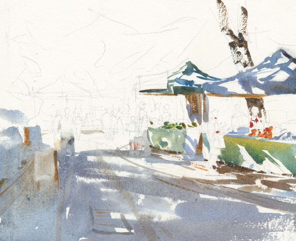
Step 3: Once I have the main shadows to my liking, I brush in loose, dark tree foliage using viridian, ultramarine, nickel azo yellow, and a bit of quinacridone rose. I pay attention to where I want to keep my darks and cut around the tent areas on the right.
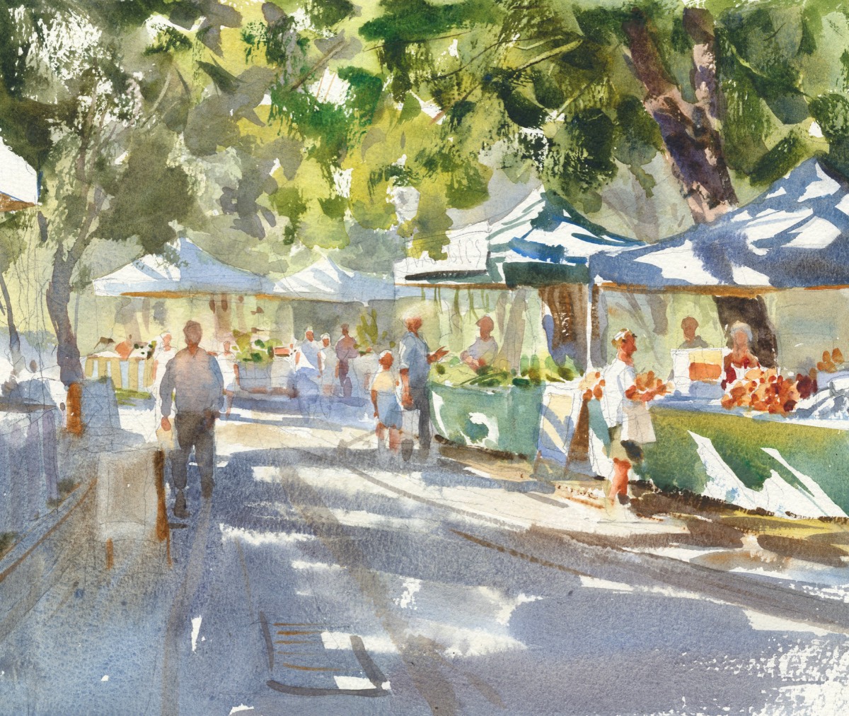
Step 4: Now the background gets some treatment. I keep things light and gray the color a bit to create a sense of distance (cobalt blue and yellow ochre with bits of quinacridone rose are perfect for this). I also add a few loose figures. To the main tree, I add bright greens with loose brushstrokes, and scrape into them to create branches. I must be careful to choose just the right moment to scrape into the paint. If I scrape too early, I’ll get a dark mark instead of a light one. Watercolor is all about reading the moisture of the washes on the paper.
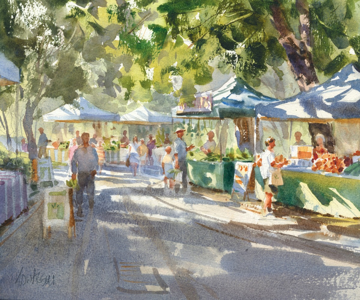
Final Step: I add a wash of the same shadow colors over the foreground, which I want to be ever so slightly darker. Careful not to overwork it, I then finish with a few details to pull the painting together.
WHAT’S GOING ON HERE?
Let’s take a closer look at one section of Fresh Juice.
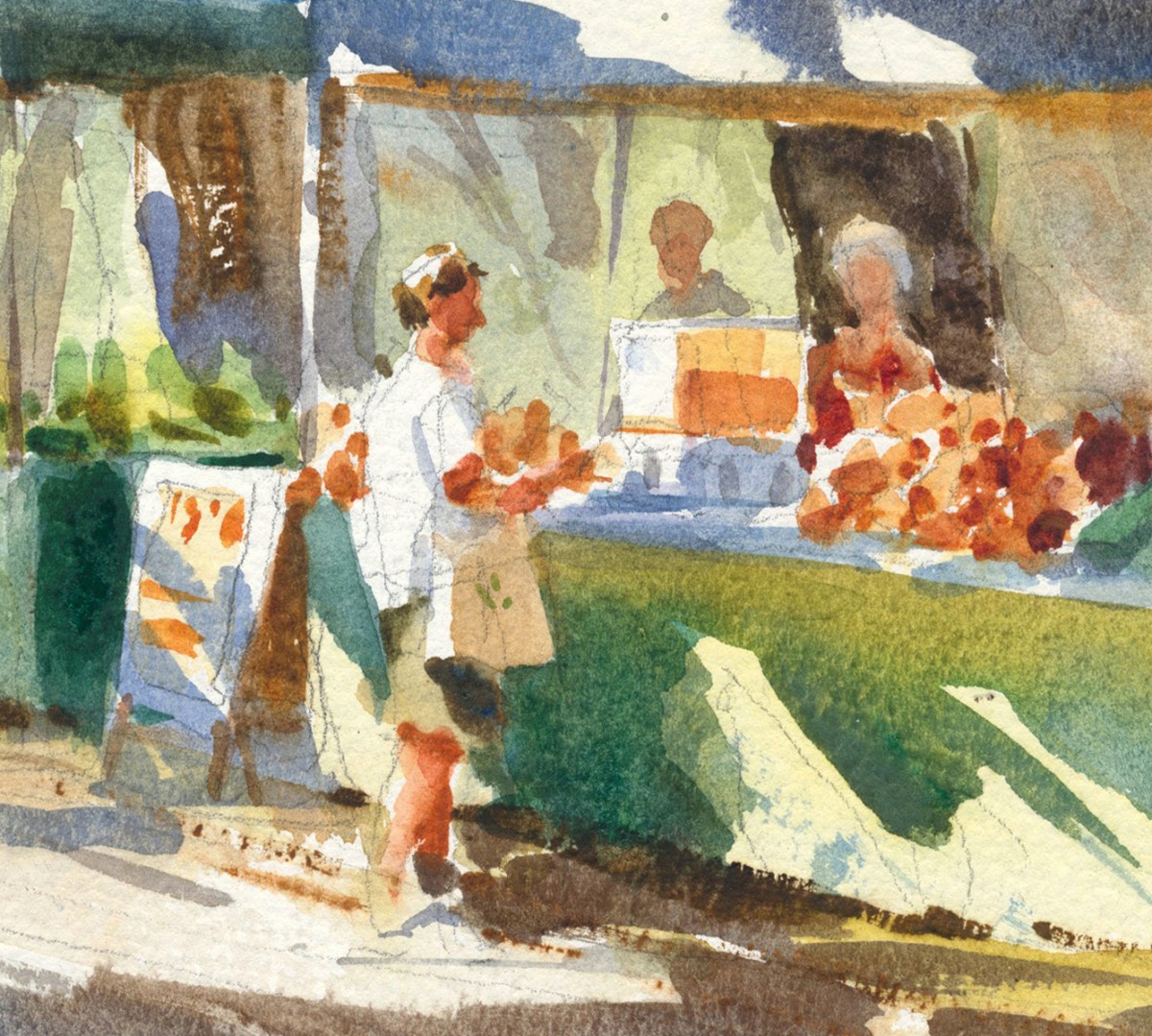
- To indicate the reflected light on the tablecloth, I dropped a mix of yellow ochre and raw sienna into the wet green shadow shape. Note the cool and warm exchange of the shadows.
- The direction of the shadows support the main subject area.
- I used sharp angular edges and rich darks in and around the main figure to animate him a bit.
- Deep orange dabs help describe the piles of fruit on the table. I use nickel azo yellow, quinacridone rose, and burnt sienna for this detail.
For more inspiring stories like this one, sign up for our free weekly e-newsletter.


