
Most artists who use transparent watercolors are accustomed to working under the controlled, comfortable, and un-timed conditions of a studio. That was certainly the case when Jeremiah Patterson was creating large, detailed, and carefully planned still life and interior paintings in watercolor. He spent weeks developing compositional sketches, plotting out his subject on watercolor paper, and executing the work with an extensive palette of colors. Then, in 2000, he decided to attempt working directly from the landscape, which led him to simplify his approach to painting in watercolor.

“I needed to get out into the landscape to study light, color, and space in nature,” Patterson says. “And even though I was a confident studio painter, it took a lot of trial and error — and some very unsuccessful plein air watercolors — before I developed an effective way of working with watercolors in a limited amount of time during which the light and atmospheric conditions were constantly changing.”
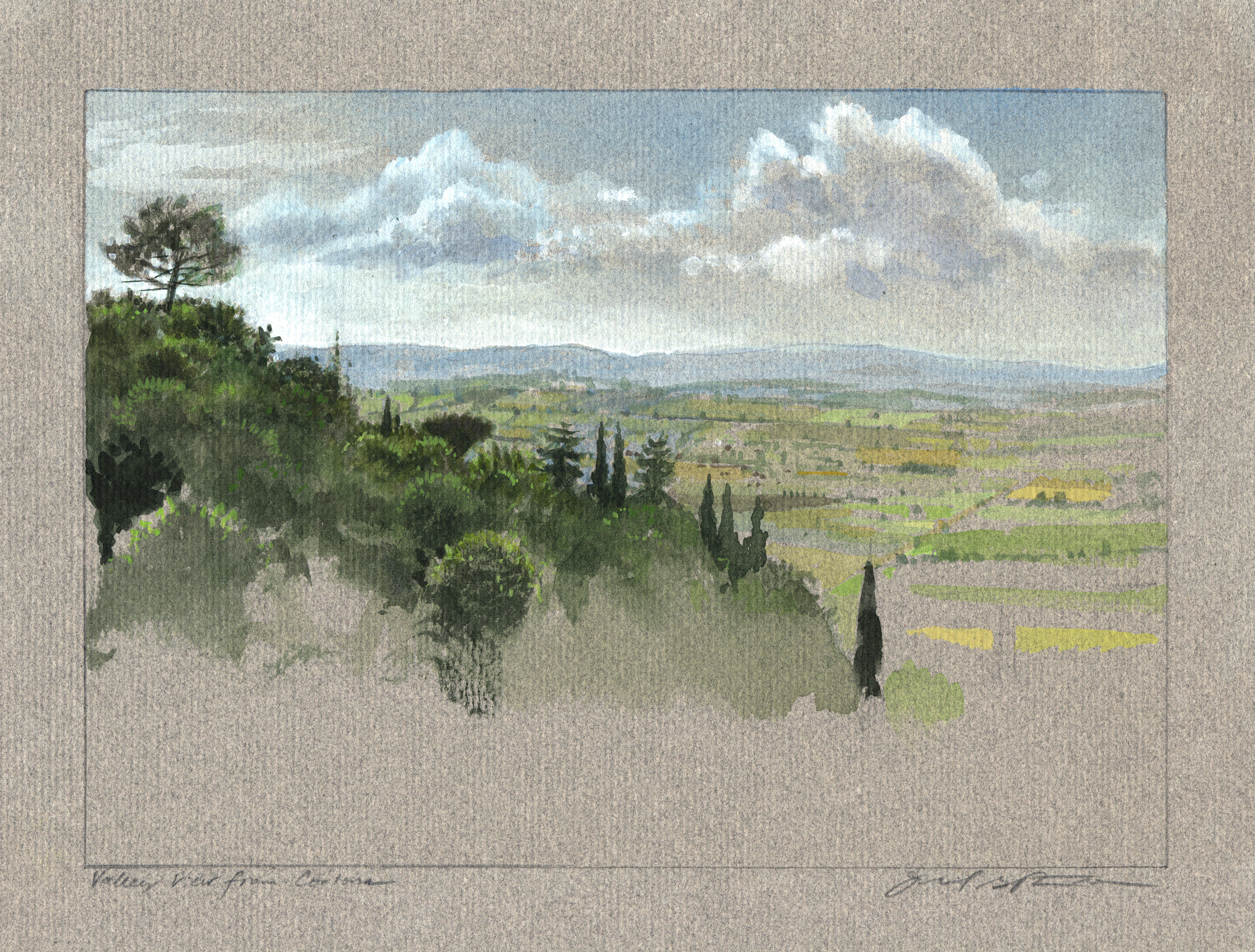
By the time Patterson made a trip to Sicily in 2001 with a friend who was teaching a photography course, he was well prepared to paint small watercolors of the scenes that had inspired great 19th-century artists like Thomas Cole and William Stanley Haseltine. “I carried my watercolors around the island, recording views that included the architecture, landscape, and the sea,” he says.

Tips for Painting Outside With Watercolors
In transitioning from studio to plein air painting, one of the first changes Patterson made was to stop making intricate pencil drawings on watercolor paper, and instead establishing preliminary indications of placement, scale, and perspective with linear strokes of a light color or light graphite lines. “Detailed drawings are certainly helpful in planning a studio painting,” he says, “but on location they can delay a response to momentary conditions, and they can muddy the colors if the graphite draw-ing is more than a ghost image. Drawing with watercolor is more difficult, but the line work is freer, cleaner, and brighter.
“I also rethought the palette of colors and the type of paint I use outdoor. I decided to work with half-pan cakes of paint on location instead of the tube colors I use in the studio. There are distinct advantages to using a half-pan set with about 24 colors, of which seven become my principal arsenal while painting. The dry cakes can be moistened as they are needed whereas tube colors are more difficult to carry from location to location. Those seven colors include cadmium red medium, permanent alizarin crimson, cadmium yellow light, yellow ochre, cobalt blue, Prussian blue, and sap green.” He also uses convenience colors, such as raw sienna, Indian red, cerulean blue, and ultramarine blue. “My primary palette includes sap green and all three of the primaries, in both light- and dark-neutral versions,” he notes. “This allows me to make variations in mixtures, whether I am painting areas that are illuminated by sunlight or spaces that are in cast shadow.”
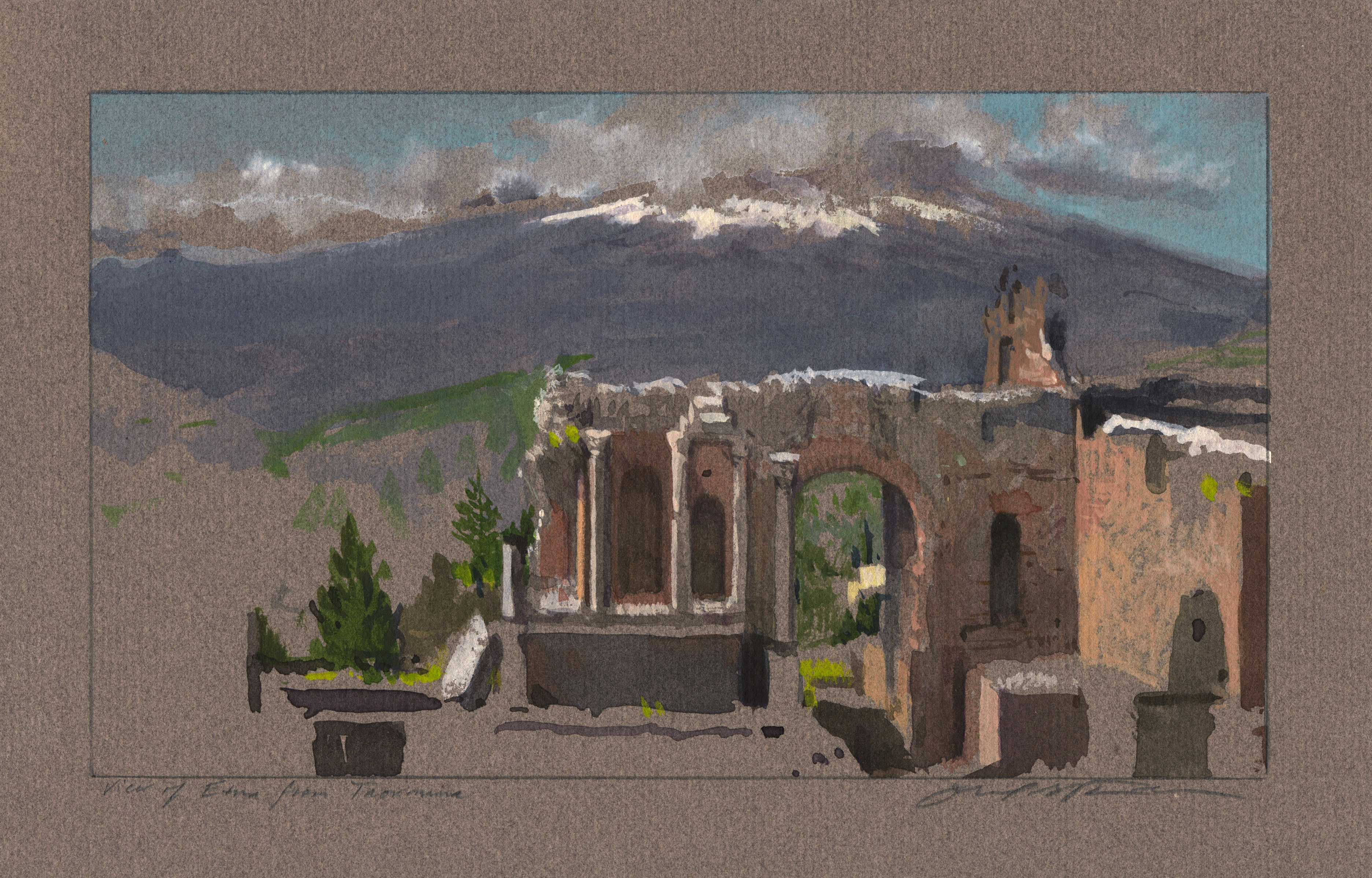
Lately, Patterson has been experimenting with the use of opaque watercolor (also known as gouache or body color). In that effort, he is inspired by William Trost Richards (1833-1905), who used opaque watercolors on toned paper. “Over the last couple of years, when I’ve been painting in Italy, I’ve worked on gray Canson charcoal paper that I stretch,” Patterson says. “Because the charcoal paper is thinner than watercolor paper, I have to use dryer mixtures of paint, but I can work with the same palette of colors and simply add Chinese white.”
Whether painting on watercolor paper or charcoal paper outdoors, Patterson primarily uses sheets cut to 7 x 10 inches. “I have a block of Arches watercolor paper of that size and I tape off a border around the edges, which makes a cleaner edge for matting the finished paintings,” he says. “I load my over-the-shoulder guide pack with paper, a collapsible cup for water, No. 6 Raphael brushes, a drawing board with a tripod mount, and a tripod. I don’t haul an easel outdoors because I often hike to remote locations.”
Whether working in the studio or outdoors, Patterson employs the traditional technique of reserving the white of the watercolor paper for the lightest values and gradually building up layers of transparent color from the lightest to the darkest, and from the background to the foreground. “I try to avoid painting wimpy mixtures of color, even when developing an atmospheric sky of distant mountains,” he says. “Layer upon layer of wimpy color doesn’t have the brightness and transparency of one bold stroke of an accurately mixed pigment.”
On gray paper, however, Patterson uses white gouache to lighten values and create highlights. He says, “When I’m painting outdoors, I have to make allowances for the fact that wet paint will bleed when applied next to another wet area of the paper. That’s why I might paint in veils of color to suggest an atmospheric background and then jump down to the lower part of the paper, which remains dry, to block in dark shapes so I can keep painting while the first washes dry.”

Patterson develops studio watercolor, egg tempera, and oil paintings from his watercolor sketches and supplemental drawings. “The outdoor work really has helped me understand the impact of light on objects in space,” he says.

Jeremiah Patterson was featured in the February-March 2014 issue of PleinAir Magazine.


I love the look of these paintings on charcoal paper!! Can you use tape on that paper also? Can you provide a link to the paper you use? I want to try it.
Jeremiah, I was thrilled to see you and some of your special paintings featured here this morning. Your article was on the spot -thank you. Appreciate the detailed list of what you bring for Plein Air Painting and how you transport it. I am in Italy painting right now😊
Beautiful pieces!!
Jeremiah. I first learned watercolor glazing from you way back in 1997. You were set up near me in Sondra Freckelton’s workshop. Great learning experience, and my painting has been influenced ever since. These paintings wit body color are so beautiful.
Gouache is a medium invented for professional Illustrators, for good reason! I used this media to paint nearly 20,000 projects for architects and developers for over 50 years. Windsor Newton realized the need and dominated the market for these years.
For more info, please contact me. 817-579-5550