
By Russell Jewell and Stewart White with Kelly Kane
The idea for an instructors’ symposium came to Stewart White pre-pandemic. Fast forward three years and 4,000 miles and his dream finally materialized.
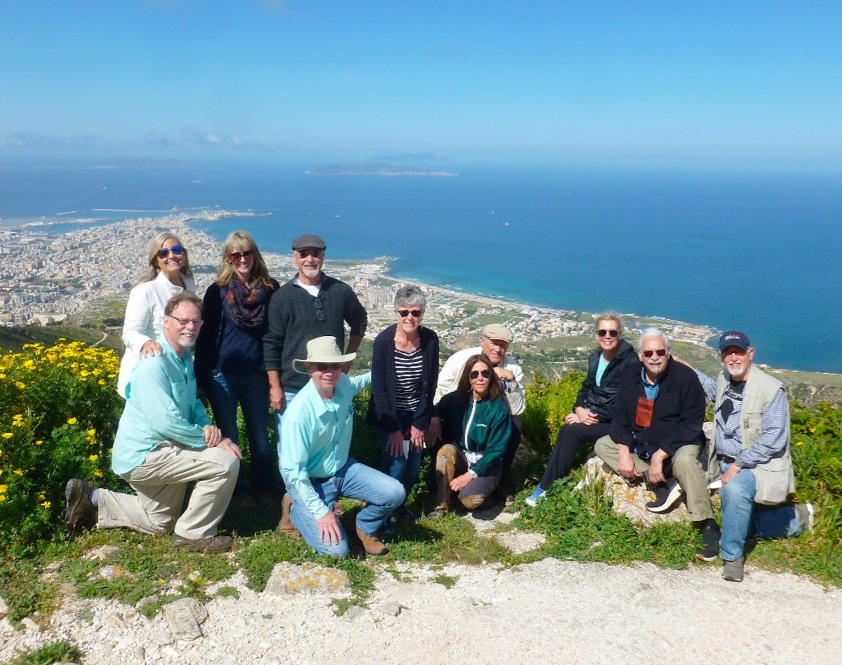
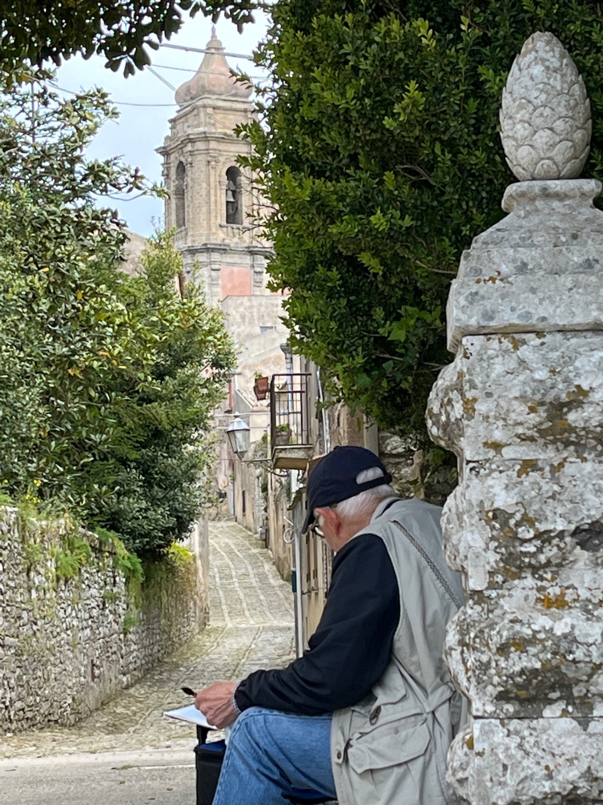
“My idea was to invite a number of established watercolor workshop instructors I know to join me in Sicily to ask the questions: How do we learn about art, and how do we teach art?,” he says. “A few adventurous souls accepted the invitation. Before we knew it, we were all gathered together in Marsala, Sicily, at the retreat center hosted by Yumi Igarashi and Adriano Castroni. The stage was set.”
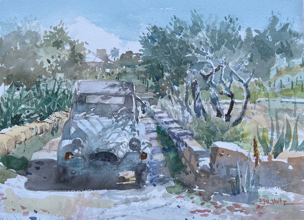
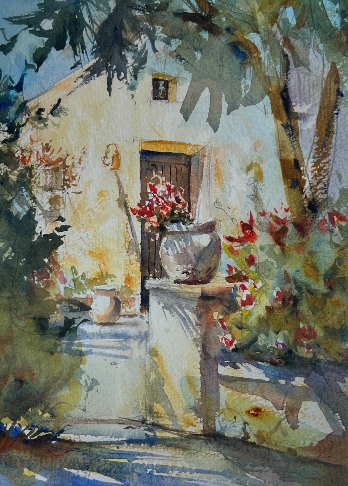
Historic Salinara is located in Marsala, close to the Mediterranean Sea. But the success of a retreat like this doesn’t just come down to location, the company kept makes all the difference. For this trip White was joined by Frank Costantino, Russell Jewell, Mick McAndrews, John Brandon Sills, and Bob Urso. Counted amongst the group were two art professors, a professionally trained artist, two architectural illustrators, and an IT specialist turned artist. Though their current or former careers varied, three common threads united them— their love of watercolor, teaching, and the landscape of Sicily.
LESSONS LEARNED
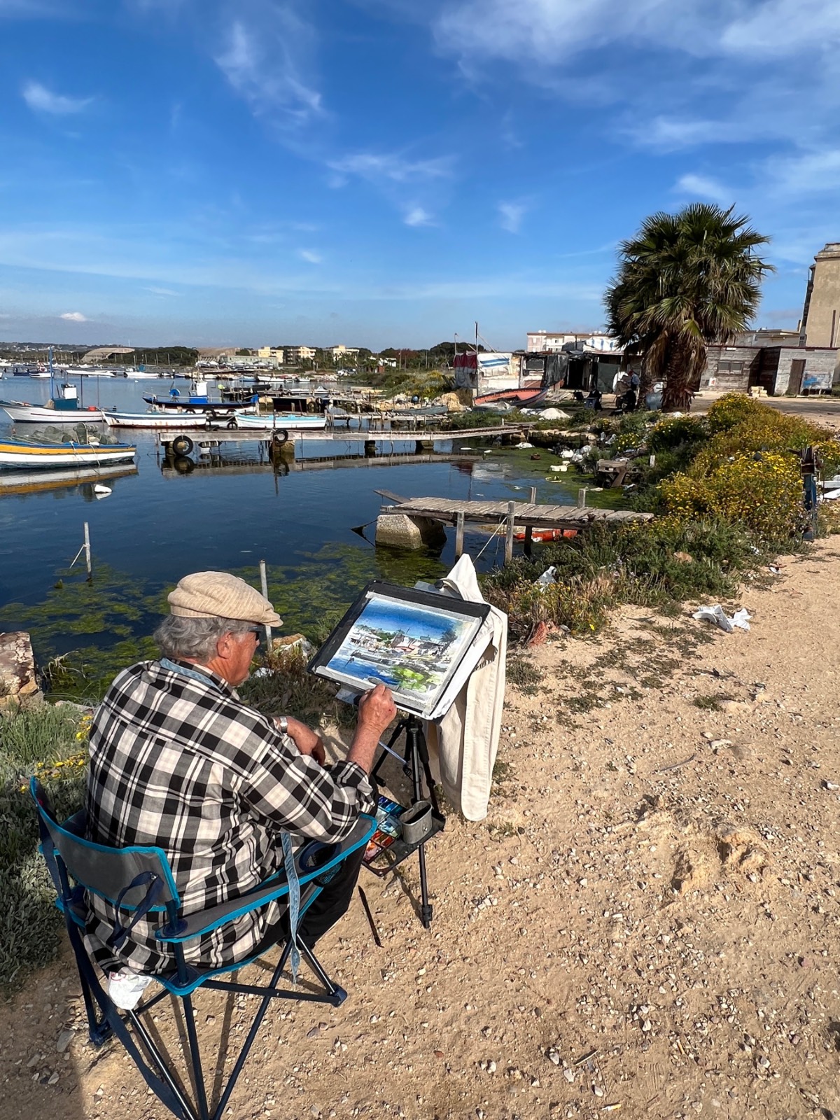
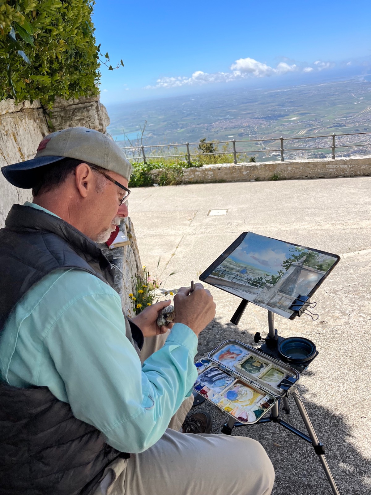
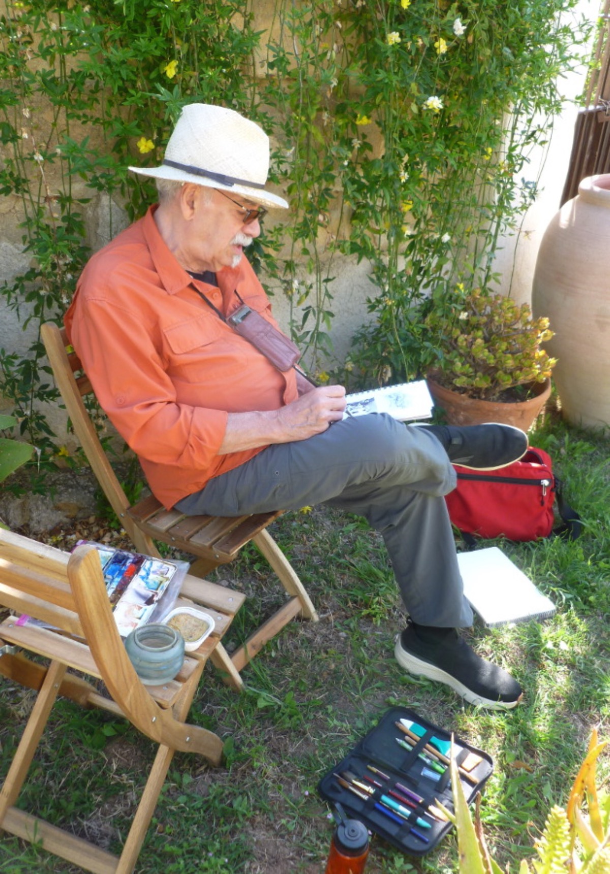
Communicating art instruction can be challenging in a workshop setting. Typically, instructors get just three to five days to communicate the nebulous and mysterious practice of art making. The basic workshop structure starts with the teacher painting a demo while explaining the “how” of it all. Though that’s a perfectly sound method, these instructors wanted to look at what variations might be possible. Now, with time, a beautiful setting, and all their physical comforts attended to, the instructors settled into their symposium.
As the week progressed, each artist presented their methods and materials along with the ins and outs of their personal workshop philosophy. The varied backgrounds of each artist provided insight into new approaches that not only benefitted the other participants but potentially provided fodder for their future students.
Sills kicked off the week with a presentation on his journey in painting. He spoke of the personal, spiritual, and transformative power an art practice can have in people’s lives. Talking passionately about art and authenticity, he said, “Painting is my voice … projected into time. We can teach or we can inspire.” And inspire he did.
“John’s aim is to minimize the sense of craft in regard to art, while maximizing the idea that art is life,” says Jewell. “Spending that week in a foreign country, living in the moment, and translating life into art with our paints and brushes, we recognized that our artistic undertaking was truly a once-in-a-lifetime experience. And yet isn’t that what every plein air painting is, a once-in-a-lifetime record of a moment well lived? ‘As instructors, we have the power to awaken,’ John said. It starts by realizing our personal human condition and then using art as a method of sharing that experience with others.”
The next day, White followed up with a presentation of dos and don’ts he offers students as a reminder to stay present:
Don’t Dilute your paint too much. Weak washes equal weak paintings in most cases.
Don’t Overwork your painting. Be concise yet eloquent, like good writing.
Don’t be Negative about your decision making. Be objective instead.
Don’t Try to fix it. Fixing a blemish often draws attention to an area that you want to go away. Wait until it dries then see what you can do with it.
Good Design will always carry the day. Be deliberate and decisive.
Be Optimistic and confident. These attitudes will go a long way to success in any endeavor
Mid-week, Costantino painted a remarkable likeness of one of our hosts as he explained his approach to mixing color to achieve translucency. “Amateurs often make the mistake of overstating the shadows, and, as a consequence, their paintings suffer from a heavy-handed use of the watercolors,” he said. “One of the things I learned from Charles Reid [1937-2019] many years ago was that shadows don’t have to be opaque or uniformly dark to convey structural form or the patter of sunlight and shadow.”
The following evening, Jewell shared his rejection of the value of “talent,” promoting the notion that “anyone can draw.” To prove his point, he said he asks workshop students to trace a simple da Vinci drawing. When they’re done he declares, “Now you all draw just like da Vinci.” Tracing proves they have no physical problems with drawing, he contends, but rather a problem with seeing. When sharing tricks and techniques with his watercolor students, he instructs them to “draw like they paint, and paint like they draw,” in other words, to preserve their whites, work light to dark, and vague to detailed.
In his demonstration, McAndrews espoused the “sophistication of simplicity.” He said: “It’s often what you don’t paint that involves the viewer more than what you do paint. In watercolor, sophisticated simplicity means focusing on interesting shape-making rather than defining subject matter; relying on a good value plan (identifying your darkest darks and lightest lights and then determining how you hold it all together with mid values); making value more important than color choices; and finally using hard, soft, and rough or drybrush edges to create visual excitement. I’m always surprised when someone says how much they enjoy all of the detail in my paintings, when in reality there’s very little. It’s just that I’ve carefully used shape, value, and edge variety to create the illusion of detail, allowing the mind’s eye of the viewer to fill in the detail, thus making them part of the painting process.”
Finally, Urso wrapped up the week with an academic note on the basics. To demonstrate his approach to teaching color, he shared a simple exercise. “I start by having the students bounce their gaze around a shape whose color they’re trying to identify. (For this, I often cut up a magazine and have each student randomly select a color patch from the pile of scraps.) I then ask them the color of their shape. Most will say a color name, like rose, magenta, or violet. But I tell them they must limit their choice to red, yellow, or blue. At first they resist, but soon are able to pick which primary they feel their shape is most near. I then ask if the color leans more towards cool or warm, and how saturated the color is — for example, if it’s intense or dull. If it’s dull they can add a bit of the complementary color to gray it. If it’s too dark, they can add water to lighten the color. After making just three decisions regarding hue, saturation, and tone they’ve correctly mixed their color. For beginners, this is a much better color-mixing method than relying on trial and error, which usually results in mud.”
Learn from 25 top watercolor artists from around the world at the next Watercolor Live!


