
“Color is an aspect of painting that one could explore for a lifetime,” says Carla O’Connor. “I love color, too, but my main concern regarding color is balance and its place in my design. To me, it’s a second string player. I use color and its considerable impact to re-enforce my message by setting the mood or expressing emotion.
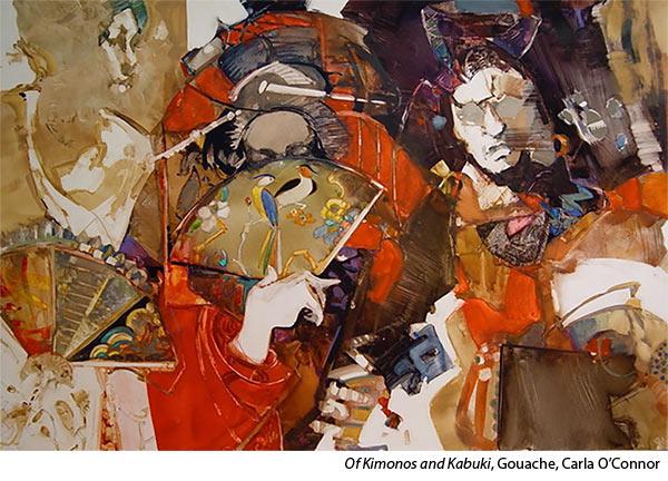
“I believe that color is made more beautiful by what is next to it — lovely warm and cool grays.
“The biggest struggle I see facing students in regard to color, at least those who love color above all else, is that they want every color on their palette in one painting. The result is that each one of those colors cries out for all the attention. It is very difficult to convince a student to be selective and use some gray hues to surround and enhance the color even more. Remember, the most important design principle is dominance.”
Carla O’Connor is a signature member of the American Watercolor Society, National Watercolor Society and Northwest Watercolor Society and is an AWS Dolphin Fellow. She shares her process in Figure Design in Gouache: The Process With Carla O’Connor


