Richie Vios shares his tips for using composition, shape, value, color, and edge treatment for drawing the viewer’s eye to your center of interest.
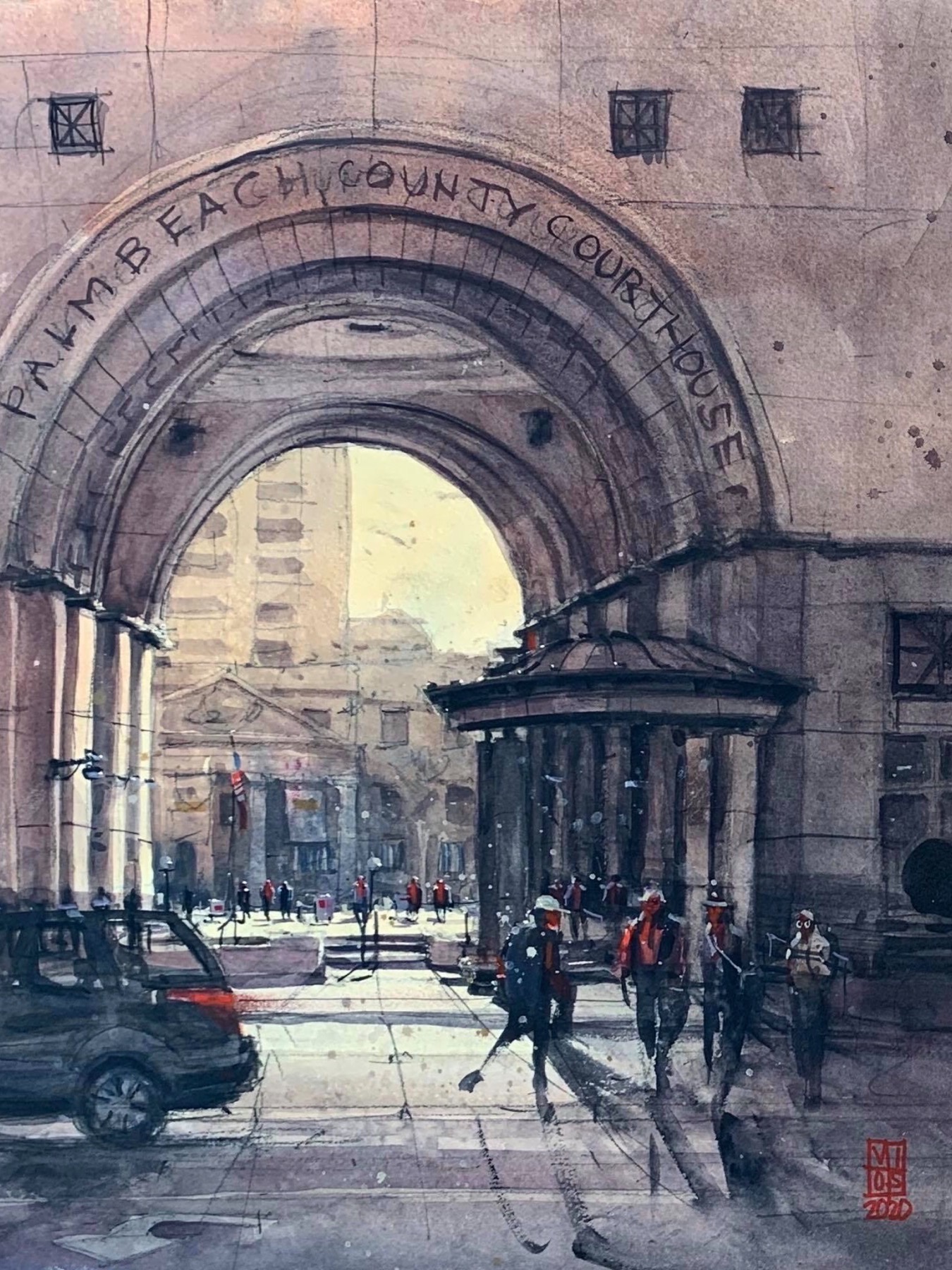
“I liked how the classical architecture of the old courthouse in the background contrasted with the contemporary courthouse in front,” says Richie Vios. “I emphasized the contrast by aligning the triangle-shaped roof facade of the older building within the huge arched courtyard of the new structure. Using a limited palette, I opted for warmer colors and lighter values on the distant object and cooler colors in mid-tone to dark values in the foreground to create the illusion of depth and separation.”
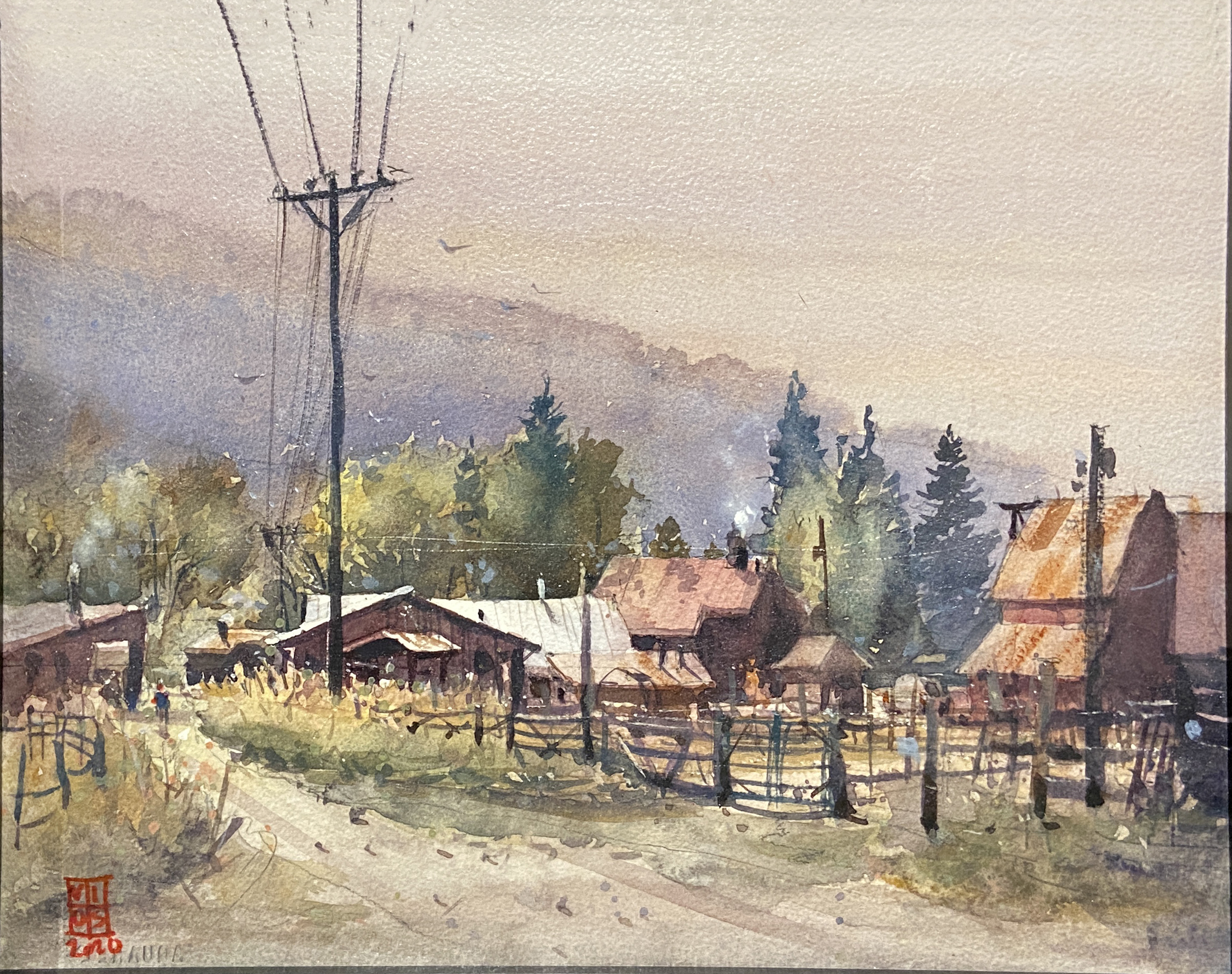
“This scene provided a classic view of rural buildings with intriguing tin roofs that varied in slope. I designed the composition so that the triangular elevation of one of the barns aligned with the lower left intersection of my rule of thirds grid and would serve as my focal point. To enhance the center of interest, I complemented the exposed white paper roof with the dark electrical post and used the triangular path of the road to lead the viewer’s eye to the spot. I added the blurry mountain ridge to generate distance.”
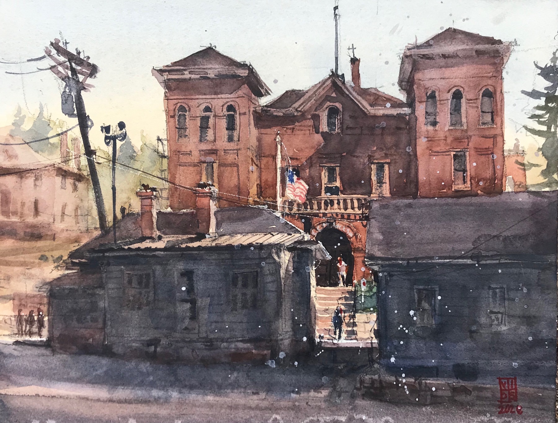
“I was attracted to all the terra-cotta brickwork on this courthouse, so I centered my color scheme around the warm earthy color. I intentionally placed the arch of the courthouse entrance on the lower right intersection of my grid to serve as my focal point, adding the American flag and figures to draw attention to the area. I darkened the two buildings in the foreground, leaving a gap that leads to the focal point.”
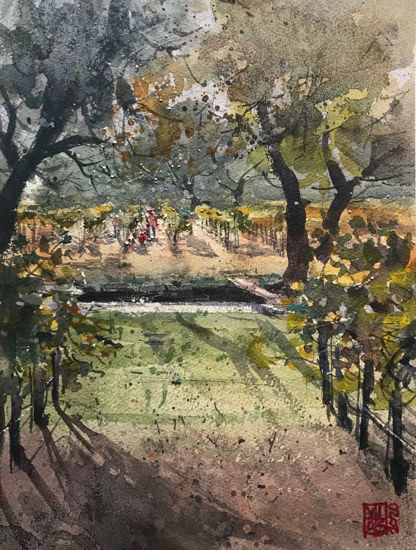
“I used an appealing triangular-shaped composition to enhance the rows of planted grapes with figures at the top of the painting. Horizontal planes vary in width to create atmospheric perspective, adding depth of field to the layers. Darker trees and foreground rows of fruit frame the figures harvesting the grapes. Lastly, a shadow anchors the landscape elements to the ground.”
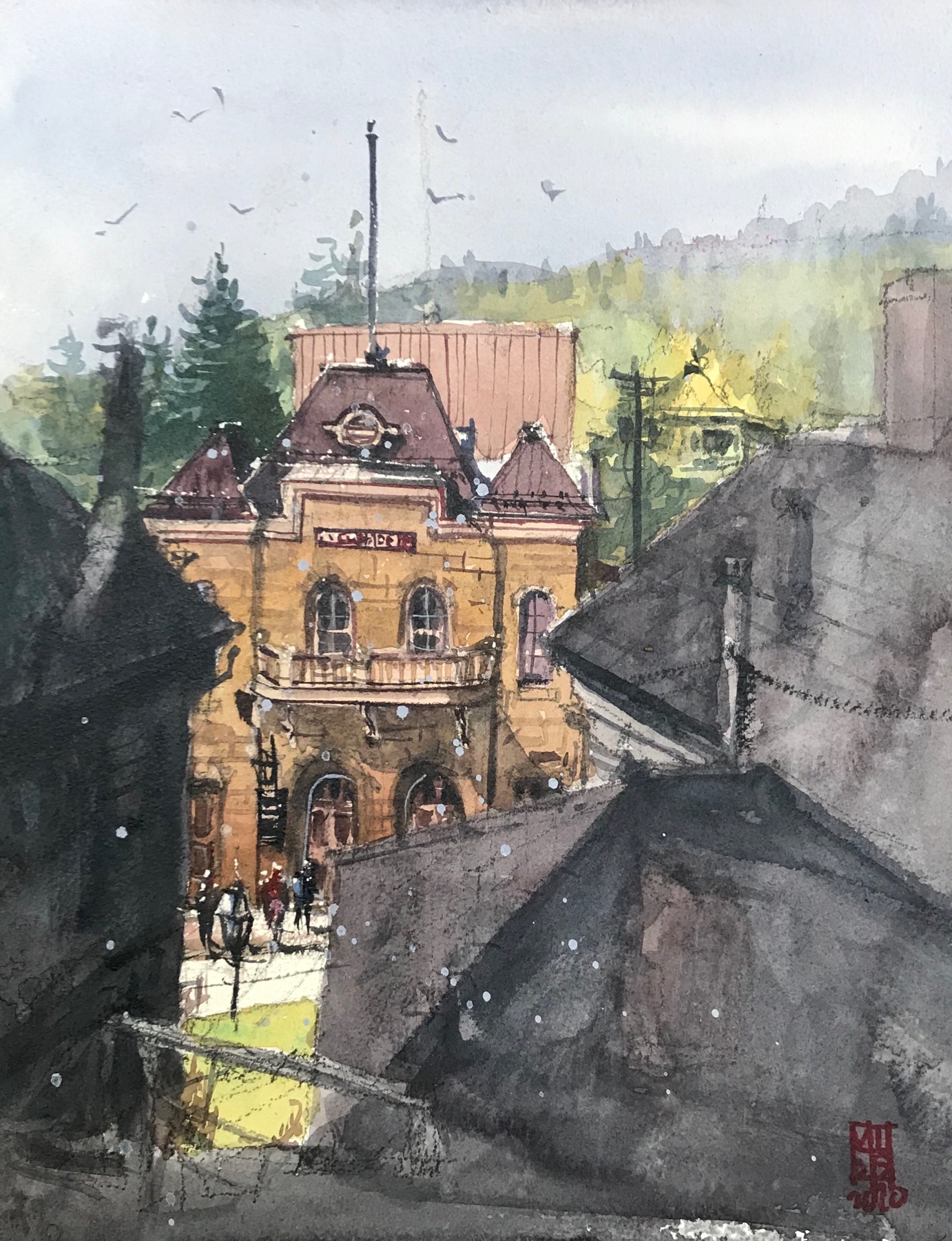
“When competing in Quick Draw competitions, I necessarily simplify my subject. Here, I drew only the facade of the iconic opera house. Again, my center of interest lies in the lower left of my grid. Since the facade is so symmetrical in design, I added proven tricks to draw the viewer’s eye to the focal area. The gap between the two varying forms of dark buildings in the foreground reveals figures and exposes the arched entrance to the opera.”
Paint alongside Richie Vios, Amit Kapoor, Joseph Zbukvic, and other top watercolor artists at the Plein Air Convention in Reno/Lake Tahoe May 19-23, 2026.




Thank you for sharing your design and intention. I found it very helpful.