
“Most students paint with way too much water and use too big of a soft brush for the entire painting,” says Dan Marshall.
Choose the Right Watercolor Brush for the Job
“It’s important to use the right tool for the right job, abandoning your largest brush once you’ve finished the initial washes. I hold all the brushes I need in my left hand while I am working. Selecting these brushes at the start of the painting is one more step in thinking through the painting start to finish. As I move through the painting I disregard a brush when I am finished with it and by the end of the painting my left hand is empty.”
Use the Right Amount of Water
“The watercolor clock was developed by Joseph Zbukvic and is a method of determining pigment-to-water ratio (thin to thick) as well as identifying the moisture level of the paper (dry to wet). It is key to knowing what consistency of paint to use on what level of wetness of paper and when to use it for the desired effect. This is the key to giving your paintings a real sense of color (not weak paintings), full of tone, body, and a sense of gravitas.

“To keep your paintings from looking like a cut paper collage of tone and color, work while controlled areas of your painting are wet to create soft and lost edges that suggest subtle details or add atmospheric perspective. For example, you may work on the background while it’s wet, but the foreground or middle ground is dry. Working in this manner keeps unity in the large shapes while still suggesting complexity and detail.”
Joseph Zbukvic Watercolor Clock
One side of the clock represents the paper and it is divided into four different degrees of wetness: dry, damp, moist and wet.
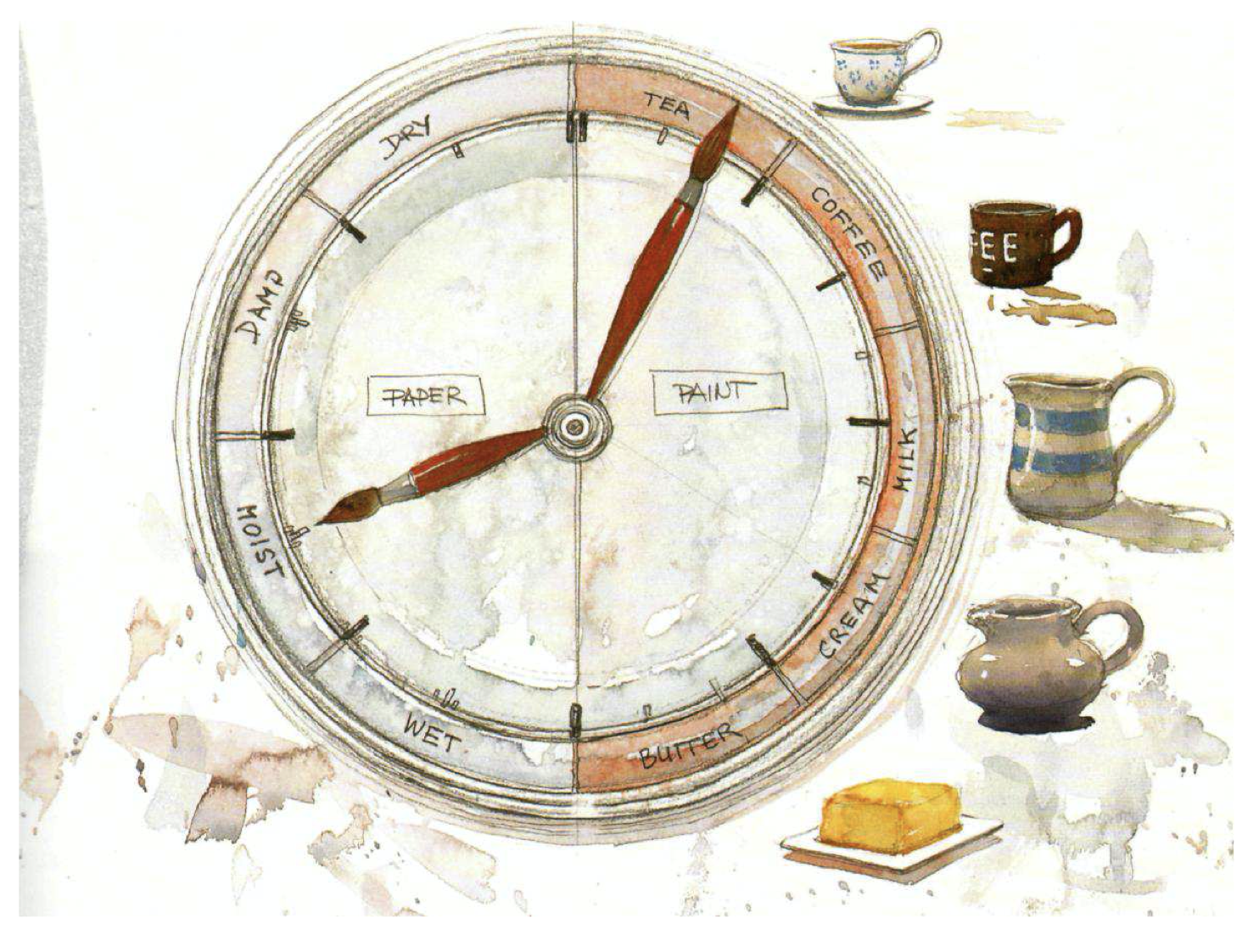
DRY PAPER
For hard edged shapes and for dry brushing. Drawing, scraping and make lines. The time to do sharp effects.
DAMP PAPER
For broken edges and shapes.
A good time to lift pigment and to scratch out.
MOIST PAPER
For soft, controlled edge shapes.
Best for misting effects, shaping and for blending.
WET PAPER
For soft, “lost” or uncontrolled edge shapes.
The other side of the clock represents the palette with varying consistencies of watercolor mix: tea, coffee, milk, cream and butter.
TEA
Weak transparent colors are suitable for those gentle misty paintings.
• This is the lightest toned wash.
• Tea washes will run freely on a tilted palette.
COFFEE
Strong translucent colors are ideal for bright and happy paintings that are
full of light.
• This is the wash to use for quarter-tones. • Runs freely, but less than tea.
MILK
Creating a medium contrast against white paper, it’s probably one of the most frequently used washes. Over larger areas it will form those wonderful granulating effects and rich, yet transparent, colors. It can be dry brushed effectively.
• Use this consistency wash for half-tones. • It will move slowly on tilted palette.
CREAM
Fantastic for the strongest color notes in powerful, rich paintings.
• Thick pigment for three-quarter tones.
• Will move only a bit, if at all, on a tilted palette.
• Cream wash will not bead.
BUTTER
Butter consistency pigment is good for solid color in small doses, such as stop-lights and small figures. It should be reserved for the very darkest darks when finishing your painting with those last magic touches.
• Full tone pigment —no water.
• This will stick to the palette like glue.


very interesting and informative
Hi Kelly,
I am so happy I now get your newsletter regularly. All the articles are very interesting and stimulating. I live in France but thanks to all the wonderful digital tools available, there’s no distance between watercolour lovers!
Many thanks for the American watercolor.
Agnès
thanks for the painting ” Tips “, great to get reminders of what I should remember.
great article, learn a lot.
Hi Kelly: I love getting my newsletter. They are all so inspirational. Especially now, since I am home.
I am a fan of Joseph Z., but I don’t understand how this chart is to be used. How are they used together?
My question also.
I am happy to be subscribed to the watercolor painting; so many valuable tips!