
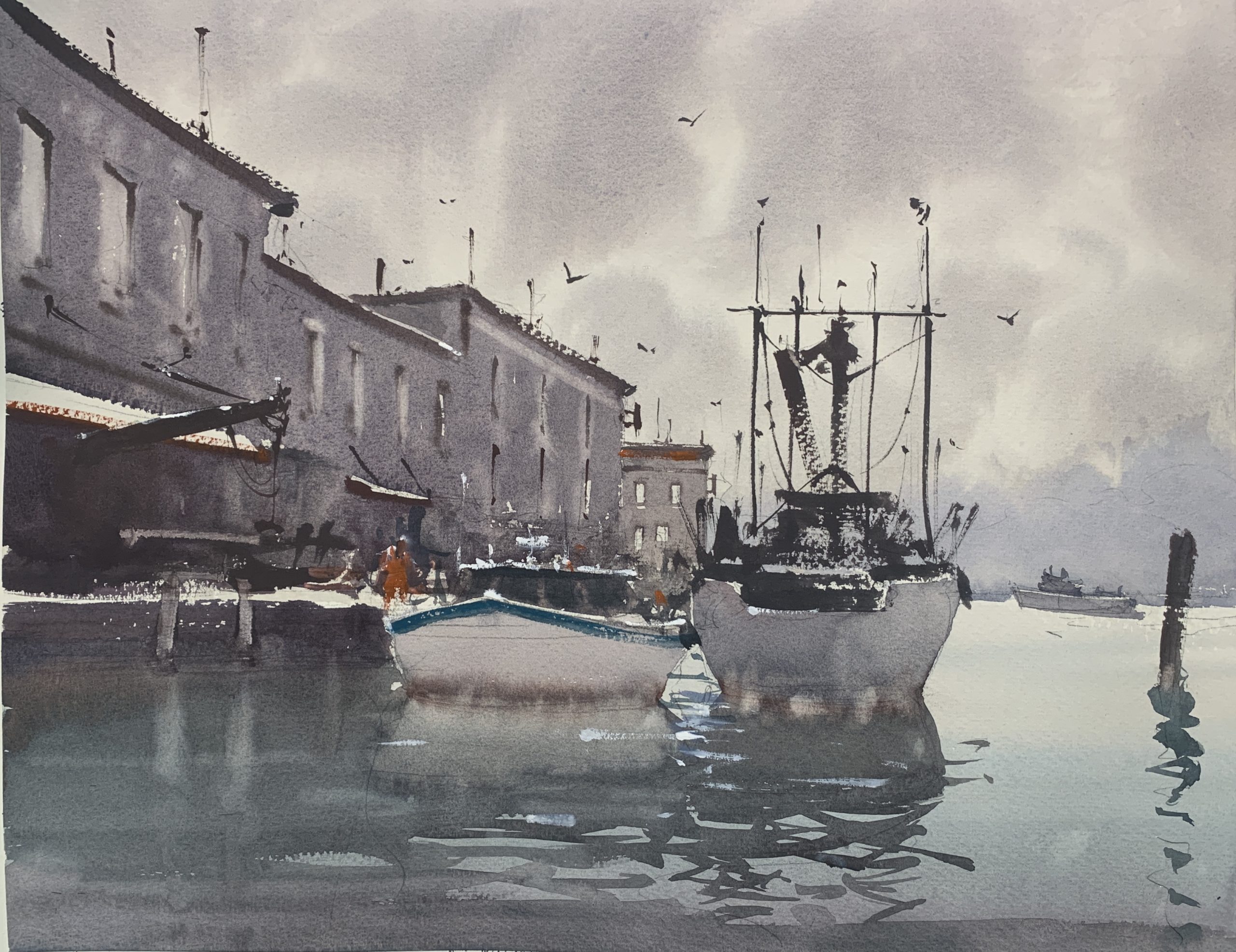
“Neutrals, when used correctly, evoke a feeling of mood and quality of light that is unequaled,” says Dan Marshall. “Your work can be brought to a higher level of harmony and sophistication that will touch the emotions of the viewer. A tonalist approach requires neutrals, a colorists approach should employ their use to accentuate the saturated colors.
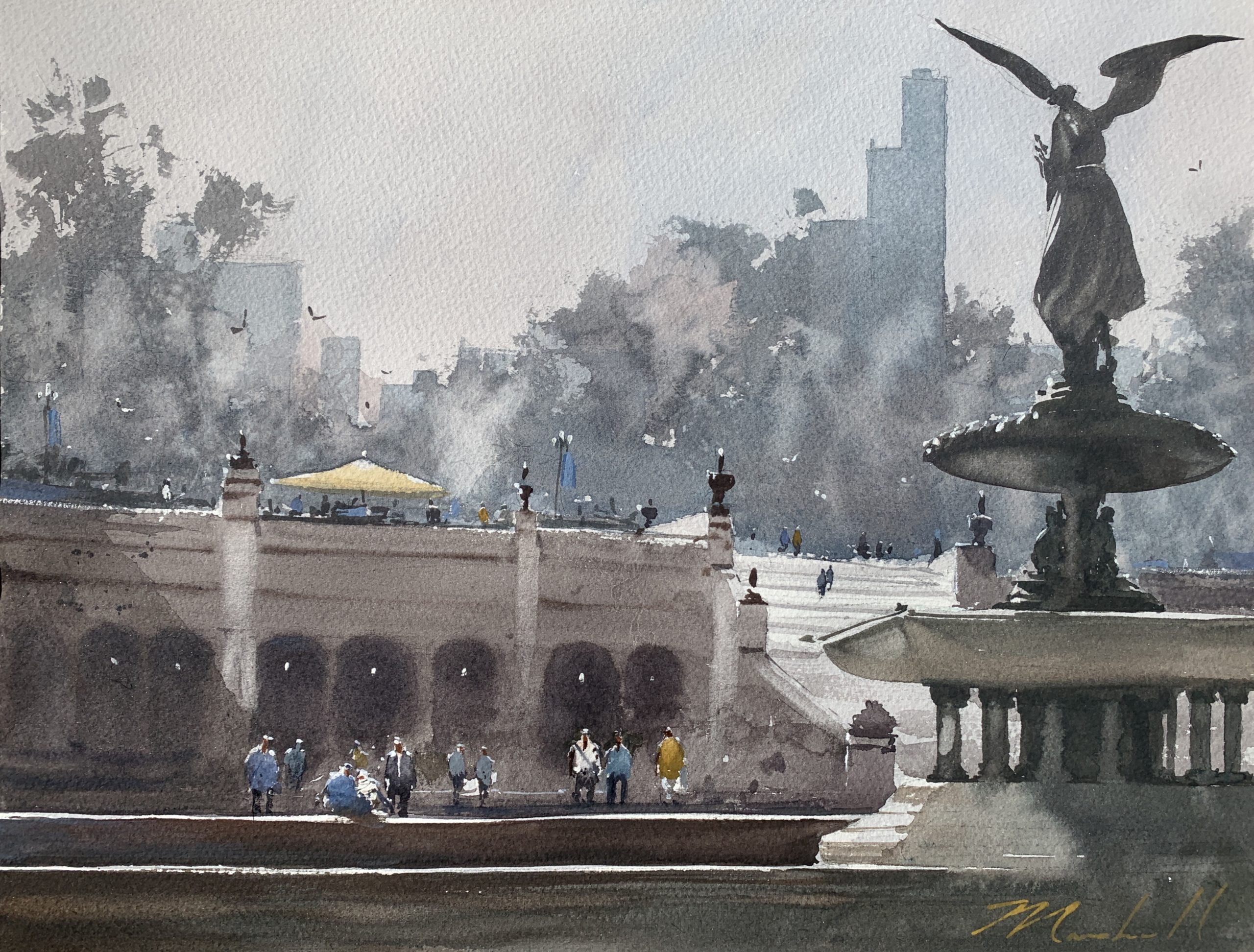
“Painting with neutrals in watercolor shouldn’t, but often does, equal muddy and dull paintings. Unfortunately, when used incorrectly, that’s exactly what happens. The problem is not necessarily the mixing of the neutrals, but improper use of tone. Luminous skies can be painted with the “muddiest” of color if the tone is correct. Tone is controlled by the paint to water ratio in the washes. I start very translucent and thin as I work my way from background to foreground, lessening the amount of water and increasing the amount of paint until I reach the final details, ending with almost no water at all. This almost automatically ensures the painting has a sense of depth through proper tone and the use of warm and cool neutrals.
“My palette is fairly traditional. A warm and cool of each primary with the addition of a few special and short cut colors such as Winsor Violet and cobalt turquoise. (My full palette and organization of colors is available at danmarshallart.com in the about section). Very rarely will I use neutral tint or any premixed neutrals. Learning to mix neutrals from clean colors has helped immensely to keep the mixes from getting that dirty look.
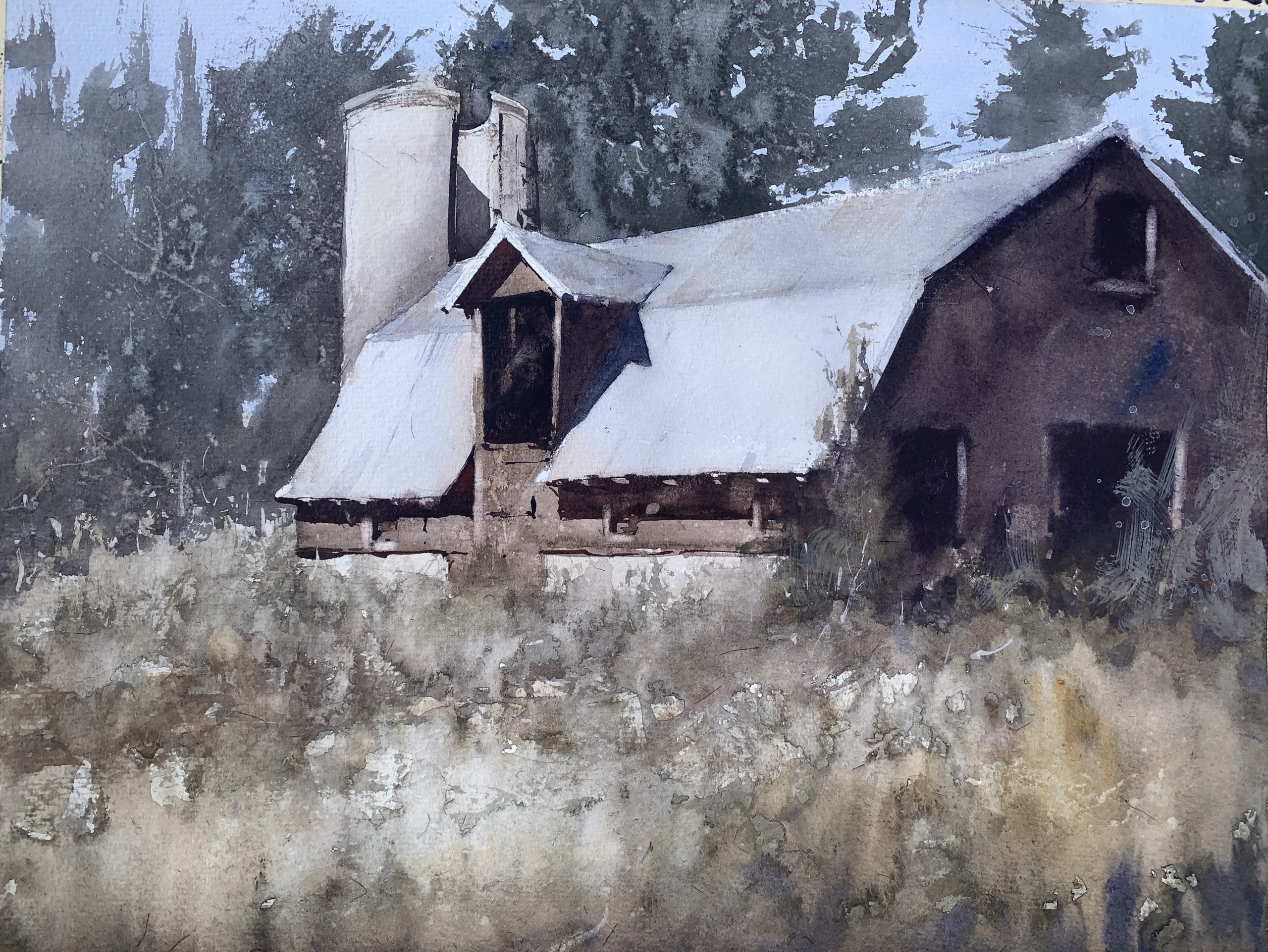
“An important aspect of plein air painting is that we learn to see and mix natural color. The true colors we see in nature are far more neutral than the manufactured pigments and bright colors of our phones, advertisements, and photoshopped photography that we are constantly bombarded with. Forgetting the names of colors we see in nature and seeing them as they truly are, we see they are far more neutral than the colors we are brainwashed to associate them with. Grass is not always as “green” as what we are conditioned to believe. Oh, grass is green, right? I guess I’ll use full strength viridian. No! Start by mixing a proper green, then add some red, burnt sienna, or purple to neutralize it. To identify neutrals, squint while looking at your subject. Squinting, narrowing your eyes as you look at your subject, not only allows you to see quality of edges and simplify tone, it will also aid in seeing the neutrality of color. Then, the questions of how to mix the colors we see in nature are all answered in the color wheel. Look to the colors across from each other to see what will neutralize the base color you are after. Is your color too warm? Add a cool. Color too cool? Warm it up. You really don’t need complex recipes, it’s as simple as that!
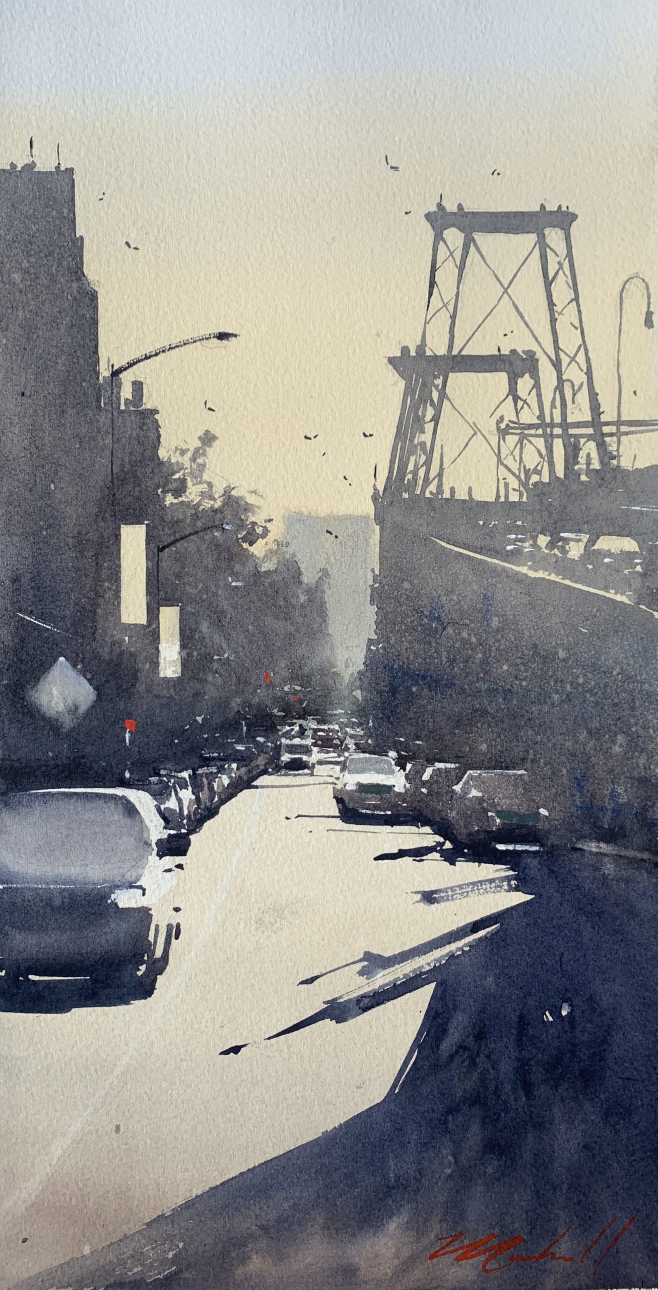
“Of course, we are all drawn to express ourselves in different ways and I too enjoy creating a more colorful piece from time to time but neutrals will always play a role. Personally, I find more satisfaction and sophistication in works with a quiet, tonal and neutral quality. Taking those primaries and complementary colors and mixing towards beautiful, un muddied, shades of warm and cool grays that add atmosphere and mystery to a piece. Whether it be a sunlit scene or a hazy overcast rainy day. Often keeping a closer range of values and a bit monochromatic with pops of accent color does the trick for me. For colorists, consider using neutrals to bring more focus and pop to your areas of rich color.
“For any style of painting, the proper use of neutrals, combined with the proper use of tone, can do so much to enhance the mood, light, and color quality of the work.”
The Color Wheel
 “The answers are all here in the color wheel! Look to the colors across from each other to see what will neutralize the base color you are after. That doesn’t mean mix in equal parts. Add in small increments until you see the tone of neutral you are after.”
• RED + GREEN • BLUE + ORANGE • YELLOW + PURPLE
Dan Marshall shares more of his process in the DVDS, Cityscapes in Watercolor With Dan Marshall, and Plein Air Watercolor: Capturing Nature With Dan Marshall.


Very inspiring. Thank you for making lucid suggestions and illustrating them is such a lovely way.
What a talent! Dan’s design and depiction of his subjects is remarkable.