
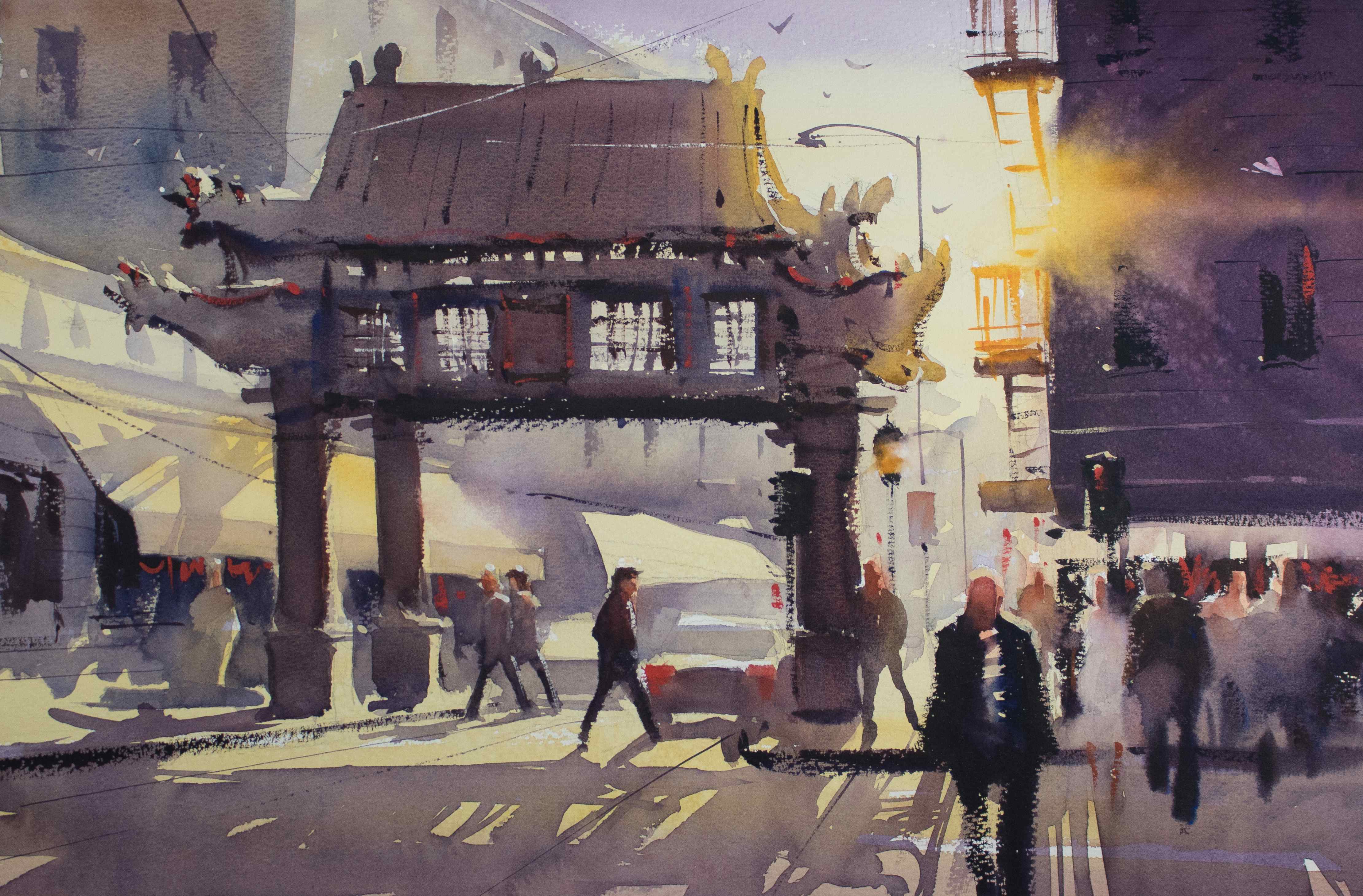
“It would have been easy to get caught up in details like the arch, figures, and signage on location, but this would only have frustrated me and confused the painting,” says Stocke.
“Simplify, simplify, simplify” has become a mantra for Ron Stocke. “As an impressionist painter, I try to convince the viewer that they are looking at an object that I have created with brushstrokes and value,” he says. “Over time, I’ve come to realize that the simpler the shape, the more power it can have. Now, I purposely try to create each shape with as few brushstrokes as possible.”
One way he accomplishes that is by using large brushes. “An area may take 100 brushstrokes to paint with a small brush, but I can cover the same territory with 10 strokes of a large brush. I tend to make fewer mistakes using a large brush, as well.”
Stocke also avoids getting hung up on the details of a shape. He keeps things simple and loose by squinting at his subject or stealing only a quick glance, rather than studying it closely. “Just a few seconds is all I need for my mind to register the shape itself,” he says. “I’ve learned to look not only at the specific object I want to paint, but at the positive and negative spaces that surround or connect the shape, as well. In this way, squares become less rigid, circles less clear. Unless it falls within my focal point, an abstraction of the shape is always best.”
Watercolor Painting Gallery
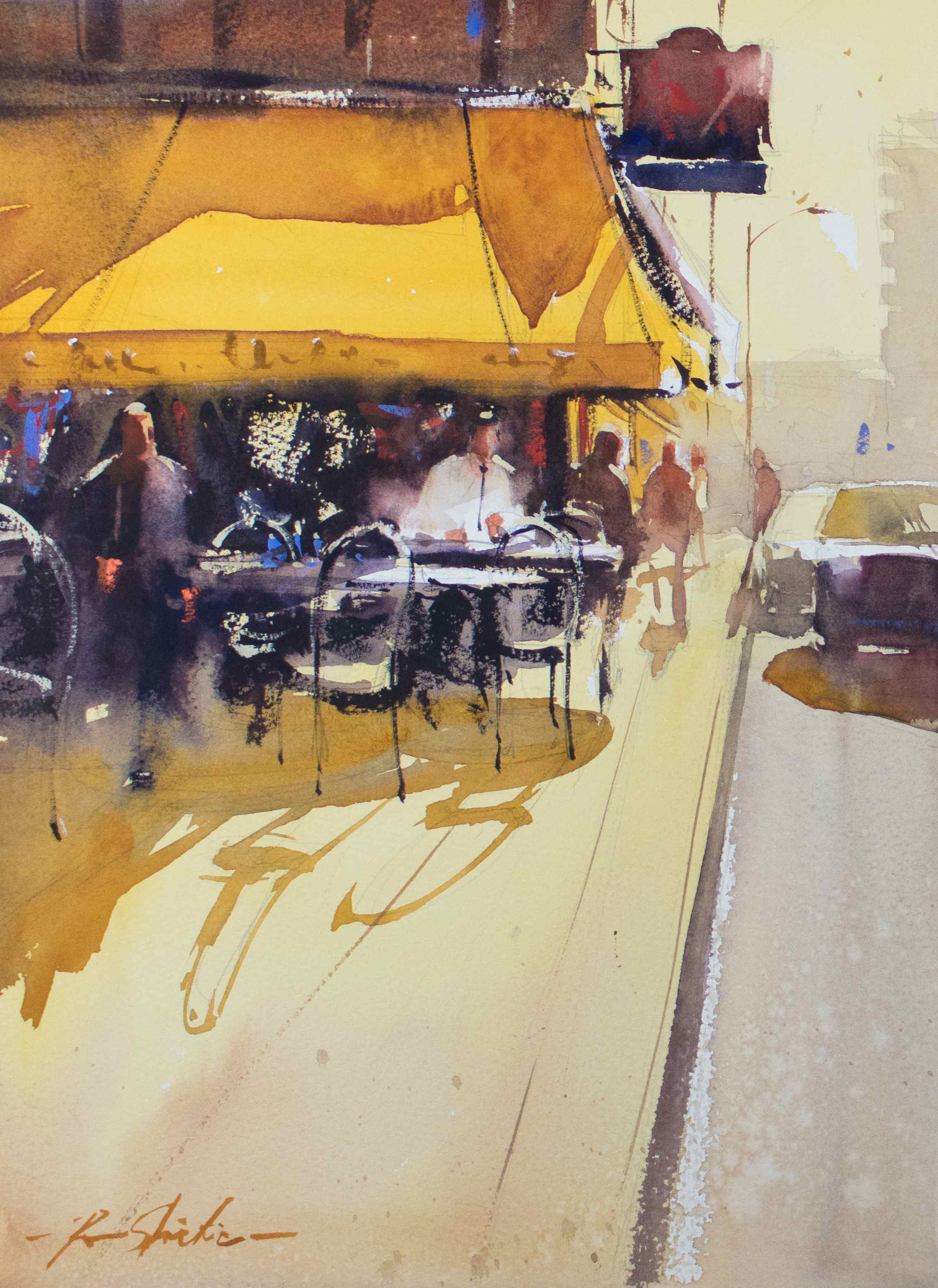
I like to play with shadows,” says the artist. “I don’t try to think about how an individual shadow may appear on the surface it’s being cast onto, but rather how to connect multiple shadows to one another. Notice how I’ve connected the shadows of the figures, awning, tables, and chairs into one shape here.”
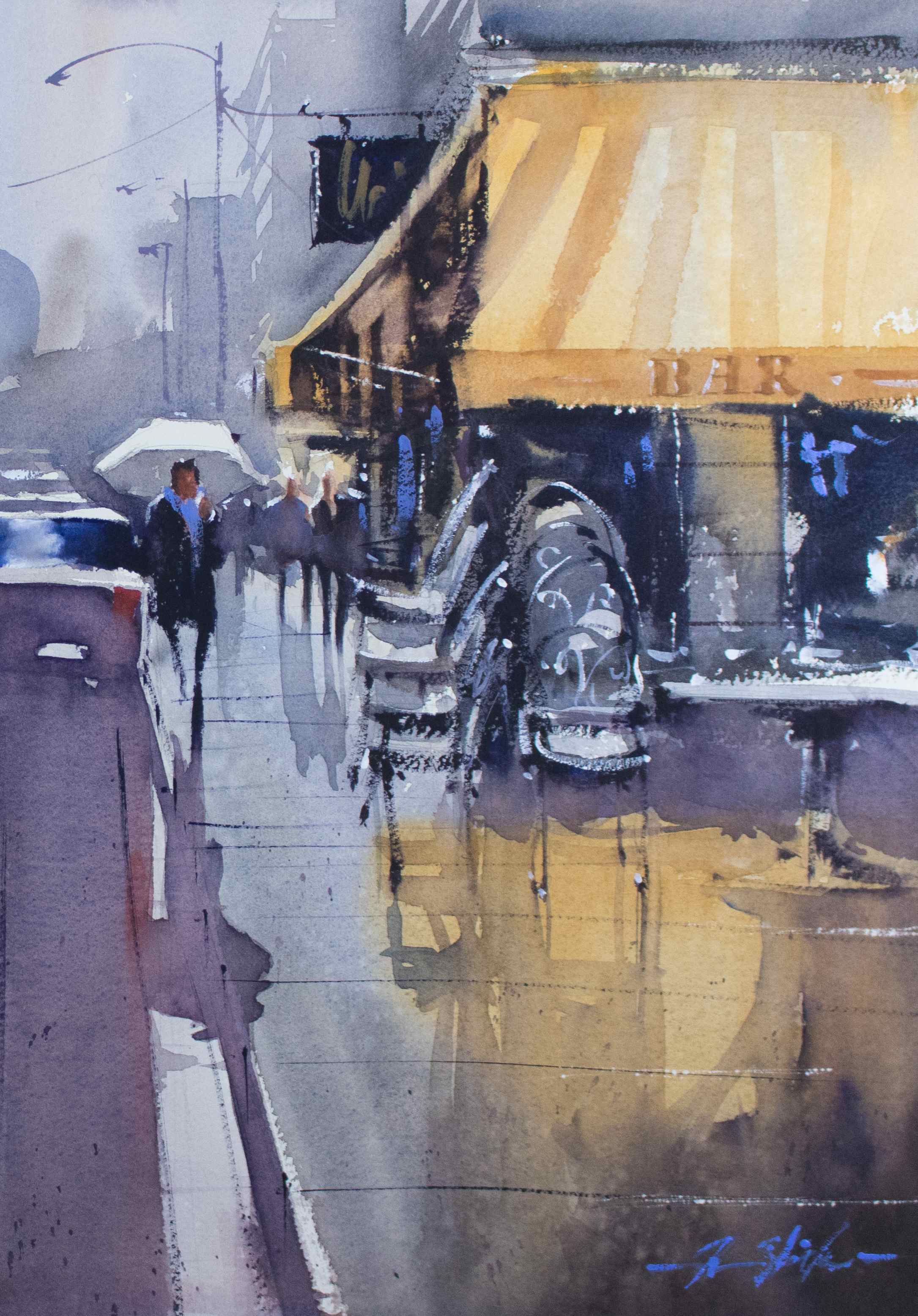
“I really only used two hues on the entire painting — yellow ochre and a palette gray — just in different values and consistencies,” says Stocke. “The stacked chairs made for a bit of fun.”
“I did this painting for a group a few years ago, while conducting a workshop in southern France. I tried to keep it as simple as possible, by limiting my palette and keeping the shapes very basic. The main figure in the hat was a known actor who had retired to this small town and was the perfect focal point for the painting.”
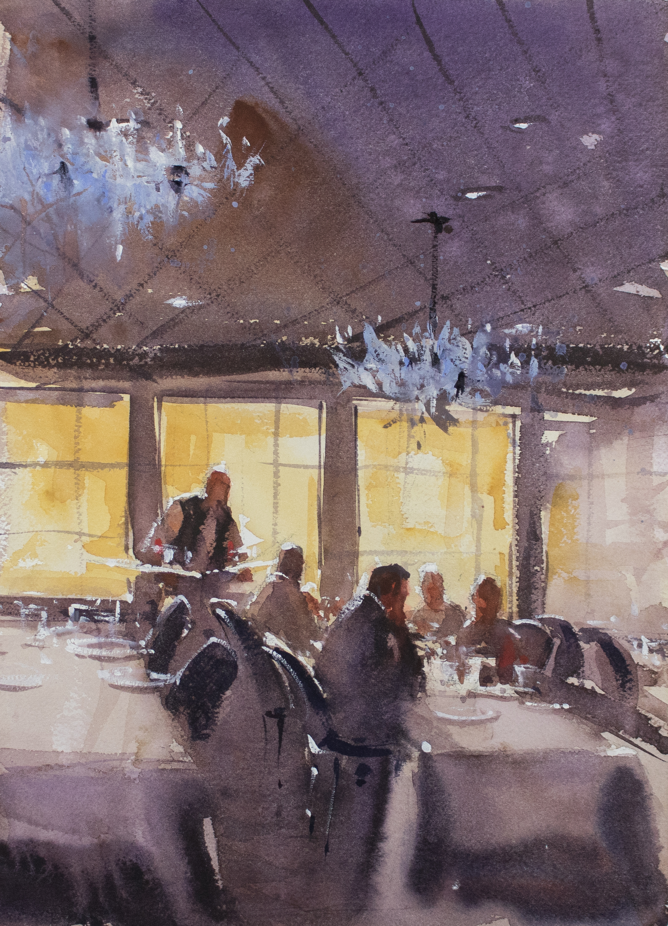
“By backlighting the figures I’ve accomplished two things. One, I’ve created great mood in the painting, and two, I’ve been able to simplify the shapes. I added the chandeliers later with some opaque watercolor. It’s the memory of this painting that makes it a favorite of mine. I did it while on a riverboat cruise with my friend Don Coley, just outside of Portland, Oregon.”
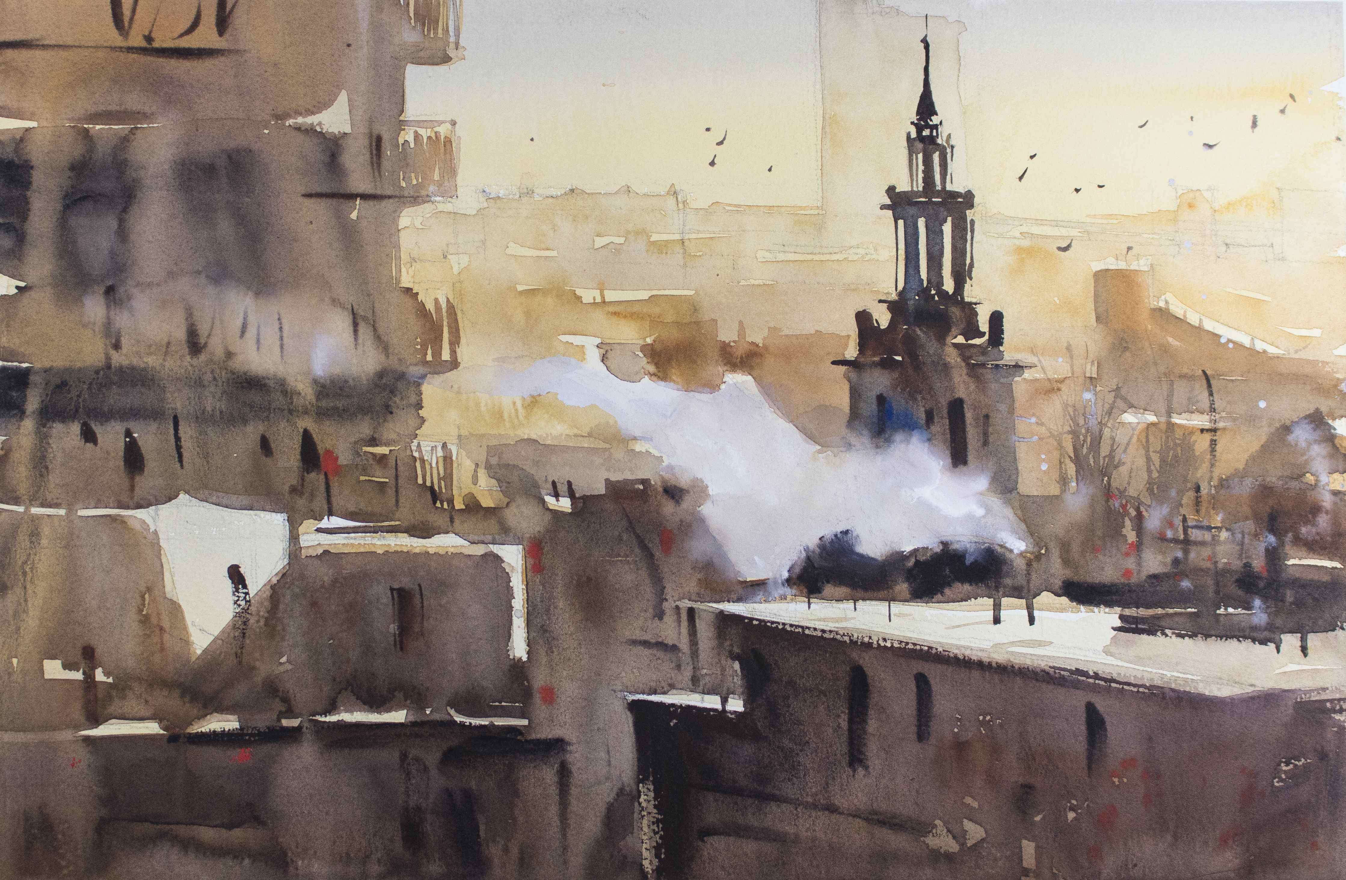
“Proof that simplicity works, this piece was done with only four colors, and, if you squint, you can see that it really consists of just three basic shapes: the light, which includes the tops of the buildings and the steam coming from the pipes; the church steeple; and the mid and foreground buildings.”
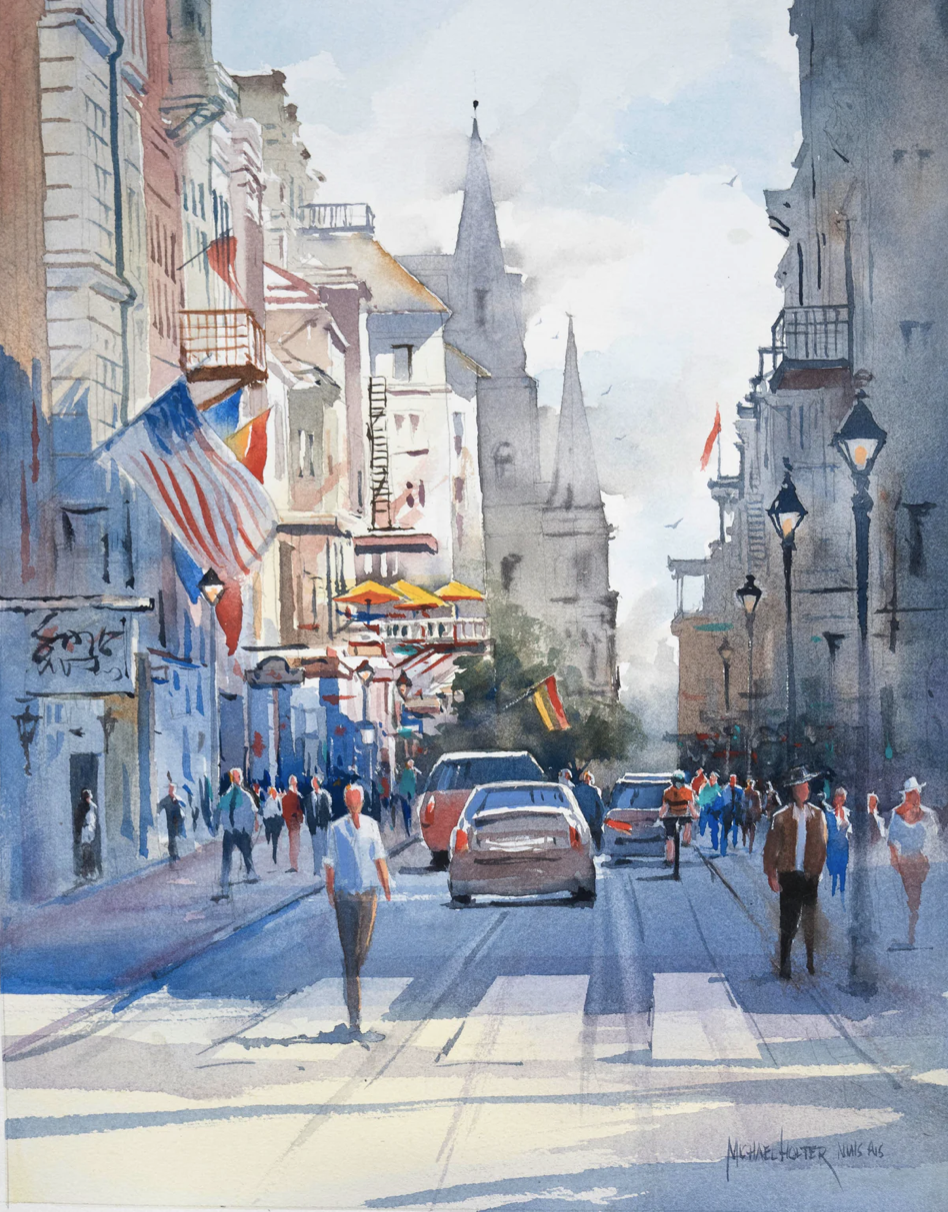
Let Award-Winning Artist Michael Holter Show You How to Achieve Stunning Results and Bring Depth, Atmosphere, and Emotion to Your Cityscape Paintings in his video workshop Paint the Town.


I recognized that Gate in The International District immediately. I stayed in the hostel right there last Spring!
I always paint with oil so I am just learning watercolor. The above paintings are outstanding.
Your work is superb. I want to paint with watercolor like YOU DO.
Your name does not appear anywhere on your website. Your name should be everywhere!!