
“I trained as a medical illustrator and spend much of my time creating tight, detailed illustrations, so I have to make a conscious effort to break from that to paint the kinds of loose, expressive watercolors I admire by painters like Sargent, Trevor Chamberlain, Alvaro Castagnet, and Eric Wiegardt,” say Minnesota artist Andy Evansen. “It really helps to make small preliminary value studies of a subject so I can then be freer with my response to the scene. I use the studies to evaluate potential compositions and define three basic values — the bright white of the reserved paper, a large medium-value shape, and the dark calligraphic lines that define the focal point.
“I don’t always make value sketches, but when I do, they help me focus on the essential elements of a picture and eliminate extraneous details. Going through the exercise of making the sketch prepares me to paint larger watercolors with confidence and direction because I’ve made all the key decisions about mixing the right values and applying them in a deliberate, sequential manner. Oil painters may be able to keep reworking a painting until they get it resolved, but when a watercolorist does that, it’s likely the colors will become dense and muddy and the picture will be confusing. One stroke of watercolor paint that has the right hue and intensity is better than 10 hesitant marks because it has the kind of brilliance and freshness that is the hallmark of a great watercolor painting.”
Evansen explains, “Students have a tendency to paint isolated objects instead of seeing the possibilities of using connected shapes. They can overload a watercolor painting with too much information because they’ve worked almost exclusively from photographs. That’s a recipe for a disconnected plein air painting. The students would be more successful making one broad statement about their observations rather than painting isolated details. It takes discipline to learn to see this way.”
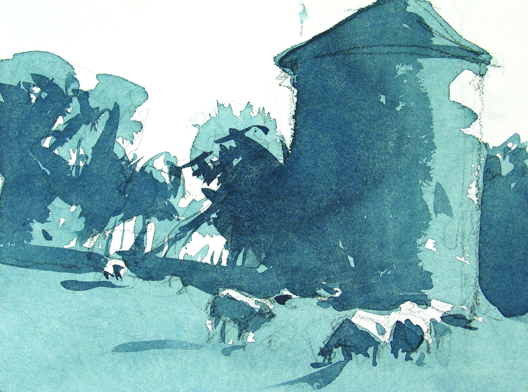
Evansen says a value study can be completed in five minutes or less before an artist commits to painting a larger, full-color watercolor, and recommends creating studies on 7 x 10-inch blocks of Arches watercolor paper. “I use a Joe Miller Signature Field Easel, which holds my John Pike plastic palette on the extension attached to the right side,” he says. “Working in a standing position, I quickly draw the outlines of the main shapes in graphite. I then use a round Silver Black Velvet brush and Winsor & Newton Payne’s gray to paint big areas with a medium-value wash, allowing the white of the paper to indicate the light-value shapes in the composition. Finally, I load the brush with a darker mixture of gray and use the tip to paint linear outlines, cast shadows, and large dark masses.”
After Evansen has composed a subject in a value sketch or in his mind, he begins to develop a full-color watercolor of the subject using the following colors squeezed into the compartments of a palette: Payne’s gray, French ultramarine blue, cobalt blue, cerulean blue, sap green, raw sienna, burnt sienna, alizarin crimson, cadmium red, new gamboge, and cadmium lemon. He paints on a 9 x 12-inch block of Arches water – color paper or on quarter-sheets of 300-pound cold-pressed watercolor paper, dampening the surface before he begins painting and keeping it slightly elevated so gravity will cause the fluid paint to move down without running.
Evansen uses one big wash brush and three round brushes on location, and he adds two additional brushes to his supplies when painting in his studio. “Another advantage of doing the value study,” he says, “is that it helps me break the composition into three dominant values and thereby simplifies the painting process. It’s easier to describe the landscape with broad strokes of accurately mixed colors and avoid the tendency to paint every subtle shift in hue or detail. The sketch also reminds me to connect the shapes, and that’s extremely important in unifying a painting with harmonious colors and patterns.”
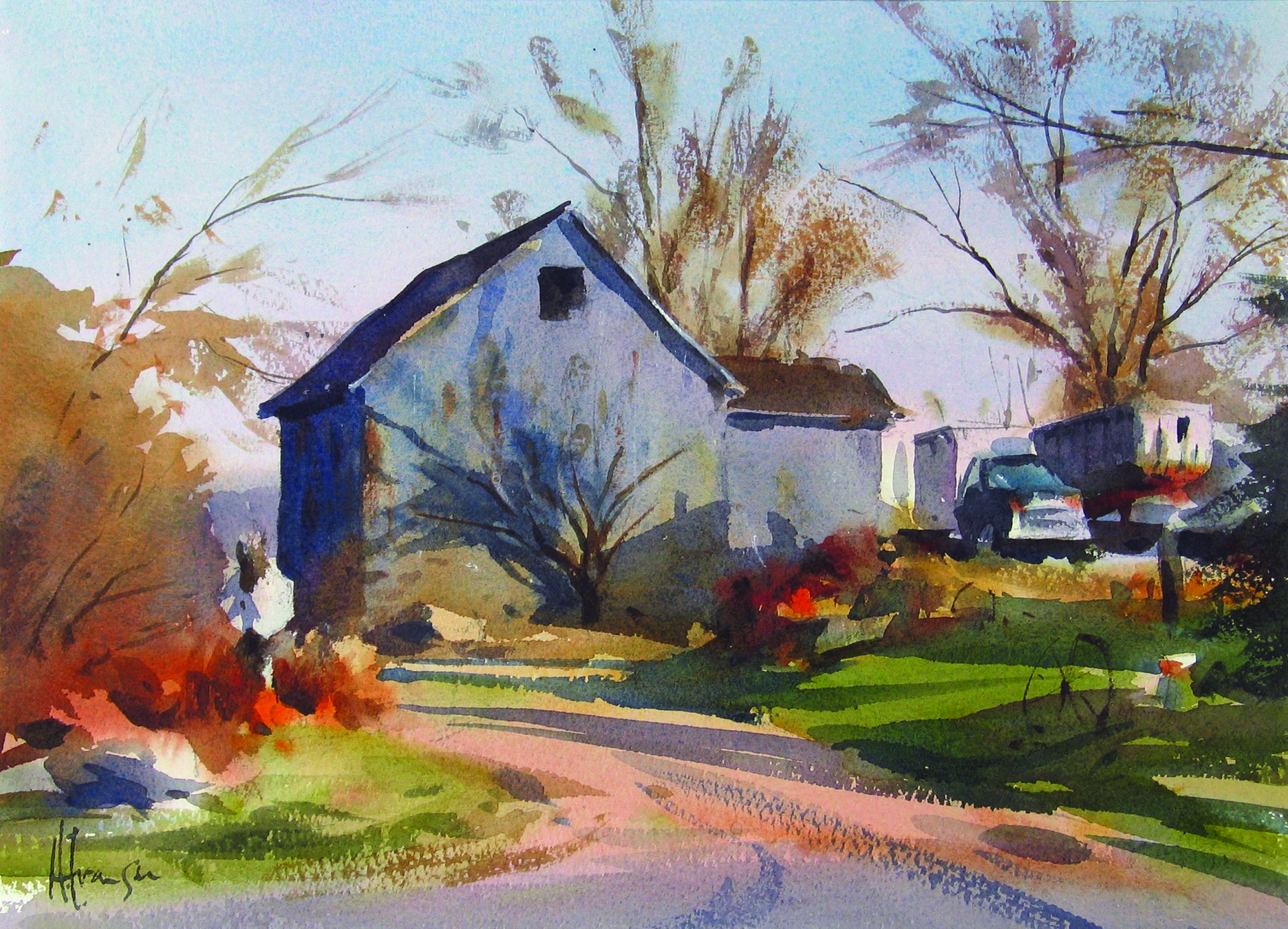
Watercolor Tutorial: Starting with a Value Sketch
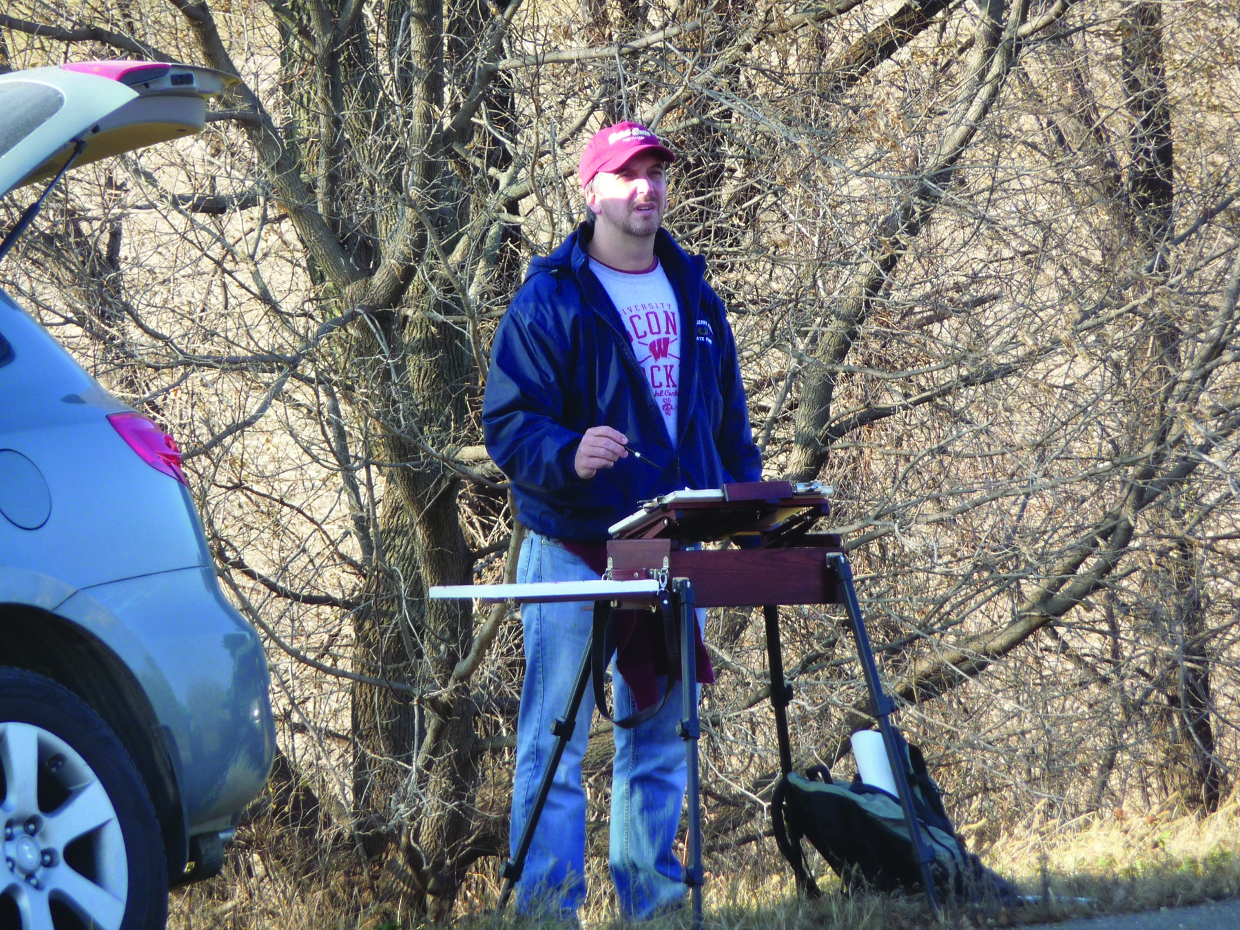
Andy Evansen sets up to paint a barn in rural Minnesota near his home.
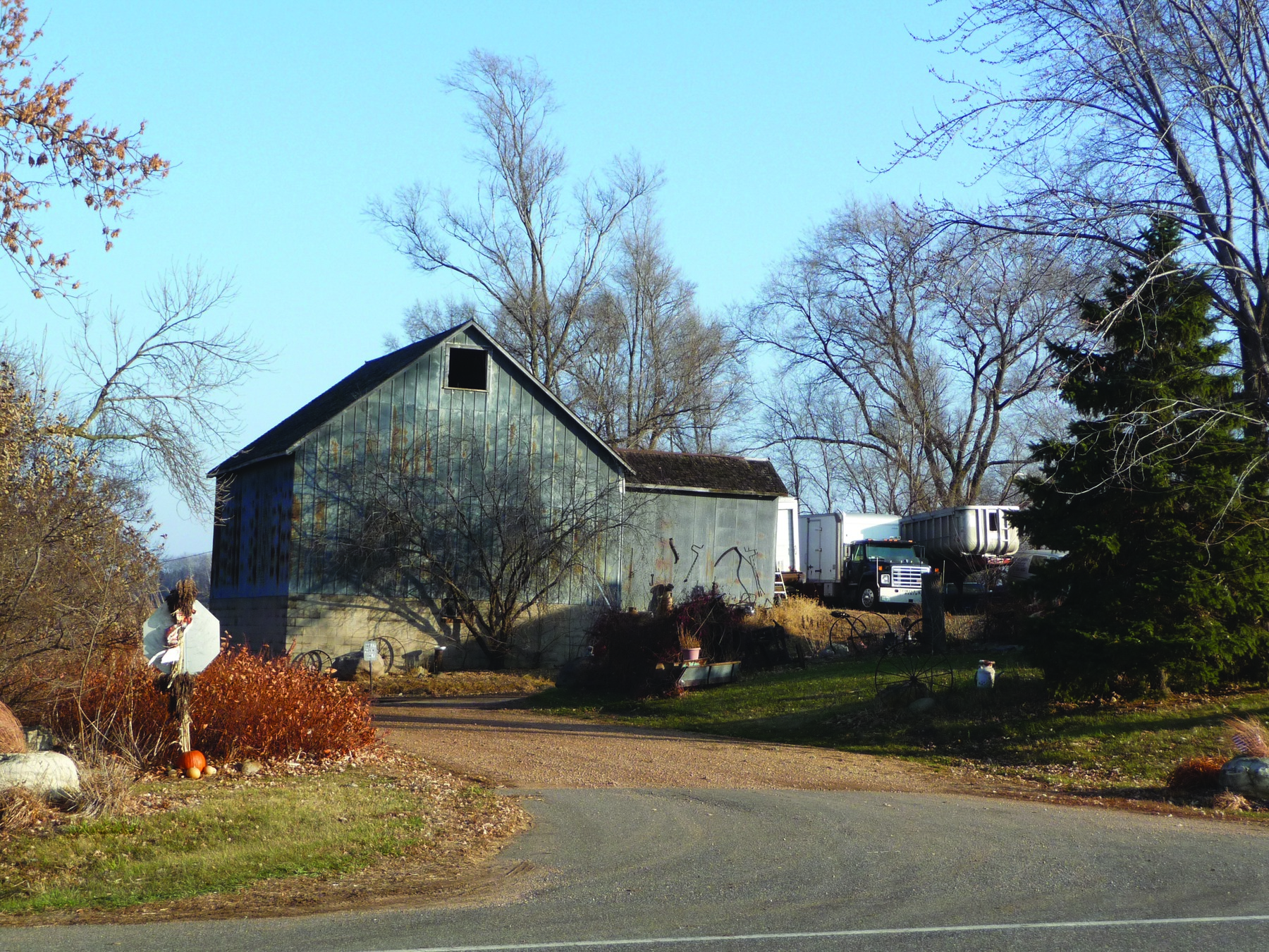
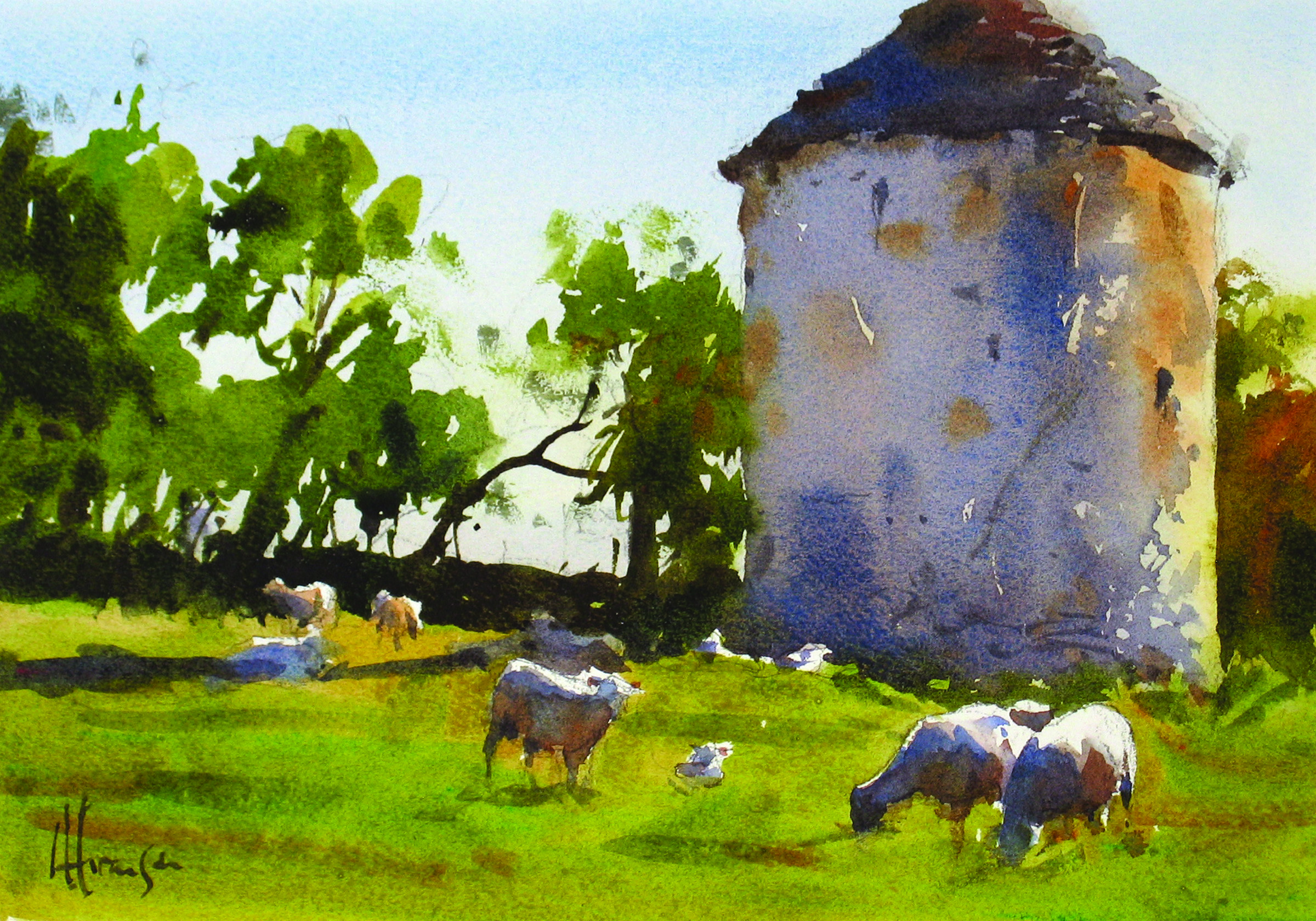
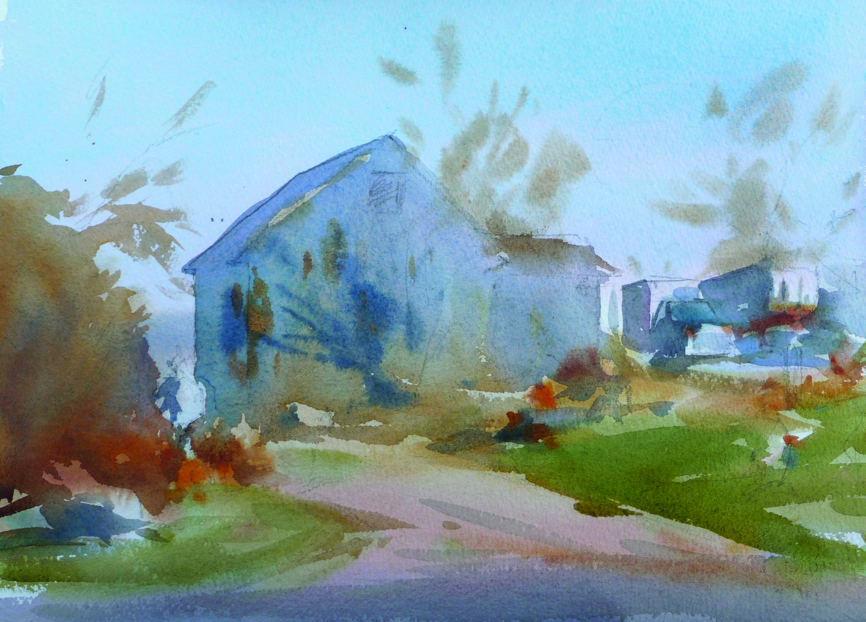
The scene Evansen paints in this demonstration
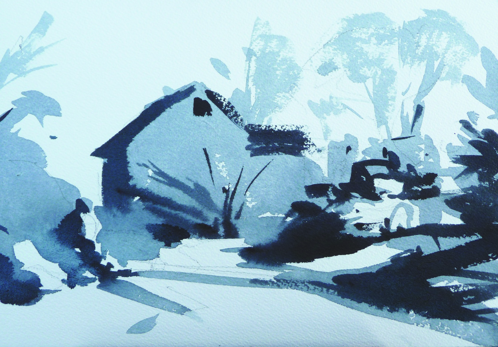
The completed 7 x 10-inch Payne’s gray value study
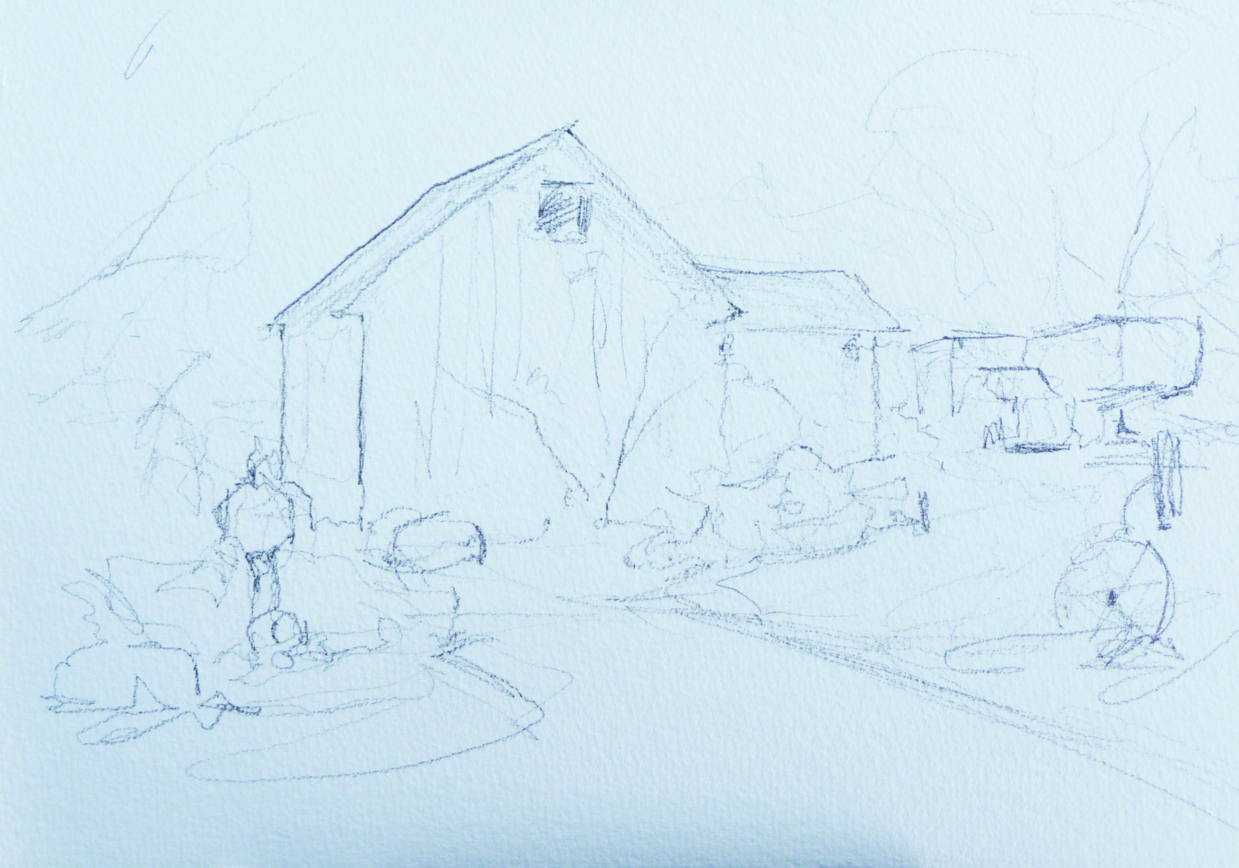
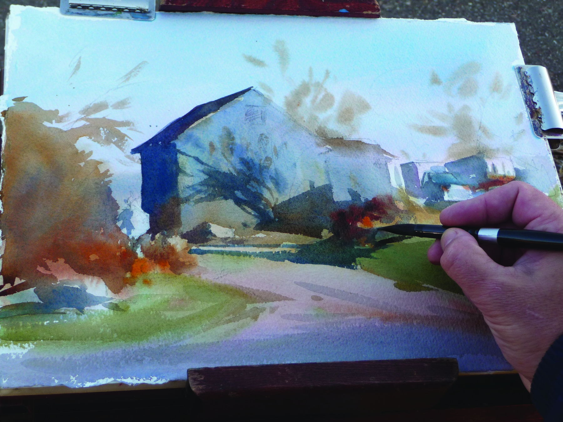
After completing the value study, Evansen draws the outlines of the shapes on another sheet of 300-pound Arches cold-pressed watercolor paper.
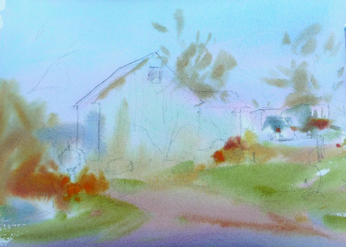
With his paper clipped to the easel, the artist applies broad washes of transparent local colors throughout the landscape.
Using thicker mixtures of paint and more calligraphic strokes of the round brush, Evansen marks the case shadows on the barn and across the land.
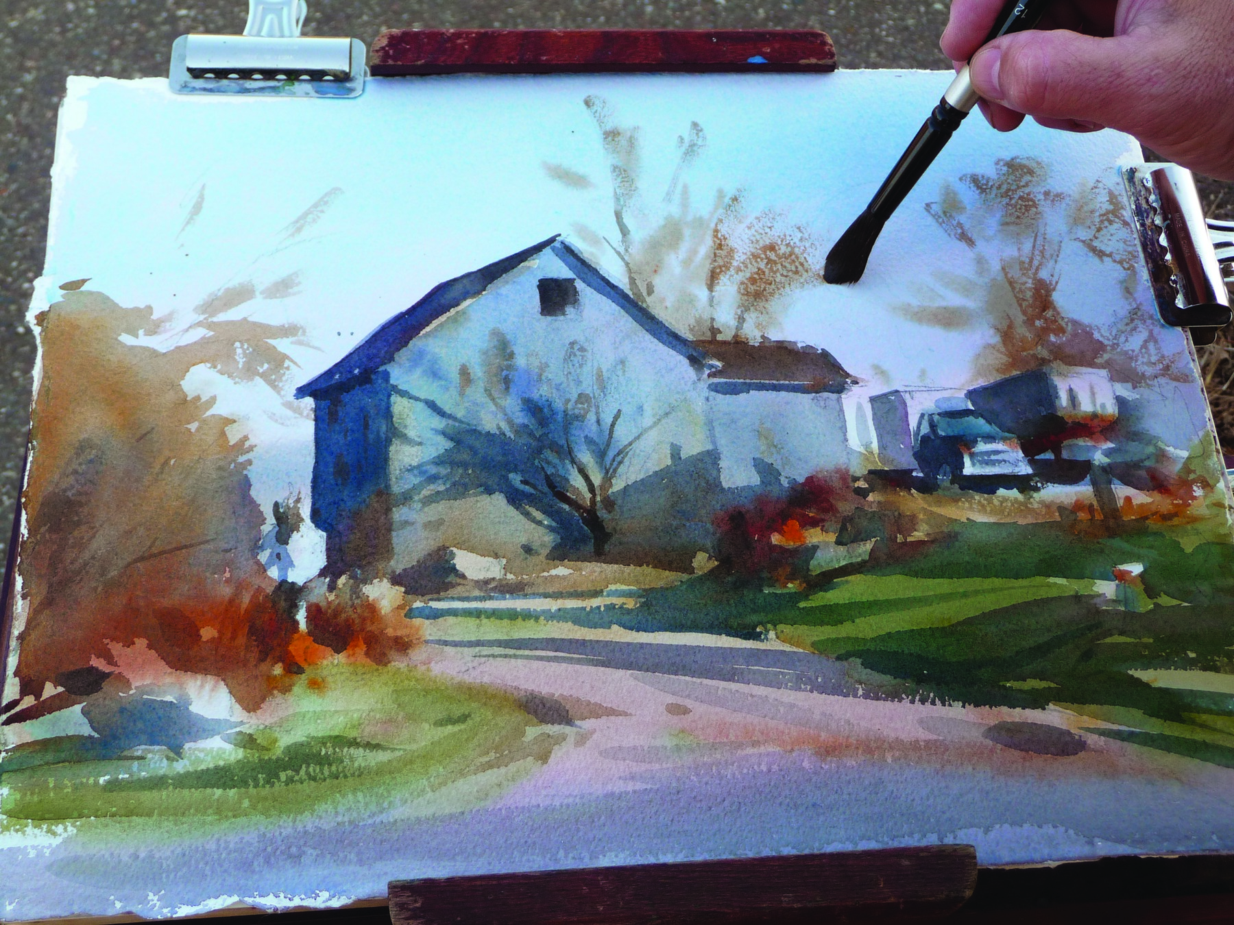
With his paper clipped to the easel, the artist applies broad washes of transparent local colors throughout the landscape.


Excellent article on Mr Evansen!
Both paintings are so beautiful. I love seeing the step-by-step process, as well as the value studies. These are so important and yet I skip this on most paintings. This loose, expressive style is what I’m after in my paintings, and this article is so helpful. Thank you Andy Evansen for this wonderful tutorial!
I was so lucky to be with Andy in Southwest France when he painted this
picture. I now own it and am able to look at it daily and remember the
great time we had on that trip. The sheep had just had their lambs and they were everywhere. He is a wonderful painter and I truly have been
blessed to have traveled with him to Italy as well for a plein air trip in
Umbria. Not only a wonderful painter but Andy is a truly sweet person and always makes everyone feel good about their work no matter at what level they may be painting. Thanks Andy for many memories and for many paintings of yours that we now own. susan and ivan
Inspirational as always my friend. Those value studies can certainly be the deciding factor whether a painting hangs together nicely or not, especially regarding linking your shapes!
Thank you for this step-by-step! Mr Evansen is my favorit “value” watercolor master!
really enjoyed your article on the basics that produce an interesting painting, cheers grant NZ
This was a great reminder of how to maintain that looseness needed in watercolor, and how not to keep fiddling with detail and muddy it up!
Thank you so much. Very thoughtful indeed. 🙏🙏
Excellant piece for someone who paints in Acryllic !!!
I love the watercolorist movement on paper. The value studies have helped me, thank you