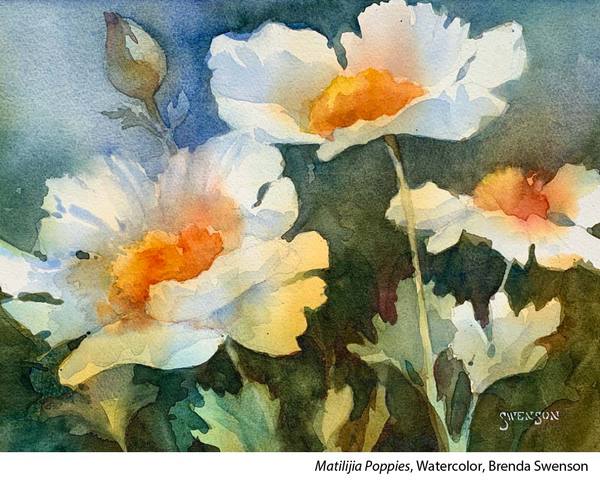
“The best description of watercolor is it’s alive,” says Brenda Swenson. “It’s a dance between you, the paint and the surface moisture on the paper, stepping into or pulling back. Watercolor requires you to stay awake and respond to what’s happening on the surface. Never turn your back while the paper is wet. I once heard someone say, ”Oil is like a dog, it wants to obey. Watercolor is like a cat, it does as it pleases”. I couldn’t agree more!
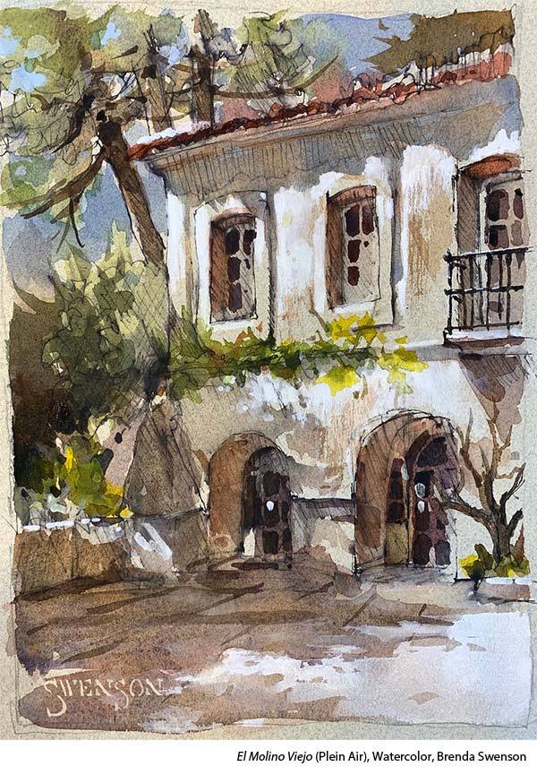
“Understanding your materials can save a lot of frustration, wasted time and money. Let’s start with paper. Watercolor paper isn’t something you want to skimp on. Every surface (cold-press, hot-press, rough) acts differently. Knowing how surfaces will react will save a lot of frustration. The weight of watercolor paper (90lbs-300lbs) varies greatly. Too light and the paper will warp, too heavy and the pigment soaks deep into the paper and slows drying time. Lighter paper, like 90 lbs, is fine for watercolor sketches, dry brush or light washes. Heavier papers, 140 lbs to 200 lbs cold-press, are my preferred weight and surface for painting.
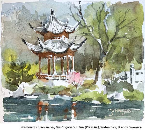
“Student-grade materials are a recipe for frustration. I would rather see students attend workshops with limited supplies that are artist grade than an abundance of student-grade paint, paper and brushes. In the past, good brushes were very expensive. With modern technology synthetic brushes can fool an experienced painter. You don’t have to over pay to have quality. Most people own more colors than necessary. You will learn more with a limited palette of eight colors. But don’t be cheap with watercolor paper!
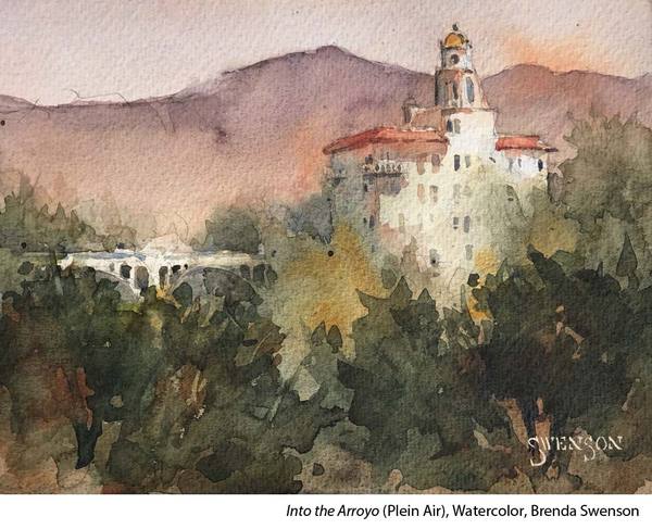
“Color is complicated. The task of understanding pigment as it relates to watercolor is compounded by understanding paint characteristics: granulating, staining, transparent, opaque and semi-opaque. Once someone wraps their head around these characteristics the possibilities of watercolor opens in new and exciting ways.
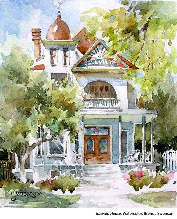
“I mainly use transparent paints and a few semi-opaque pigments. I like the freedom of being able to develop a painting with transparent colors without worrying the colors will go flat or muddy. I can create glowing surfaces with multiple glazes while creating interesting and complex shapes with each glaze.
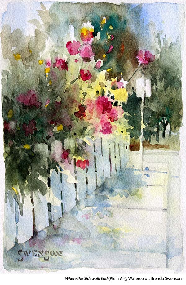
“There’s nothing wrong with opaques but they do not work for negative painting. My plein air palette has several opaque colors. Why? Opaque pigments are perfectly suited for creating body color and atmospheric perspective (fog, distance, skies…)
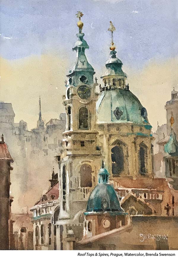
“Before the paint touches the paper. When I’m draw and laying out a painting I am literally walking through the painting in my mind. I’ve always thought of watercolor as a thinking man’s (woman’s) medium. There’s no wiping off a section and starting new. I failed painting is a humbling experience. With that being said, a failed painting is a great teacher.”
“Think like a turtle, paint like a rabbit.” ~Sergei Bongart
Watercolor Terms Defined
PAPER
Rough – A pronounced, varied texture, great for a textured loose feel.
Hot-pressed – A very smooth surface and almost no tooth. Good for painting detailed paintings and creating very smooth washes.
Cold-pressed – A slightly textured surface compatible with a variety of techniques and applications.
COLOR
Granulating — when water is added to watercolors with heavy pigment particles, the pigments separate from the binder and settle into the “valleys” of the paper. As it dries in the “valleys” it leaves a grainy texture.
Staining — colors that absorb into the paper before the water has had a chance to evaporate; they’re difficult to lift and will leave a stain on the paper
Transparent — paint consisting of pigment mixed with gum arabic, glycerin and a wetting agent
Opaque — the opposite of transparent or translucent, opaque watercolor reflects light rather than letting light pass through it.
Drybrush — brushwork done on the dry surface of the paper
Brenda Swenson (and upcoming CCP artist- add your name here to learn more when her video comes out!) is an artist, author and watercolor instructor. Her artwork has been featured in numerous publications including Splash, Watercolor Artist, Watercolor Magazine, Plein Air Magazine and many others. Brenda has achieved signature status in WW, NWWS, and SDWS. An active participant in the arts community she has served on the board of directors for the National Watercolor Society and Watercolor West. She is in demand to judge shows, demonstrate and teach workshops to groups nationwide and abroad.



Hi Kelly, since getting a jump start on my learning to watercolor, thanks to Covid19, of course I’ve watched many tutorials, and jumped in with 2 feet and made cards for a few different occasions, I always find myself wondering where is the right place to start on a painting. I know it must vary, depending what you’re painting, but is there a rule of thumb somewhere in there I’m just not getting? I’m now looking at everything thru watercolor glasses. Lol I knew I’d love it!
Thanks for your time,
Michelle