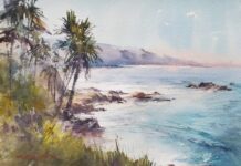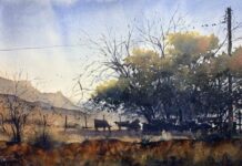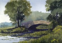

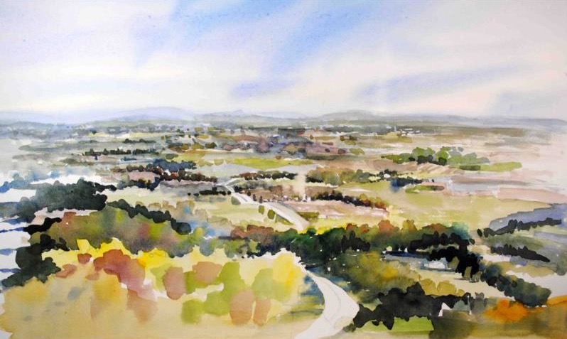
Each week for five weeks, we’re sharing the regional palette wisdom of one accomplished watercolorist, drawn from a feature in PleinAir Magazine. If you’re just joining us, you can find earlier installments here. This week, we head to the Southeast.
THE SEASONAL LANDSCAPE OF VIRGINIA
Few regions in the country demand as much palette flexibility as central Virginia. With four distinct seasons — each bringing its own temperature, light quality, and color character — Catherine Hillis has built a palette capacious enough to handle all of them. “The colors not only change with every season,” she says, “they often change within a season.”
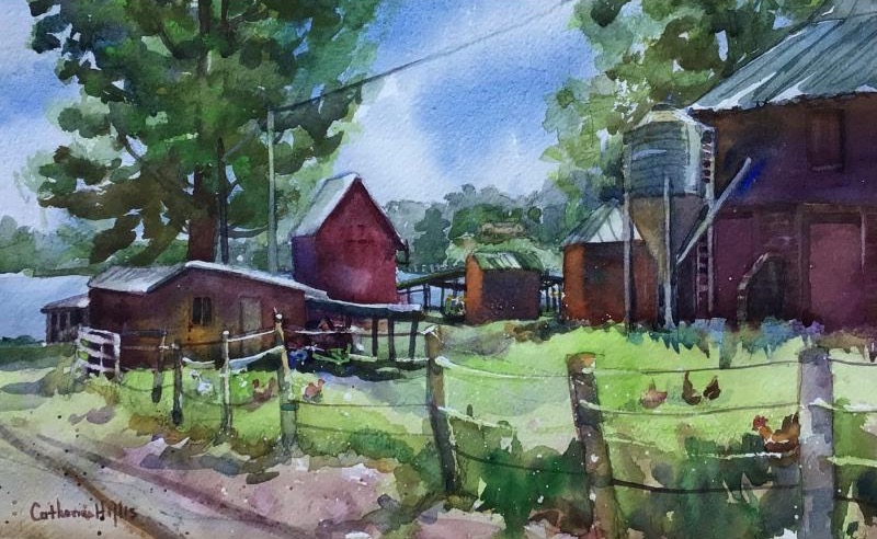
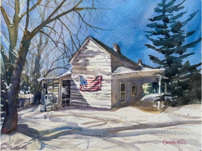
Spring arrives cool and acidic — epitomized says the artist by “the American Journey color Skip’s Green,” along with a variety of whites, pinks, and reds — but it ends with warmer lush greens and richer hues. By mid-summer, the Virginia landscape deepens into the full complement of complex greens that define the region. As the season wanes, those greens take on what Hillis describes as an almost “tired” appearance — shifting from yellow-based to Burnt Sienna-based mixes. Fall explodes into the full spectrum, while winter can go warm and luminous on a sunny snow day, or icy and blue on the coldest mornings.
Threading through all of it is a growing sensitivity to color temperature — a quality Hillis considers one of the most important and hardest-won skills a painter can develop. “As my ability to discern color temperature has grown, so has my palette,” she says. “I think being able to differentiate and then paint color temperature and atmosphere is a marvelous thing and one which develops over time.”
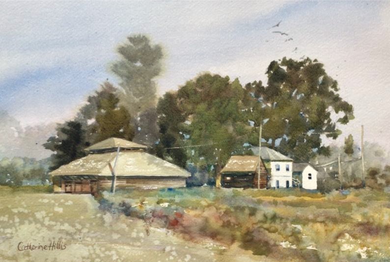
Her must-haves reflect that philosophy. Ultramarine Blue (Daniel Smith) anchors the palette — dark enough to build toward black, and warm enough to suit her preference for paintings with a warm overall temperature. Quinacridone Gold (Daniel Smith) is her go-to yellow: clean, bright, and transparent without the opacity that plagues most yellows. For her red, she alternates between Quinacridone Rose (Daniel Smith) and Quinacridone Magenta (Daniel Smith), the latter valued for the sense of depth it brings to mixes. And Neutral Tint (Daniel Smith) earns its place as a reliable path to dark values. “I can mix it with any color to make various shades of gray to black.”
Among her more unconventional additions is lavender — not a color typically associated with landscape painting, but one that Hillis reaches for constantly. “I use lavender a lot in landscape painting because it’s a lovely color — one I see often in the misty foothills of the Blue Ridge Mountains,” she explains. “It also mixes beautifully to create subtle shades of gray.” Equally unexpected is Lunar Violet by Daniel Smith, which she has recently added. “It does unexpected things if I leave it to do its work,” she says — particularly in stormy skies, where its behavior in wet washes creates effects difficult to achieve any other way. For summer foliage, she relies on Daniel Smith’s Primatek Greens — Serpentine Genuine and Green Apatite Genuine among her favorites — for their granulating quality and realistic color. And for focal points, she keeps a tube of Holbein’s Horizon Blue close at hand. “Just a pop of it can draw the eye,” she says.
What ties all of these colors together is the way Hillis deploys them. Rather than working from a fixed palette, she selects a fresh triad of primary colors for each painting — one red, one yellow, one blue — chosen to match the season, the light, and the mood of the scene in front of her. The result is a palette that shifts constantly, even as the underlying approach stays the same.
In early spring, the aforementioned Skip’s Green is essential — nothing else captures the fresh quality of new leaves. For yellows, she leans on Quinacridone Gold, Lemon Yellow (Daniel Smith), and Bumblebee Yellow (American Journey). Her blues are Ultramarine Blue, Cobalt Blue (Daniel Smith), and Cerulean Blue (Daniel Smith). And her reds are Quinacridone Rose, Alizarin (Daniel Smith), and Red-Hot Mama (American Journey).
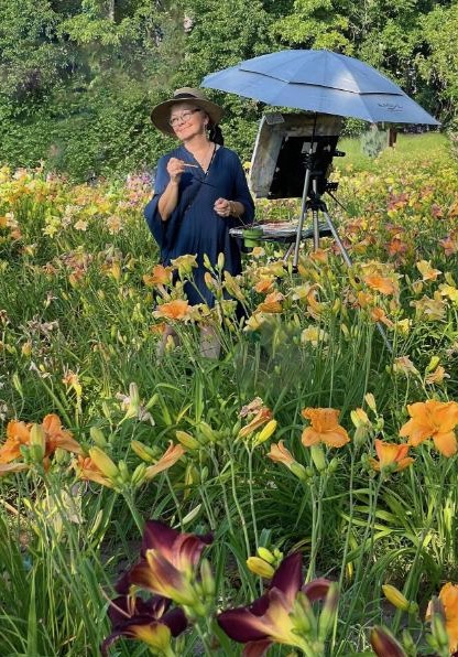
As summer deepens, she pulls out all her tube greens alongside her mixing palette, adding the Primatek greens for depth and complexity. As the foliage ages and warms, Burnt Sienna (Daniel Smith) replaces yellow in her green mixes. Fall calls for Perinone Orange (Daniel Smith) in addition to her full summer palette, with Quinacridone Gold, Quinacridone Rose, and Red-Hot Mama doing heavy lifting — though she cautions against overindulgence. “The real issue is overusing color,” she says. “It’s important to limit your palette and intermix frequently to create a unified painting.” Winter in the south can bring swings in color temperature, depending on the conditions. But for snow, “there’s nothing more lovely than the sparkle of pure white paper,” she says.