
For centuries, watercolor artists have struggled for recognition of their medium as equivalent to others in importance, stature, and value. Over the past couple of years, a group of top watercolor artists have explored the use of varnishing techniques generally reserved for oil or acrylic paintings to display their work.
Sponsored by Golden Artist Colors, Inc., and curated by Laurin McCracken, an exhibition of these artists’ works will be on view at The Painting Center in New York City through October 2, 2021.
“Aptly titled ‘Breaking Glass,’ the show is about removing glass as a barrier to the viewer as well as breaking the glass ceiling of arbitrary values placed on a medium and not on the work itself,” said Golden Artist Colors CEO, Mark Golden. “We continue to devalue the work of many incredibly talented artists because they have chosen the medium of watercolor. We have created a devalued market for their work, not based on aesthetics or merit, but on the fact that the work is created in paper and exhibited behind glass. We hope this show will shed light on a topic needing many further discussions and changes in the future.”
Artists featured in the exhibition are Laurin McCracken, Rance Jones, Michael Holter, Matthew Bird, Lynn Pratt, Thomas Bucci, Wash., James Maria, Iain Stewart, Frank Spino, and David Stickel.
Matthew Bird
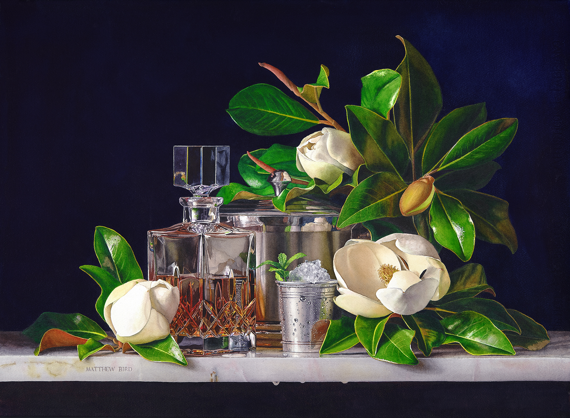
Varnished Watercolor
22 × 30 in.
“The subject matter of my figure and still life paintings communicates my deep love and respect for nature and life. Some paintings stem from a joy or narrative that is from my own experiences. Other pieces reflect the simple beauty I find in everyday objects composed together. I have focused on developing my craft to capture the beauty of what surrounds me with precision and clarity and strive to convey that to all people through the universal language of representational art. It is my desire that when others see my work they may be inspired by the perceptible signs of the real Creator.”
matthewbird.com
Matthew Bird explains the process he uses to varnish his watercolor paintings here.
Thomas Bucci
Varnished Watercolor on paper
11 × 15 in.
“I’ve chosen watercolor for its gestural quality, capriciousness, and spontaneity. The ability to quickly suggest form with loose washes and conjure the illusion of detail with crisp brushwork has always appealed to me. This approach to watercolor requires me to work quickly, and I’m willing to take the risks associated with that to realize its potential.
“Sometimes a landscape serves up a ready painting idea and I can use it directly. More often ideas come from something less complete; a glimpse of atmospheric effects, the way sunlight lands on a surface, or an element in a landscape. I paint or sketch at every opportunity with the goal of putting these ideas down on paper.”
thomasbucci.com
Michael Holter

Watercolor
20 × 14 in.
“I want the viewer to enter into the painting and liner with me as I explore the landscape or the character of the subject’s facial features. Each painting that I work on is an adventure that is unique and different from any that have gone before. Since I paint with an impressionistic attitude, even if painting the same subject multiple times, the result is something completely new and often, more expressive than a previous version.”
michaelholter.com
Rance Jones
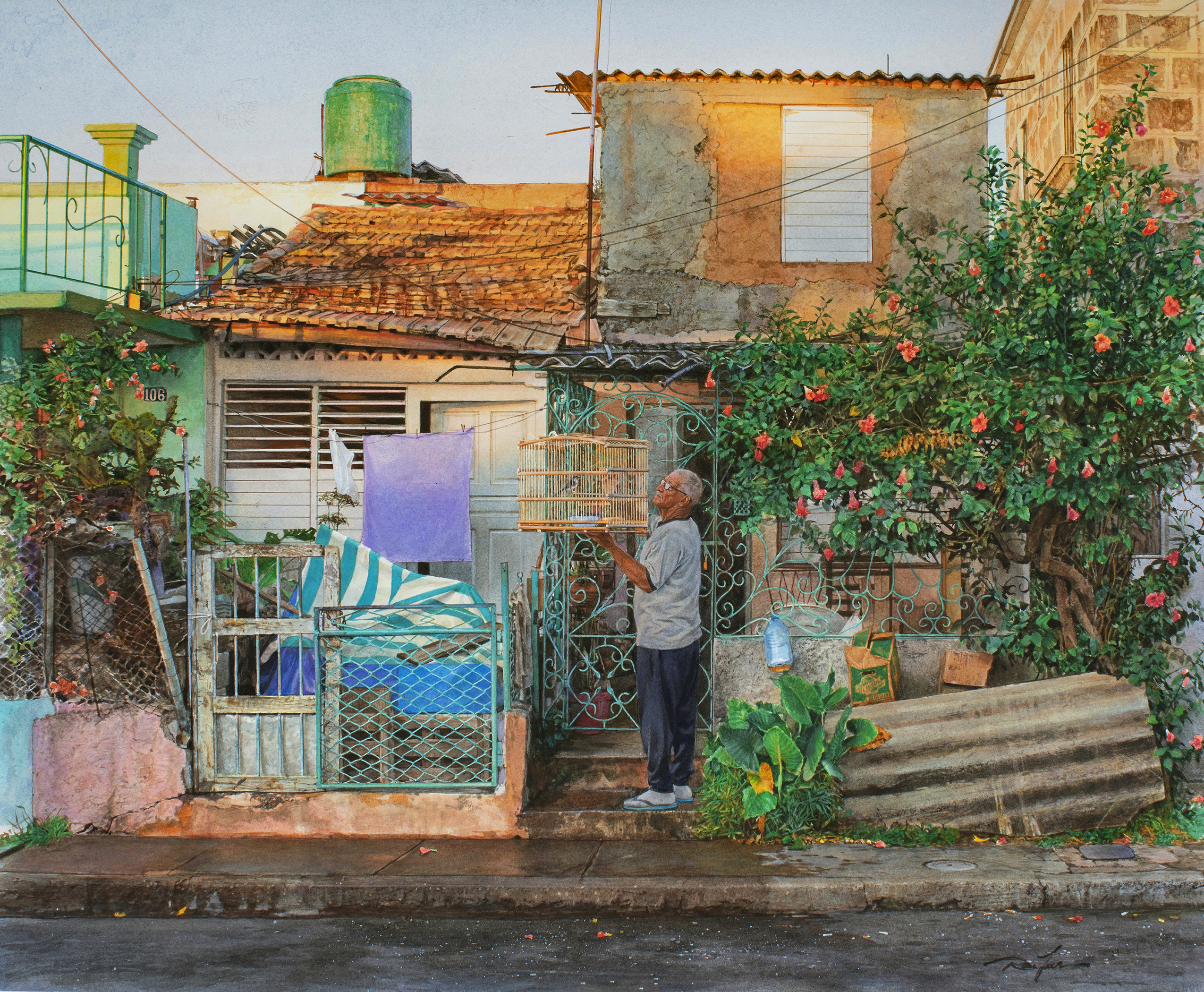
Watercolor
21 × 25 in.
“My paintings are social narratives relating to modern Cuba. Within each work, the symbolic nature of the subject’s body language and expression reveal the emotional connection Cuban people have with their surroundings and gives insight into the social realities that shape their lives.
“I paint in a highly realistic style so that the viewer can direct their attention at the subjects of the painting and consider the work from an existential standpoint. Every element of the composition is subtext woven into the narrative; a crack in a sidewalk, distressed textures on a wall, a plant, a sunrise, a door frame, a person’s face. Elaborate, vibrant and complex, my paintings, in a visceral sense, mimic the lives they portray.”
rancejonesart.com
James Maria

Varnished Watercolor
12 × 16 in.
“I employ the visual language of entropy and abandonment to discuss shifts in economy and industry while also developing a lexicon to ask universal questions about the metaphysical — more specifically, cycles of spiritual desolation and consolation.
“By depicting the apparent struggle between the natural and synthetic worlds, I intend that the rusted, crumbling objects and spaces that I chose to paint stand as monuments, not to human ingenuity, but as documentation of the process by which the remnants of industry and invention often fade. I offer gentle reminders that nothing of this world truly lasts.
“In the processes of oxidation and decomposition, human imposed “order” tends toward the apparent disarray of natural order. I propose that these images bear witness to the simultaneously destructive and restorative essence of that struggle.”
Jamesmaria.art
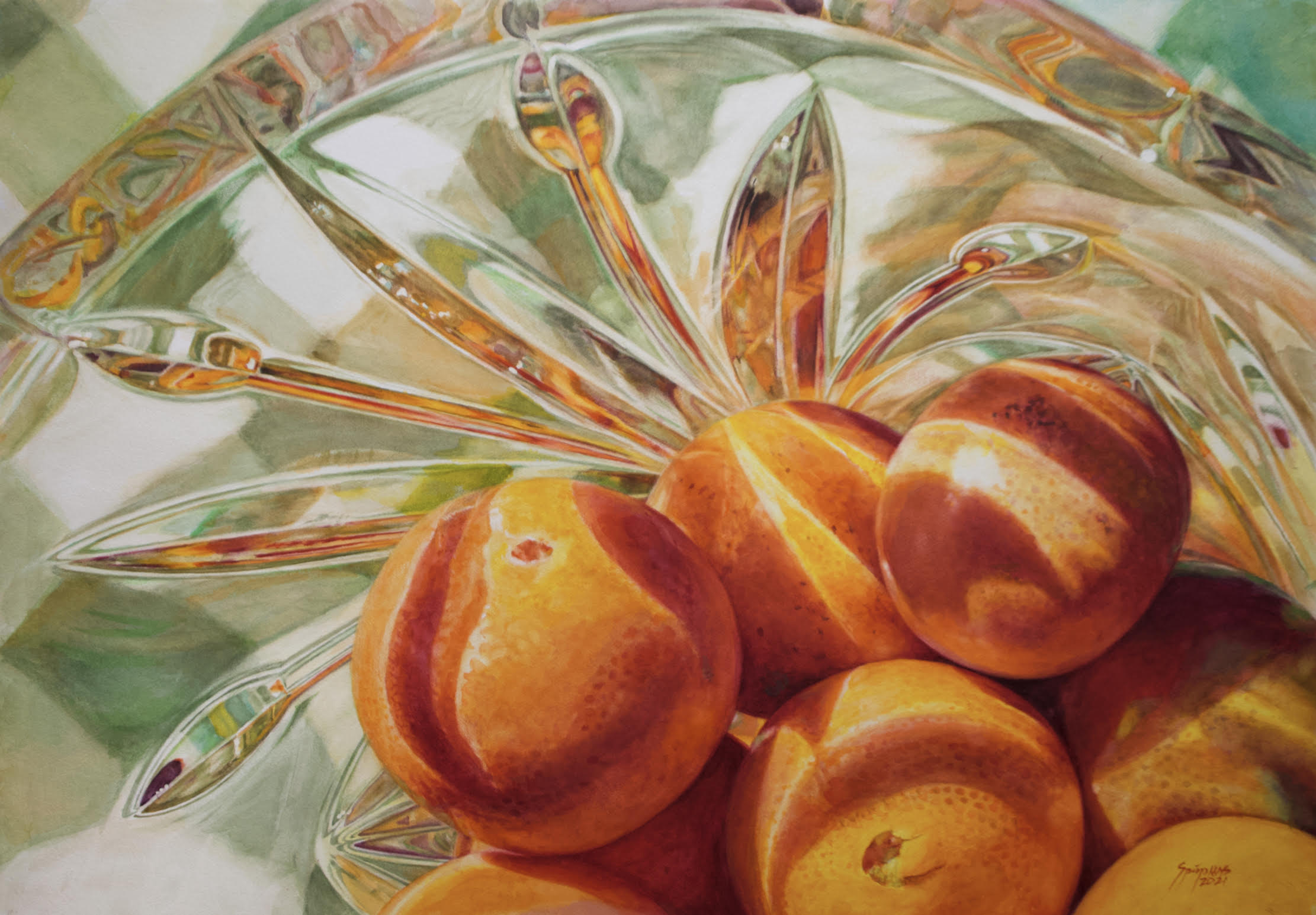
Laurin McCracken

Watercolor
26 × 20 in
“I am a realist watercolorist whose work is largely influenced by the Dutch and Flemish Still Life painters of the 16th and 17th centuries.
“My goal is to record the world around me with a high level of detail. This is not a painting style that is typically associated with the medium of watercolor. Look closely at one of my painting and you will not only see the objects in the paintings, but you will also see reflections of other objects within the very objects I paint.
“I use my ability to see things with a high level of acuity to transcribe what I see in the world around me into watercolor on paper. I use this historic influence to record the beautiful things in our lives: the flowers, ornate crystal and silverware, clouds, the glassware I grew up with, toys and anything that attracts my eye and spurs my imagination.
“When I look at the world and think about what I might paint I am reminded of the quote from Henry David Thoreau: “It is not what you look at that matters, it’s what you see.” Then I ask myself, ‘Can I paint that in watercolor?’ ”
Lauringallery.com
Lynn D. Pratt
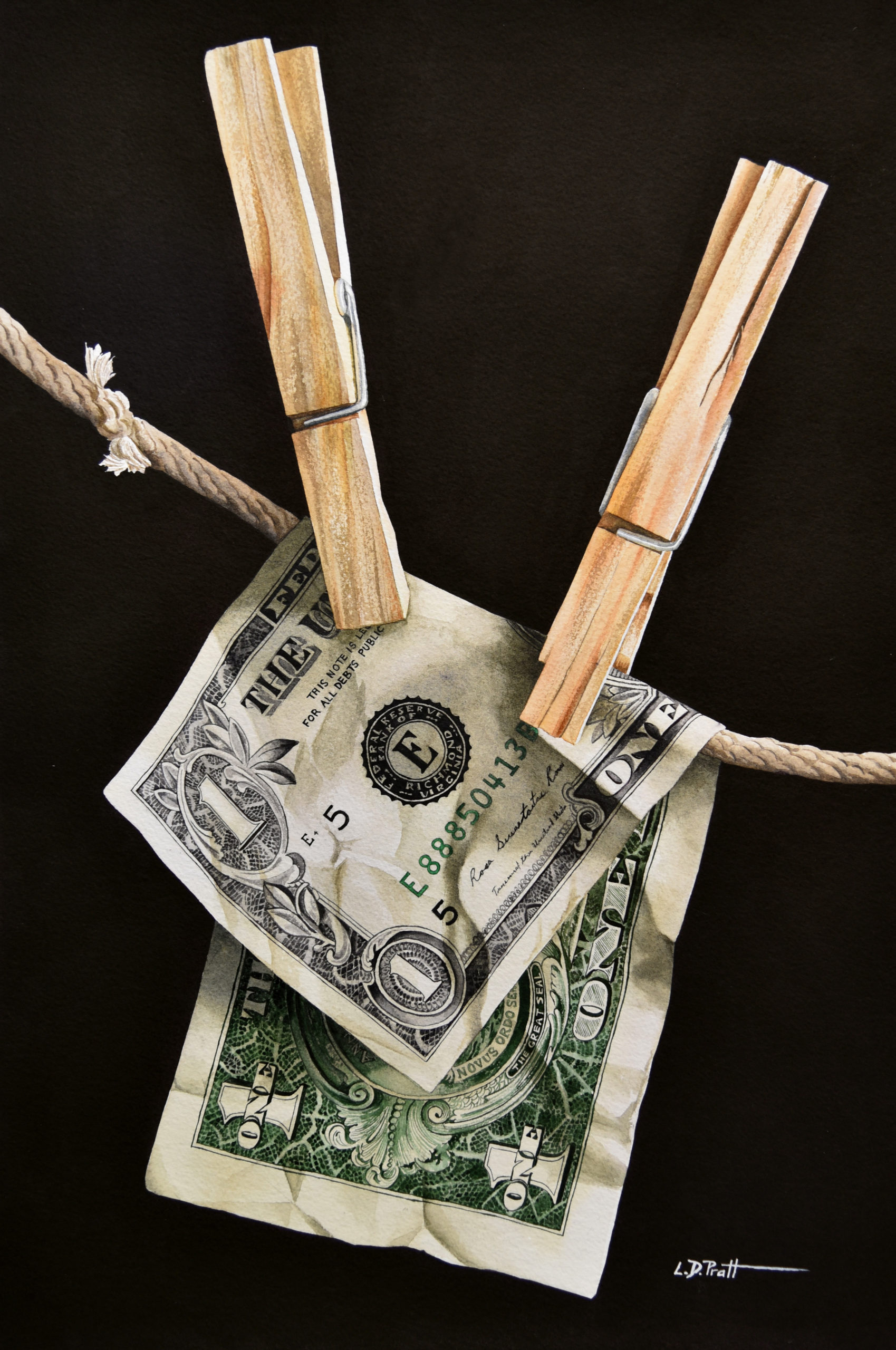
Varnished Watercolor
22 × 15 in.
“I enjoy painting in a very photorealistic style. My perfectionist nature from a career in architecture is evident in all of my art. I like every detail of my paintings to be realistic and authentic. I want to give viewers a different perspective on the things they see in their daily lives, something that they might pass by every day and never truly notice. I focus on sometimes small, everyday objects and paint them large so you can see and appreciate every detail.”
lynndpratt.com
Frank Spino
Watercolor
29 × 41 in.
“Life is beautiful. Can I capture a single, fleeting moment of light and suspend it, timeless in a picture frame? This is my quest.
“I am moved by strong light, rich color, and full plastic form. I feel the need to model form in color, which follows after my first love — drawing. Now I am able to create in color what once I could only capture in shades of gray.
“My goal is to make a painting with accurate color and engaging compositions that share a moment that moved me.”
frankspino.com
Iain Stewart
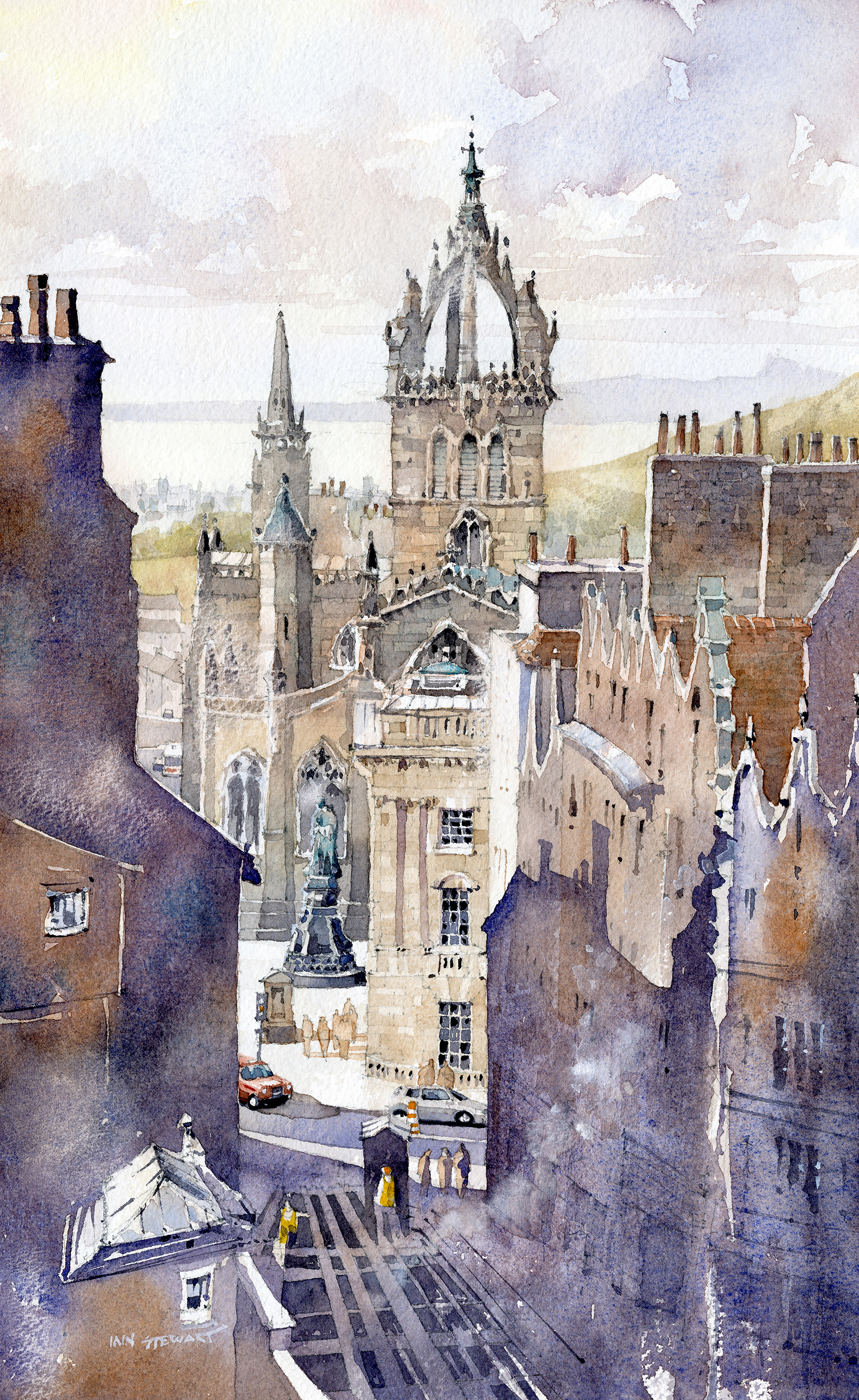
Watercolor
17 × 11 in
“I am trained as an architect and, as such, approach painting design with a very similar sensibility. I feel that I need to communicate the vernacular of place in a way that is deeply personal to me. I embrace a dialogue between the real and imagined- seeking a way to allow myself to express my personal feeling of being in a certain setting rather than being confined by the reality of it. That ebb and flow, the back and forth, are what I find important and is the motivation for all of my work.
“In deciding on painting surfaces for this exhibition I wanted to show how a few of my papers react. I have a vellum surface 100-lb., a 140-lb. cold-pressed, and finally a robust 300-lb. rough. The results achieved on each paper vary considerably and this is evident in the final varnished work without disguising or altering the qualities of each paper; varnishing accentuates these differences with gratifying results.”
stewartwatercolors.com
David L. Stickel
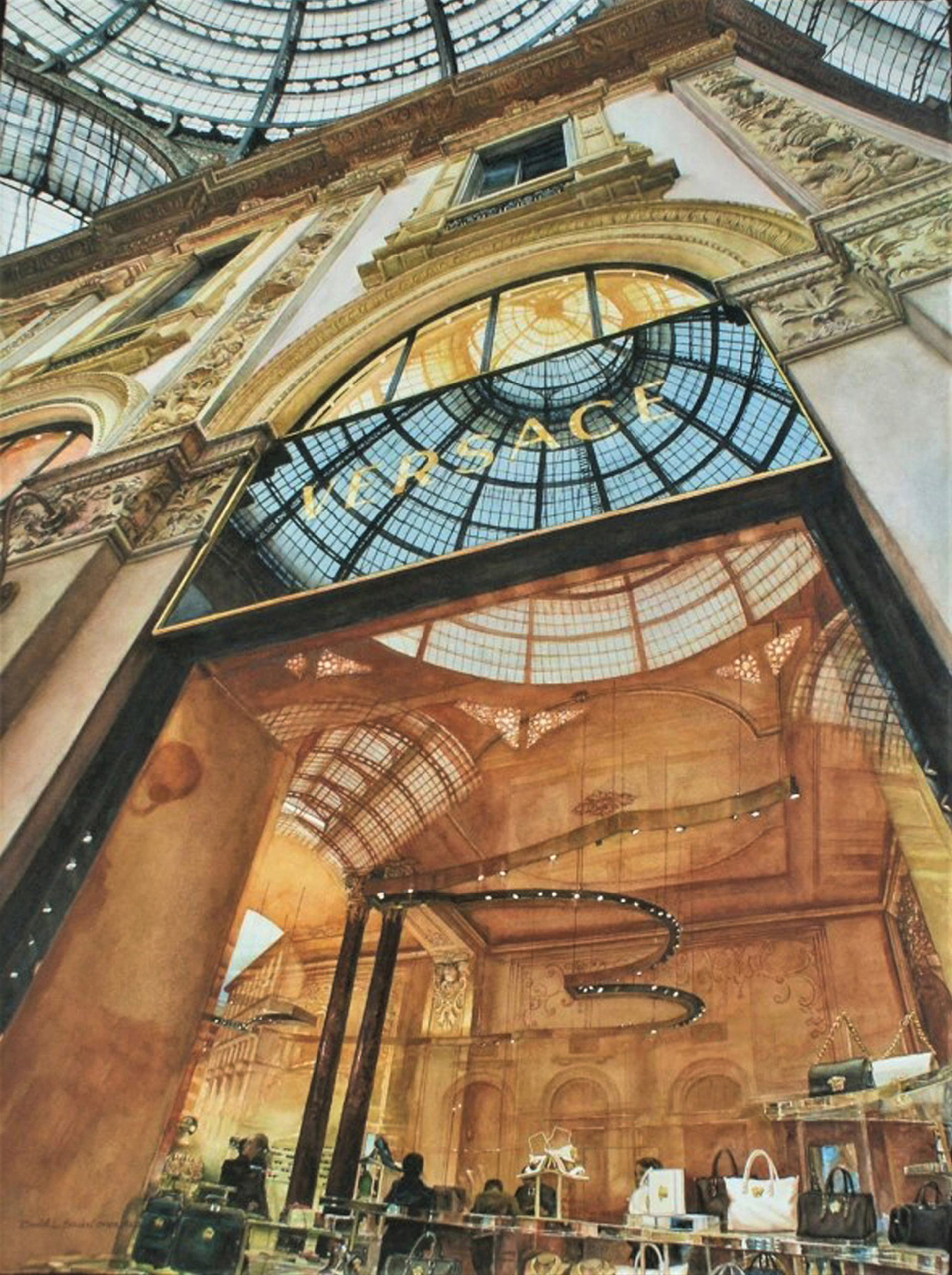
Watercolor
30 × 22 in
“They are headaches, but I truly love them — I love laboring over detail!
“When I choose a subject, my mind’s eye and creative soul seek out a composition that is so complex that few would attempt such a painting.
Messages that windows convey come alive – from the objects displayed inside the window to the contrasting world reflected in the glass – all intricate representations of life stories. I push the intensity of the colors to draw the viewers in. I seek to capture their attention long enough to marvel at everyday treasures that we usually hurry past.”
DavidLStickel.com
For more inspiring stories like this one, sign up for our free weekly e-newsletter.


I hate glass! Finally! A fresh perspective on the medium. All of my work is UV Archival Krylon Varnish treated / sealed.
Do any of these artists use cold wax as a finish. I am wondering how it holds up to the elements.
Sure wish I could see this exciting show!
Also, Michael Holter is from Plano, Texas, not Virginia as listed in the article.
Such a great concept and initiative to explore new options and shed new light on this fabulous medium! Bravo.
What about shows that do not accept this approach? I stopped doing traditional transparent watercolor because of the cost of glass.
Has the industry changed ??
Mathew Bird has a beautiful video on YouTube- how to varnish, and does offer an amazing workshop every now and then – I would look out for it. Or go on his website and let him know, he will let u know when and where. It’s worth it !