
Karen Knutson started painting representational watercolor before realizing she needed a change. She made the jump to abstraction and never looked back. Today, her focus is less about reality and more about strong design and color.
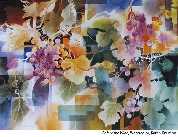
“About 20 years ago, I was still participating in art fairs,” she says, “and I began doing semi-abstract paintings where one could see through the objects [see “Before the Wine” for an example of this work].
“I remember my husband being skeptical about the change, worrying that I would eliminate both traditional and abstract audiences. But I told him, ‘Maybe it will be exactly the opposite; that the traditional clients will be excited by the change, because they can see something recognizable in it.’
“It worked! My sales went up and the change was well received. Then after I quit doing art fairs, I hardly ever would do traditional work. I get really excited at the challenge of abstracts. I never know exactly how they will turn out and that mystery excites me. I used to belong to a networking group and I remember announcing, “I don’t care about sales anymore. I just want to paint what is in my heart!” The next person was a stockbroker who said that she felt exactly the opposite, and we all had a good laugh.
“I still think, I’m the happiest of them all, doing what I LOVE! My husband made a good living, so I have to admit that relieved a lot of stress on my choices about my art. But I truly believe that I sell more when I paint from my soul.”
MOVING AWAY FROM REPRESENTATIONAL PAINTING
“Design is my number one consideration,” she says. “So I almost always begin every painting with a value sketch, featuring only two values, light and medium. (I add darks only when the painting is three quarters completed).
“At the beginning, I ask myself what emotion I want to portray. I use bright colors for happiness and dull colors for somberness. With my acrylic paintings, I put on paint, then I remove part of the layers using rubbing alcohol. As I do this, lots of times, an image will evolve. Then I’m off and running!
“Many times, I add something recognizable, but I still try to keep lots of mystery in the artwork so that the audience can also get involved in the story. One of the challenges as I work, is when I really LIKE a certain portion of the painting. That’s a real problem because I constantly go around that spot to protect it. Then, inevitably I still need to paint over that portion to make the whole painting work.
“I think the main thing artists who want to move to abstraction need to remember is to develop their design skills, and then they are three quarters of the way there! I used to be attracted to paintings for their colors, but now, it’s all about DESIGN.”
WATERMEDIA PROCESS
“I have umpteen sketchbooks filled with two-value sketches. I page through them and see which one hits me on that particular day. Then I cover the whole paper with an acrylic underpainting that usually is the opposite color from what I’d like to have at the end. The reason for this is that I sprinkle water drops on each layer and expose some of the color that is underneath.
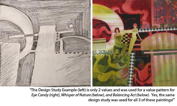
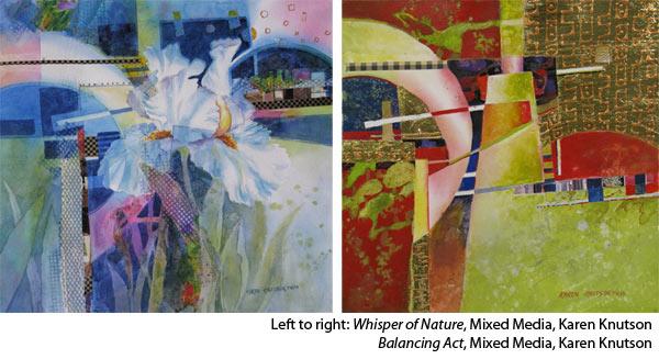
“At this point, I refer to my value study and create a ‘light pathway’ using rubbing alcohol. This light pathway will ultimately lead the viewer’s eye through the painting. I build up the mid-tones, being careful to preserve a little bit of each layer, so that my painting will have depth. I’m constantly referring to my value sketch, but I’m also very open to whatever happens on the paper that may be better than my original plan. I try to be open to change. My husband would disagree with that general statement. In real life, I don’t like change, but in my paintings, it’s my time to be wild and carefree! When I’m comfortable with the design, I punch up the center of interest by adding the darkest values and some “wow” colors that command attention.”
ADVICE FOR FOCUSING ON DESIGN
“Remember 3 words: Repetition, Variation, and Dominance.
“When I draw my two-value sketch, I’m constantly trying to repeat things, but vary them. For instance, if I have a vertical thin path, I will repeat that thin shape but make it a horizontal. (That’s variation.) If I have a smile shape, I will make a curve somewhere else, but make it in a frown shape. Then when I’m done with my two-value sketch, I ask myself, is there domination? I check for dominant values, curved lines, angular lines, soft edges, hard edges, texture, etc. Sometimes, I also do color studies before starting the actual painting. Then I make sure that it is a cool or warm painting. One of those needs to dominate. I find that I get into less trouble when I use a limited color palette of no more than four colors.
I feel there is too much to remember with all the principles and elements of design. So, I concentrate on just those three: Repetition, Variation, and Dominance. I turn my painting upside down to check for balance, and to see if I have a center of interest. When I am completed with a painting and not satisfied, I check those 3 words and it’s always an easy answer of how to make the painting better.”
WARM-UP EXERCISES
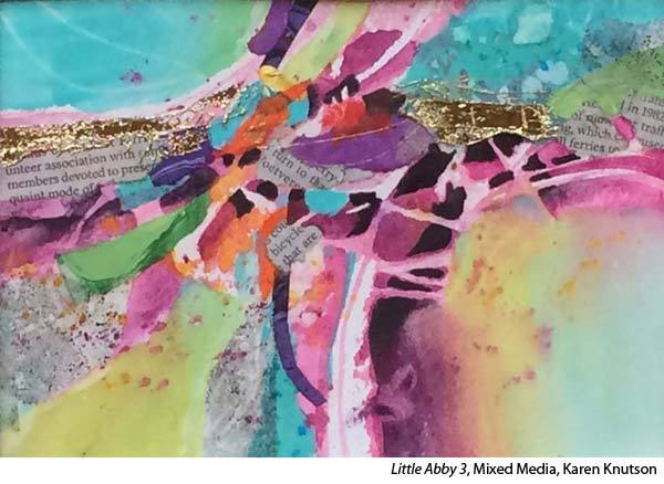
“I make small abstracts, which I call Little Abbeys, starting with a drybrush method and then adding collage to enhance the colors. Layers of watercolor are added to “knit” the collage into the painting. They take about one hour to do and, many times, I like the results so well that I use them as my color study for a larger painting.
“I also have a watercolor color study warm up where I limit myself to only 3 colors. I make 3 shapes on the paper and color each of them a different color. Then I use a glazing process to create many beautiful grays and new color discoveries.
“Sometimes, I use only collage to produce a small 5” x 7” study. I use a glue stick, torn up magazines and actually do them on airplanes. They are very fun to do.
“If I haven’t painted for more than a week, I find warm-ups less intimidating than a big white sheet of watercolor paper. I don’t do much painting in December because I love Christmas decorating, baking cookies, parties, etc. It’s the only time all year that I give myself a break from painting. In January, it’s actually scary to face that white paper, so small paintings are less intimidating. They also get me back into the rhythm of remembering good design!
“I once did a 30-minute study, using Tombow markers, every day for a whole year! Yes, every single day (except for one day that I forgot). I tell my students that if they do this, it will be better than any workshop they will ever take. I learned so much while doing this.
“The reason I limited them to 30 minutes was that I wanted to limit the number of shapes and get to the heart of the painting in as short a time as possible. After the first 30 days, it was very evident that I had made a breakthrough and that my studies were getting better and better. These markers work great for this because they work like watercolor and dry quickly.”
ABOUT THE ARTIST
Karen Knutson is a signature member of the Transparent Watercolor Society and teaches nationally. She shares her process in the DVD, “Fun With Mixed Media With Karen Knutson.”


Thank you so much so helpful
Maureen
Thank you for sharing. I’m now trying my hand at abstract and your advice will help me. Gail
Wonderful
Karen is such a wonderful teacher and artist. I have taken multiple workshops with her and own several
of her paintings. She always brings something new to a workshop and more often than not, it’s something that sticks with me.
What an interesting article! Karen does such interesting and unique work.