
“In transparent watercolor, the white of the paper is precious,” says Brenda Swenson. “I have experimented with using masking fluids and tapes to save the areas I want for my whites and lights, but found the end result harsh-looking or unnatural. Instead, I simply paint around the areas I want to preserve, hence the term “negative painting.” It’s what we don’t paint (the white of the paper) that becomes our glowing lights. Think of it like carving stone, chipping away until only the most precious elements remain.
“In this demo, I start simple and work towards the complex, building up shapes with glazes (transparent colors laid over dry, previously painted areas) and capturing the color in the reflected light and shadows of my subject.”
TYPES OF SHADOWS
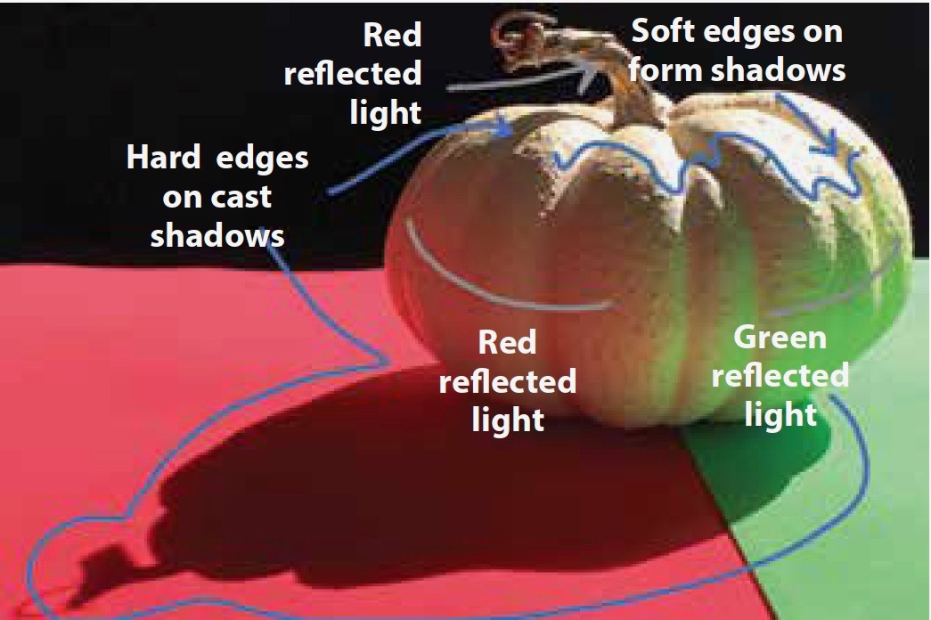
Cast shadows suggest the shapes of the objects that cast them and have distinct edges. The further a cast shadow is from the source, the more it is infiltrated by light; as a result, it becomes warmer, softer, and paler. Cast shadows are darker in value than the objects on which they’re cast.
Form shadows are delicate in appearance and play an important role in making a subject appear three-dimensional. Form shadows are lighter in value than cast shadows. Because form shadows aren’t created by a blocked light source, but by turning from the light source, they also have softer or less-defined edges.
WATERCOLOR TUTORIAL | NEGATIVE PAINTING
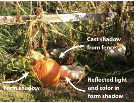
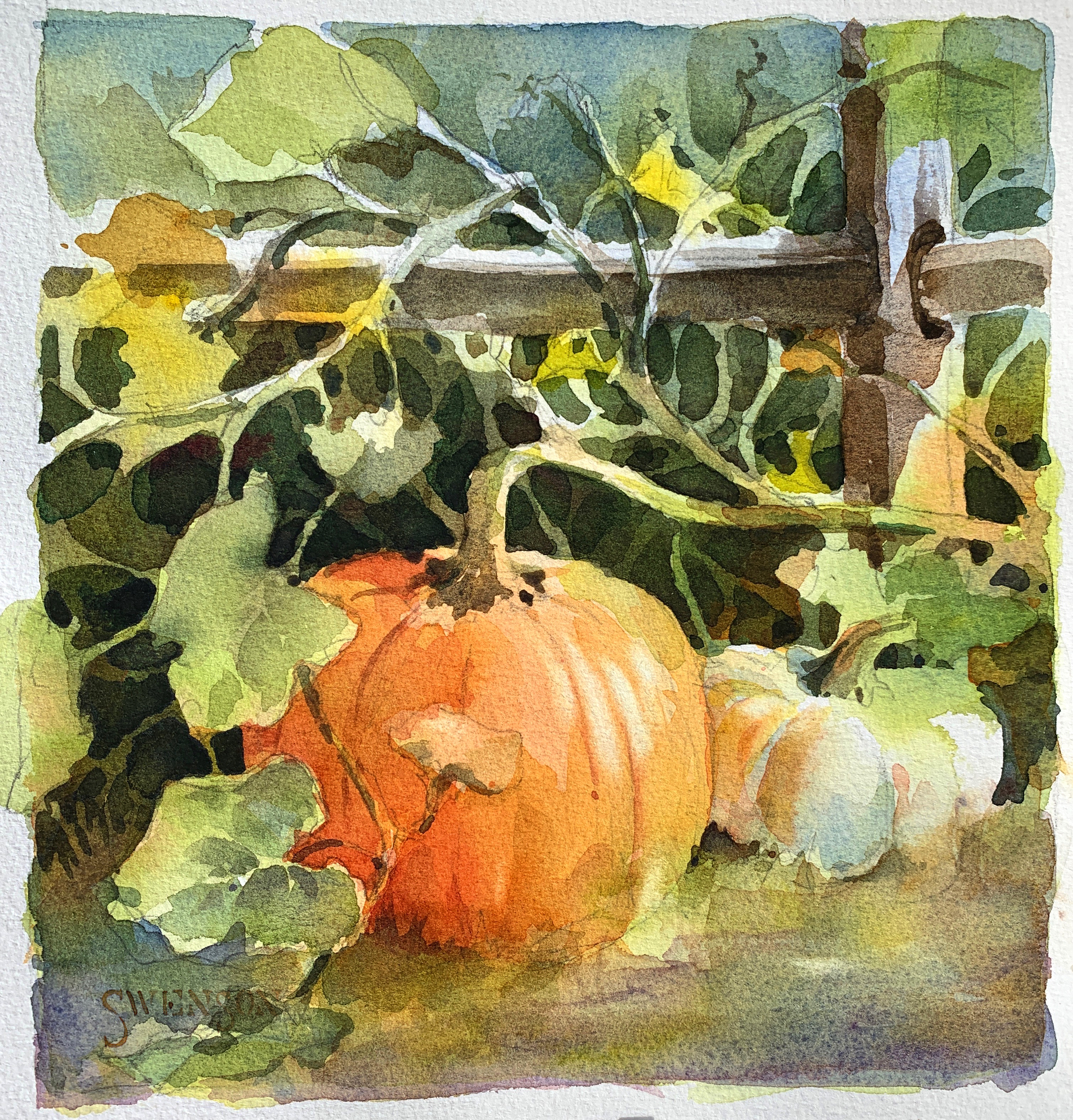
View of the scene
The illuminated area near an object reflects, or bounces, light into the shadows and carries color with it — this is called “reflected light.” The orange pumpkin on the left has form and cast shadows. For my painting, I edit out the cast shadow created by the fence rail that ran across it (yes, I can do that). On the white pumpkin, the color in the form shadow comes from the light reflected off the orange pumpkin.
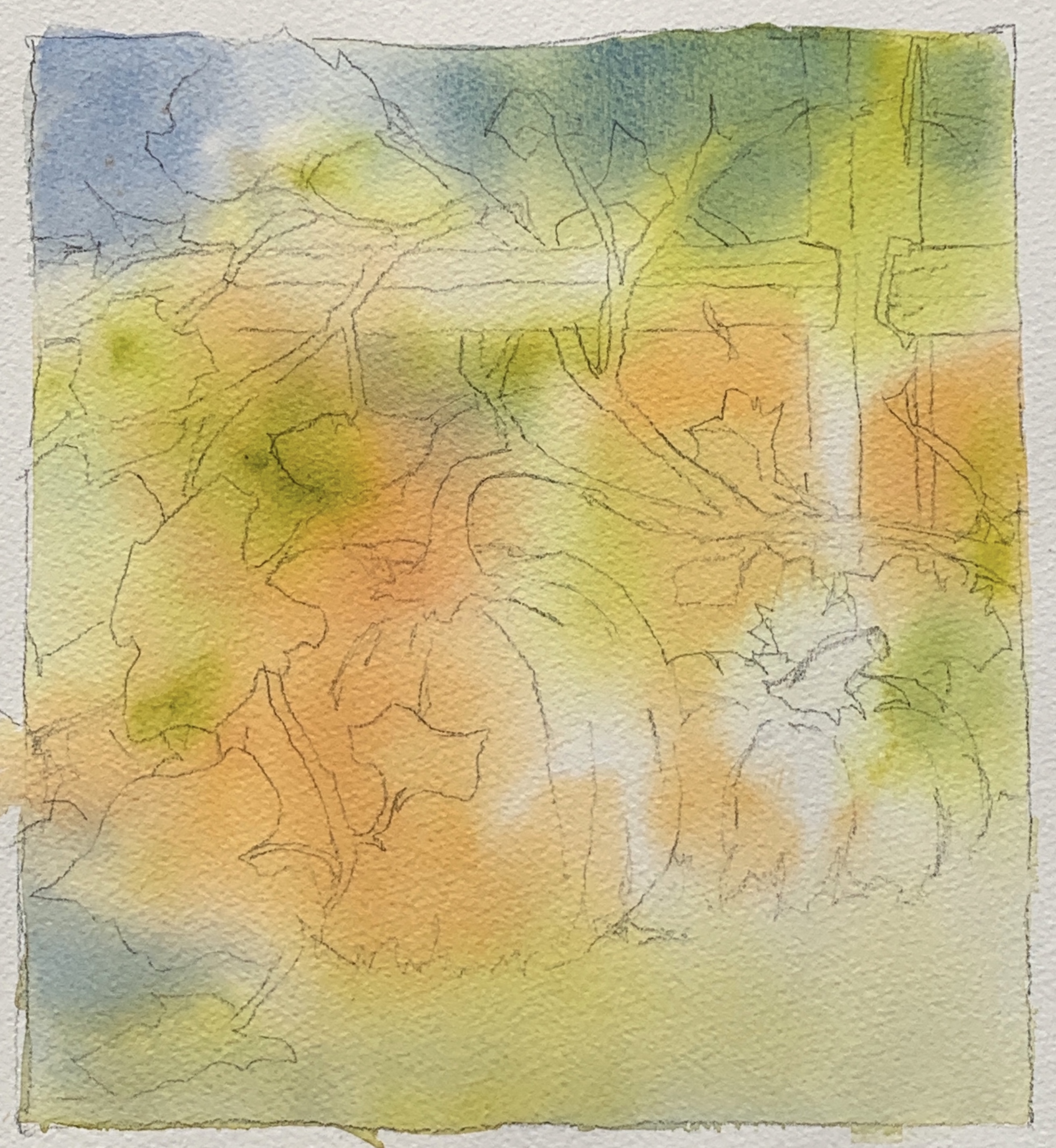
Step 1
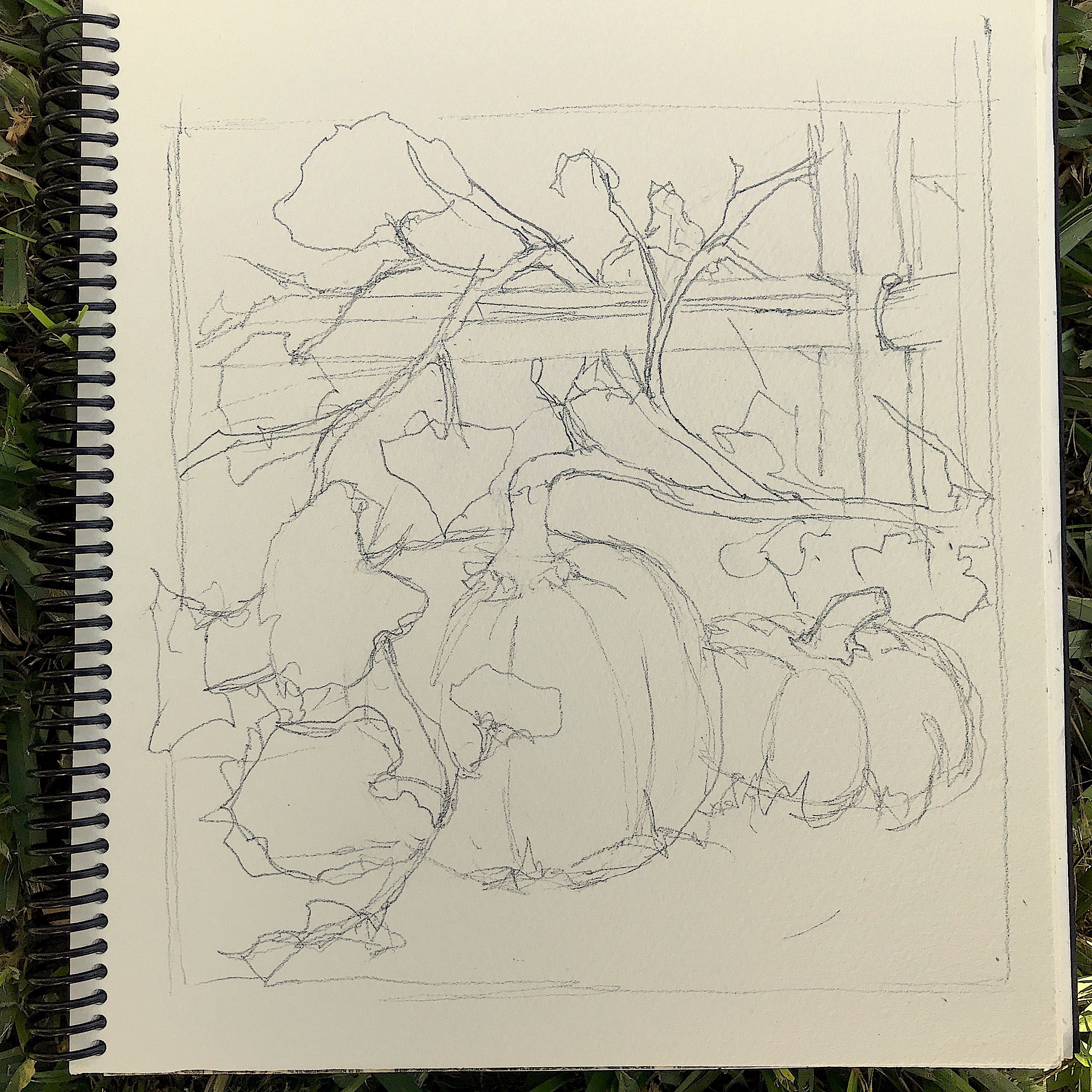
I start by drawing with a 2B pencil on 140-lb. cold-pressed paper. I’m especially aware of the negative spaces between the elements in the scene, particularly around the vines and leaves. Aiming for variety in size and shape, I draw just enough to get the general forms, without overdrawing. I want to leave opportunities for shapes (both positive and negative) to develop during the painting process.
Step 2
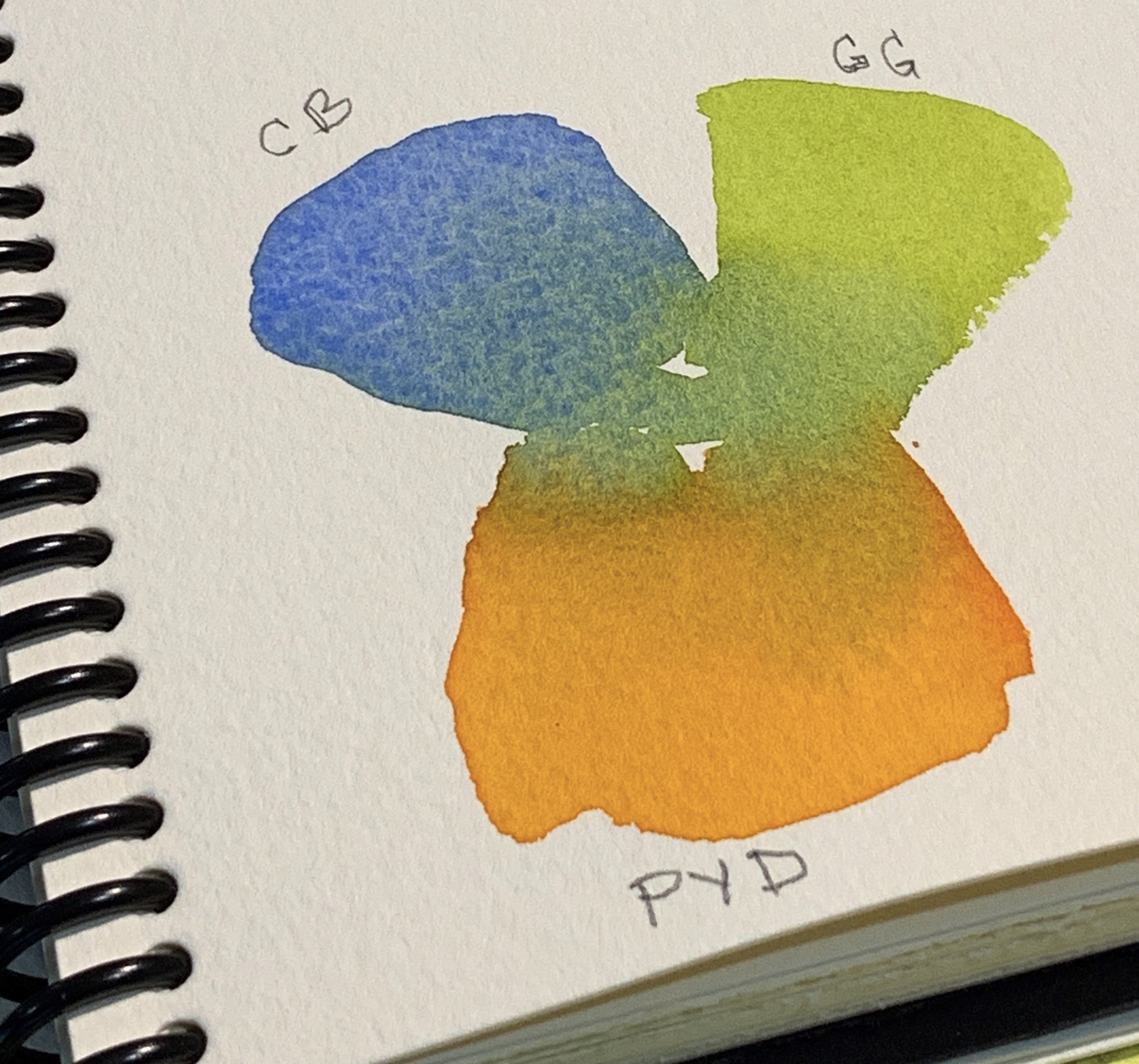
I identify the three colors that dominate the scene. These colors will show through at the end of the painting in the lightest values and give the appearance of reflected light and colors. I mix small swatches of paint on watercolor paper to see how they will mix and what secondary colors I can use them to create. I call these my “mother colors.” I select cobalt blue, green gold, and permanent yellow deep.
Step 3
I wet the watercolor paper with clean water. While the surface is still shiny, I introduce the three mother colors separately into the wet surface. I encourage the paint to mix and mingle by tilting or rocking the paper; I don’t overwork the surface with a brush. As the paper dries, the paint will continue to move. If the paper is drying and the colors aren’t mixing, I can mist the paper with a spray bottle. I want a few areas to remain light and only slightly tinted by color. I let the painting dry throughly.
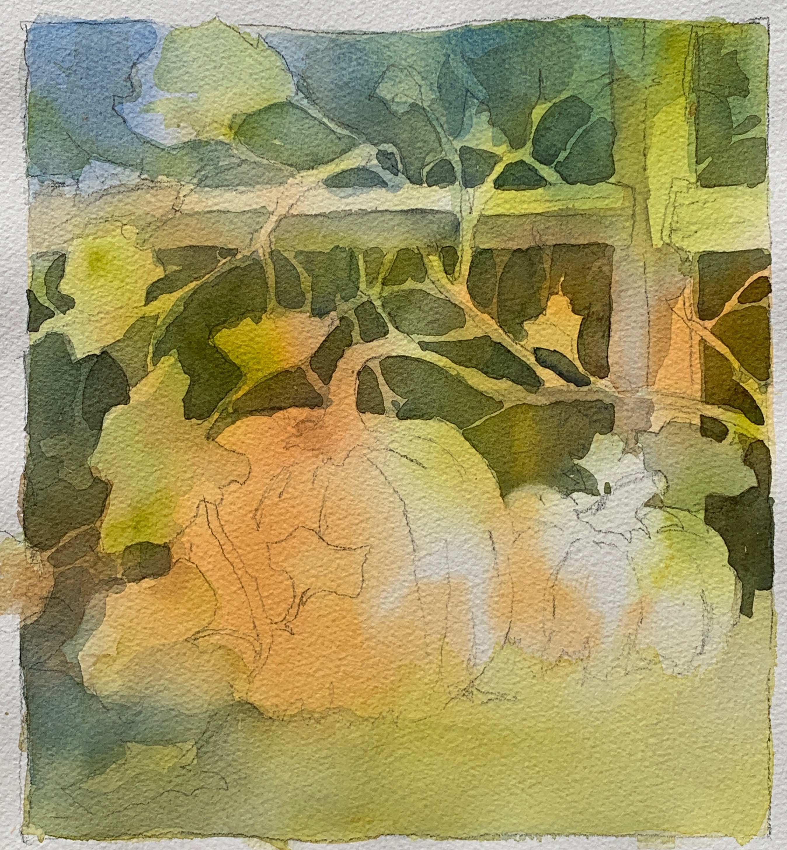
Step 4
I pull green gold (one of the mother colors), quinacridone gold, and French ultramarine into the mixing area of my palette. They mix in the center, but towards the edges, the pigments remain pure. I start at the top of the paper and work my way down, painting around the main shapes. The edges are hard against the objects, but I soften them with water as I move away from those shapes. With each brush load, I vary my colors slightly by pulling more from one of the three colors listed above. When I get to the bottom of the paper, I soften and pull the colors into the foreground, particularly in the lower left corner, then let the painting dry completely.
Step 5
At this stage, I want to create depth. I paint into the last glaze using a darker value of green made from burnt sienna, phthalo turquoise, and quinacridone gold. I often drop a little quinacridone rose into the darkest passages of green; the unexpected warmth livens up the area. I suggest vines and leaves by creating more negative shapes behind the pumpkins. I start at the top of the large pumpkin and move out. My negative shapes look more organic if I create them with a brush, rather than draw them. At this stage, I also begin to look at positive shapes — the fence post and pumpkins. I paint the shadow side of the pumpkin with permanent yellow deep and quinacridone burnt orange. I don’t stop at the edge of the pumpkin, but pull the color into the area behind. I suggest the shadows on the fence post and the leaves that drape over the pumpkin.
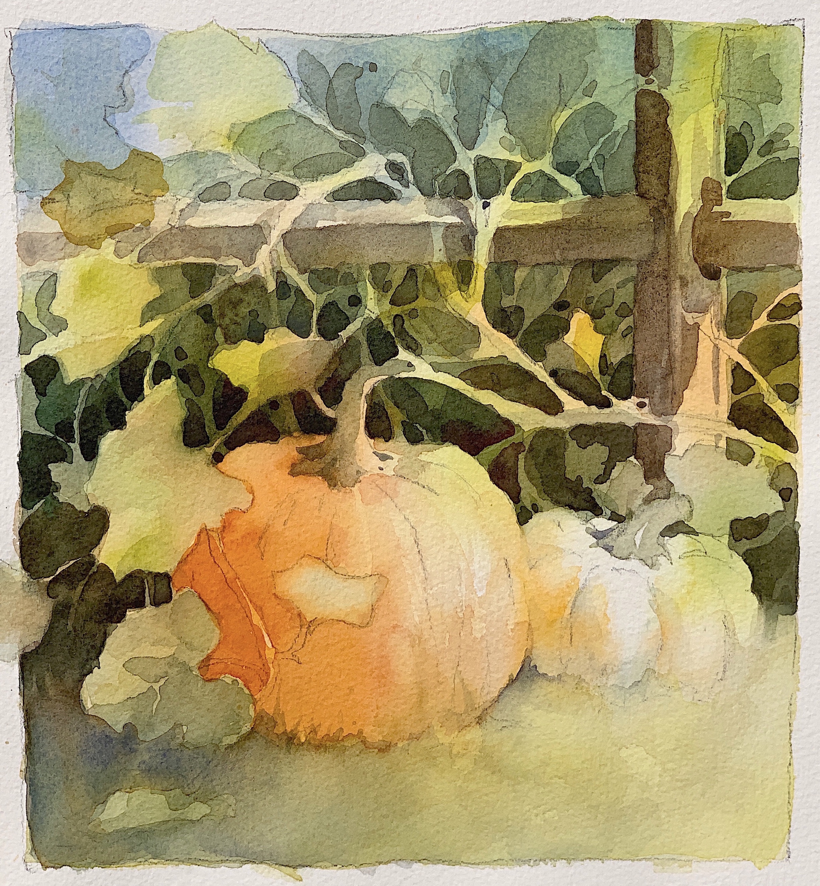
Final Step
“Don’t paint the fleas before the dog” is a good reminder to get the big shapes down first and save the details for last. In the final stage, I paint the smallest shapes and darkest darks, as well as make any adjustments. With fresh paint and clean water, I paint the form shadow on the orange pumpkin with permanent yellow deep and quinacridone burnt orange. I liven up the reflected light and color on the white pumpkin with permanent yellow deep. I also see that the yellow foreground needs to be toned down. A glaze of imperial purple does the job. Finally, I lift a few highlights with a stiff brush and clean water. The impression of reflected color established in the underpainting can be seen throughout the piece — in the orange and green on the white pumpkin, and the orange on the post and parts of the vine.
Brenda Swenson demonstrates her process step by step in Glowing Watercolors.


Looks like a fun project to do. I will take your suggestions in the demo, and paint a pumpkin or two this week.
Thank you.
Linda,
Glad you enjoyed my demo!
Brenda
http://www.swensonsart.net
That was a really good tutorial thank you very much!!
Marianne,
You’re welcome!
Brenda
http://www.swensonsart.net
I really love your painting style and consider you the queen of negative painting. Thank you for this tutorial I will follow your steps and pretend I am in one of your workshops. A bucket list must do but coming from Australia it’s harder.
Susan, You’re so sweet! Thanks for the kind words.
Happy Painting!
Brenda
I have 3 pumpkins outside I shall wait until the storm blows through and try to do a quick sketch and see what I get thanks for the inspiration.
Eunice,
Hope you had a chance to paint after the storm.
Happy Painting!
Brenda
A great demo and I am also going to try my hand at painting some pumpkins. Love your painting.
Linda,
Thank you!
Loved your article in Plein Air Mag and watching the steps in the painting. Also really enjoyed your newsletter and the painting in front of you. will we be working on a flower one in the Bonita Springs Workshop? Looking forward to seeing you again (was at Cheap Joe’s several years ago and thoroughly enjoyed that class).
Hi Jo Ann!
Enjoyed the article very much and seeing your painting steps for the pumpkins. Will we work on a floral like the one on your newsletter in the Bonita Springs workshop? Looking forward to learning from you again (Cheap Joes a few years ago).
Excellent, clear, and very well articulated demo – Thanks so much for this wonderful demo! Beautiful painting too!
Sharon, You’re welcome.
Brends
Really good tips. Planning ahead helps! The shadow advice is really informative.
Kathleen, Glad you found this helpful.
Happy Painting!
Brenda, I opened the American Watercolor message today and there you were!!! Made my day! What wonderful reminders and as always, your step by step “talk through” developing the painting is so very helpful.
You are the queen of negative painting. Thanks dear friend.
judy C
Thank you Judy❤️
Brenda, thank you for excellent instruction, starting with a review of some basics, something we always need, then introducing us to relatively novel ideas, which really enliven your demonstration painting. Whenever I see one of your paintings or enjoy the benefit of your teaching, I think, “Oh yeah, I really need to do that!” using more reflected light in this case. Quinacridone orange in the shadow and the orange bouncing around the fencing, the shadows, and the leaves really add excitement!
Thank you Mary!
Thanks for the tutorial on lights and shadows, something I struggle with on a daily basis
You’re welcome Sheryl!
Just seeing this article now. Thank you! So informative!
Brilliant painting, and I’m going to try your technique — thank you, Brenda!!