
How many times have we heard it: “Green is hard.” I don’t believe green is the problem but that a lack of observation is, along with a hastiness to paint greens straight from a tube instead of mixing colors to create what is actually seen in nature.
I was driving along the marshes near my home one day and everything was gray: the mossy oaks, the palm trees, the marsh grasses, the water. My brain told me spring was near and trees should be green, but because of the weather and lighting conditions, the world was bathed in shades of gray.
If I painted the landscape before me in Viridian Green or Sap Green, common colors on the painter’s palette, I would be making a mistake. This landscape was not green, but rather shades of gray. Many of you may be painting your landscapes with the wrong color. And, tubes of green often need to be mixed with other paints to create the correct hue. Viridian Green, while an important color because it’s one of the few hues that creates dark values, is a color meant for mixing. Below are some guidelines for painting beautiful greens:
1. Use The Right Paint Color.
There are some greens in watercolor paint that are good choices to use straight from the tube, but Viridian Green is not usually one of them. Among some of the realistic greens that you can use directly from the tube are Serpentine Genuine, Jadeite Genuine, Green Gold, Perylene Green and Skip’s Green. If you like to use greens from the tube, be sure you have many realistic choices above and beyond the normal one or two greens.
2. Maybe It’s Not Green: Observe carefully.
Your brain may be telling you to paint every living thing Sap Green. But, if you stop and observe, you may discover that none of the trees or foliage in your selected landscape are green. Certainly, all trees in one scene cannot be the same green or same color. Every object in a plane will be a slightly different color, depending on what it’s close to – what colors are bouncing against that object – and what colors below and above are reflected. With continued observation, you will see that every species of tree and foliage are different colors of green.
3. When In Doubt, Use the Complement.
If your green is too bright, then lower the intensity of the hue by mixing in some of the complement. The complement of viridian is alizarin. The more of the complement you add, the more neutral, and more natural, the color becomes. Rose, alizarin and some of the violets mix beautifully with green. Use your color wheel to find the exact complement that you need.
4. Mix Your Own Greens.
Mixing your own greens is always a better solution to painting greens because then you have limitless choices. In class, I coach students to make a green chart because it’s a useful tool for exploring and learning color mixing. Try making a chart of your own. Write down every yellow and brown you have along the left side of the paper. Write down the names of your blues along the top of your paper. For the sake of brevity, mix every blue and yellow together in a 50-50 mixture. Think of it, if you use different percentages of yellows and blues, the possibilities are endless.
5. Value Is Everything.
Even one tree will have several different values within the shape. Creating several values within your shapes will make your trees and foliage more believable. Often, the values you paint are more important than the colors.
Green: Creating Colors From One Tube of Paint
Here, I’ve used only permanent green to mix a variety of greens. Experiment with how many colors you can make by mixing other colors on your palette with only one tube of green.
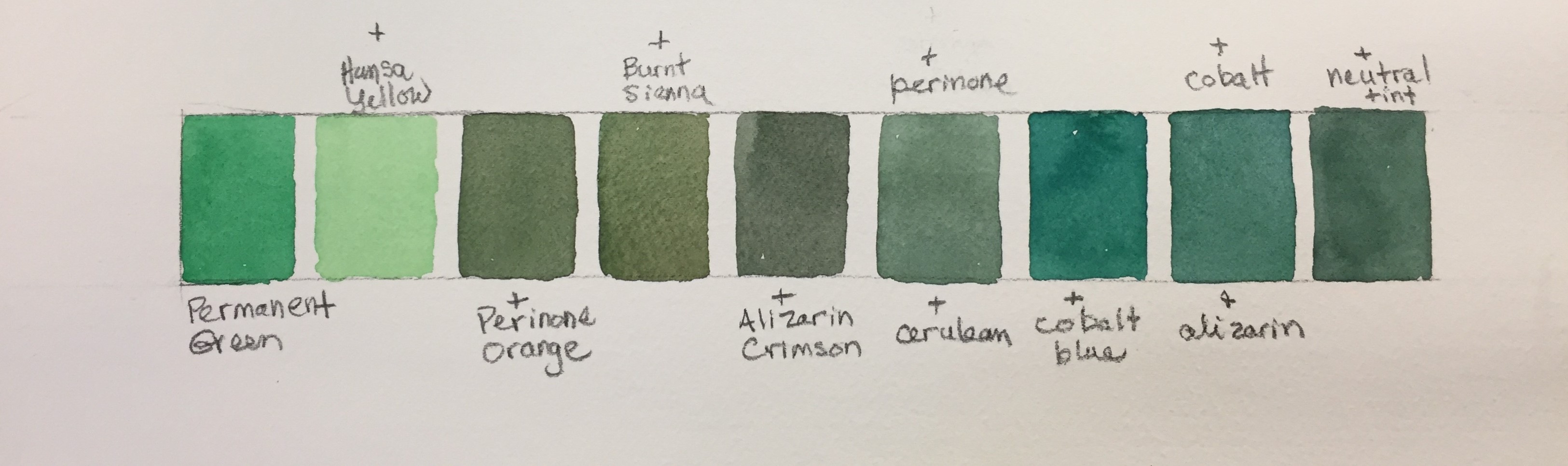
Here I’ve mixed:
Permanent Green with Hansa Yellow
Permanent Green with Perinone Orange
Permanent Green with Burnt Sienna
Permanent Green with Alizarin Crimson
Permanent Green with Perinone Orange and Cerulean Blue
Permanent Green with Cobalt Blue
Permanent Green with Cobalt Blue and Alizarin Crimson
Permanent Green with Neutral Tint
The possibilities are endless. You can make an infinite number of colors from one tube of green by mixing it with 2 or three colors from your collection of paints.
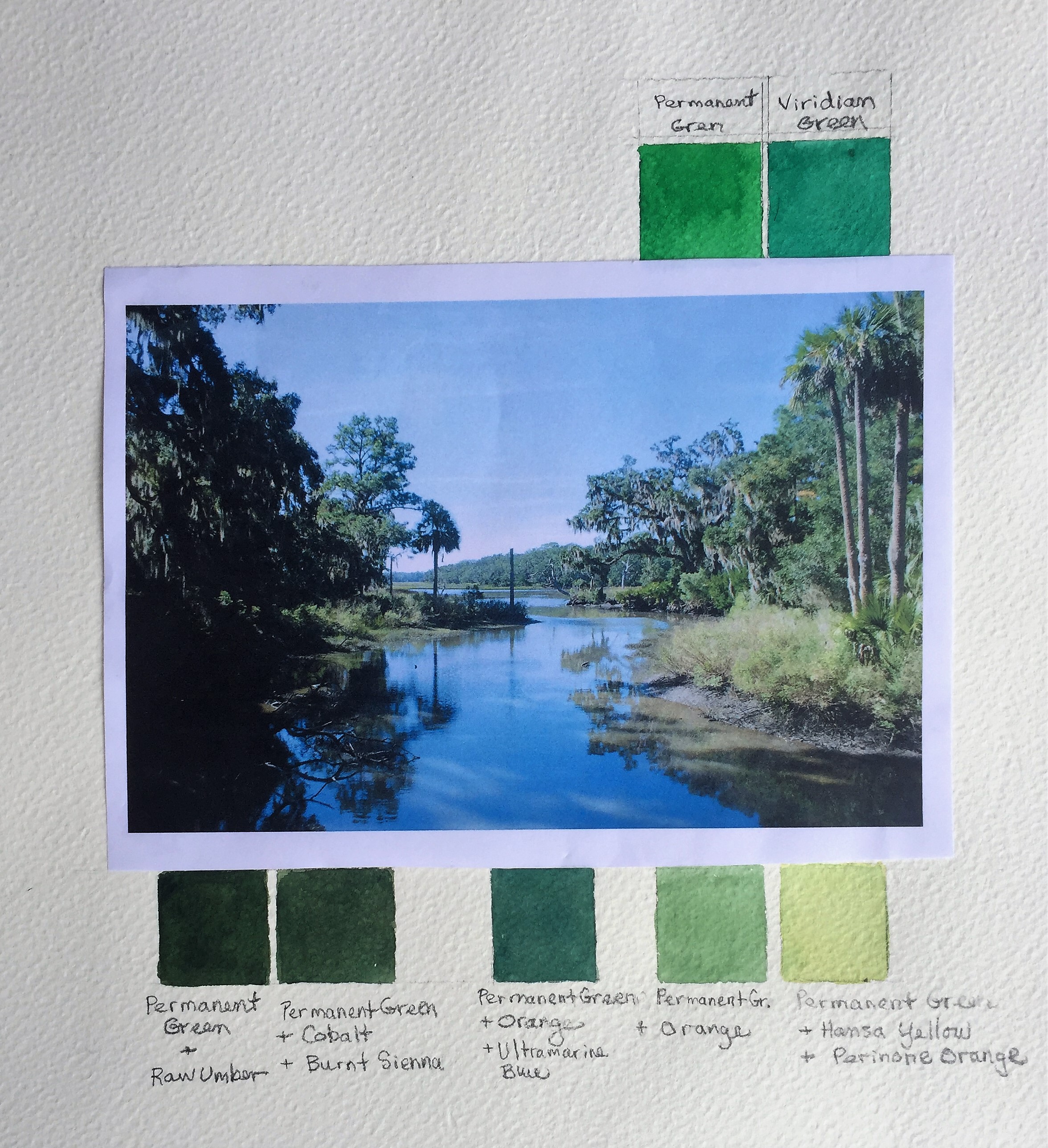
Matching Nature’s Greens
In the photo below, you can see that permanent green and viridian green straight from the tube have no place in the natural landscape. Instead, I chose just one (permanent green) and mixed it with a variety of other colors to create a full range of natural greens that are true to the landscape.
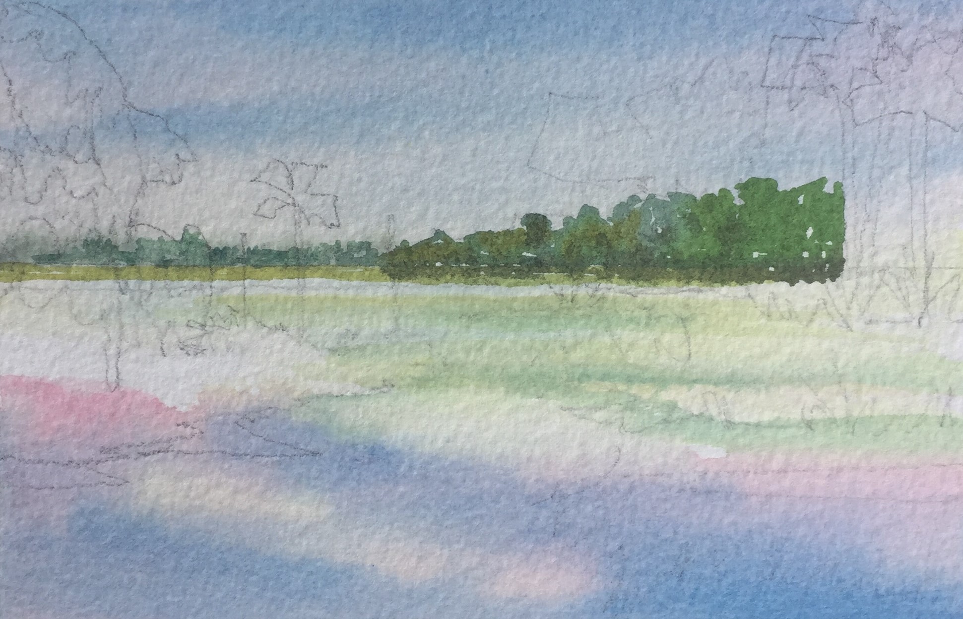
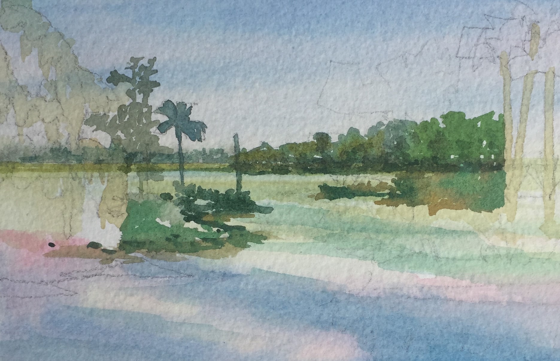
Step-by-Step Watercolor Tutorial: A Landscape Comes Together
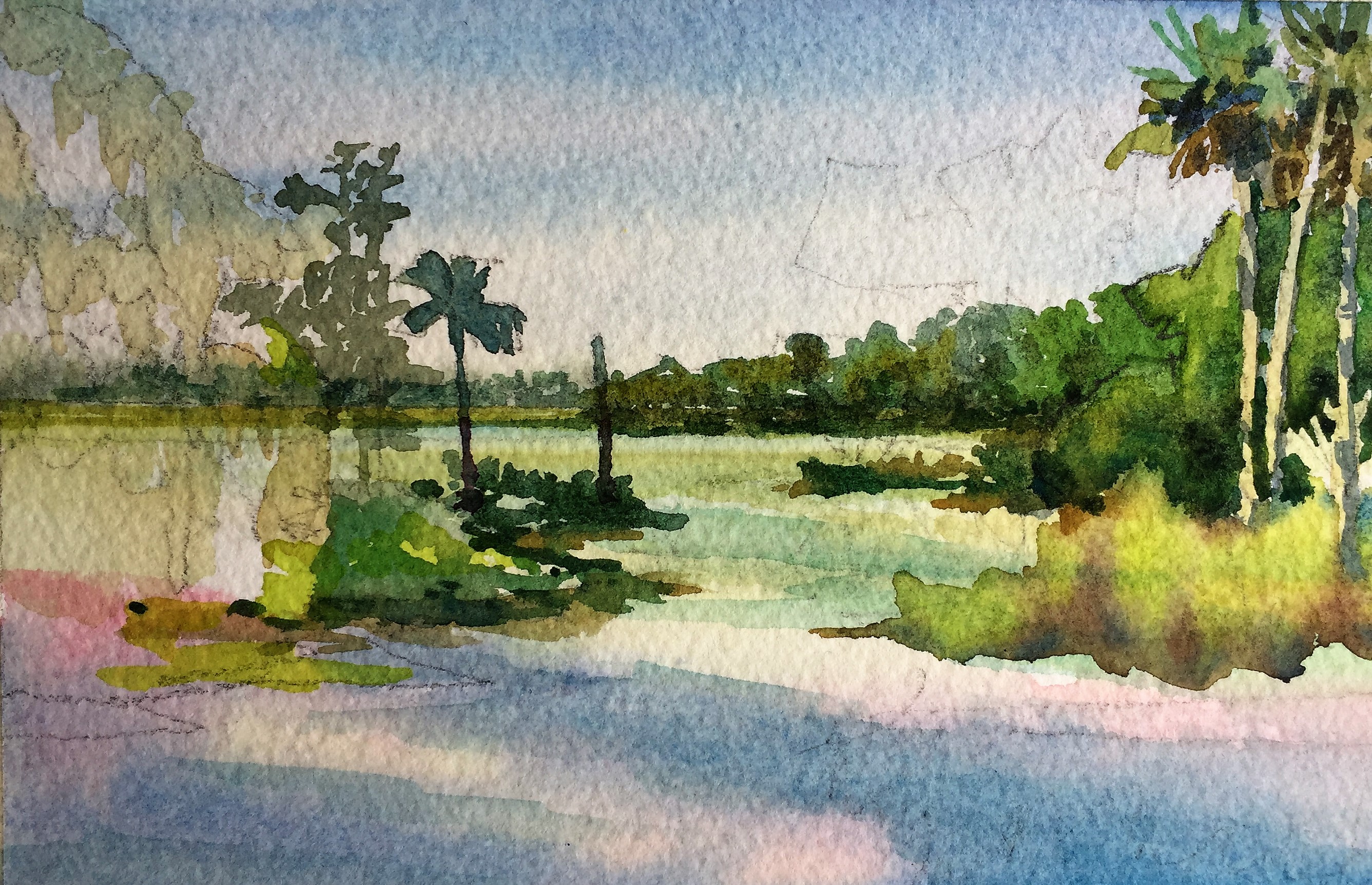
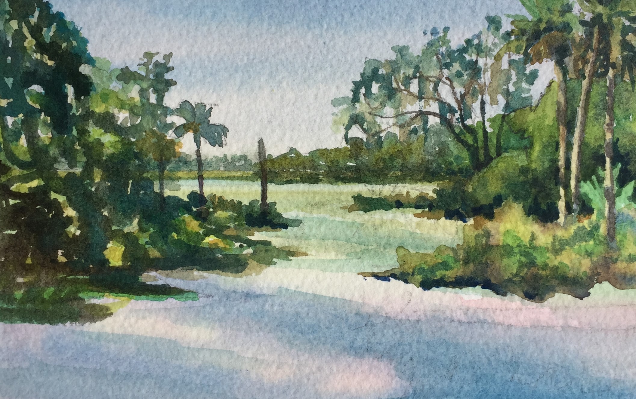
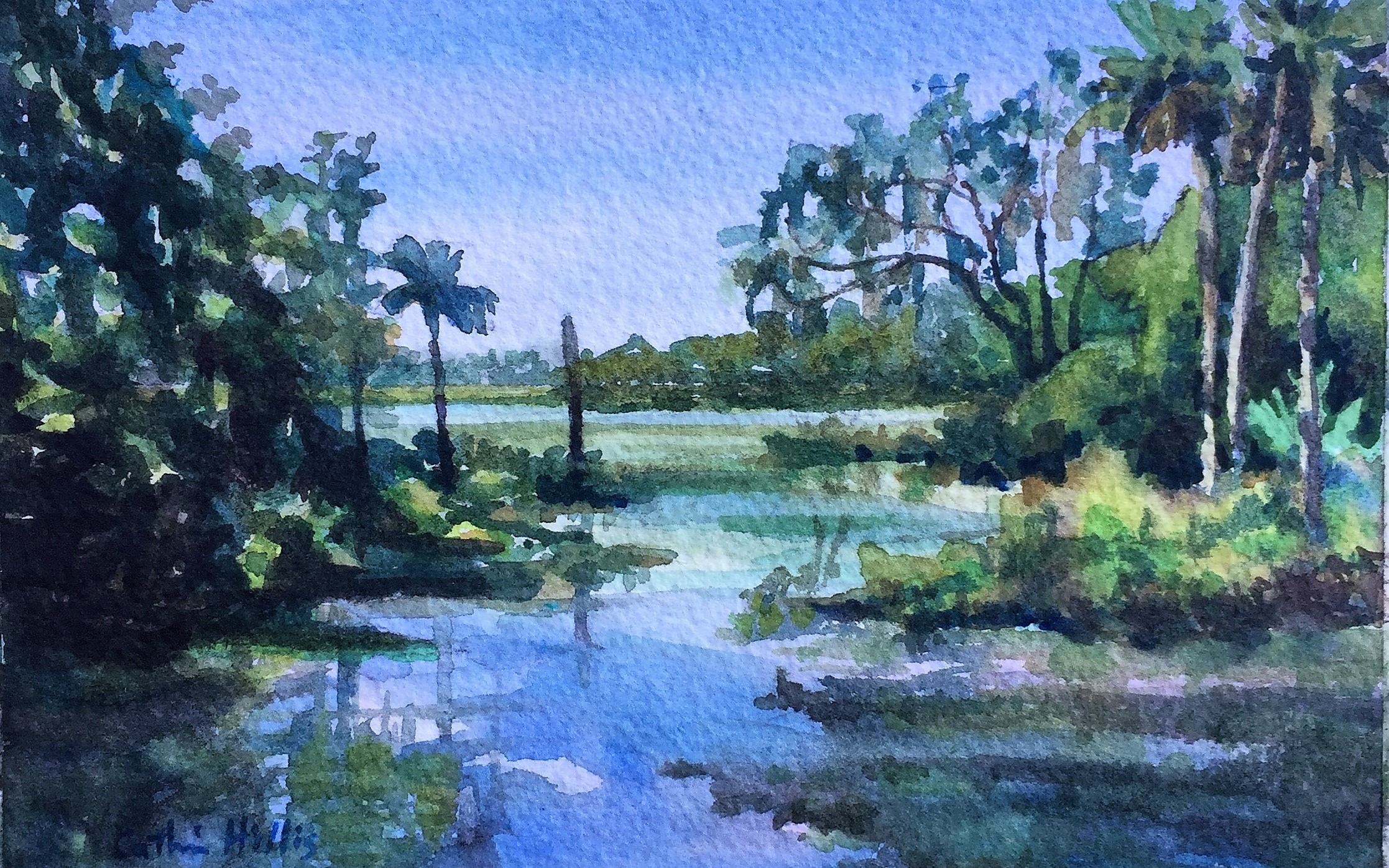


Loved these tips and love the weekly!
Loved the article on greens – thank you!
Excellent article!! Thorough and very interesting.
Jeanne Dobie mixes Viridian Green with several colors for greens, beginning by using Aureolin Yellow to make a more transparent set of greens.
Good direction and loved the samples.
Very helpful article to try out during plein air.
Excellent article! Cathy provides a straightforward path for artists struggling with creating realistic greens!
So appreciated this demo! Don’t think Ive been brave enough to use that many greens at once. Ill give it a try!
Wonderful article. I always struggle with my greens. Her recommendations are very helpful.
I’ve always struggled with greens and sometimes hate them, but they are needed. This was so helpful and made me think in a different way about greens.
Excellent instruction that improved my knowledge in which paints to use and mix in order to achieve some very interesting variations of greens. Thanks!
I enjoyed the article. What brand are you using? I know one green can vary from one manufacturer to another.
Enjoyed the article on greens. Mose helpful
Joanne M.
Enjoyed the article on greens. Most helpful.
Joanne M.
Catherine Hillis is an excellent teacher! Who would have guessed that so many colors could be had. She also leads amazing painting tours in Italy.
Catherine, your tutorial on greens are excellent! Want more of this. I am a beginner in watercolor, so I appreciated your showing the progression of the painting. You are right-on with the greens!
Very helpful article and I especially liked that you showed not only your reference photo but the result and steps along the way. Thank you.
I appreciate the insight into creating beautiful landscapes. I have one request for all contributors. Branded paint color names are very confusing for us who don’t use Windsor and Newton or American Journey.
Skip’s Green is convenience mixture of phthalocyanine green and hansa yellow light or lemon yellow. It’s also known as permanent green light or permanent green, depending on the manufacturer.
I think W&N and American Journey have the most unique / non standard names and I’m sure it is valuable for marketing, but I am always a little disappointed that those teaching do not acknowledge brand names are not universally accepted.
A simple statement of Manufacturer (American Journey) and the actual pigments (PG7/PY3) to make it easier for us all to find the specific paint you are discussing. It would be very helpful to me.
Wow, what an eye opener for me! I am just starting to paint and am so often not observant enough. With your article fresh in mind I want to jump into looking at our landscape. Already, even though it is Winter here in TN, I see some greens. I want to do a chart as you suggested for mixes of the colors I have, I tend to use only out of the tube or the pan. Thanks so much for sharing.
I wish I would have had this info when I started with WC. Excellent tutorial…