
By Dorrie Rifkin
I fell in love with letters circa 1965, when I was seven or eight years old. Shopping with my parents in Two Guys (a New Jersey – based prototype of Target), I spied the soup cans, and realized somebody got paid to create and draw the labels. There, in the aisle, I knew what I wanted to do when I grew up … and it’s exactly what I did. Type and logos were my specialties in my first career as an art director. Back then, ad agencies didn’t have computers. We drew all our layouts by hand, and we used magic markers.
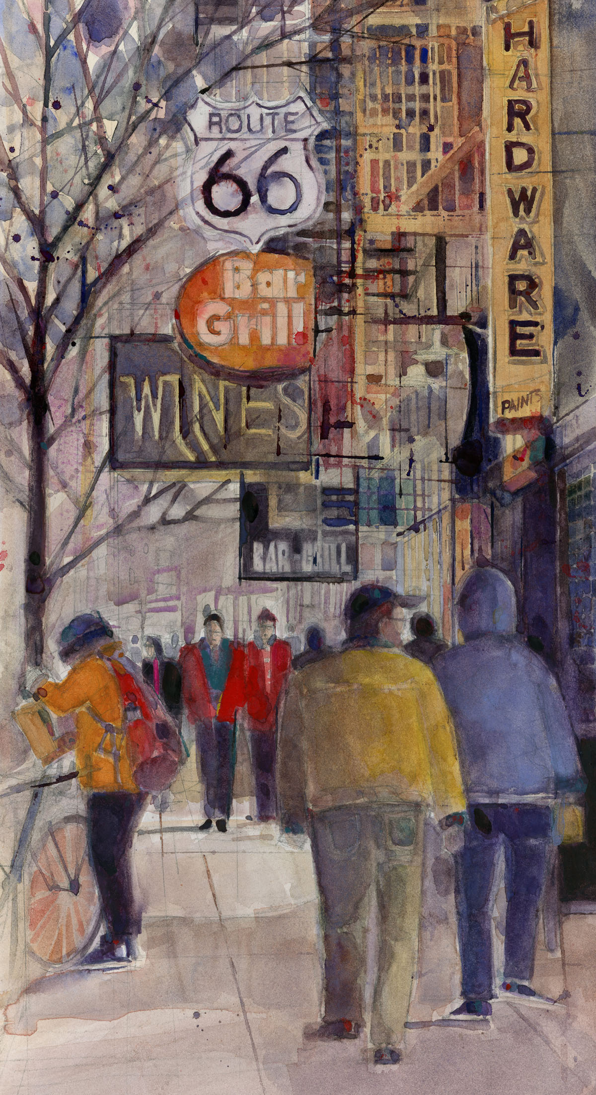
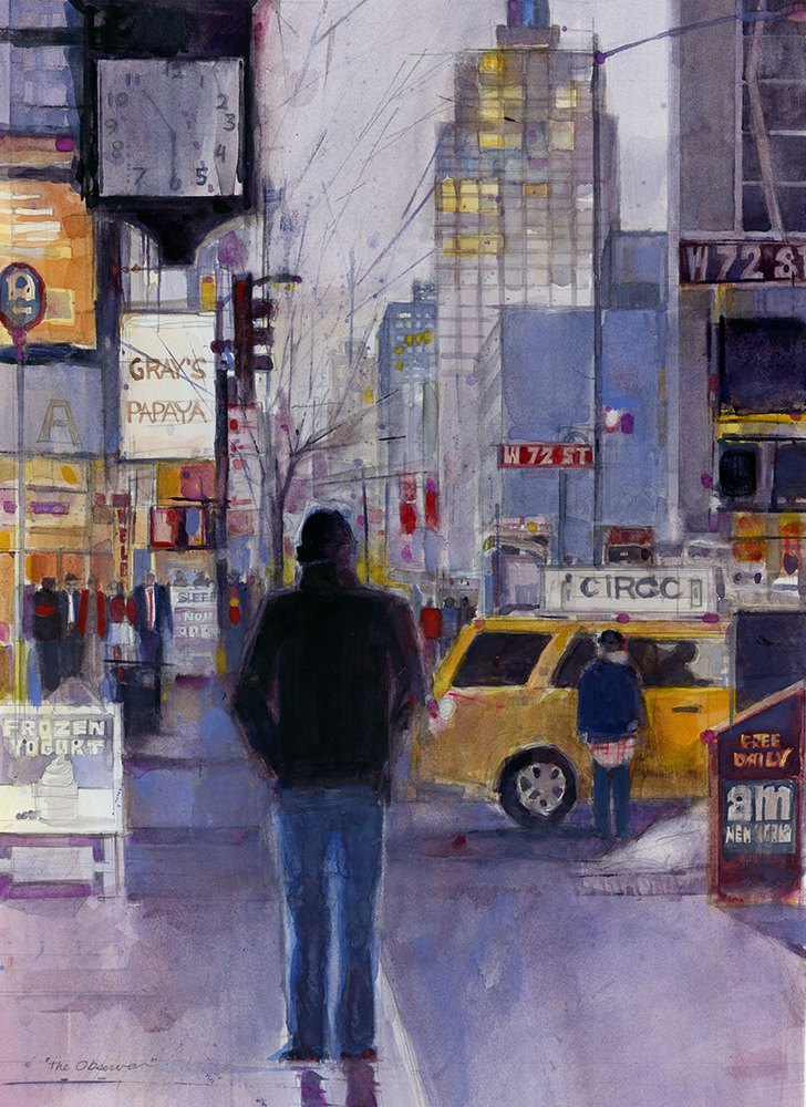
Painting is both self-expression and communication. Via my cityscapes, I use people, buildings, and, especially, type to tell my story, as well as convey time and place.
Supplies used for this watercolor tutorial
• ruler
• 2H pencil
• Stillman & Birn Zeta Series paper (extra heavyweight, white, smooth)
• watercolors (I like the QoR and Daniel Smith brands )
• round paintbrushes – sizes 6 and 2
• Patience !
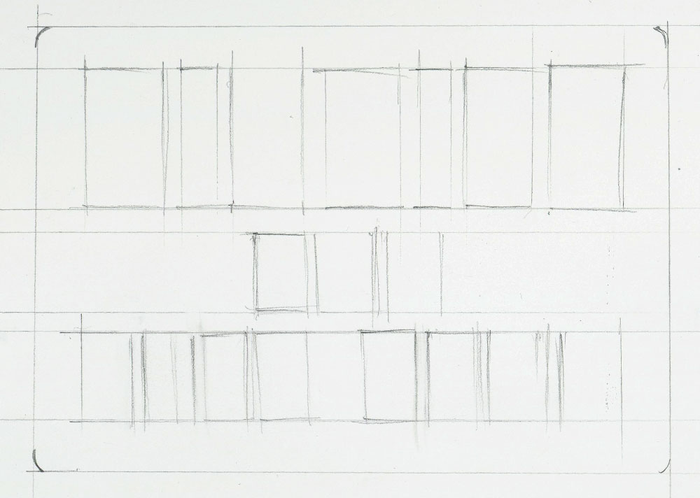
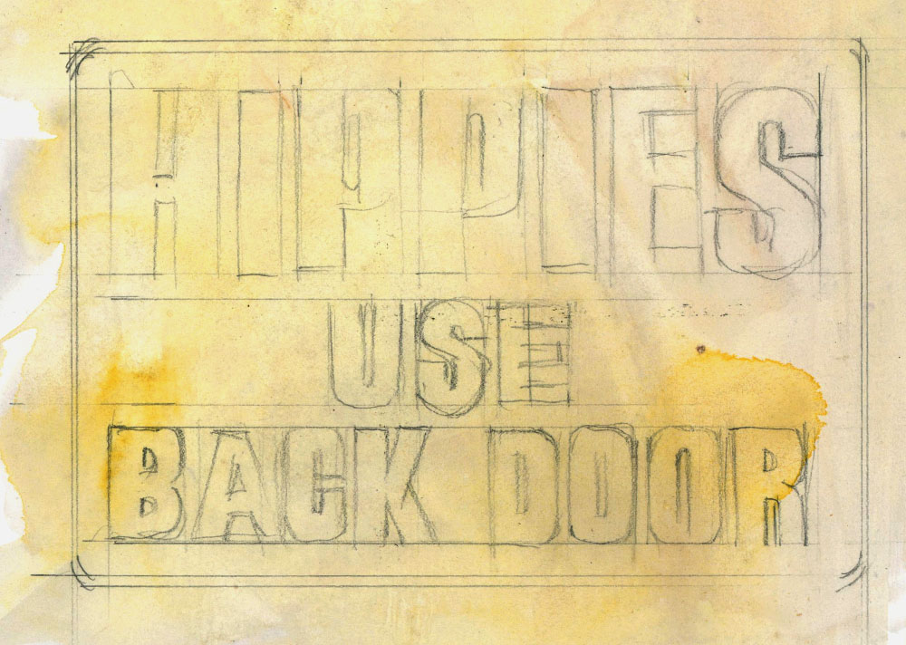
Step 1
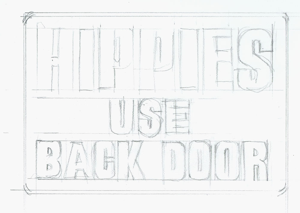
With a 2H pencil and ruler,draw parallel lines,and mark off the top and bottom of each letter;this makes letters look straight.Then, quickly make boxes so as to block in the letters; this helps prevent spelling errors and space shortages.
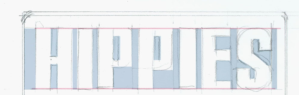
Step 2
The fun part — start drawing the letters. Simply draw rectangular, triangular,and square shapes, either from the two parallel lines or inside each box,to create the letter.(I used Photoshop below, only to aid understanding of how I draw letters.)
This is how your type should look at this stage.
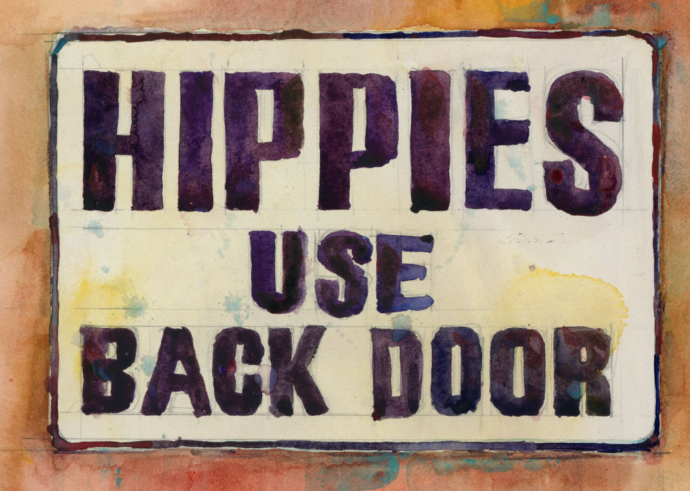
Step 3
Now the lettering is ready to paint. Start with a light background color. Add a little splatter or texture if you like.
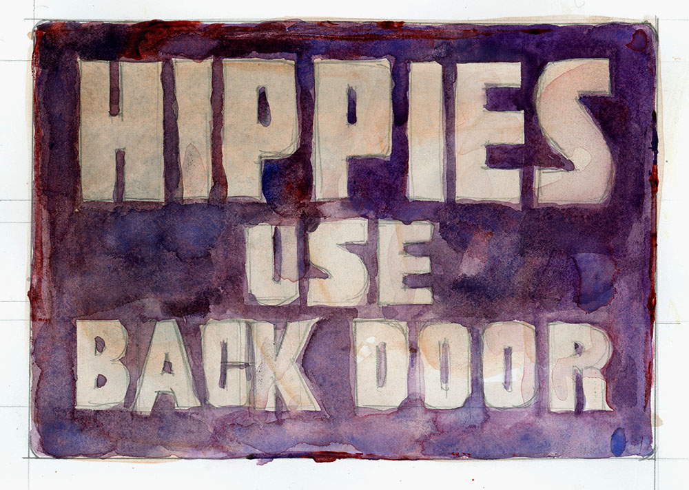
Step 4
Time to paint the type. Choose whether to paint the type or the background, and whether to use a round or flat paintbrush. (I favor round.) Below are my finished renditions.
A Few More Suggestions
1. When you go about depicting signage, trust that the art director who designed the sign did a good job of letter spacing; it is an acquired talent.
2.Resist the urge to measure letter dimensions with your ruler so as to render perfect letters. The charm of good lettering is that it’s not perfect; ironically, it’s the imperfections make type look good.
3. Before you paint, have someone proofread your penciled type.
4. HAVE FUN!
Dorrie Rifkin is an accomplished watercolor artist and painting teacher. Her classes and workshops are popular in NYC’s environs and beyond. Dorrie’s paintings have won more than 40 prizes in both international and national juried shows, and are exhibited in private collections worldwide. Her work has been featured in Watercolor Artist magazine and several editions of Splash books. Dorrie is a signature member of theTransparent Watercolor Society of America, and of the Northeast, Pennsylvania, Philadelphia, New Jersey and Baltimore Watercolor Societies.


Loved the letters instructions. They (letters have bamboozled me.) Carolynn
Thank you so much for your comments Carolynn. Type has always been a passion to me!
Thanks Carolynn… It’s really lots of fun.. Glad they helped!
Dorrie captures the vibrant city scene so well and her skillful addition of signage is a contributing factor.
Another thing about signs is that they gain interest over time, as businesses come and go and our world changes, signs lend historical context.
Thank you so much John!
I love the lettering article by Dorrie. Thanks for the ambassador feature.
Thank you Suzy!
What a great lesson! Made it looks simple! I can do that! LOVE your paintings!
Yes you can!
What’s really amazing is watching Dorrie paint! Especially signage. Her use of color and her totally confident approach to it (although she says she’s not) makes her class so much fun!
Congratulations on the article, Dorrie! 🙂 Always fun to watch you paint!