
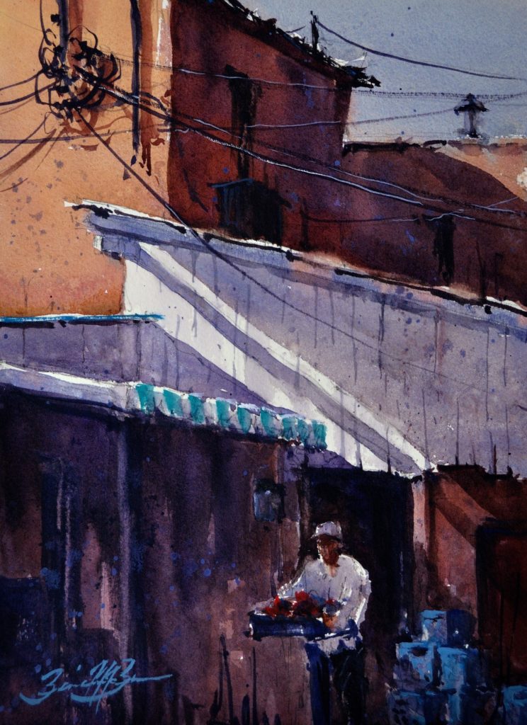
Oil painters know that having various tints of brown, green, blue, and purple can help them block in large areas of a canvas so that strokes of full-color mixtures will work more effectively in a composition. That is, those “gray” mixtures establish neutral, unobtrusive areas that allow stronger colors to have more impact.
Watercolorists can use the same techniques, but they have to be more concerned with the degree of transparency or opacity, the staining power on paper, and the color temperature of each individual pigment. Among the gray mixtures that artist Brienne M. Brown finds to be useful are transparent red oxide + cobalt or ultramarine blue + alizarin crimson + transparent red oxide; cobalt blue + transparent yellow oxide + alizarin crimson; carbazole violet + transparent red oxide +lavender; sap green + carbazole violet; and cobalt turquoise + alizarin crimson.
Brown explains how she balances her own intentions with the medium and the inherent characteristics of the pigments. She says, “I don’t make preparatory studies per se, and I don’t look through a viewfinder, but I always make a graphite thumbnail value sketch to judge the arrangement of shapes and values before I begin, and occasionally I make notan studies with markers.
Learn from Brienne Brown in person at the 8th Annual Plein Air Convention & Expo, also featuring Joseph Zbukvic, Daniel Marshall, Keiko Tanabe, and many more!
“I sketch those value compositions in a notebook, because it is helpful to have a plan, even if that plan changes. I also make a light drawing on the paper with some details, an indication of the shapes and angles, and correctly indicate the proportions. I keep the sketch nearby and refer to it as I am painting, looking at the subject less and less and instead focusing on the sketch and the painting, thinking about what the painting needs in terms of design.”
Watercolor Painting
“I finally start painting by applying a light wash of transparent color over most of the surface of 140-lb. rough watercolor paper, so there is very little pure white left,” Brown continues. “The process is a bit like toning a canvas or panel with oil colors to dull the bright white surface and begin with either a warm or a cool orientation to the painting. At this point, I only think about the balance of warm and cool, as well as a center of interest. I focus on ‘fun colors’ that run together and remain very light. Once those washes dry, I can add mid-range values or jump straight to the darkest tones, depending on the subject.
During the first wash, I only use three or four colors, usually some variation of the primaries. “I normally proceed by adding mid-range valued colors, but sometimes I paint the dark values so I have the full range marked by the two extremes. After the initial washes of fun colors, I shift gears and mix colors to the exact value and opacity I want for the finished painting. I like being bold and letting paint flow and drip, but I don’t want to be so tentative about the brushstrokes that I wind up having to apply layer after layer of color and have a dull surface. Watercolor always looks best when an artist confidently mixes the colors and applies them with one active stroke.
“Unless I punch in the darks first, I work from light values to dark ones, starting with mixtures that have lots of water and gradually reducing the amount of water so the strokes of color can be made tighter and more opaque. As I paint, I make a point of working across the paper to connect as many shapes as I can and have both hard and soft edges.”
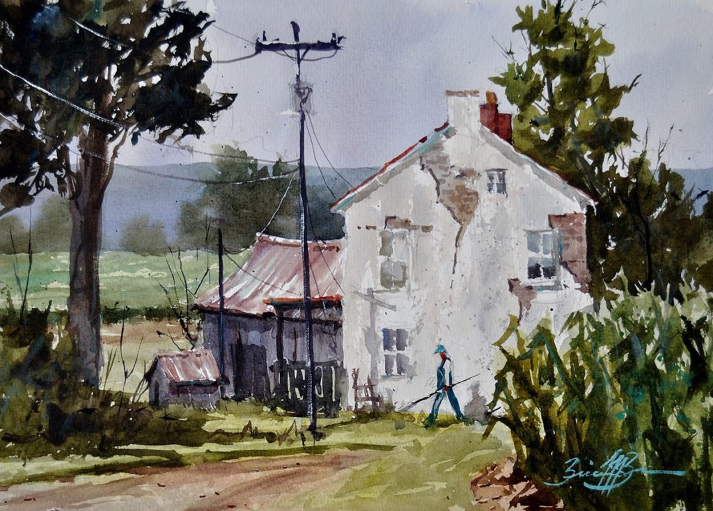
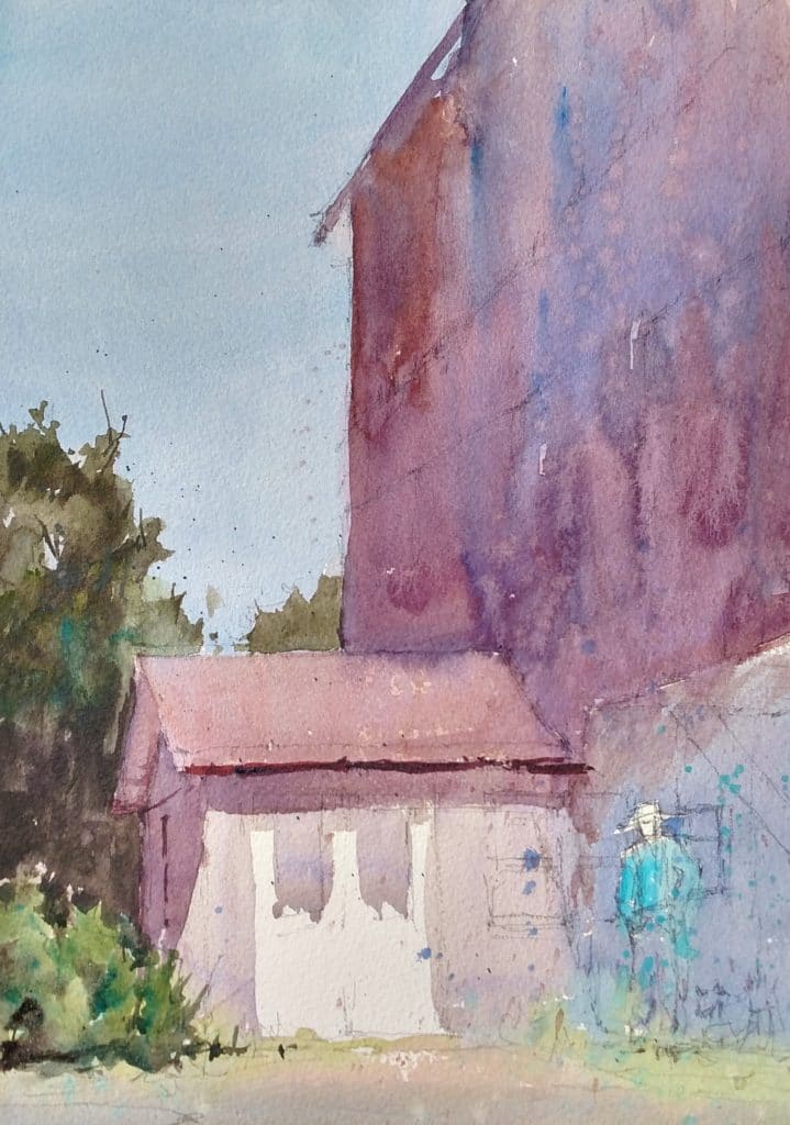
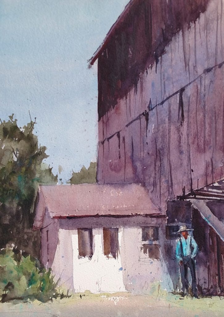
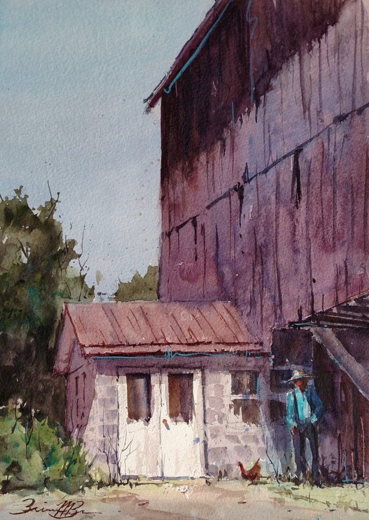
Watercolor Tutorial: Hodge Farm
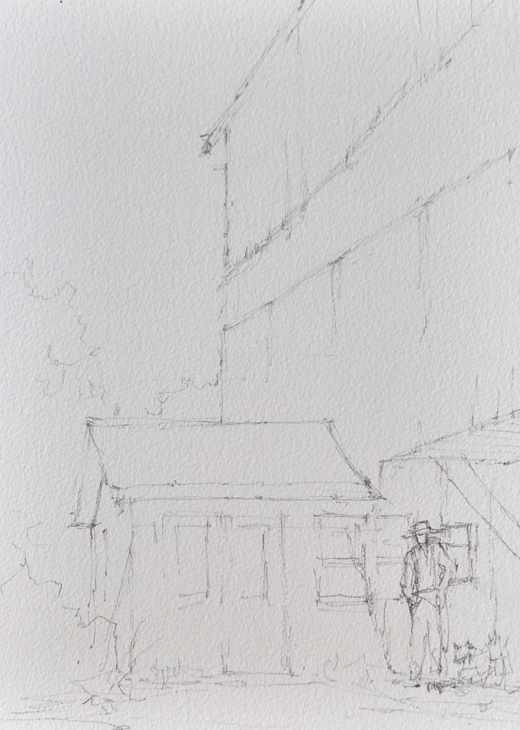
STEP 1: “After planning the composition of values with a quick value sketch,” Brown says, “I re-draw the key lines lightly on watercolor paper (140-lb. rough, Sanders Waterford). I am careful to get angles and proportions correct as well as a pleasing breakup of my paper.”
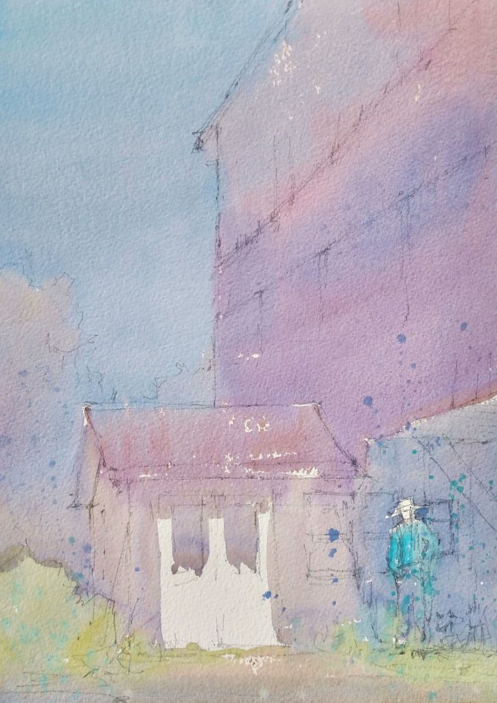
STEP 2: “Holding the paper at a 30- to 50-degree angle to the table, apply the first wash of color on the paper and allow it to freely flow. The colors in that wash are not necessarily the local colors, because the only important consideration at this point is whether they are warm or cool. By covering most of the paper and using a limited palette, I unify the painting from the start.”
STEP 3: “After the first wash has dried completely, I start adding mid-tones and connected shapes so there will be both hard and soft edges. I don’t want my shapes to get too neat and perfect, so I splatter some opaque colors or splashed water to add texture and breakup lines.”
STEP 4: “As I add the darks, I define the shapes more clearly. I connect the dark shapes wherever possible so there will be lost and found edges, and paint those darks using as few brushstrokes as possible. At this point, all there is left to paint are the details.”
The Artist’s Color Palette
Brown’s palette is quite extensive; she uses colors manufactured by Daniel Smith, Winsor & Newton, and Holbein. The palette includes ultramarine blue, cobalt blue, cerulean blue, cobalt turquoise, alizarin crimson, transparent red oxide, transparent yellow oxide, aureolin, cadmium red, cobalt turquoise, vermilion, sap green, horizon blue, cobalt teal blue, lavender, and a tube of white gouache. Still, she never uses all these colors in one painting, ordinarily choosing about eight to 10 per painting. She owns tubes of a few earth colors but says she seldom uses them.
Learn from Brienne Brown in person at the 8th Annual Plein Air Convention & Expo, also featuring Joseph Zbukvic, Daniel Marshall, Keiko Tanabe, and many more!
Artist’s Bio
From a young age, Brienne M. Brown loved art but pursued a career in science. After graduating in Chemistry, she soon found that art was more than a hobby, it was a necessity. So as a busy mom, she made time to build a career as an artist. She earned signature status in several watercolor societies, participates in many national plein air events, and teaches workshops. Brienne’s passion is watercolor and plein air. She loves using the slightly controlled chaotic nature of watercolor in bringing the everyday to life. Her work has been published in Splash 17: Inspired Subjects, PleinAir Magazine, and Watercolor Artist Magazine. She was a faculty instructor at the 2018 Plein Air Convention & Expo in Santa Fe.
This watercolor tutorial was excerpted from an article by M. Stephen Doherty in PleinAir Magazine.


