
Many artists need to think more about using value carefully, and we can all significantly improve our paintings by doing so. I am a value painter. It has been my experience as a judge, juror, and workshop presenter that more paintings succeed or fail based on the artist’s understanding and application of value.
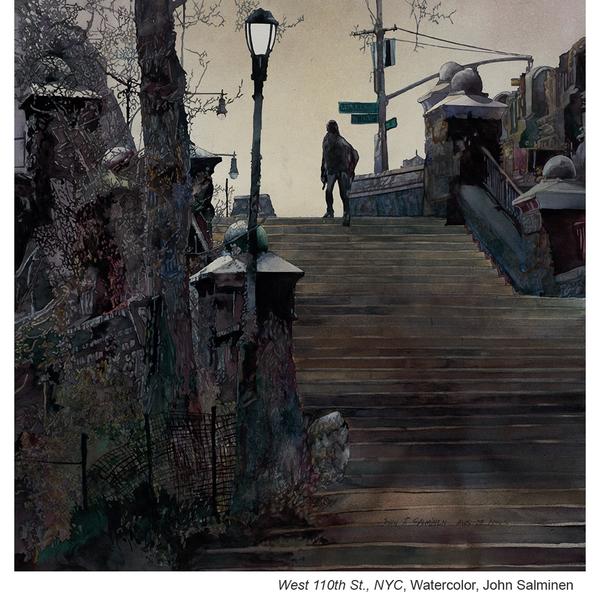
Artists sometimes avoid using very dark values and overwork the very light high-key passages, creating middle-value paintings. I try to use the full range of value in most of my paintings, from the white of the paper to lamp black or the darkest black I can mix, enabling me to fully explore all of the potential of light and shadow. Mood and atmosphere are in large part determined by the arrangement of values on the paper. The importance of a value study cannot be overstated.
I also recommend regularly studying a painting in progress from a distance. We need to ask ourselves if the painting is telling the story we want it to tell. Careful observation opens a dialogue and this is the opportunity the painting has to suggest its preferred direction.
COLOR
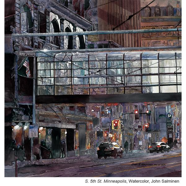
I use color subtly in my paintings, combining complementary colors to create mixes of rich warm and cool grays. I then drop in some intense local color as an accent. By limiting this local color and carefully staging its placement within a sea of neutral complementary passages, it has great impact and can lend drama and emphasis to important areas.
![]()
COLOR TEMPERATURE
Color temperature changes can be an effective tool in creating interest in various parts of the painting and in helping to move the viewer’s eye through the composition. A dominantly cool painting benefits from warm accents and vice-versa. As I design a painting, value decisions take precedence over temperature but they can be combined to make an effective statement.
EDGES
Hard-edged shapes can add high contrast and need to be used carefully. Many artists who are capable of painting great detail understand that too much detail can lead to chaos, giving equal emphasis to all parts of the painting. By using closely related values in less important areas and reserving sharper contrasting values for the center of interest, I can prioritize how the viewer reads the piece.
![]()
SHAPES
I often refer to Ed Whitney’s teaching. He says shapes should be irregular and unpredictable. Frank Webb says “paint shapes, not things”. This is very helpful advice as we often focus on the object we are seeing and neglect the need to build a design of interesting irregular and unpredictable shapes.


John puts the focus directly on the principles and elements of design, the application and management of them in creating successful paintings, whether abstractions or more traditional subject matter. The lessons I have learned and the advice he has given have without doubt helped me become a better painter. Over the years I have shared that thinking with my students and they with theirs, making us all better painters actively working to succeed. Diligently and thoughtfully following his advice given throughout this article will positively impact your work whether you are a beginner or an experienced painter. Keep painting and keep learning!
Thank you, Martha. Keep painting and teaching and stay safe.