
“With watercolor, I work in stages to build the values,” says Dan Mondloch. “And yet watercolor is better for me if there is a time constraint. I can crank out an accurate drawing pretty fast on watercolor paper and suggest warm and cool areas with washes. It’s especially good for grittier scenes with lots of stuff in them, like wires, garbage cans, and the like. I can simplify the scenes into light and shade, and unify them with washes to strip out some of the identity of all the clutter in nice light. That transformation makes a familiar subject beautiful, which can be most satisfying.”
He first paints with a light-value wash, leaving the paper to show through in spots for the lightest lights, then creates a large, fluid shape of more intense local color using middle values, then breaks up the middle values with darks, particularly in the shadow areas. “Darks are often only about 15 percent of the painting, but they make the scene legible to the eye,” Mondloch says. “Students struggle with this — leaving the darks until later — but you have to have faith with the whole painting even when it isn’t looking so good. Every painting goes through that awkward teenage stage. A few darks will bring it all together.”
The artist warns that the initial washes in watercolor may seem too dark and strong at first, but they mellow and lighten. He’s also not averse to using gouache to create a more pastel look or to achieve opacity. He is in good company with John Singer Sargent and Joseph Zbukvic, two of his inspirations. “Zbukvic said that gouache is the hand brake in painting,” Mondloch explains. “It can control the consistency of watercolor, making it dry without oversaturating the color or getting too dark. I tend to paint too dark, and I work to get more color in my darks. “I’m amazed at how much color you can put in darks and have them not be garish. I’m also surprised at how dark you can go with a color and still retain its identity.”
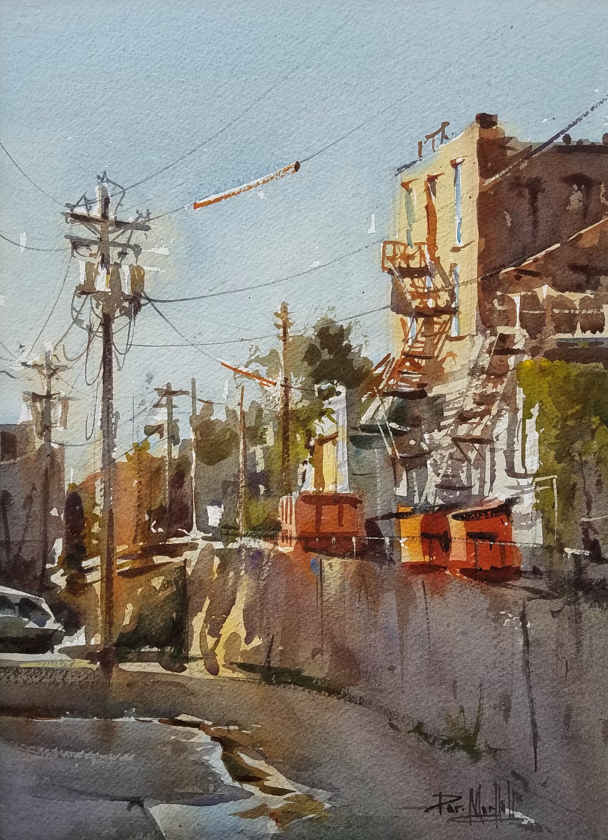
He goes on to explain that white gouache can give a little bit of neutrality to a color. It allows a watercolorist to layer without unwanted color mixing. “I often use gouache in skies, because if you warm up a cloud in a blue sky, it can become green. I get around that with white gouache mixed with cobalt. It hides the yellow enough to allow the blue to come through, without making green.” Mondloch also points out that applying bit of gouache with a rigger brush makes strong, thin lines.
Enough Is Enough
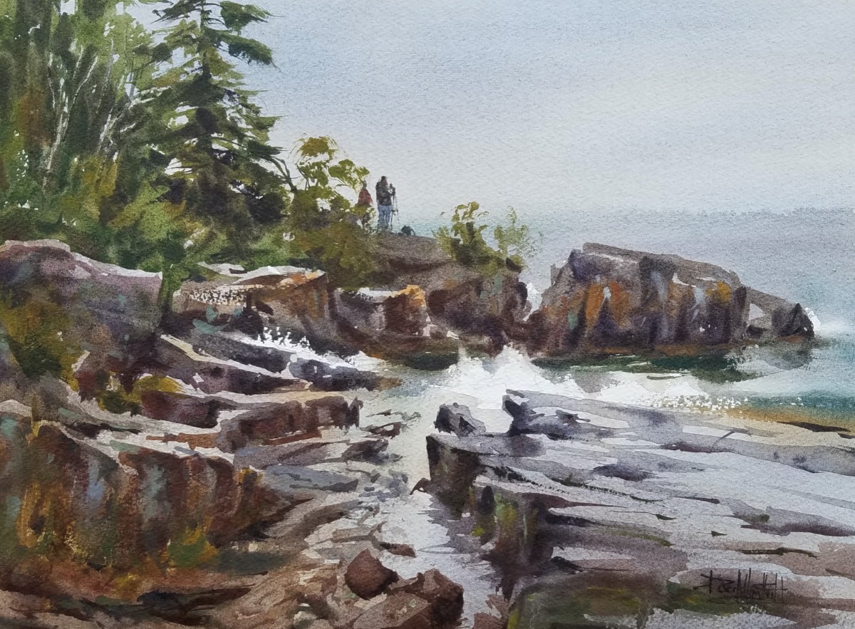
He prefers to work on 300-lb. rough watercolor paper, the heavy texture of which allows for interesting effects. “I like the rough texture because it enhances the gesture of a brushstroke and captures the energy of the moment en plein air. It’s good for trees, but also for street scenes, where the rough texture skips the stroke, breaking up things like telephone lines or shadows raking across the street.”

Still, he keeps detail to a minimum. “There is security in painting detail,” Mondloch explains. “I think that’s why we default to it. We live in a photographic society and we naturally compare things to photos. We see photos as visual proof. But more often than not, the more we put in the painting, the less successful it is. We can lose what makes the scene special if we add too much detail to it. You only need one or two sharply rendered elements for the rest to be just indicated. You have to know what to depict and what to suggest. That said, I don’t mind detail if it doesn’t take away from the main idea of the painting.”


