
Sometimes as artists we are blessed with a perfect composition before us, but most of the time editing is required! Editing allows us to better translate a scene and present the story we want to tell with our art. Too often we can get caught up in just trying to duplicate, not create.
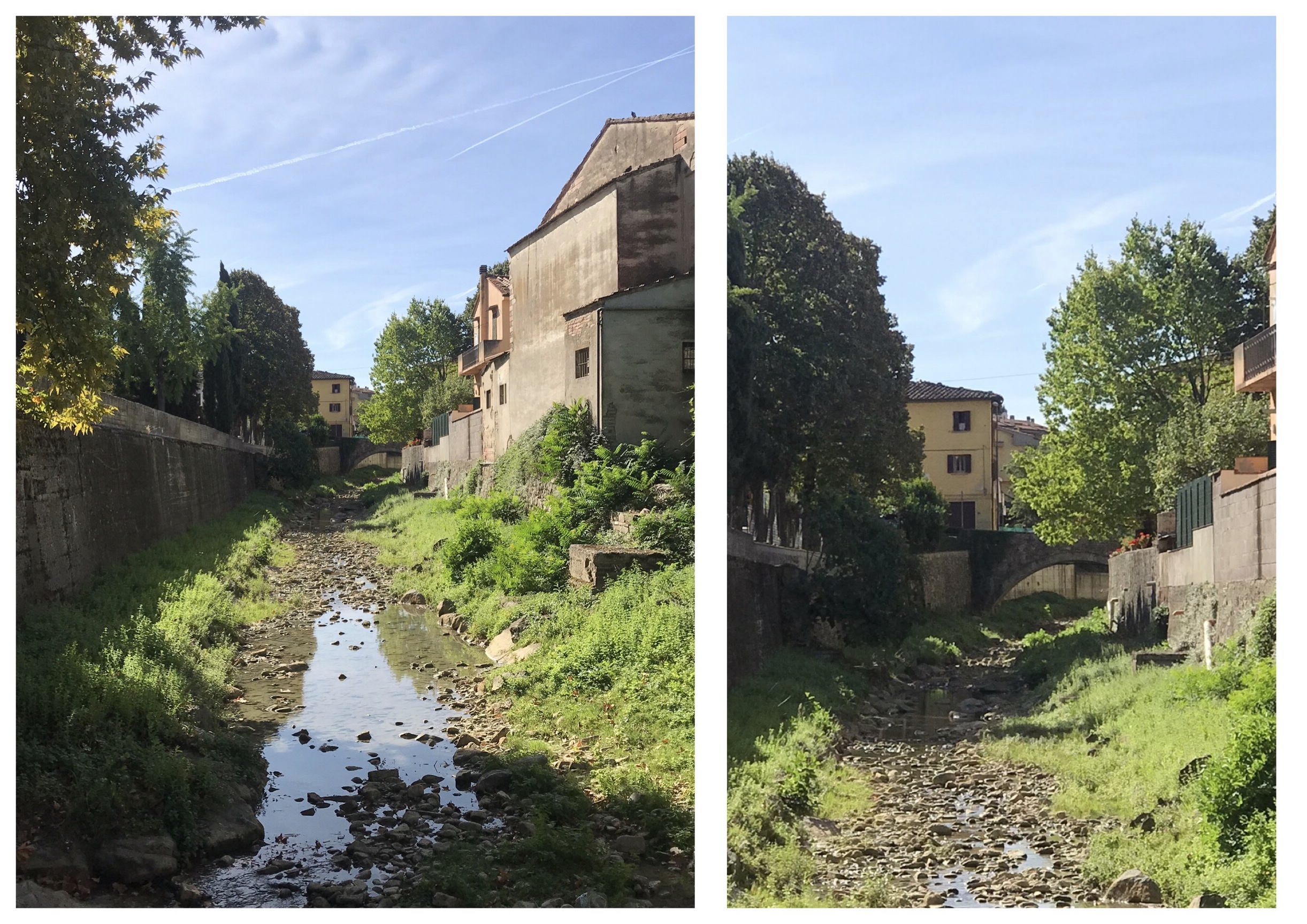
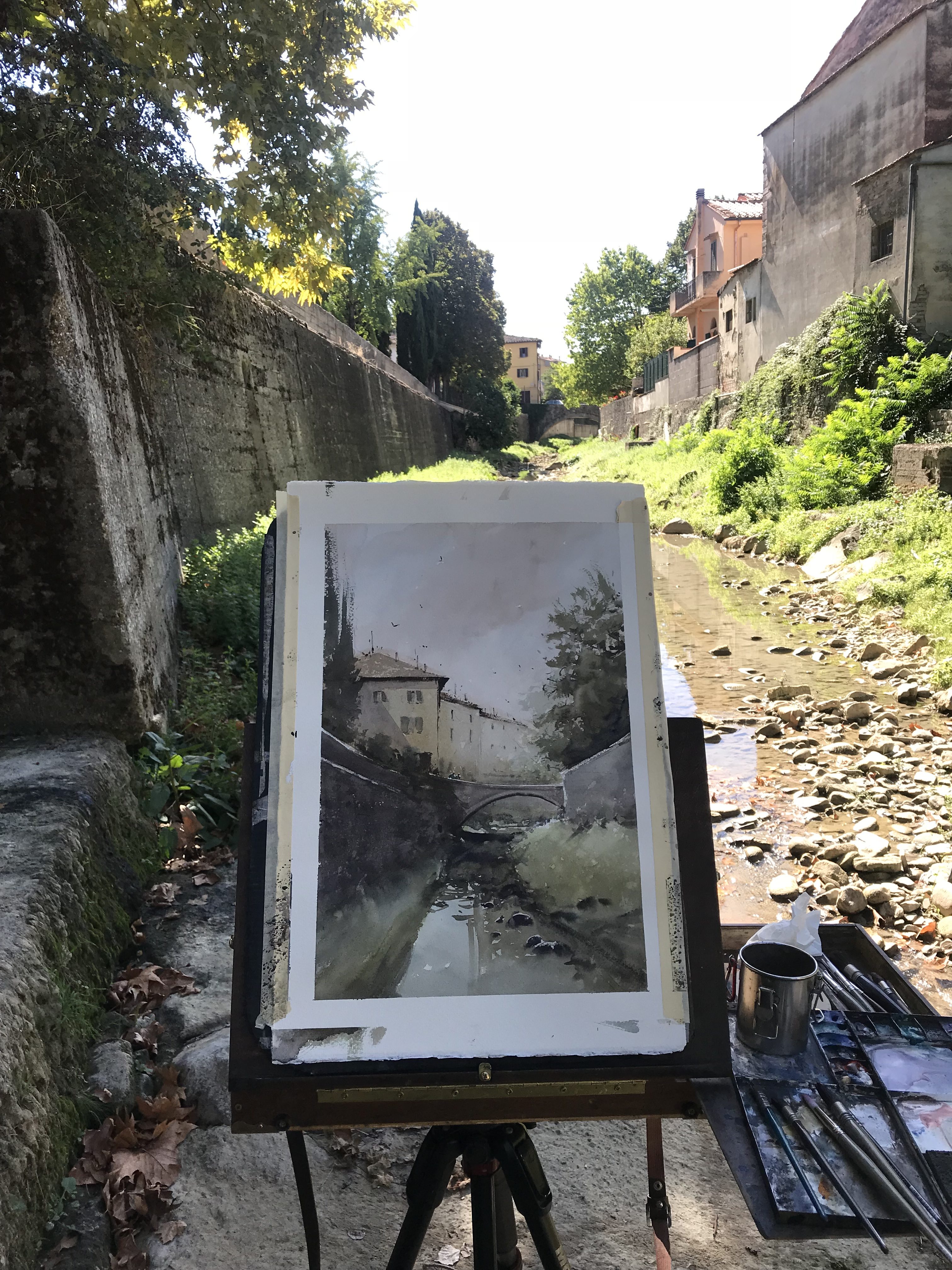
On a recent painting trip to Italy, I came upon this subject of a canal in Greve in Chianti. I had spotted it from a narrow bridge, just behind and above from where I eventually set up my easel. Since the bridge and pedestrian walkway were too narrow and not a safe place to set up, I decided to climb down the rocks onto the bank of the canal. Not only did this keep me away from danger but also away from the crowds of tourists.
It is a quaint scene with typical Italian buildings but not from a typical viewpoint. I was attracted by the strong lead-in of the retaining wall on the left and the bridge connection in the middle but the composition needed editing to create a stronger painting.
Dan shares more tips in his DVD CITYSCAPES IN WATERCOLOR WITH DAN MARSHALL.
In this case, the main building and bridge (the subject) is a little far away, The reflection of the creek doesn’t go up far enough, the light on the buildings is a little flat and the mass of trees on the left are too prominent. You can work out compositional changes to a scene with thumbnail sketches and a small study but for this, I did what I call “mental photoshop”. I gaze out and study the scene then start to visualize my painting, compose and rearrange as I see fit. Creating in my mind a pre-visualization of the finished piece.
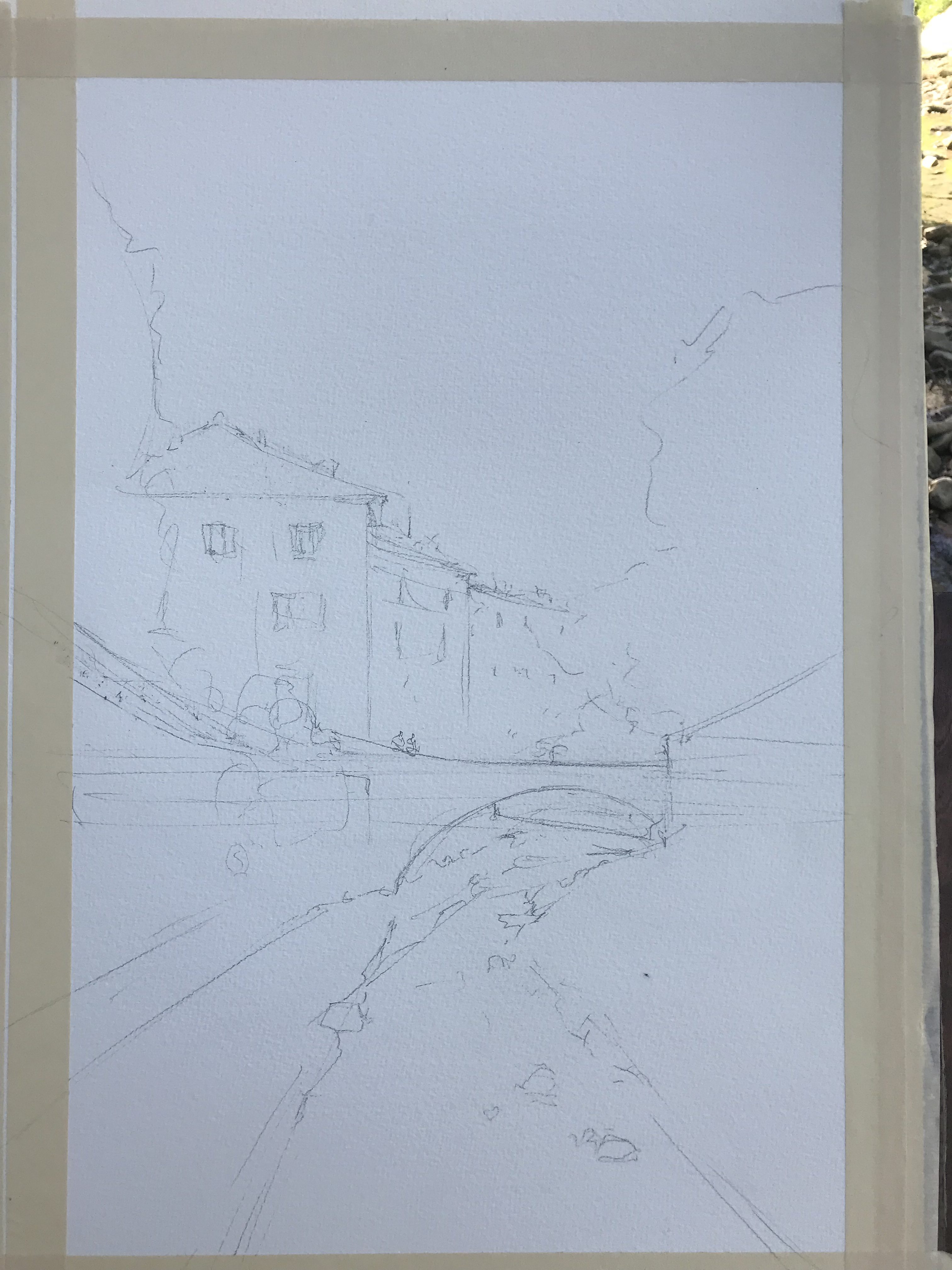
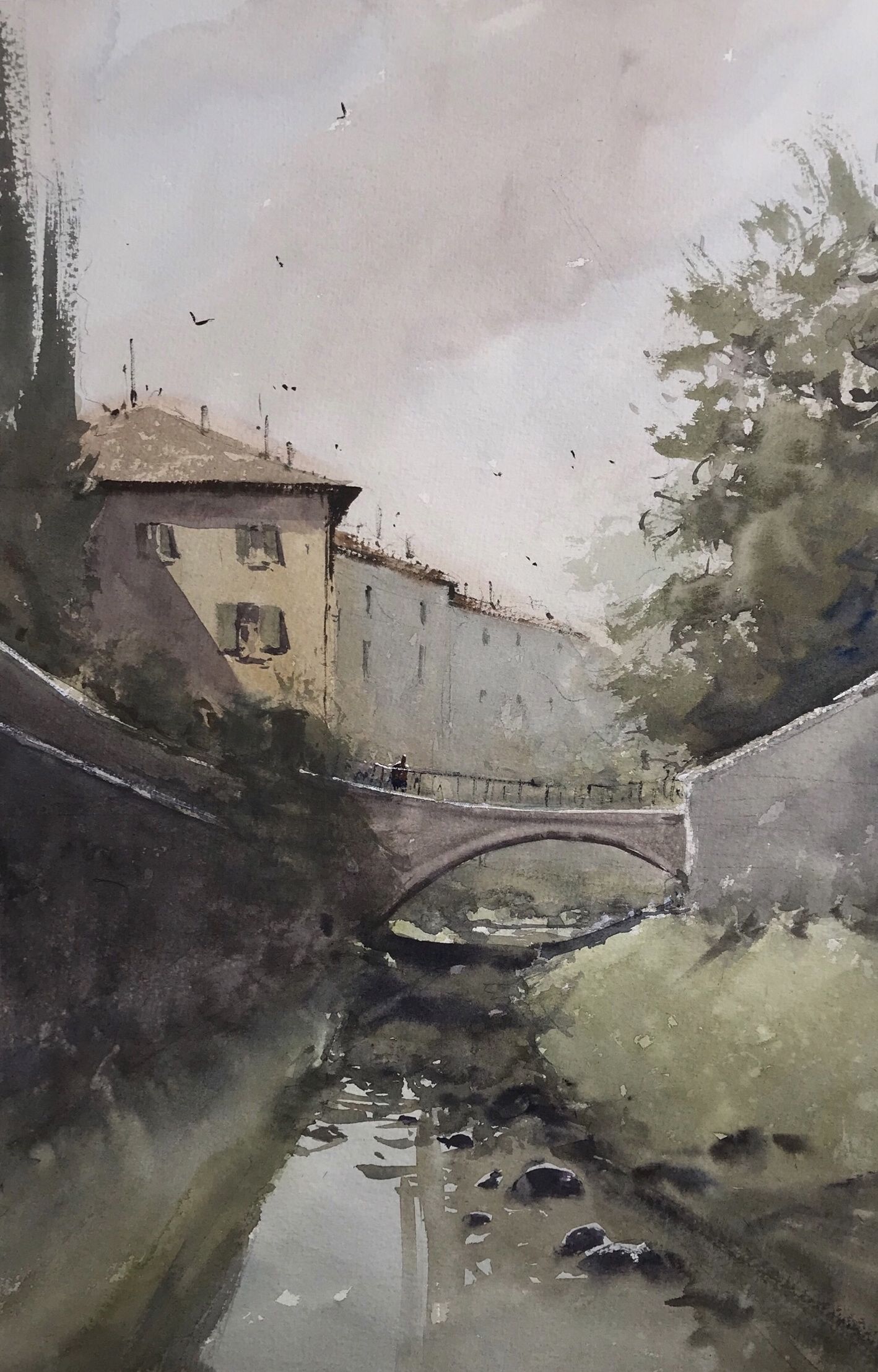
If you compare the two scene photos to my pencil layout sketch you can see how I merged the foreground creek up to better connect to the middle ground. I then use directionals of the creek and wall to lead your eye in to the subject area. In the finished watercolor painting, you can also see a strong directional shadow on the building aiming right towards the subject and a subtle design in the sky that leads towards the buildings. I also changed some of the trees into pencil lines to give more of a Tuscan feel. This painting is full of zigzag connections and echoing repetition of shapes. Look for a “V” in the sky shape and an inverted “V” in the foreground, can you see them? And see how all the elements fit together like a puzzle to create a unified design and cohesive painting?
Most of all, I simplify each major shape by eliminating unnecessary details. There is still enough suggested detail to make it interesting to the viewer.
This is all achieved by intentional design and not just a happy accident of random shapes. Nature gives us the clues and if we look hard enough, all the information is there, we just learn to organize the pieces to create visually pleasing paintings. On your next painting, see what you can do to reorganize a scene and take it a level beyond ordinary!
Cityscapes in Watercolor with Dan Marshall from Creative Catalyst Productions on Vimeo.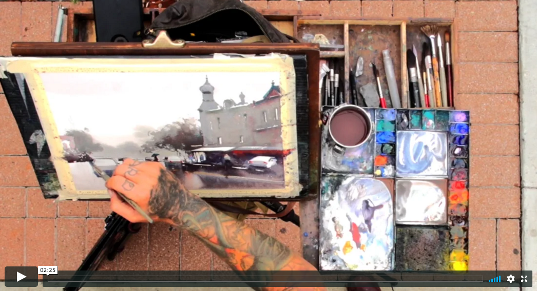


I really enjoyed this commentary on how to dissect a scene and turn it into a winning painting. Often I take a similar stance on a mundane scene and even surprise myself with what I come up with. I don’t have to travel overseas to come up with a winning painting. It would be nice if I could afford it but alas I cannot. Keep up the great work and tips…..your video is really, really good. I appreciate that you took the time to teach your methods and thoughts.
Great article. I really like the grays you use and your design is great. Remarkable you are able to do it in your head without sketching it out.
This is the perfect dvd. Dan is an excellent teacher. This is suitable for beginners to advanced watercolorist.
The composition is nice, but the shadow under the bridge is confusing, too solid dark, and going up the little hillock.
Enjoyed seeing your work. God bless, C-Marie
Gosh… I thought the vertical reflections in the shallow canal bring the eye up towards the left hand part of the shadow under the bridge which in turn leads to the lovely light on the building… but the clever shadow under the bridge has to travel up the hill to the right to also lead the eye upwards to the soft trees on the upper right… it means the painting, to me, is balanced and not directing the Viewer solely to the left hand side of the composition….. but… so interesting to have a forum to learn and discuss…. thank you… beautiful, apparently simple effect but appreciate all the pre planning and design.
Appreciate your thinking process and composition concepts as you analyzed the picture for a painting! Many thanks!
That’s exactly what I need, tips and lessons about composition. Great explanation.