
Meet Dorrie Rifkin, this week’s top American Watercolor Weekly Ambassador!
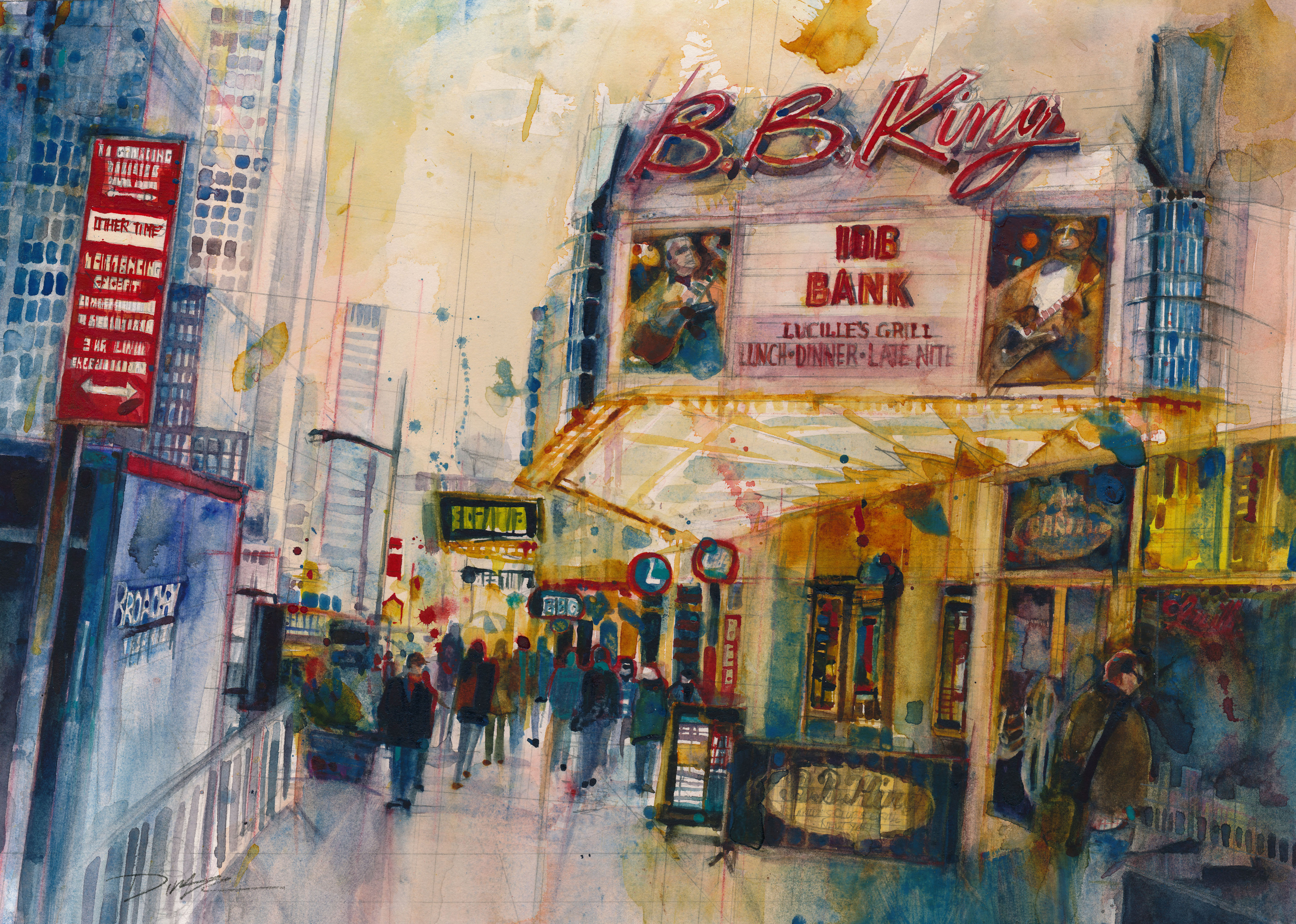
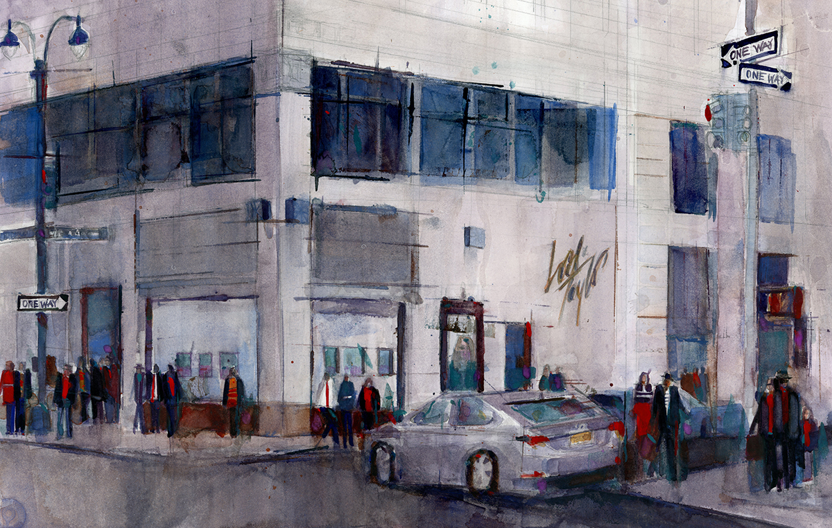
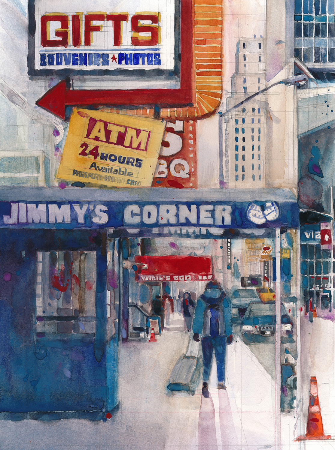
Dorrie Rifkin paints from her passions. Thirty years’ experience as an award-winning art director ignited and cemented a life-long love affair with typography. Her other passions — music, New York City, and family – are palpable in her work. Every painting has a personal story. “I’m lucky to live near the City, and spend a lot of time there,” Rifkin, an Englewood, NJ, resident, says. “Usually, I’ve a camera or sketchbook in tow. Running out of things to paint would mean that I was not doing much of anything with my days.”
Dorrie’s major influences were advertising and graphic design luminaries whose works leapt off magazine pages and into her heart: the illustrators Bart Forbes, Bernie Fuchs, and Mark English, and type master and ITC Avant Garde (art deco) font designer Herb Lubalin. Now, she is inspired daily by scrolling through fellow artists’ Facebook postings.
Dorrie can’t remember a time when she didn’t paint. Her mother would always give her sketchbooks to keep her busy. But nearly a half century later, what might have remained a hobby suddenly loomed as a possibility of a second career, when she took a watercolor workshop in cityscapes that rocked her world.
She quickly emerged as both an accomplished watercolor artist and popular NJ-based watercolor and drawing instructor, and soon thereafter began teaching workshops throughout the country.
Her paintings have won more than 30 prizes, many in international and national juried shows, and are exhibited in private collections worldwide.
Dorrie was featured in the article “Ones to Watch,” appeared in, and her painting, Leaving the Highline, served as the cover of, Watercolor Artist magazine (December 2010 and February 2015, respectively). Her work was selected for Splash 14, 15, 17, 18, 19 and 20. She is a signature member of the Transparent Watercolor Society of America, and of the Northeast, Pennsylvania, Philadelphia, New Jersey and Baltimore Watercolor Societies.
Her paintings have won more than 30 prizes, many in international and national juried shows, and are exhibited in private collections worldwide.
Dorrie was featured in the article “Ones to Watch,” Watercolor Artist (December 2010), and her painting “Leaving the Highline” served as the cover of Watercolor Artist magazine (February 2015). Her work was selected for Splash 14, 15, 17, 18, 19 and 20.
She is a signature member of the Transparent Watercolor Society of America, and of the Northeast, Pennsylvania, Philadelphia, New Jersey and Baltimore Watercolor Societies.
Become an American Watercolor Ambassador for a chance to be featured in an upcoming issue!


