
By Stewart White
To keep my skills sharp in the cold winter months — when it’s a challenge to paint en plein air with watercolor — I like to make my versions of paintings by masters like Joaquín Sorolla and John Singer Sargent. (A good practice no matter what subjects you like to paint.) The twist is I copy oil paintings in watercolor and watercolors in oil.
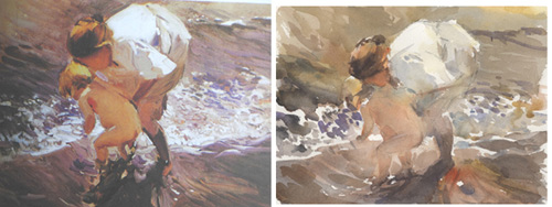
For example, I love this work of Sorolla called Child in the Water — a masterclass in lost and found edges. I try not to spend more than 30 to 40 minutes per study. The point is to capture the major impact of the work, not the colors or details. Sorolla was great at simplicity and focus.
Lesson learned: See where “the big moves” are. In this case, it’s the white blouse catching the bright beach sun, echoed in the froth of the waves. These lights come forward and all else recedes. The trick is to spot these relationships in nature and express them in your own way.
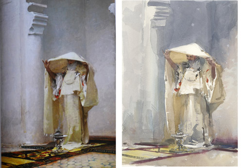
This iconic masterpiece by Sargent called Fumee d’ambre Gris is an excellent study in cool and warm. It’s a terrible copy on my part, but the main thing is the play of light throughout the composition to capture the sense of light coming through fabric. This will be a handy lesson to remember when it’s warm enough to paint sailboats.
Lesson learned: This is actually quite colorful without using a broad spectrum of color. By keying everything down to a white family of values and temperatures, the viewer becomes more nuanced in his viewing. Subtle variations become more apparent. I want to look for this same problem. It is magical when a painter is able to suggest light bouncing off the opposite side of fabric as in a sail or sheets of laundry on a line.
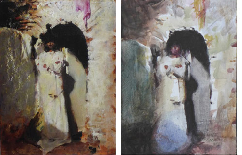
Continuing with Sargent, I chose a painting with a full range of tones, from very dark to white. I experimented with a paintable watercolor ground from Daniel Smith on Masonite panels, which feels like painting on plaster at first but becomes more receptive as the layers dry. I like it for its color saturation. In general, I keep these studies very loose and small — no more than 6 x 8 -inch panels.
Lessons learned: By copying work like this I become attuned to Sargent’s decision making. I am aware of his attention to nuanced passages in the study and also where he merely indicates a texture or shape. I learned from my copy that I have a tendency to use more chroma than I actually see — not a bad thing, just something to keep in mind. Also, I came to the conclusion that I may want to use the look of a sanded surface in a plein air piece some time. Next chance I get, I’ll bring a few of these panels along just in case I see an old weathered wall with an angel standing nearby. (wink)
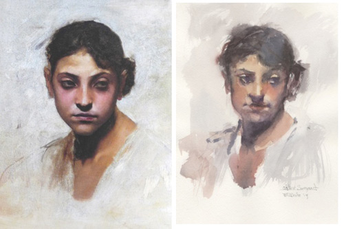
Portraits don’t rely on good weather; only a model is required, but when none is available who better to copy than Sargent? A good portrait demands a level of precision that is so elusive in watercolor, but it didn’t stop me from trying my hand at copy of his Head of a Capri Girl.
Lessons learned: This exercise helped me see where edges are hard or soft, to apply color wet-into-wet at the right time so as not to create disturbing “blooms,” and to successfully hint at flesh and bone beneath the surface of the skin. As if that wasn’t challenging enough, it was important to create a believable head, where both eyes belong to the same face and then to add a believable expression. Again, my copy isn’t very accurate, but the point was to learn how to craft volume with watercolor in a quick and gestural way. There is more power in the way the pupil of the eye disappears into the shadow of the eye socket than if I tried to paint every little eyelash and fold of skin.
I’ll often make several of these studies every evening, copying maybe three or four of my favorite master works, and then choosing a “not so favorite” and learn why the artist was interested in a particular play of light or composition.
Lessons learned: This small study by Sorolla called Beach in Biarritz is a lesson in connections. Detail and texture take a back seat to the interactive nature of cool grays. We see form and volume, and we can almost sense texture, but in fact that is mostly taking place in our own heads. Careful inspection shows us that none of that is present. Sorolla has, in a sense, made us co-painters with him, and that to me is the most satisfying of aspect of his paintings. I am transported to a moment in time. My imagination comes alive, and I live in Spain a century or more ago — miraculous when I consider it’s just a few spots of color artfully arranged!
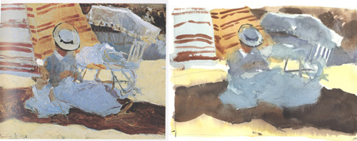
In this example by Sargent, we have big, simple shapes and a play of cool and warm blues and whites. While working on the copy, I asked myself, what did Sargent see when he set up his easel? What did he learn while painting? Was he happy with the result? He seemed to be fascinated with the temperature changes in white objects — something Sorolla also worked on.
Lesson learned: This example celebrates the abstract nature of light and shadow, and of cool and warm planes of color. It goes to show you can make a compelling painting from just an arrangement of white walls.
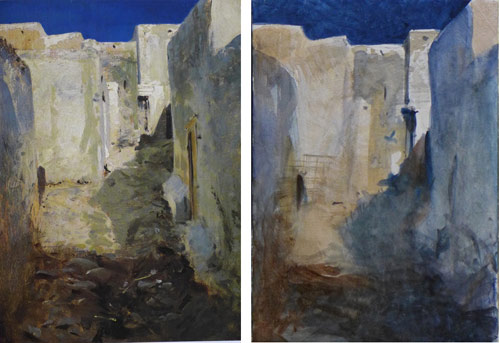
Going from a watercolor to an oil copy is quite a different exercise altogether. I think I learned more about Sargent’s mastery of changing temperature inside of a shadow by trying to re-create them in oil.
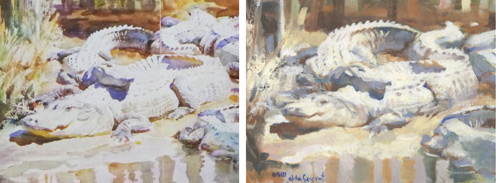
Lessons learned: When copying the iconic painting of muddy alligators sunning themselves on a bank, my first observation was the impossible white of the paper. White paint cannot come close. I became more aware of how the sharp edges create the baking hot atmosphere of the scene.
In the oil paint copy, I saw where I could drag paint over an area to give it the feel of rough paper. I’m going to do a few more of these oil copies of great watercolors because on the one hand, I notice more subtleties in the watercolor, and on the other hand, I am intrigued by the richness of oil paint in layering, which I seldom do in watercolor. I also noticed how I could not bring myself to use that cobalt blue color in the shadows. They work wonderfully in the watercolor, but I couldn’t pull it off in oil — something to strive for, I suppose.
In Conclusion
By translating a work in another medium I become conscious of the extraordinary ways that my choice of medium plays into the portrayal of mood. I try to celebrate the inherent qualities of each medium and exploit them for their strengths. If you’re interested in doing these exercises in the warmth of your studio, I recommend the French Impressionists, as they are good for copying, especially Sisley and Pissarro. Pick your own favorites, and mix up the media a bit. Notice how easily blends happen in watercolor that take more care in oil. One of the main benefits you’ll find is that it forces you to not slip into autopilot.
In Painting Architecture in Watercolor Stewart White shares a simple technique for painting architecture (that you can use for any subject matter!).


