
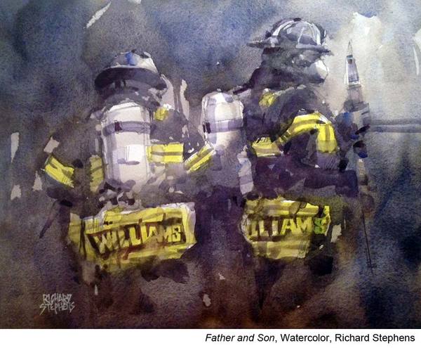
“I am all for experimenting, trying a new approach and materials,” says Richard Stephens, “but I have found that having a consistent process gives me confidence that, at least some time, I can create a successful painting. Or, at worst, have fun trying. I pretty much know what to do next, what has worked in the past, and the price I’ll pay if I get lazy and skip a step.
“A quick overview of my painting process would be:
- Select a subject to paint.
- Do a value Sketch.
- Do a quick contour drawing on watercolor paper.
- Do the painting.
- Critique the painting. (I feel every painting is just practice for the next one.)”
Getting the Values Right
“I consider myself a value painter. If I get the values right, whatever I determine “right” to be, then the colors will work. I seldom strive to match local color, though I might stay in that family of hues. I am more interested in creating an atmosphere than in an accurate rendering of the subject and I recognize color is a major element in creating atmosphere. I almost always have some thoughts about color before I began a painting, but after the first wash, instinct takes over and I focus on shapes of light vs. dark, warm vs. cool — not objects.
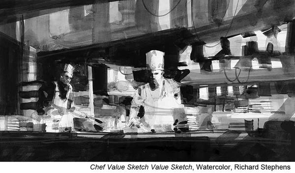
“One important thing I try to impress on my students is that a value sketch is not just an attempt to accurately draw the subject. If that is all you are doing, then you are simply practicing your drawing skills, which is a not a bad thing, of course, but it’s not what I’m after in this step. The purpose of a value sketch is to design your painting in terms of placement of elements, composition, and indication of the value relationships.
“A value sketch should be about thinking not drawing! At this stage, we simplify, eliminate, move things around, and sometimes even add elements in our quest for the best design.
“Over the years, I have used various materials to do my value sketches including markers, charcoal, and soft lead pencils — anything that would give me a good range of values from the white of the paper to a strong dark.
“I have evolved to using Payne’s gray, obviously applied with a brush, to do my value studies. This is not unique to me as many other artists use this technique also. The fact that I paint the value sketch is a great warm up and I experience, at some levels, the process I will go through in the final painting. Pardon the pun, but I think that gives added “value” to the this very important stage.”
Planning Edges
“Edges are the second most important element I consider in my planning stage (value sketches) and the final painting. Edges are crucial in directing the viewer through the painting.
“I discuss three types of edges in my workshops and almost always have all of them in my paintings. Hard, soft, and lost edges each have their place in most works.
Hard edges indicate an abrupt or sharp transition from one color shape to another.
Soft edges indicate a gradual or smooth transition.
Lost edges are so soft you cannot actually see them (but you know an edge is there based on other elements).
“In watercolor, they almost happen automatically, but we, as the artist (Art Director), must use them thoughtfully and wisely. Hard edges draw attention and help define a center of interest, soft edges demand less attention but are just so beautiful. Lost edges allow us to combine and join elements within our painting, yet let each maintain their own identity. Values, then edges are number one and two in my design process.”
Learn how to create complicated watercolor paintings in a straightforward way with Thomas Schaller’s “The Power of Design.”


I love Richard’s article. I like what he said about value sketches are more about thinking than drawing. Value and edges are key for me too. I also love line. Thanks Richard!
This is a great article and very instructive. As I was reading I was able to understand more thoroughly the importance of values and establishing them from the begining as well as to not place over importance on perfect drawings. Thank you Richard.
Richard. I do agree with you about the importance of values…and edges. Thank you for the wonderful article.
I enjoyed reading Richard’s article .It was a good reminder to do a value sketch after deciding on the composition.Very timely as I often go straight in without too much thinking.Thank you.
Great article and great examples too – I definitely need to spend more time doing value studies! I know that I often end up preferring the value study to the ‘finished’ painting it’s supposedly helping design!
I was so delighted to see this article by Richard Stephens. I follow his FB posts and own one of his “chef” paintings and I am always awed by his limited palette, his use of whites, and his wonderful structures….old barns, buildings, etc that always make sense when he paints them! And YES to the value sketch! Thank you Richard!
Thank you Richard; I enjoyed your article very much. As a new artist, I still struggle with my value studies. Great explanations were offered. Much appreciated!
Thank you for helping me finally, to understand the the answer to my illusive question “where is the light?’. It’s in the value study. Thanks for clearing that up.
Richard, not only are you a great painter, but a great writer! Thanks for your explanation through your processes. You made it easy to understand and follow.
this article is such a great tutorial for beginners, especially. it includes all of the basic concepts that a beginner needs to learn before they can really start painting a picture that reflects the knowledge of a true painter.
thank you for this opportunity to learn and relearn important aspects of painting.
[…] Discover Two Steps to Better Designs […]