
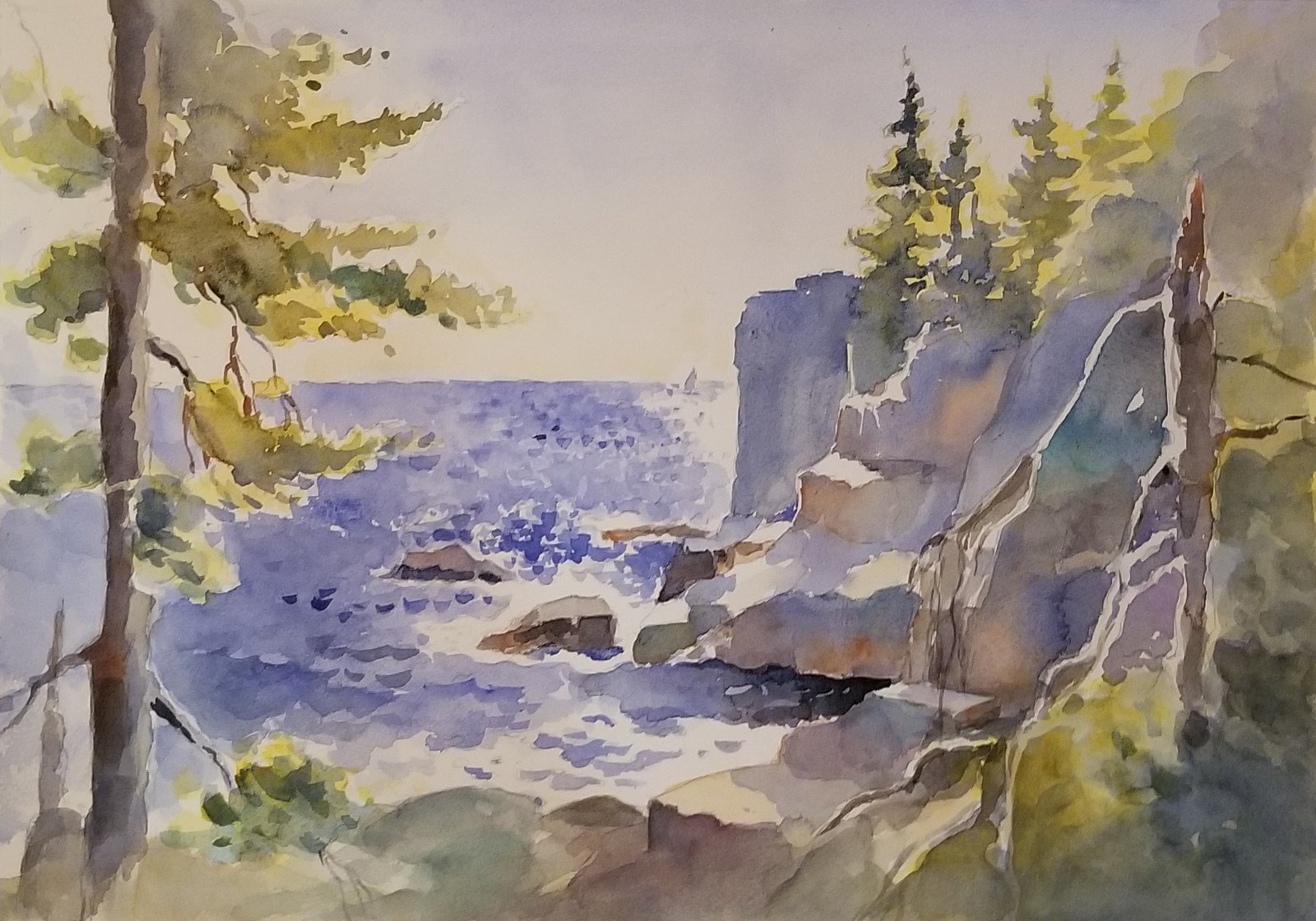
A study in backlighting, Theresa Heidel’s watercolor painting above captures the beauty of Maine’s Otter Cliffs. In the demo that follows she shows you how she layered translucent washes of color, emphasizing sharp contrasts by preserving areas of pure white paper, to recreate the sparkling play of light on the water that day.
WATERCOLOR TUTORIAL | By Theresa Heidel
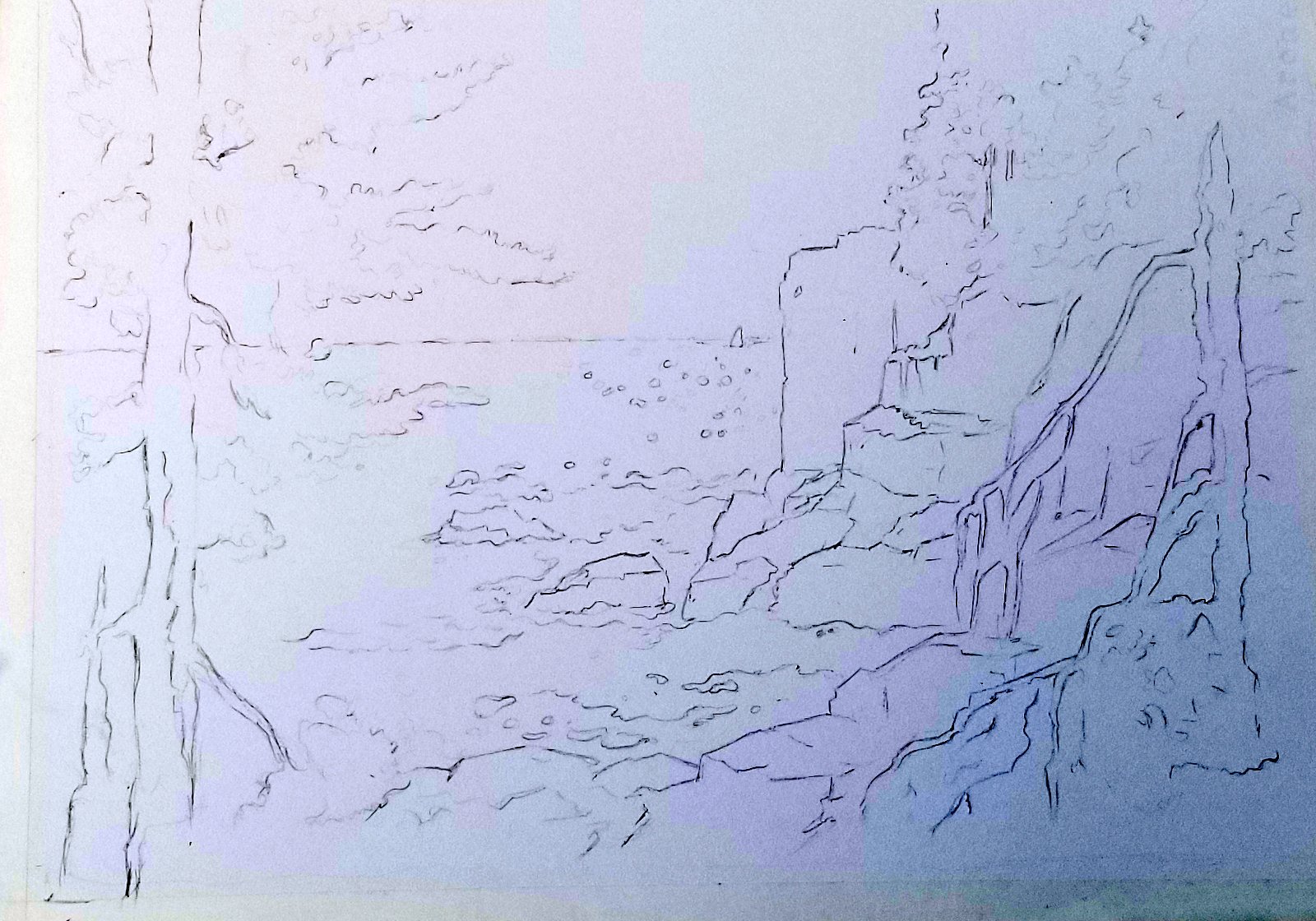
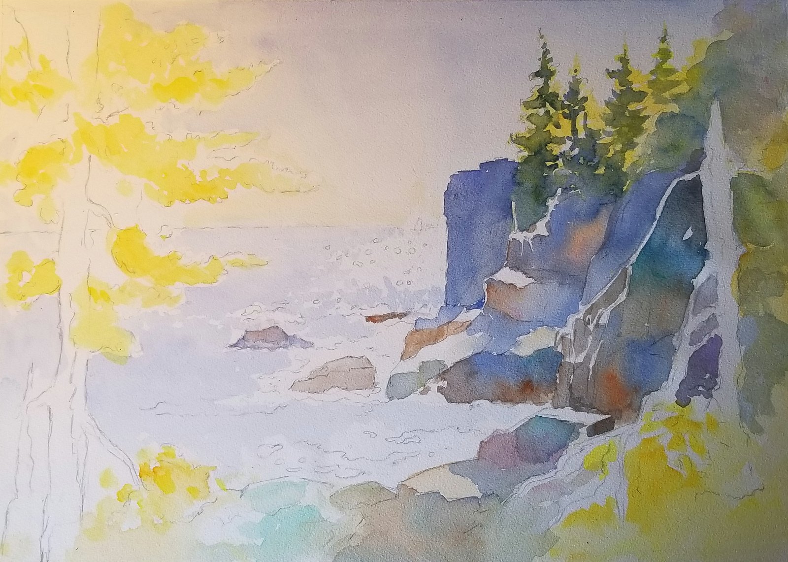
Step 1: Basic Outline
In 2H pencil, showing crisp lines for the sharp edges of the rocks. I use a kneaded eraser to remove any extra carbon before I start to paint.
Step 2: Underpainting
First I lay in a sky wash with the Skyflow brush, starting with cobalt blue at the top of the painting and gradually flowing in a yellow ochre as the sky meets the water, continuing the light ochre into yellow where the trees will be, on the upper right.
I paint a light blue tone in the water and leave the paper untouched where the sparkles will be.
While this is drying, I start to paint the lower right bright yellow where the sun hits the trees. I also put yellow ochre and light burnt sienna and blue along the rocks.
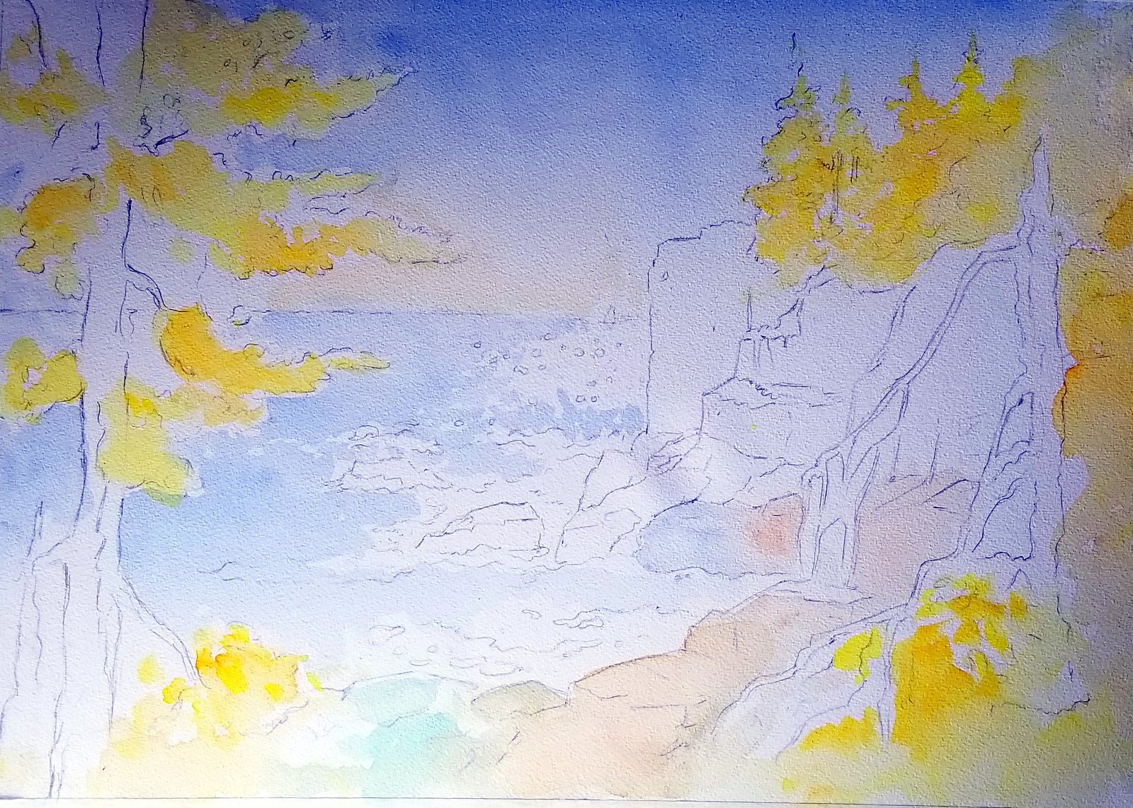
By this time the upper left should be dry enough to put the yellow undertones on the tree on the left. If not, I wait until it is dry so the edges will be crisp against the blue sky.
The yellow undertone should be strong enough to show through successive layers on the trees. This is glazing, and it’s what makes a watercolor luminous.
Step 3: Adding More Color
I begin at the cliff on the right, using direct strokes with a flat brush, carving the sharp edge of Otter Cliffs using a strong mixture of Payne’s gray and cobalt blue. To get a crisp edge, the paper has to be completely dry.
This value contrast and sharp edge draw the viewer’s focus to the center of the painting. I continue this mixture up into the trees on top of the cliffs, leaving the edges yellow to show the light behind the trees.
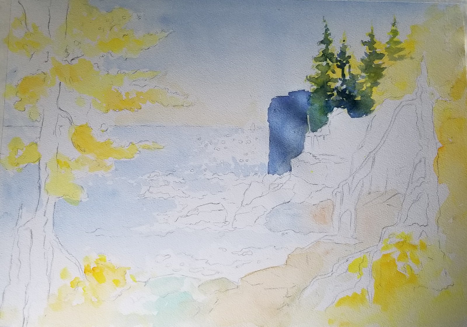
On the right side of the painting I connect the shadow shapes of the rocks to keep a unified look and leave the top planes of the rocks untouched to emphasize the light effect. I strategically leave the white of the paper to give more strength and punch to the painting.
This has to be done with the whole composition in mind — otherwise, it could be distracting. I like to let in a surprise color like a phthalo green or permanent rose to break up the neutral look, and to let the colors fall into each other without trying to control them.
The main consideration is the unity of the painting. The rocks can show reflected light at the base of the shadows, with burnt sienna flowing into cobalt blue toward the tops of the rocks.
Step 4: Tree and Foliage
I begin the tree on the left using burnt sienna and sepia for the trunk. For the foliage I use cerulean blue; new gamboge for the medium values; and ultramarine blue with new gamboge for the darker values, making sure the yellow shows through.
Now the composition is more balanced with the tree on the left and right.
Step 5: Painting Water
Now I work on the sea, using cobalt blue and ultramarine blue. I use the tip of my brush (Escoda Perla round #12) for the sparkles themselves and make stipple marks with the blue to show the sparkle.
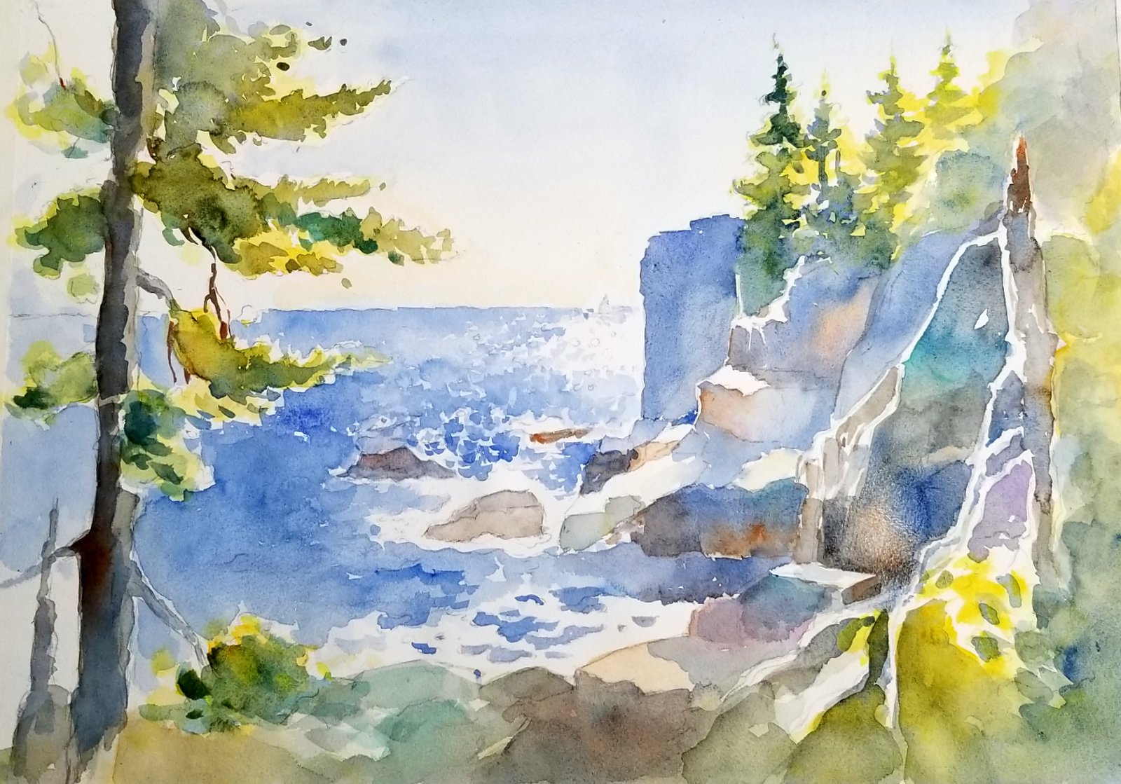
I deepen the water overall with another wash of cobalt blue, and when that is dry, I make action marks in the water for movement with the ultramarine blue. This pulls the composition together.
Step 6: Adding Details
I deepen the darks in the shadows of the rocks and trees and bring up the sparkle in the sea using a high contrast of the blue against the white to make it more brilliant. This is done by using a deeper blue color against the white of the paper.
I use the rigger brush to bring up the branches and fine details in the trees.
THE ARTIST’S SUPPLIES
Colors: Cobalt blue, French ultramarine blue, cerulean blue, permanent rose, phthalo green, sepia, burnt sienna, yellow ochre, new gamboge, hansa yellow, and Payne’s gray.
Paper: 90-lb. cold-pressed Arches, stretched on a board
Brushes: 1- and 1/2-inch Robert Simmons White Sable Skyflow flat wash brush, Da Vinci Jumbo synthetic round #30, 1-inch Cotman flat brush, Escoda Perla round #2, and a #3 Cotman rigger
MISC.: a Pike palette
In Fearless Waterscapes, Shuang Li shows you how to harness the beauty and power of water in your watercolor landscape paintings.


