
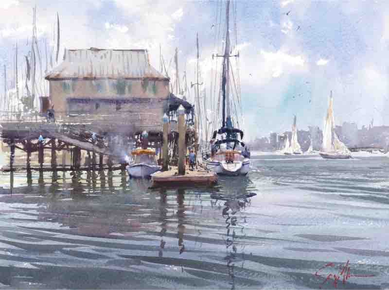
“As a subject, water is elusive — a mysterious, moving arrangement of abstract shapes,” says Geoff Allen. “There are many variables that affect how water appears to us — whether it’s shallow or deep, choppy or glassy, and whether the day is overcast or sunny. Adding to this complexity is the angle at which we view the water’s surface. I work from my observations and impressions of a scene at the beginning of a painting session. Knowing that the appearance of the water will change, I try to lock the initial experience into my memory.
“Regardless of how it actually looks, however, I’ll make alterations for the purpose of creating a compelling artwork. Ultimately, my paintings are not only about water but also what surrounds it — the atmosphere, marinas, and people. In particular, I love to paint harbors, and my description of water in those pieces comes from my accumulated plein air observations and experiences.
“When used to paint water, watercolor showcases its greatest attributes — soft, silky smooth, transparent gradient washes and “one go,” brisk, calligraphic patterns of mark making. En plein air, I avoid using masking fluid because it would take more time and I prefer the idea of training my mind and hand to do without. That said, I’m careful to go light in areas I want to pop visually.
THREE-STEP PROCESS
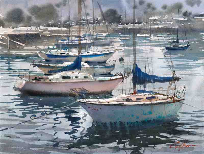
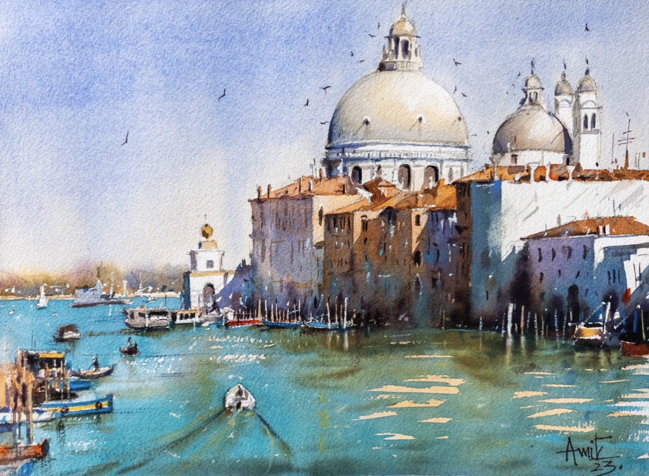
“I apply watercolor in three ways when painting water. The first application is a gradient wash (wet on dry). I use a big mop brush loaded with a mixture of a few colors. I call my mops “water shovels” and the more mixture of paint and water I apply, the smoother the gradient will be. I also vary the speed of my strokes. By softly and quickly stroking across rough paper, I try to create the “bits” — tiny dots of white paper. The “bits” are like sparkle. In general, this wash represents the reflective state of the water’s surface and in many cases I lighten values closer to the horizon and darken values closer to my point of view. To make sure I get a complex mix of color in my wash, I add some leftover sky colors to my moist wash surface. Where the water becomes shallow (or transparent), the color of the beach sand, river bottom, or ocean floor comes into play, and I’ll add that as well.
“My second application needs to happen while the first wash is moist so it helps to be quick about it or have something on the palette premixed. I call these marks “soft waves.” I thicken and darken my initial mixture with a smaller brush and attempt to match the moisture level in the paper. If I get my timing and mixture right, my mark will be absorbed into the wash, creating a soft wave. I also apply a small line of clean water from the tip of a small brush to create highlights on the surface. The window of time to do all of this closes quickly and experience tells me when to stop.
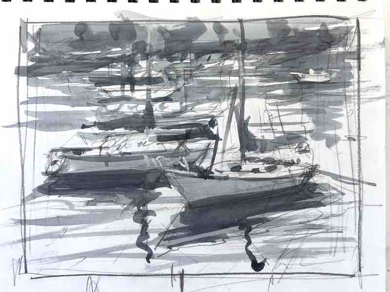
“Finally, I add the layer of reflections. In harbors specifically, I’m painting wave reflections as well as shadows with a middle-size pointy brush and a milky mixture of water and paint. These reflection shapes, like many other natural forms, can be a compositional connecting device. By exaggerating, extending, or altering their shape and location, I can connect various objects that share the same flat water plane and help simplify a complex scene. To identify the connecting patterns of reflections, I often make a rough value sketch to start.
“I premix more color than I’ll need for my reflections because I don’t want to stop in the middle of what I’m doing to make more. I start painting at the top of the paper and work downward, continually adding enough mixture to connect my marks, like a wash. Just like clouds, wave reflections will become smaller and smaller, as well as lighter in value, and flatter, as they approach the horizon. As I paint the waves, I’ll shift hues to refer to objects being reflected or colors I see as I move down the paper. Whatever color I add mingles with my initial mixture as it flows downward. In this process, it’s easy to go too far and mindlessly make too many strokes. To avoid this, I squint as I paint so that I’m seeing not the individual wave, but how much compositional space I’m covering and, most importantly, creating a random pattern of shapes. My goal is to avoid marks and negative shapes that are too similar.”
International superstar Amit Kapoor demonstrates how to paint colorful shadows and reflections in water, and much more, in “Composition for Watercolor.”


