
Waterfalls are a gift and a trap. The drama is built in — but so is the temptation to chase every ripple, every splash, every glittering highlight until your painting freezes into overworked chaos.
Watercolorist Steve Puttrich has a better way.
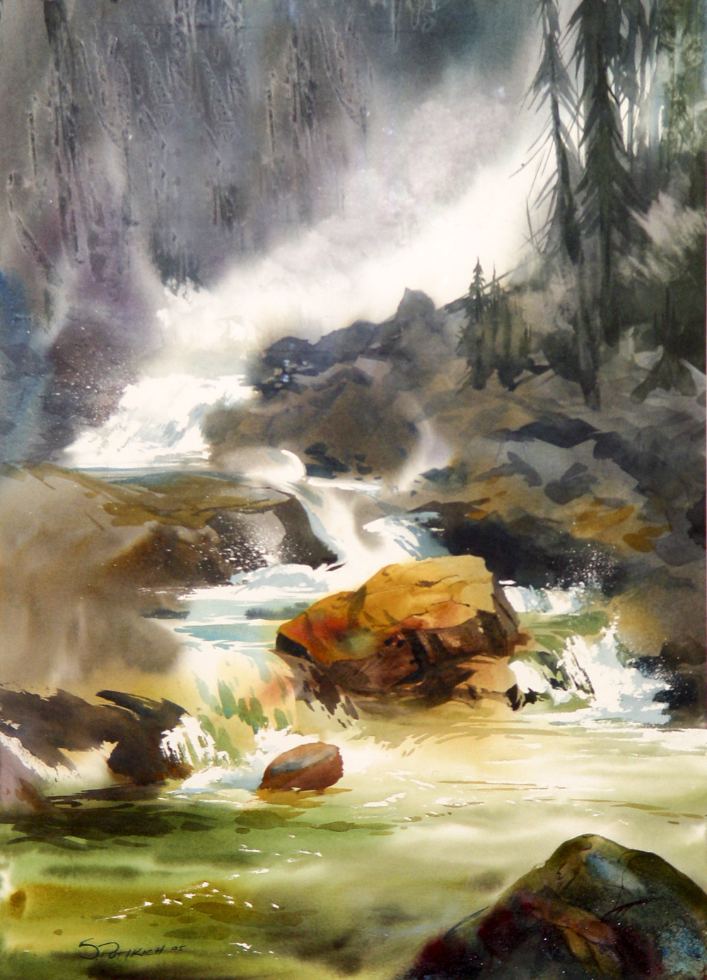
Before he even unpacks his kit, he identifies the element he calls the “wonder” — the bright chute cutting through dark rock, the quiet pool below, a shaft of light igniting the mist. That element will become the hero of his painting. Everything else will play a supporting role.
So how does he do it?
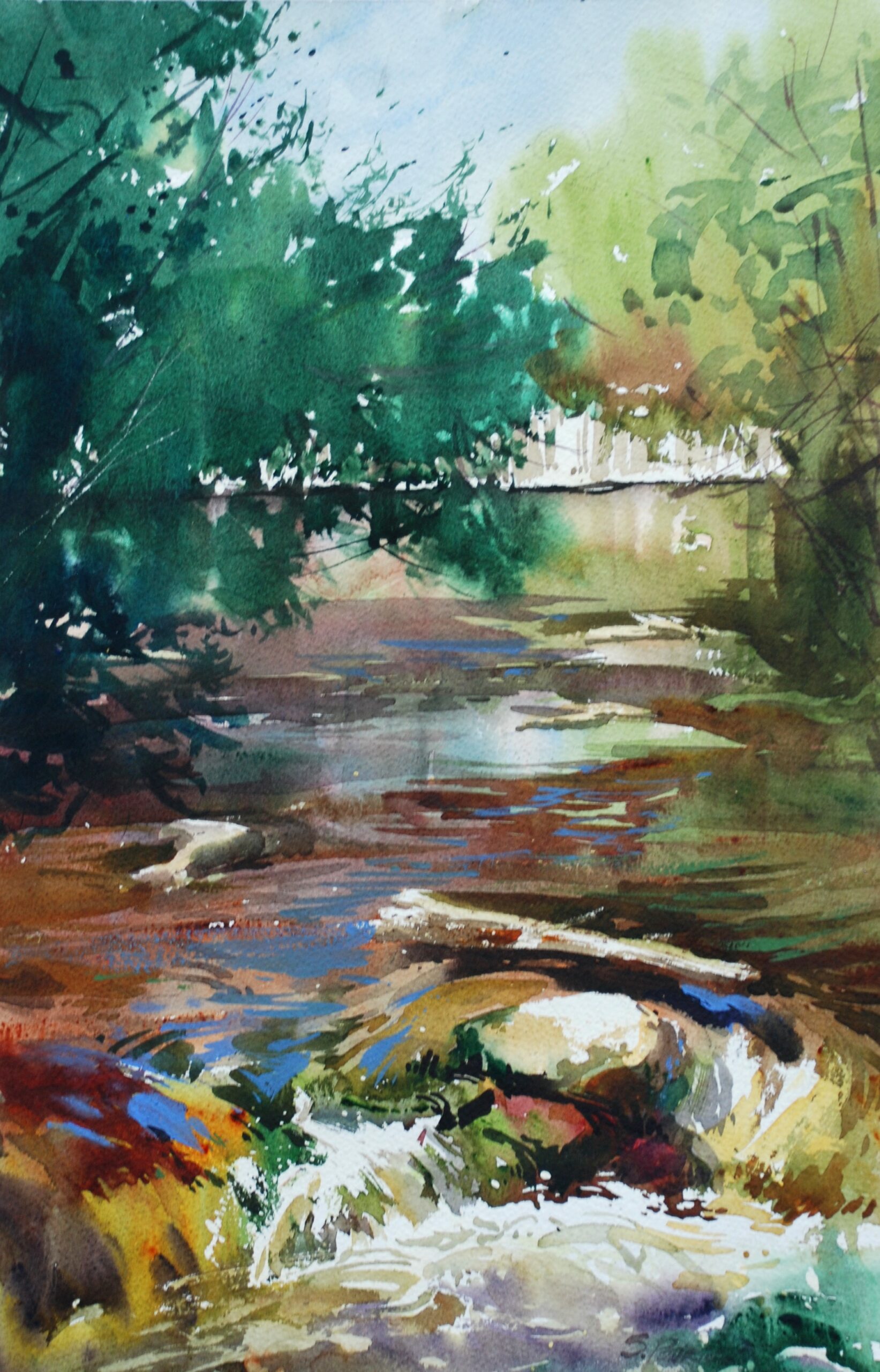
Think in Shape Families, Not Individual Stones Steve simplifies complex rock formations by squinting until the scene reduces to light, middle, and dark shapes. He thinks in terms of large landmasses and smaller shapes — what he calls “Continents and Islands.” Big dark and mid-value groupings provide structure, while selective edges guide the eye.
Water is handled the same way: big directional movements first — the broad sheet of falling water, the dark channels between cascades, the still planes of the pool. The smaller splashes and textures come later. If the large forms aren’t convincing, no amount of surface detail will rescue the painting.
Save Your Whites Early — or Lose Them Forever Steve commits to a clear value hierarchy from the start: dark anchor shapes in the rocks, supporting mid-values, and reserved whites for the water’s highlights. “White water only looks bright if it has something dark beside it,” he says. Overwork the water or fail to protect those whites, and the glow is gone.
Let the Brush Do the Work For falling water, he holds the brush upright like a calligrapher and pulls clean vertical strokes. “A waterfall has a rhythm: drop, impact, scatter, regroup, slide,” he says. “Indicate those beats with a handful of well-placed shapes and edge changes — it moves. Paint every ripple — it freezes.”
For gentler currents, he flattens the angle on his brush and slows his movement. He wants to feel the inertia and flow in his arm before the viewer feels it in the painting. “I use negative shapes to carve out dark rocks against the water,” he says, “and I break the edges of the water selectively, so it feels like it’s moving.” He finishes with a few selective lavender ripples in the pool, and nothing more.
The chaos of falling water, it turns out, is best captured by painting less of it.
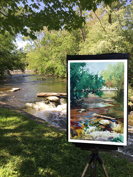
And if you’re looking for the perfect place to put Steve’s lessons into practice, the Ozarks are calling — with cascading waterfalls, rugged bluffs, and endless plein air inspiration. Don’t miss the Plein Air Convention & Expo this May, right in the heart of it all — grab your spot now!


