
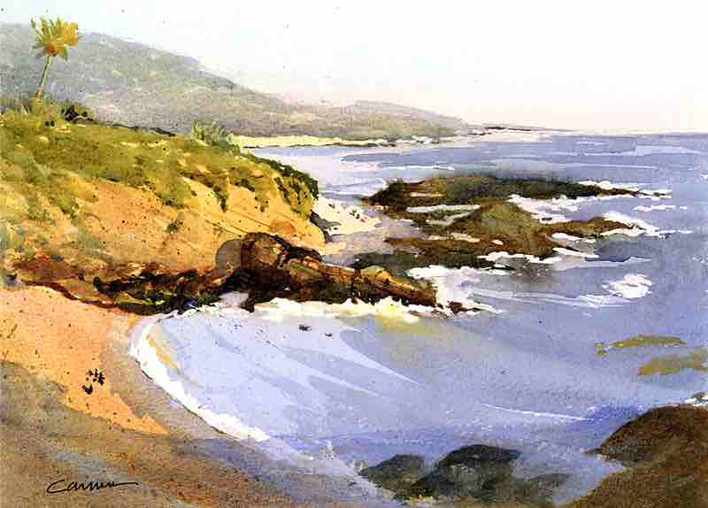
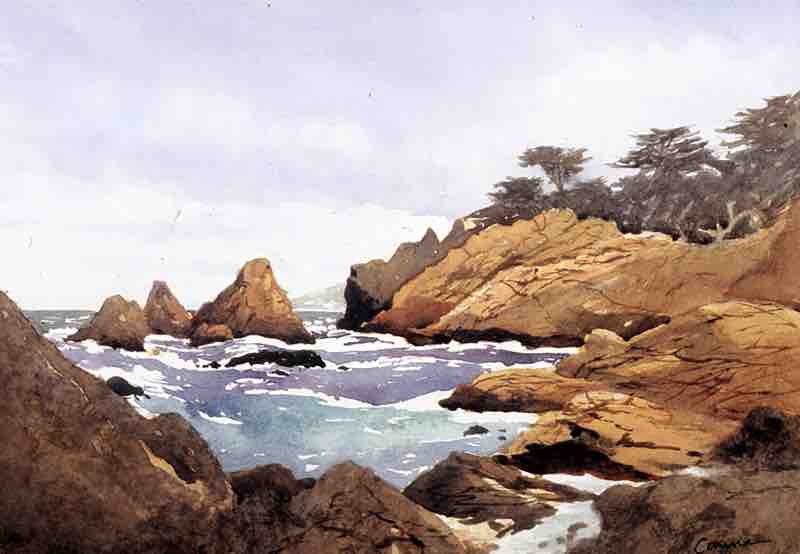
“The Pacific Ocean with its heavy surf and rugged coastline never ceases to inspire me,” says Larry Cannon. “To stand on the shoreline and view the force of the waves pound away at the rocky shore as it has for millions of years is to feel in awe of Nature and become acutely aware of the vastness of time and space.
“Sailing on San Francisco Bay, I became attuned to both the invisible and tactile forces of Nature, in particular the strong winds and tidal currents I could feel through the tiller of the sailboat. For me, watercolor is uniquely suited to expressing water in motion.
“But as any artist who has painted the ocean knows, two challenges dominate. First, the surf and sky are constantly moving so there’s only a brief moment to capture that energy. Even when I’m working on location, I start by taking digital photos of the wave crests and breaks as they change over time. I can then review them on my phone to plan the major and minor movements within my composition. I can also convert the images to black and white and evaluate the native value structure of the scene.
“The second challenge is that the weather is also ever-changing. The dampness of the air may unbearably extend the drying time of initial washes, while the wind can quickly dry both the paper and the paint on one’s palette. Like a sailor who must shift the boat’s tiller in response to the tidal currents and changing wind direction and speed, the artist must constantly adjust.
“To help me preserve and highlight a focal point area and establish a dynamic three-dimensional quality to the breaking surf lines and shoreline foam, I use liquid masking fluid. With those areas of the white paper protected, I can paint freely, using flowing brushwork to indicate movement and color changes.
“Later, I’ll glaze over those first washes to further highlight the saved white areas while muting less important areas of the painting. Too many competing white areas in a seascape can defeat the objective of the composition.”
LARRY CANNON’S TWO TIPS FOR PAINTING SURF
1. “Ocean water is seldom flat so the colors can change dramatically as the water recedes from the artist’s viewpoint. The color is most intense and viridian in hue nearest to the shore while the thin vestiges of the waves running up the beach is a combination of blue sky reflections and the brown sand below showing through.”
2. “Where I paint in Northern California there is almost always a high tideline defined by a flotsam of kelp and other objects pushed ashore by the waves. Including this phenomenon adds a sense of passing time to a painting and provides a stopper to the energy of the surf that prevents the eye traveling off the edge of the painting.”
Unlike other subjects, you can’t translate water directly from a photo to a painting; you have to first learn the language. In “Fearless Waterscapes,” Shuang Li shows you how working from multiple reference photos helps you capture the true emotion of water.


