
When it comes to watercolor paper, what does 90lb versus 300lb mean? What is meant by “intensity” in a watercolor painting? How do you maintain transparency? Why are we talking about “messing around” at American Watercolor Weekly?
Because we love art, and we love to encourage you to experiment with all the techniques that many of you are picking up this week at Watercolor Live!
We began the day with encouragement and advice from our hosts: Eric Rhoads (CEO and Publisher) and Kelly Kane (American Watercolor Weekly / PleinAir Magazine Editor in Chief). From there, we dove right into hours of all-things-watercolor.
When we invited everyone to tell us how many Watercolor Live events they’ve attended, we saw many returning friends and newbies:
“First timer – the folks at my local art school raved about it so I had to do it!” ~ Lea N.
“Second time for me…LOVE THIS!” ~Rebecca L.
“I think this is 5th… but 1st as a faculty!” ~ Deborah Chabrian
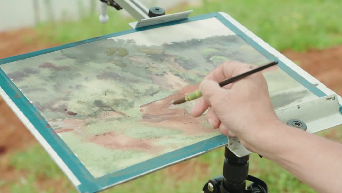
Watercolor Live: 2026 Essential Techniques Day
Understanding Your Materials
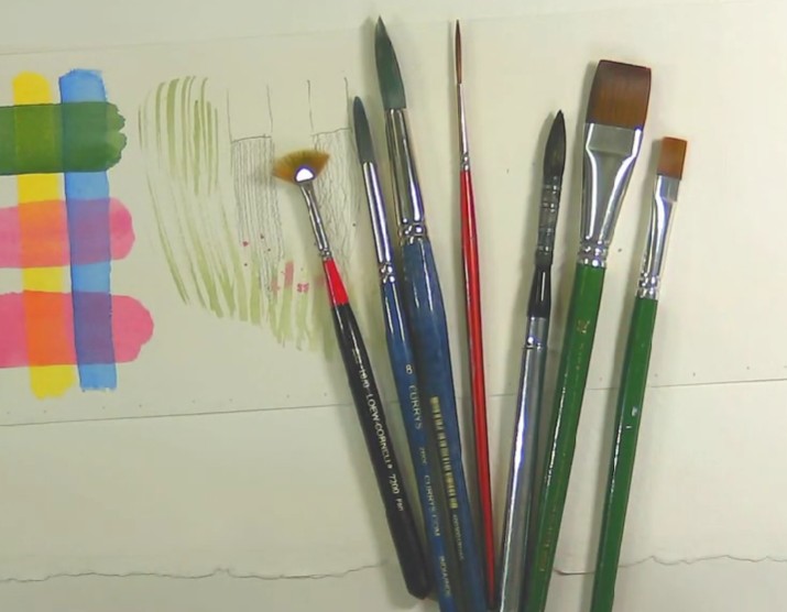
Tip: Round brushes are the “workhorse brush” and are used for most things with a very light touch to protect the paper, and flat brushes are useful when you’re painting architectural scenes because you can create nice lines.
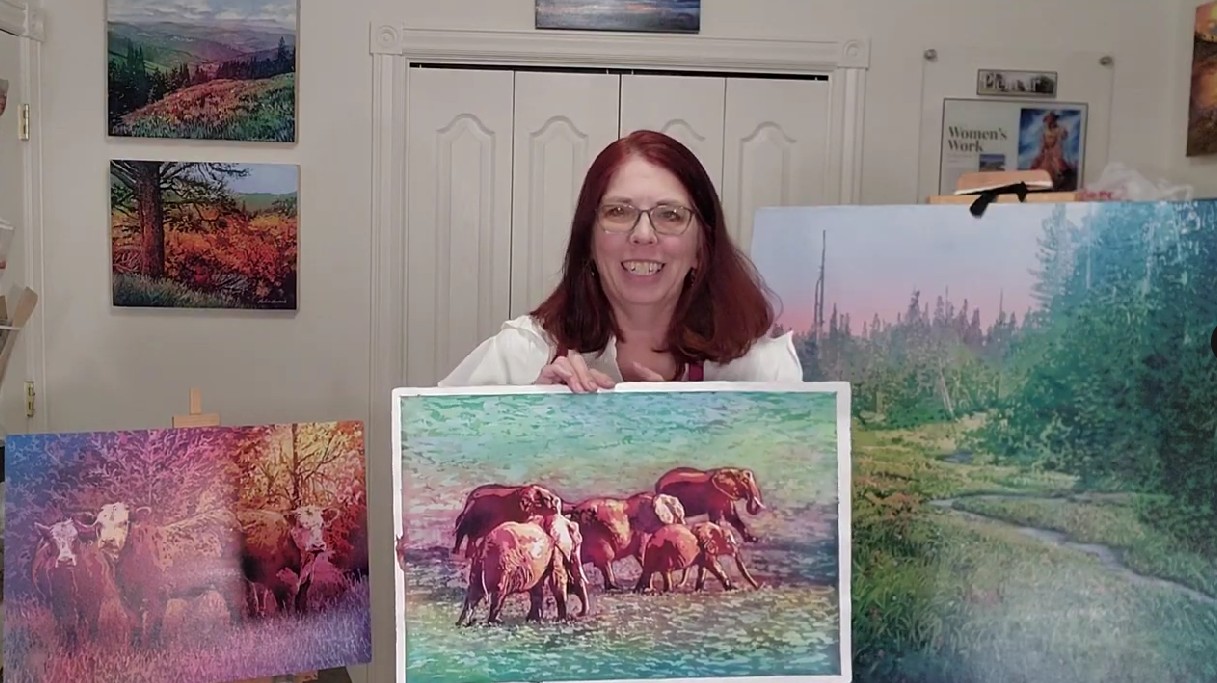
Shelley Prior, who is especially known for her realistic still life paintings of glass, gave a helpful overview of the various materials and art supplies you’ll want to be familiar with if you’re new to painting with watercolor.
For example, what does 90lb versus 300lb paper mean? Paper “poundage” refers to the weight of a ream (500 sheets) of paper. Common weights are 90-lb (thinner), 140-lb (the most common – sturdy, but bends easily), 200-lb, and 300-lb (thicker).
“I’m familiar with watercolor and am surprised by how many great tips I got from this explanation!” ~ Patricia N.
Basic Techniques & Special Effects
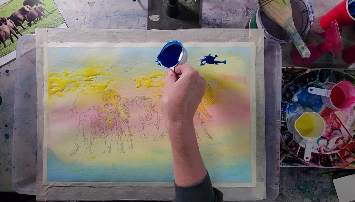
“For me, luminous realism and pouring watercolor is about letting the paint feel real and alive; letting it glow with light, story, and emotion, rather than over-defining every detail,” said Leslie Lambert in her watercolor pouring demonstration. “You don’t have to control the water. You just have to listen and respond.”
“This is like watching an exciting sport.” ~Jada R.
Building Layers During Watercolor Live
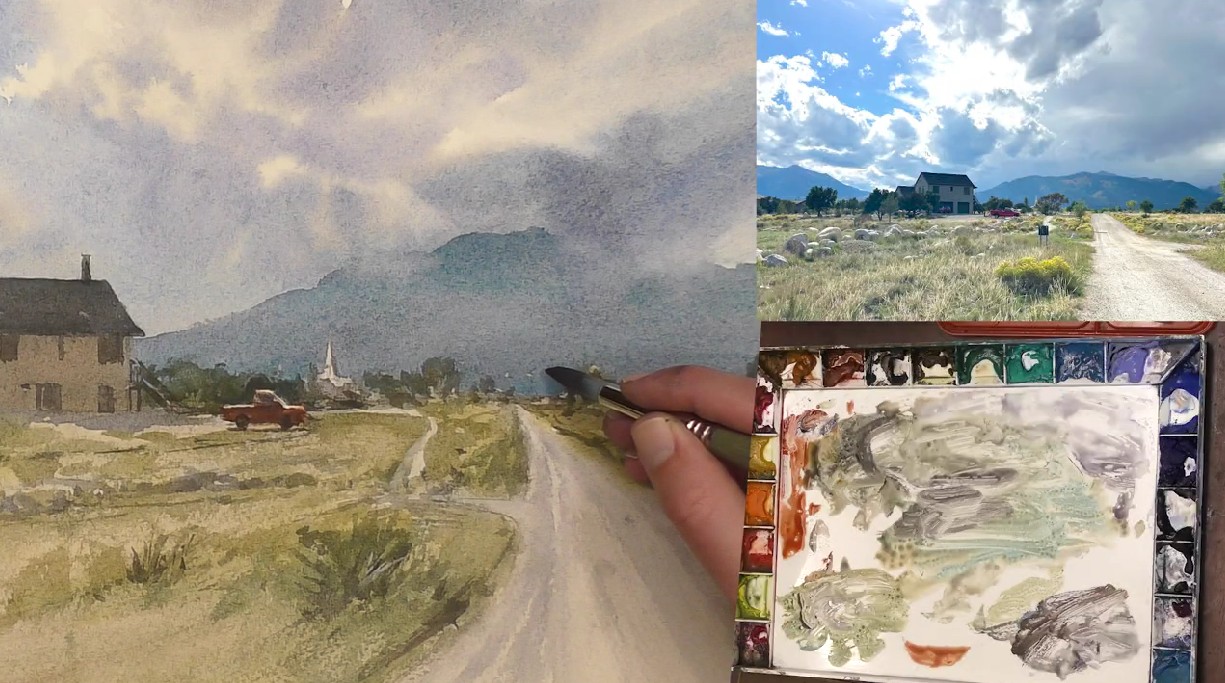
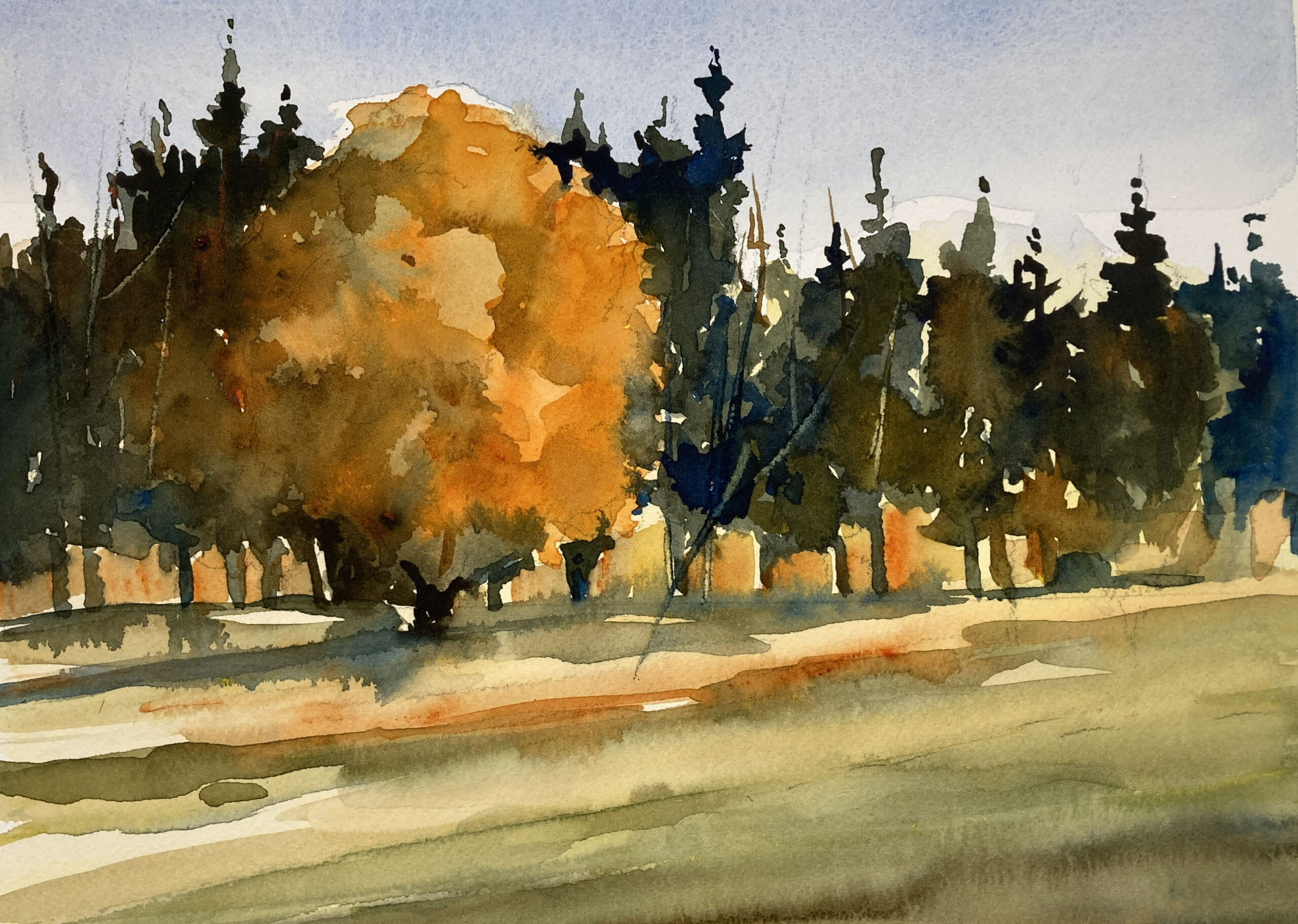
In his dramatic sky and landscape demo, Matt White said he doesn’t like leaving only white paper for the clouds, so after dampening the entire paper, he added just a little bit of tone to the sky. To create a neutral warm color for the clouds, he used a mixture of raw sienna and a touch of lavender.
Color Lesson
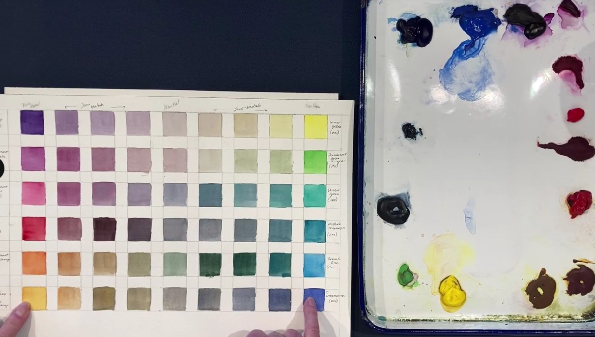
In a not-to-be-missed session, Catherine Hearding broke down the basics of color theory, including the properties of color: hue, value, intensity, and color temperature.
Still Life Demo
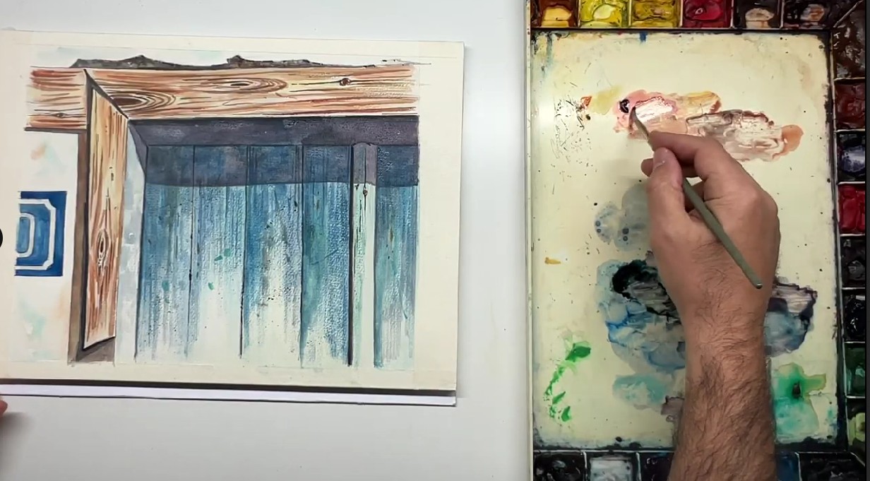
Transparency is essential, George Politis says. His watercolor demo, in which he frequently added water to his brush to encourage transparency, honed in on the textures of an old door he came across in Greece.
Portrait Demo
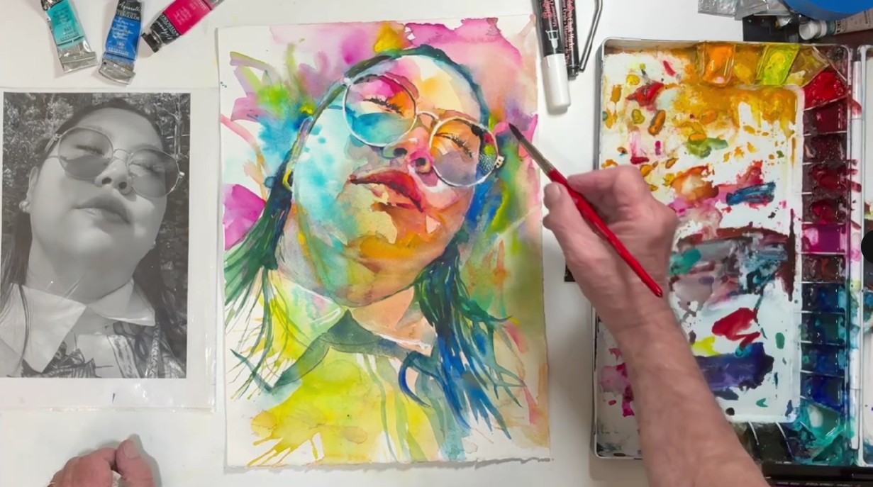
If you’re looking for “California vibe” watercolor portraiture, you’ll find it with David Lobenberg. His work is bright and expressive, and he uses somewhat unusual ways to apply paint to watercolor paper – all of which he shared during his demonstration of “California Dreaming.”
In addition to these demos, we saw bonus presentations from two of our amazing sponsors: Blick Art Materials (featuring Sarah Simon) and Legion Paper. We also enjoyed special discounts, a stream of interactions with the faculty during the live chat, and face-to-face breakout room sessions, including the evening Cocktail Hour and Paint Along session.
Learn more about this incredible annual event at WatercolorLive.com now!


